CH
Visual
Ball Animation - 4/12/2020
During this session, I applied the basic animation principle of squash and stretch, as well as looking at the cycle of a bouncy ball.
My attempts can be seen on the right And my later attempts can be seen below.
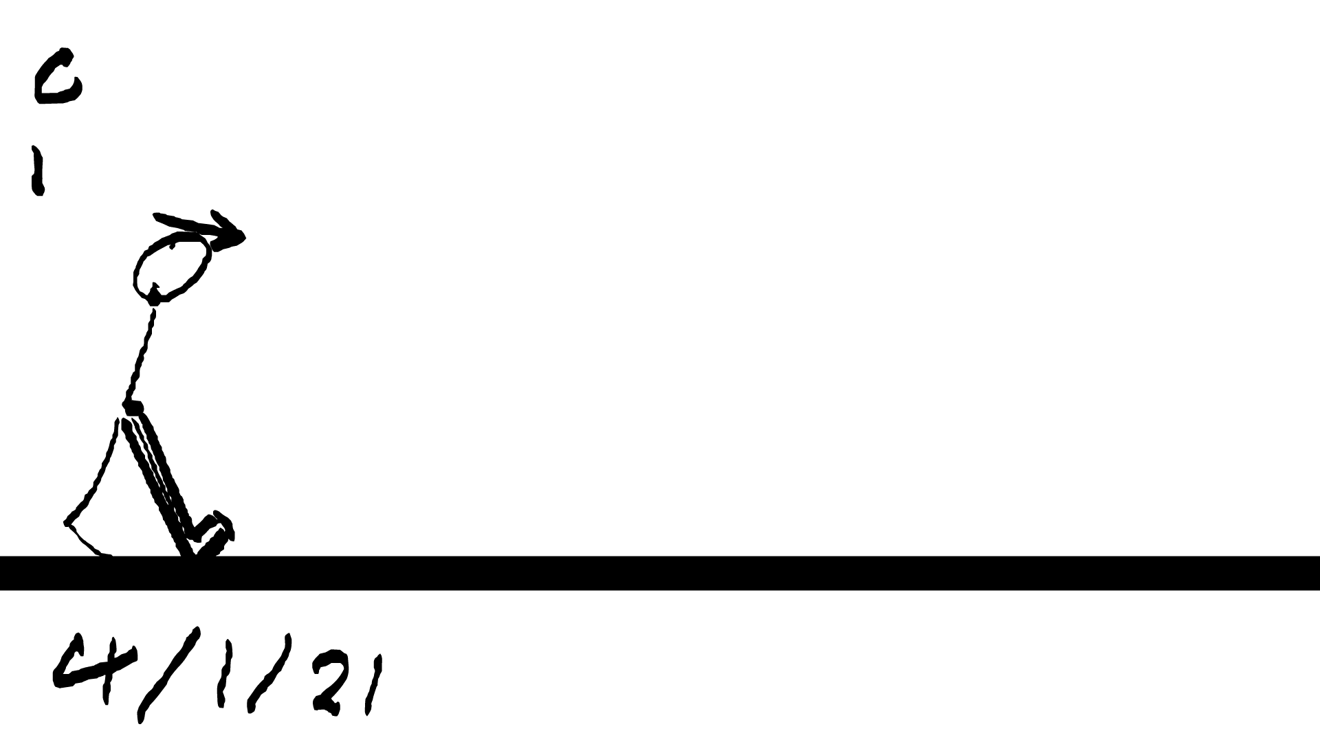
This was all done on Adobe Animate. The first attempt just focused on getting the ball from the top of the screen to the bottom. This was surprisingly the most frustrating part of the lesson. After creating a new file I had to learn the new layers system. The shortcuts were f5, f6 and f7. Regardless of which one I used I kept getting the previous layer pop up (when in reality I needed a blank one). My first solution, after a bit of experimenting, was to use f5 to duplicate the previous layer and delete its contents. After communicating to those around me and the teacher (Scott), I found out a better solution. f5 expands the frame (dups the previous frame) while f7 creates the blank frame. Although this is slightly different on Mac computers - forcing me to press 'fn' and f7 (which was why it didn't work originally.
After this revelation, I decided to start from scratch. Attempt 2 was much smoother. This time I decided to do squash and stretch. As it sped up the ball distorts and stretches outwards. When it hits the ground (and momentum is reversed), the ball squashes down and changes direction.

Arc Continued - 11/12/2020
My first attempt was to just get the movement pattern. To get the ball form one side to the other. My next attempt was to apply the squash and stretch animation principle. It runs so much smoother compared to the first. Major improvements were made. This is the start of learn how to make my character move. Not gonna lie, the 1st attempt did push my patients a bit. The buttons didn't do what I wanted and the ball itself was very jumpy and unpolished. Attempt 2 was much better for me, although there is a small freeze on the bounce up I want to fix.
The next step was to get the ball to move in an arc. The movement itself all came down to physics. Momentum has to be conserved, volume also has to stay constant. Overall, I found that the more practice lead to the greatest improvement. The method was the same, it all come down to trial and error. I had fun doing this. I had a lot of fun doing this and plan to experiment further in Adobe Animate.
pen tool = p, tap once then tap and hold 2nd for a curved line.
brush tool = b

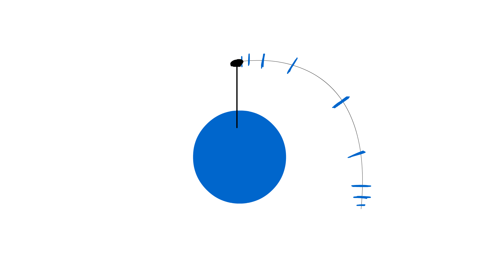

Today we continued on with the arc motion. It consists of the same techniques as last time, although now we are considering the material of the ball and what happens when it is attached to a rod. The 1st one is more of a rubber ball while the later attempts makes the ball much harder, more like steel. The 1st attempt was just practicing the method from before. Now I tried to get the rod to act as a spring (or more of a rope). It speeds up on the way down and rebounds at the bottom, due to momentum.
Although, when asking for class feedback. It was mentioned to me how the ball should stop earlier. A later stop meant that a "drag effect" occurred. As if it froze out of nowhere. I would either make it stop earlier or have the rebound extended lower.
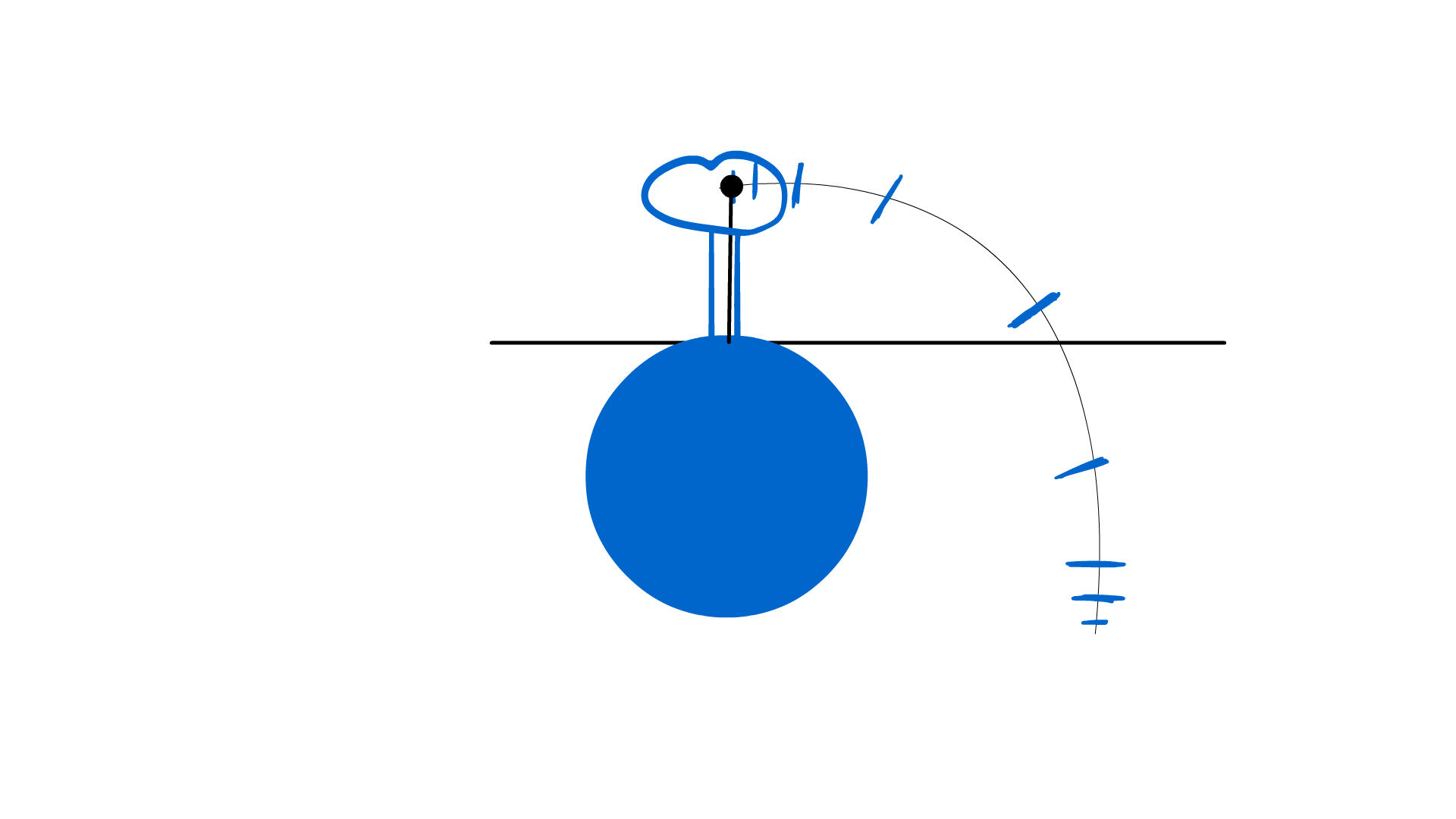
We were then shown a tree example of how we can use the arc on real life objects. The trunk is made of a more solid material (less bend) while the leaves are much more fluid (creating much more distortion). I had the idea to snap the trunk on the way down. Scott mentioned how the tree was almost slingshotted forward, so I drew a man and rope to literately string shot the tree.

After showing my work yet again to the teachers, I was suggested to make the tree drag much more. A slingshot will create much speed and this in turn will distort the tree even more. The drawback got extended and the fasted frames got re-drawn. I smoothed the frames with the stick figure in it and created more impact lines for the tree itself. I followed feedback throughout the creation to create the result below. Although more improvements can be made. The trunk (bottom half) almost teleports across the screen. The gif flickers each time it restarts (I could add more still frames at the end to help solve this).
I had fun doing this, and having those around me give feedback during creation really helped me push it. it allowed me to see errors and improvement it as I went along. I want to attempt this in the future. try the same techniques with a different concept. Maybe have a powerline fall, a plane crash or a tennis ball being thrown.

Character Design 1 - Designed 2/11 - Wrote up 12/11


Pinterest, n.d. Plague Doctor. [Online]
Available at: https://www.pinterest.co.uk/pin/203084264426304965/
[Accessed 2 December 2020].
TomBanwell, 2020. Plague Doctor Staff w/ Winged Hourglass Topper. [Online]
Available at: https://www.etsy.com/uk/listing/158686736/plague-doctor-staff-w-winged-hourglass
[Accessed 2 December 2020].


This was my 1st attempt at designing a character. It was before any research took place except for the 2 screenshots shown above for reference. I wanted to get a starting point to see where my character drawing skills have progressed to and improve it from there. I'm also trying to write more effectively as feedback has shown I write too much, same points can be made in less words.
I challenged myself with a 3/4 view. It resulted in the basic sketch above. The character still looks front facing, except now very wide. I corrected this as I went on but it still makes my character look front facing. I want to try and break out of this position and it will be difficult.
The same techniques used on the concept arts were applied here. Dark red represents wrath, anger, war and death. It is a colour with much energy and has darker connotations depending on the shades. Very effective for signifying a villain. Although my character would clearly be on the villains side, it is unclear weather his motives are villainous at this point. Colour scheme needs to be experimented more as the character is no longer clear cut on his loyalties. This was an idea I had after the personality resdearch and moodboard design.


The line art is deliberately rough and the character is only defined but an outline and shadow. The limited colour scheme emphasises the raw anger present here. The complete lack of facial expression except for the glowing eyes gives the impression a monster is kept silent under the mask. I personally like the art for its simplicity and roughness.
However, the original posture and position looks almost comical. After research, it was established how he feels nothing, a complete lack of emotion. Although I did hint at a buried anger/madness below the surface. However this took place before any research was done and has therefore deviated from the path of progression. I have to lip sync my character in the future, but it would be impossible with this design. A backstory (character profile) is also needed but the plague doctor below is just a standard representation of a plague doctor, nothing that makes him unique besides the art style (not the character itself).
It is a good sketch at best. But that's all it is, a sketch backed up with little research. This is a clear example of why the research comes before the character development, not after like now.
For the future, I plan to develop him further. I have established a personality and had a few ideas on backstory. I want to incorporate them into the design somehow to make him stand out, while keeping features of the plague doctor costume. Experimenting with the face shape, the mask and overall outfit. I told people of my idea and one query was how I am going to lip sync if the mask covers the mouth. The plan is to break the mask, to reveal portions of the face. It will allow me to play with explosions and injury to alter the outfit below - to create more identity.


These were the main reference images I used in my creation of Plague Doctor 1. There were 2 main themes I could go down. The more traditional plague doctor and the cyberpunk (blade runner style). This character went down the traditional route. For my first attempt, I wanted to just get used to the basic theme. To familiarise myself with the clothes, the style and the basic representation of what makes a plague doctor. Later down the line, I plan to put a creative twist on it to give the character more identity. Right now, it is at its most basic. Much more work will need to be done before my design in finished,. Many redraws will have to be done.
BONUS ART

After finishing my first character drawing, I messed around with the layers. I created ones of these by accident and was fascinated by the effect. So I got to experimenting and created these 4 images below. I boiled the character down to its most basics and see what it looked like when I removed certain features. The lines are extremely rough and there are clearly some anatomy errors, especially including the hands.
I want to try experimenting with the anatomy without using the basic 8 head template. To get used to drawing freehand with no guide or template. The 1st sketches are always rough but I want to get to the point where I don't have to worry about human proportions when sketching. This one sketch took 2 hours and its my goal to lower that time.
I felt pleased with my work for the time, happy with my results. I have already gone through the positives and negatives. I plan to improve the design to create a sense of identity in the future. If I was to do this again I would go over the line art to tidy up the shape. I would also use my mood boards as reference, not just 2 images.


Plague Doctor 2 -
Made 13/12 - Wrote 20/12 to 2/1/21


This is the 2nd character design - labelled "Plague Doctor 2". At this point, I would of done a 4th moodboard for image reference and my 1st draft of my character backstory (which was re-purposed into a diary entry). It was clear that the backstory will lean into very militaristic themes. So the design itself will have to reflect the backstory. My 1st issue was the era he was set in. My original idea was to set Plague Doctor 2 in WW2 trench. However this would of heavily restricted the technology of the time, being set back so far into the past. Unless I involve time travel, there wouldn't be any logical way to add any customised, futuristic technology. I wanted a way to keep the character grounded and give reason for his incredibly high skill of training.
So I done a new method of brainstorming - post it notes. I took all the stuff off my door and started brainstorming ideas. Themes, settings, time period, just throwing lots of ideas out and seeing what sticks. I got this idea from a behind the scenes look at onward video (Pixar).
My first attempt was just getting used to the anatomy, giving me a rough line of proportions and placement. Most of this will be covered up or redrawn when I decide on body position. It is helpful to map out my proportions. For example the 3 head rule, the half legs half torso rule and overall muscle placement was taken into account. I found, from my own experience, that starting with the head and drawing in the basic skeleton of the body position is the easiest way to start. After it is a matter of attaching muscle and deciding on the overall shape.


Once I was happy with the overall build, I focused on the colour and key features. The suit was mainly green and white before. But this resulted in standing out far too much for camouflage. After research, I found that a tundra camouflage would be white man brown, not green.
The lines are still very sketchy, which can be improved on in the next character design. The legs went through some changes. The hands were redrawn and so was the characters collar. Most plague doctors had their neck covered, so it didn't make sense to have him open necked. Elements such as the mask, heavy gloves, staff (fashioned into an axe) and beak were all taken from the doctor design.

Positively, the character design aligns with the backstory much better than the 1st one. The militaristic influence shows clearly through the uniform and build of the character. The characters powers are honestly very grounded at this point, most of his presence is physical with advanced training. More research needs to go into the weapons of choice. Weather I use standard issue or custom made, it needs more research. The knees are not as defined as I would like, making the leg look like one long shape rather than a joint being present. The feet are honestly too pointy for practical use. The line art is still very scratchy and sketchy - looking less professional. Most criticism when showing the character was directed to the gun. Feedback said about how it was to small and how you shouldn't hold it like that.
Although I never intended to draw the gun in a firing position, however I admit it needs work. Overall I am satisfied with how it came out. The line art needs work, the colour needs more through put into it, looking at the effect on the audience. I plan to focus more specifically on the military wear, make it more for combat and focus on the weaponry.

This is the feedback I got from discord, showing the 1st reactions to my character in the discord. Most mentions were towards the gun, rather than the character itself.


This is the mood board I used (on top of the other mood boards) to act as references for my character 2. I focused on the mask and the suit. The previous design was generic, with no detail that would define its personality or motive, nothing that made it unique. The one is clearly militarised, a strong build, cold, hardened face. He looks dangerous, he looks like a veteran and a cold killer.
What I am saying is that sense of identity, that difference from other plague doctor, has now been created. I have went through my method and positives/negatives. I feel content with this, although I do feel like I lost too many plague doctor elements. It just a solder in a mask now. For future plans, I'm going to adapt this design into a more tactical, more lethal version of itself. Focus on the outline and the "evilness" more. Also I want to show part of the face in order to convey emotion easier. If I was to do this again, I want to experiment with colour choice more, as right now the colours have been random and very hit or miss.
Plague Doctor Sketches 3 - Made 17/12 - Wrote 20/12
These were rough sketches of future possible designs. During lesson, we looked at how shape and outline can portray the personality. Squares are strong, solid, powerful traits while triangles are more sinister, evil and dangerous.
Many character can be defined by their outline. Their shape alone is enough to identify them.
To the right are some sketches of how to use lines to create shape. The triangles are much leaner, more pointy. Very sharp and very deadly. The squares are much more built. Very robust and sturdy.


These were the 1st design trying to use this new method. Feedback from the teacher suggested that these were too similar to each other, not just the bird theme but the overall shape. Many were similar in shape and stature, conveying basically the same ideas as the rest. Out of these 1st 5 sketches, no 3 and 5 were my favourites. no 5 I could play into the wingspan concept wile no 3 gave me more bounty hunter vibes with the eye and build. I had a choice weather to make my character more man like or more bird like.
Given the feedback from before, I then created no 6 and 7. No 7 was a combination of 3 and 5, combining the bird like features with the bounty hunter vibes of before. I made it a lot slimmer and skinner to make some more variation. In turn, no 6 was used to experiment with bulging muscles and deliberately huge muscle structure.
A new method I was taught was called "blackout". This is when you simplify the base character to focus on the outline only. What shapes are most known, how do I establish an identity on outline appearance alone?
no 7 was the outline I chose to develop. The shapes were clear but not well defined. I worked open making the edges sharper, I already built the character out of triangles. In turn, it was clear that he had a villainess nature, emphasised in the spikes and sharp edges. Due to the army background, I want to play into more close combat traits. More character traits that would aid in a close encounter. Although I do want to give it some ranged attributes as well.
However, I thought that it was looking much more like bird than man. The backstory is a man in the military who defects/get betrayed. Having such skinny features would not make the character as compatible to the backstory. No 8 was created in response, with the wings transforming into spikes that lined the arm. However his blackout outline looks too generic. It built out of squares rather than circles this time and the effect in turn completely changes.
So I went back to my original 3 mood boards and used them for inspiration. No 9,10 and 11 were my attempt at drawing pre-existing plague doctors on the mood board. This was me practicing and taking notes of possible traits and designs to incorporate in my own.
The beaks covered the face as well as the nose, normally going round the eyes. Many wore robes or baggy clothing and other wore suits or robotic outfits. The feather in no 9, the build of no 10 and the nature of no 11. That is what I want to incorporate into my design.


So far, all my notes have been on the method itself and my through process throughout. I have responded to feedback at every step. I have adapted my designs, experimented with a brand new method and played with elements of existing designs. This all resulted into a potential new design route to develop. If I was to o this again in the future I would just do more sketches and experiments. I'm happy with how they turned out and honestly at this early stage, quantity is the only way to improve it.
Overall, I will be using this method again in the future and play with specific elements, like wings, arms and the head especially. This is something that is vital for design experimentation. I would say I may of gone too detailed into some sketches than I had to. Lines are supposed to be rough and sketchy, although I need to practice having clearer defined lines overall.


Plague Doctor 3 - Made 29/12 - Wrote 10/1


This is the 3rd main attempt at designing my character, called plague doctor 3 for the time being. Most of my poses have been front facing until now. I wan to play with pose and body position as well as angle and different perspectives. It will be more effective at communicating information than just speech alone. Posture and camera angle will be especially important since the majority of the face is covered up.
So at this point I have created a basic method to creating characters in terms of position and proportions. I start with the head, establishing a direction to look. I then draw the basic skeleton to decide the body position and then do muscles/clothes over the top.
At this stage, the line are still very sketchy and need to be tidied up before applying colour. Details were experimented with and rough locations were planned out. More research needs to be done on key areas such as weapons, the robotic arm and the military uniform. The Uniform was scraped in this design for something more custom and easier to draw.
Also, while the head is at an angle, the body is still front facing. This leads to the resemblance of his torso being completely flat. Hands are still an issue to draw and needs sorting out before the final design.
The mask is my personal favourite to the drawing. the hood covering the head and the mask covering the face down play the human qualities, making him look more like a monster than a person. After the final line art and the colouring, the head is my favourite part. The blood red eyes with the shattered skull of a bird. The hint of a mouth underneath with the exact same colouring. I also quite like the idea of the spikes and torso design ,although they need more development. The arms and legs need the most work - Hands are still an issue!
I incorporated techniques from previous lessons, such as the blackout method and previous sketches to help aid in my design. It made clear to me the key areas of his design, what made him unique and recognisable. Small adjustments to the body, especially the sharp pointy objects, were made in response to the blackout method.
Overall, I am proud of the design and the outcome. Although several changes to the backstory and character have been made since the time of this design. Elements such as the arm and clothes need far more research put in, rather than a "slap-dash". The characters cold, efficient ruthlessness has now be turned into overpowering rage with the desire for revenge and closure.
The biggest issue with the design is the fact that the vision for what my character wasn't established tell afterwards. The character profile and backstory kept changing and a as result, this is no longer a viable final design. Many alterations will have to be made in the future and that is what I will do coming from this.
I jumped into the character design before I done the research for my theory. because of my accidental backwards approach, I will now have to update the backstory, character profile, character design, write up and evaluate the lot of it, as well as deal with any new work that arises.
Research into the art style, colour, movement, existing characters (inspiration) will have to be done in order to progress further.


Adobe Animate Introduction - 21/12 - Wrote 19/1


123, T. R., 2021. tool experimentation ADOBE ANIMATE INTRO (project 2 - year 1). [Online]
Available at: https://www.youtube.com/watch?v=bnAKaRrjDV0
[Accessed 20 January 2021].

This video and screenshots show my 1st experiences with Adobe Animate. In this video, I go over the basic tools such as the brush, selection and all the individual settings associated with them. Transformation tools were also shown, giving my further manipulation over my brush strokes. I finally went through tools specifically needed for animation such as frames, onion skin and framerate.
Overall, this was just a first taster into what animate is capable off. I didn't try and achieve anything here except experimenting with the tools available. Overall, I am satisfied with my progress. I plan to use what I learnt today to produce animatics and explore the fundamentals of animation. This in turn will teach me the core principles of movement which I can one day apply to my character. The main area I want to research is the walk cycles and the principles of animation.
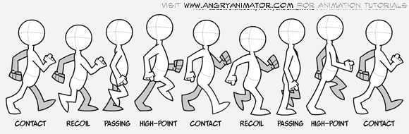
The Walk Cycle - Made 8/1/2021 - Wrote 10/1


The walk cycle is something I have experimented with in my own time, as well as in lesson. The cycles to the left are my in lesson cycles and below are my own cycle attempts (before the lesson). We wasn't given a method. We was shown a stock motion video and essentially told to get on with it. So I had to take imitative in researching a method for the arms and legs.
The cycles can be broken down into 5 main stages. The contact stage either end on frame 1 and 5. The passing pose (3rd frame) is between the 2 contact stages. And between those is the up and down pose, the highest and lowest point of the walk. At the end of contact the legs and arms would of essentially be swapped over and the sequence will repeats once more for a full cycle.
My 1st ever attempt (the blue stick figure gif) had several issues. I was just focusing on the legs so no arms were included. However I had a major issue with the brush tool that ran throughout every walk cycle attempt. If I attempted to start my brush stroke on a previous stroke (on the same layer) then it wouldn't register.
This meant that for every walk cycle I had to do each brush stroke in reverse in order for it to count. I asked students about the problem and they came to the conclusion of a bug. I asked one of my teachers and he had never seen this before and recommended I videoed it and sent it to adobe forums. That way someone on the internet may of had the same issue and could help me. I got 12 views at the time, with 5 views on the vid and no answers/solutions. Finally, I went to my second teacher in an online class and he found the issue. Due to some setting changes, It was set to "paint inside" rather than "paint normal", meaning the issue above was formed.
This is an example of a software problem that I overcame using several different methods. From feedback from students, then teachers (as they have a greater knowledge), then forums (when they didn't know) and finally back to teachers where it was solved. This was on top of my own experimenting and browsing to try and solve it myself.
So every walk cycle suffered from this issue. The black stick figure cycle below was shown to the 1st teacher. He gave me a positive response and a way to improve it. The figure was in constant motion, which lead to it looking like he was walking on an escalator. When the foot plants down, it should stay in the same spot until the foot lifts up. Mine did not.
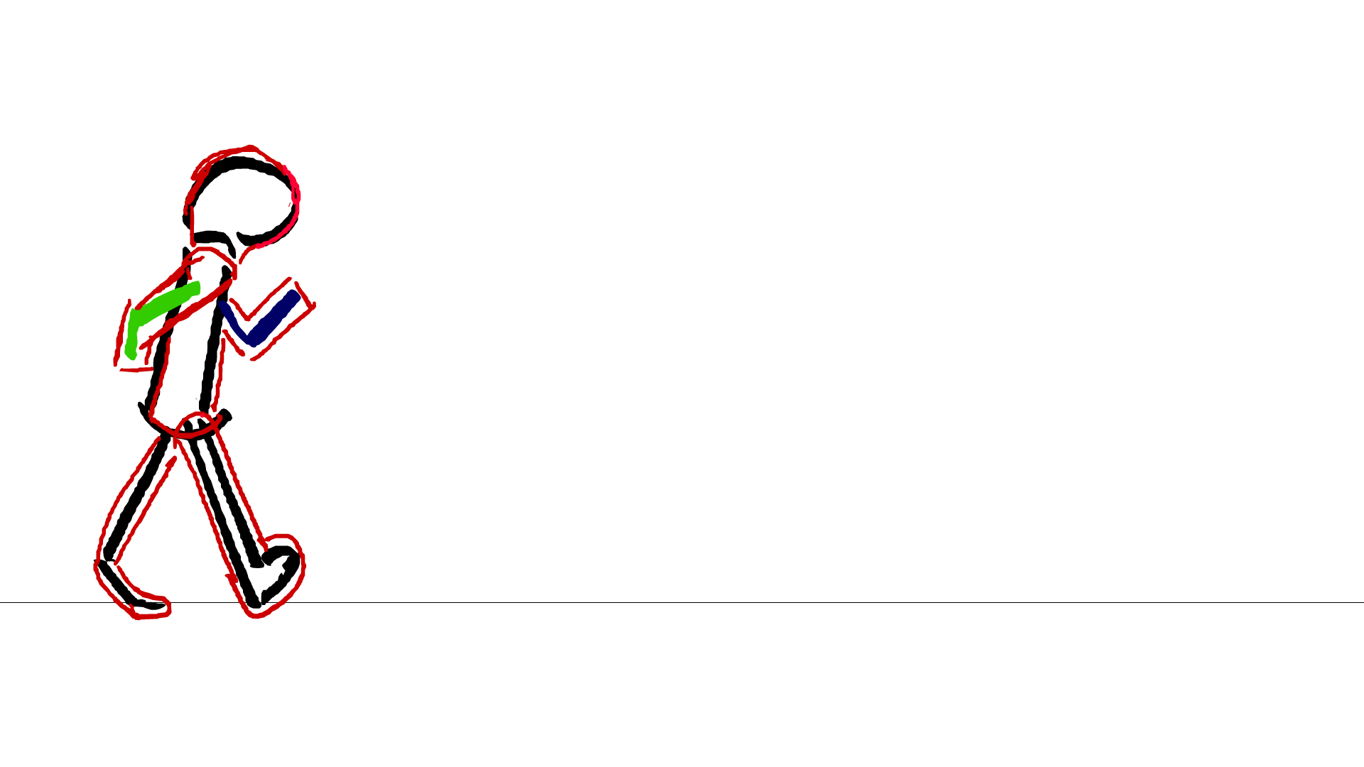
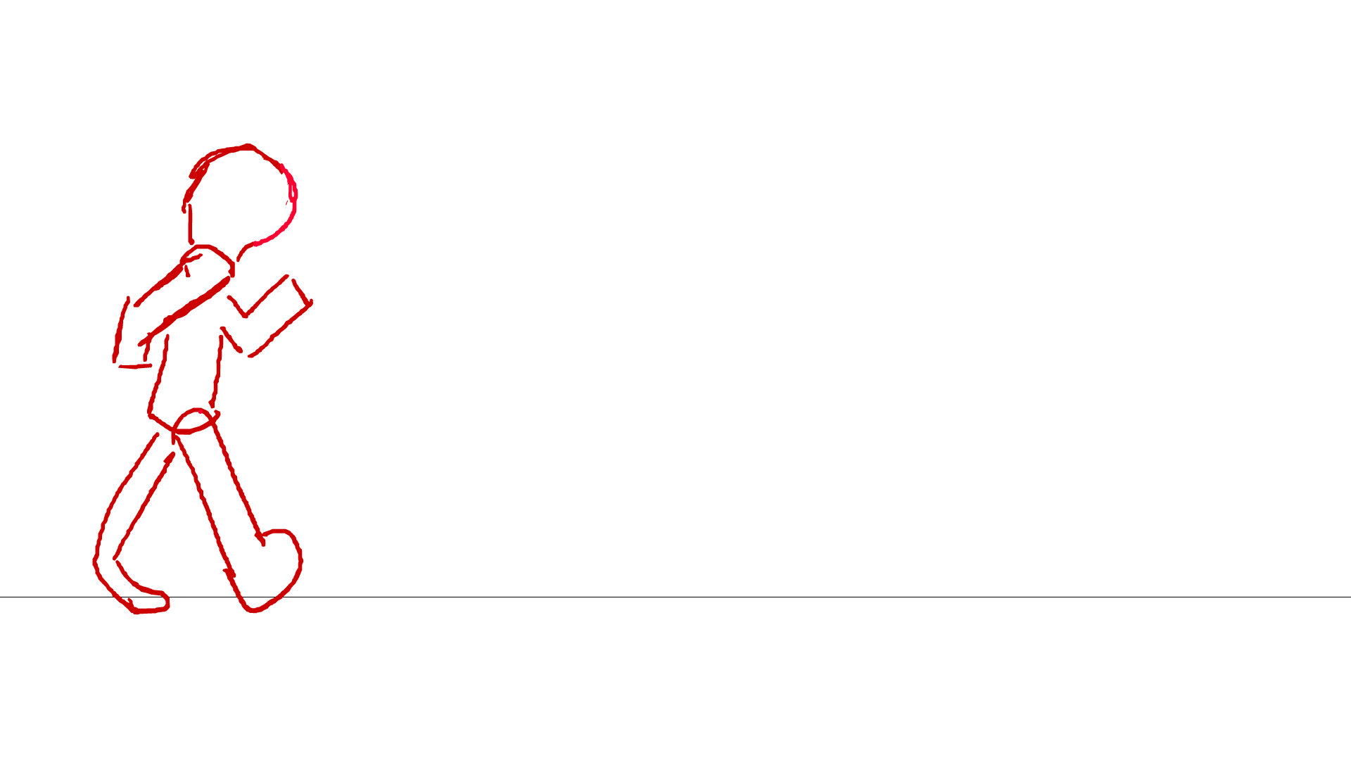
So when we did it officially in lesson. I focused on planting the foot and keeping close to the walk cycle stages. The result was definitely an improvement from the last 2 attempts, evidents of clear development. The new problem came with the arms. It was my first time animating arms in a walk cycle and getting them in sync with the legs was difficult and felt very frustrating. The animation was only a second long and the frames close together. So drawing the arms on a new layer and getting them in sync with existing movement was hard. This is probably the weakest area of this attempt.
Later I was then tasked with giving the stick figure some weight. To make it more complicated. In the end, since I found out he wasn't looking for a complete set of clothing for my character walk, I just expanded the body to hold mass.
The red drawing on top was rushed due to the time deadline being so close but did it. I'm happy with the result. If I was to do this again, I would manage my time better to allow for clearer defined lines. I would also improve and develop the arms, as they are clearly the most flawed element at the moment.
My own Personal Attempts - Walk Cycle Continued

These are my won personal attempts, before we officially learned about it in lesson. I had some spare time during the Christmas break and focused on this particular animation element. I wouldn't of had that much practice with actual animation so this was a start.
The lesson walk cycles developed off these early attempts as said above. Due to the few frames, the 1st one turned out into a speed walk while the 2nd one was much more controlled.
I need to focus more on movement due to my lack of experience. My character design is far to complex atm, and will need simplifying down for a more realistic idea of movement. I also need to consider my method of colour. The cloudy effect of many smooth brush strokes built upon each other will be almost impossible to replicate and keep consistent for each frame. I will need to research better method of colouring in for this to work well.
More practice on the walk cycle, more research into colour (method and style), another character redesign, a character simplify and more overall research into actual movement. Also I need to practice my human anatomy and eventually make more complex objects move, as well as write up all research, sources and evaluations.

Plague Doctor 4 Sketches + LIVESTREAM - 7/1/2021


These are the sketches I done after creating my 3rd Plague Doctor design. I wanted to focus on the idea of simplifying the character, as well las playing with key elements such as the face and the idea of wings. Many artist works on plague doctors show them with feathers and bird inspired features. So I experimented with this as well as poses and other key areas. I achieved the different body positions but failed on the simplify. It still feels like the same character just drawn in a different position. I need to put more research and through in the design itself. start researching character that exist, those with similar powers, similar personalities or just similar design ideas.


To further improve the sketches and to experiment with the body more, I decided to stream my progress on my YouTube channel ,TOXIC RAVEN 123. I have done this in the past to record my method and show my process in the concept 5 and 6 of Project 1 (task 1).
It also allowed me to practice with photoshop tools such as several lasso tools, image editing, filters, text and structure. This was in the creation of my thumbnail. The sketches themselves were used by using small variations of the same brush, using reference images for dynamic poses, practicing human anatomy (with very mixed results) and playing around with future ideas.
It also meant I could receive feedback from strangers and friends as my work was being designed. For example, a useful tip I was given on stream was about my lines. Instead of using lots of small sketched out lines, try using broader strokes. They are easy to undo and form shape much better.
My old thumbnails that were made in photoshop can be seen below, making it clear how my manipulation of photoshop has progressed.
In streaming, I had to entertain an audience whilst applying the skill necessary to draw in the 1st place - combining soft and specialist skills. I had to rely on my communication and presentation skills top keep peoples attention. I had up to 9 people watching at a time. The issue was maintaining them. The more time passed, the harder it was to keep the same energy and attention grabbing. I could only manage 2 hours before I tired myself out with trying to do to much at once.

TOXIC RAVEN 123 - YouTube
123, T. R., 2021. Drawing Plague Doctors LIVE - TOXIC RAVEN 123 Photoshop Livestream. [Online]
Available at: https://www.youtube.com/watch?v=Nwg0AHCCq_o&t=3s
[Accessed 7 January 2021].


As a result of half my attention being on my audience. My drawing suffered as a result. I wasn't able to put as much quality into them as I would of liked, leading to only 1 sketch panel. Because I burned myself out with trying to be entertaining and all the skills required with that, as well as the specialist skills, I tried to much at once. I focused on communication and my art suffered. I focused on my art and people got bored. To do both at the same time to a good standard was a incredibly hard balance to master and it was tiring.
I spoke about the pros of streaming my work process above but these highlight the negatives. It forced my to push my existing skills. But it also hindered the very reason for being there, drawing. This is a method that I will try again, but I need to make sure I don't loose sight of the goal, to improve my art and come up with a new character design.
12 Principles of Animation - Alan Becker - 15/1/21
This is a video on all 12 principles of animation, a video from a youtuber that I have been watching for years. Alan Becker is best known for his stick figure animation (for example his animations vs animator series). This particular breaks down the 12 principles in a beginner friendly way. I intend to use these principles when it comes to my own animations and my final character visual animation.
ROUGH VIDEO NOTES
1 Squash and stretch- animated objects will get longer and flatter to emphasise speed and mass. More squash and stretch, the softer the object. Keep volume of object consistent. Longer makes it narrower. Flatter makes it wider.
2 Anticipation – prepares for the action, makes it more realistic and tell audience what he’s about to do. E.G. Draws back arm to punch. Prepares them for the next action. Viewer has to notice the key info. Use it to control attention. Multiple levels available.
3 Staging - the presentation of any idea to make it clear – very broad. Control where the audience is looking. Far away is good for big actions. Close up good for expressions. Put in main or thirds of the screen. Has to be simple, proper timing. Let action finish before starting another. Text, read 3 times. Convey ideas, go over the top.
4 Straight ahead a pose to pose- straight – animation as you go, could lead to character changing size. Although much better for being unpredictable, eg fire, water…
Drawing the beginning and end of each pose, more control. Do general shapes.
Overlap the 2 wien it comes to moving parts (eg ears, hair, clothes).
Keys, extreme keys, breakdown poses.
5 Follow through and overlapping action. Body parts drag behind the main body, drag. Follow through, continues to move when the body stops. Drag = delay. Tip of appendage, late to stop, follows through with action and goes back to rest. Drag says about his mass.
6 Slow in and slow out – how all movements start slow, build speed and end slow. Take extreme poses, draw in-between them and then them and… Make it non-linear (quadratic). Drawings evenly spaced
Arcs- most move in circular path. Slow in and out. Most movement follows arc. When fast, draw arc as a smear/fragment.
7 Secondary action- describes gestures that support the main action.
8 Timing – personality of animation is affected by the number of frames for each actions. Few drawings far apart – faster. Many frames mean slower drawing. 1 drawing made for every 2 frames is called 2s, at 24fps.
9 Exaggerations- every action, pose and expression can be taken to the next level. Need to exaggerate, if a character is sad, make him sadder. Wild – wilder. Not more distorted but more convincing. Make it bigger. Few extreme frames (make it more or longer). Go over the top and draw back
10 Solid drawing – make it feel like it’s in 3 dimensional space. Spears, cubes and cylinder to construct characters. Perspective lines. Be mindful of overlap. Avoid symmetry, too flat. Avoid twinning. Show it has weight and balance
11 Appeal – make characters appealing to look at. E.g interesting to look at. All standard different. Use variety of shapes. Play with proportions. Magnify what’s interesting, shrink what’s boring. Blow up parts that define personality. Keep it simple, drawing it 100s of times. Emphasise key details, don’t use too many.

The notes above covers the main informative points of the video. Overall I was aware of about half the principles above, although I struggled to apply it to my work. It felt good to have all 12 layed out in a simple order. The one I want to try out in particular is the 'pass and pose' technique. I would of just used the 'straight ahead' technique up until now. This method works by drawing the start and end frame (the keys), establishing a destination, then drawing the extreme frames. They are the highest and lowest points of the movement. After it is just a matter of adding breakdowns (connections) and in-betweens, while getting the correct timing. Below you will find my attempt at incorporating this method in my diving board animation.


Alan Becker Application - Pass and Pose - 15/1

REFERENCE:
AlanBeckerTutorials, 2017. 12 Principles of Animation (Official Full Series). [Online]
Available at: https://www.youtube.com/watch?v=uDqjIdI4bF4
[Accessed 15 January 2021].


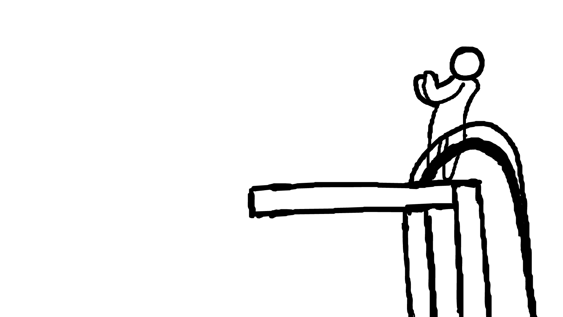
This is my 1st attempt at the "pass and pose" technique/principle. I would of already talked about the method of pass and pose above, this is merely how I applied the video in my own experimentation. The diving board animation, I tried to replicate it. With the added ease of being able to transform my frames freely (a new technique to me) and the brush issue fixed, I was able to work at my fullest.
Several small readjustments were made throughout. It was easier to redraw the head over an existing head frame, then move it into position. Once I had my extremes and key frames finalised, it was easy to fill in the gaps, although long (testing my patients). I was surprised with how much time went into a merely 2 seconds. I was averaging about an hour for 1 second of animation in this most basic style. Probably more by the time I edited and improved what I done.
I focused on getting my movement to flow, relying on the arc principle to do so. Many new in-between frames had to be added for this, evident in the 2 screenshots above. This is, so far, my best animation in terms of quality and purpose. Yes it is very simple but it flows. The movement was planned and deliberate. The line art thick but does the job well. The shape consistent enough to not be an issue, as I have struggled with maintaining volume for a while now.
However, the diving board itself is basically devoid of animation. The character just becomes a head half way through. The diving board frame looks stiff and out of place, far to solid. The character could of had more anticipation, as movement seems to happen very suddenly. The board vanishes half way through as well.
To improve this, I would finish it off. I would also exaggerate the body shape in certain frames. To emphasise the movement, I can purposely squash and stretch the character to make the movement more pleasing. Other principles (such as anticipation and slow in /slow out) can be improved on as well. They are clearly present but can be developed much more.
Overall, I am very happy with how it turned out. I want to finish it off when I have the time and use the principles here in different scenarios. I can use the base figure as a template for my own character movement, or at least use this figure the plan my movement first. This method made animation much easier in my experience with it. i am going to use these principles learned today a to improve and adapt my own character movement.

FEEDBACK
After posting by diving board animation onto an animation discord server, I got 2 suggestions from two different accounts (both either in the field or have a great interest).
Reply 1 suggested I add more squash in prep of the jump, building off the anticipation principle. Reply 2 suggested a tip on the position, about putting his arms up before the 1st jump to look more natural.
Without this feedback, I wouldn't of seen either of these methods of improvement
Walk Cycle, ATTEMPT 3 - DONE 14/1 - WROTE 16/1


Adrian's Blog, 2019. Richard Williams – The Walk Cycle. [Online]
Available at: https://adriancotapenwithdigital.wordpress.com/2019/02/14/richard-williams-the-walk-cycle/
[Accessed 14 January 2021].
angry animator, 2010. tutorial-2 : walk cycle. [Online]
Available at: https://editor.wix.com/html/editor/web/renderer/edit/9dc12f41-4e3b-445c-a0a7-aa95a70bf1aa?metaSiteId=b2251390-4ae5-49b0-85c9-a78e0426e87f&editorSessionId=beb56a98-a969-4916-989e-7ba89b46e16e&referralInfo=dashboard
[Accessed 14 January 2021].
FEELING/FEEDBACK:
Overall, I was overjoyed with the huge jump in progress. They're was an issue with the arms, I must of got confused with the shading and tried several ways to sort it. That was irritating but wasn't enough for me to be unsatisfied with my progress. Adam (animation teacher) showed me the method with the foot size and how it moves from being flat. He saw my previous attempts and gave me this new principle to try out. Results were great.


METHOD:
I followed the 2 templates provided above. The top 1 was the main reference in my previous attempts while the 2nd one is a brand new reference. I started with the down pose (foot was flat) and worked my way through the step 1 frame at a time, straight ahead method.
I found that the head was very difficult to maintain shape. The arms were very difficult in terms of movement alone.
After I had my initial walk I then focused on smoothing out the movement. I copy and pasted the frames rather than redrawing, motion tweening. Its much faster and considering there isn't any change needed for a cycle it made more sense.

PROS/CONS and FUTURE PLANS:
A strong pro would be the massive improvement from the previous attempts. Most of my last times struggled in adding mass to my character, resulting in most just being stick figures. However I was able to solve this with attempt 4.
The line art is still very sketchy. To improve I could go over my animation with smoother lines and also fix some minor shape errors with the body.
However, due to my copy and paste method, many 'glitch effects' appeared in my cycle.
I attempted solving this by adding more frames and readjusting the shape and shading.
If I was to do this again in the future, I would go over the line art to smooth it out. I would also make the legs go further back and include more frames of it coming across. The ass needs to be completely re-drawn (as it constantly changes shape). Going from this, I intend to do another walk cycle practice, although this time try and incorporate multiple principles of animation and eventually draw my base character doing the same action.


Alan Becker (YT): Walk Cycle Research - WROTE 23/1
This video breaks down the key poses, establishing the very basics needed for the walk cycles, contact and passing. It goes through several methods to show the walk cycles. Copying the cycle will result in it being mechanical (the issue with my last attempt). Doing each cycle will take up much more time, although give more control. However moving the background and keeping the cycle in place will provide a better result.
Map out each step, draw the contact poses (evenly spaced). Add the passing poses, then the up and down. Arms furthest apart on the down pose and closest together on the passing pose. Opposite to the legs.
When drawing from the front, draw the up and down poses first - basically the 2 extremes first.
Personality established through timing, position and offset.
e.g. sad, hunched over, contact and down longer, reduce bounce, droop arms.
I plan to use everything in this video to greatly improve on my own walk cycle.
AlanBeckerTutorials, 2015. ALAN BECKER - Animating Walk Cycles. [Online]
Available at: https://www.youtube.com/watch?v=2y6aVz0Acx0&t=163s
[Accessed 17 January 2021].
Hue, Saturation and Value - Colour Research, Photoshop - 16/1 - 19/1
ROUGH NOTES
Hue = Colour name.
Saturation = Amount of Chroma/Intensity of a colour.
Value = How light or Dark a colour is.
Value makes the picture readable, highlights the light and dark areas of the art work.
Hue and saturation affects value. Adding Saturation Decreases Value. Different Colours saturate to different values.
Bucci, M., 2020. Something strange you should know about color | QUICK ESSENTIALS. [Online]
Available at: https://www.youtube.com/watch?v=gJ2HOj22gDo
[Accessed 16 January 2021].


I intend to use this method to make more informed decisions in my colour choices. Contrast works by comparing light and dark areas. These value range tables will show me the value levels of these base colours.
The video also goes into several methods on how to see the values including black and white filter, greyscale and a few more complicated ways.
This will be essential when deciding on colour for my new character design and any use of colour in my animations. Contrast will make it more ascetically pleasing, this will help me judge light levels much better than previously.

Character Example 1 - Stealth - Assassins Creed
Done 18/1 - Wrote 19/1, 23/1


The last character design (attempt 3) was only backed up by internet images and my own previous experience. For the final design, I need to looking into existing characters with similar skill sets and traits.
The Assassins Creed character is built of stealth or brute power, depending on how you play the games. It a powerful build but not too over the top. Many weapons are either small enough to be holstered or hidden in the clothing. The hidden blade is a tool I want to use for my own character, so who better to use as reference than the franchise famous for hidden blades.
Izuniy, 2018. Assassin’s Creed Odyssey - Hidden Blade, Atlantis & Assassin's Creed 3 Remastered Trailer (2018). [Online]
Available at: https://www.youtube.com/watch?v=Tn5kOduFYF4
[Accessed 18 January 2021].
larryfitzmaurice, 2020. Netflix Is Bringing "Assassin's Creed" To Your TV. [Online]
Available at: https://www.buzzfeed.com/larryfitzmaurice/assassins-creed-netflix-tv-show
[Accessed 18 January 2021].
menbuying, 2021. Model Toys Cosplay NECA Assassins Creed 4 Assassins Creed Hidden Blade Brinquedos Edward Kenway Juguete. [Online]
Available at: https://www.menbuying.com/products/model-toys-cosplay-neca-assassins-creed-4-assassins-creed-hidden-blade-brinquedos-edward-kenway-juguete?variant=37353023996059&utm_medium=cpc&utm_source=google&utm_campaign=Google%20Shopping¤cy=USD&gclid=EAIaIQobCh
[Accessed 18 January 2021].
Staff, G., 2017. How the hidden blade in Assassin’s Creed evolved from a simple weapon to a Bond gadget (and back again). [Online]
Available at: https://www.gamesradar.com/how-the-hidden-blade-in-assassins-creed-evolved-from-a-simple-weapon-to-a-bond-gadget-and-back-again/
[Accessed 18 January 2021].
XB Deals, 2021. Assassin's Creed Legendary Collection. [Online]
Available at: https://xbdeals.net/us-store/game/461243/assassins-creed-legendary-collection
[Accessed 18 January 2021].
I also want to take other inspiration from this character as well as the hidden blade. I have already established I want my character to have a hood in attempt 3. It will be useful to use his hood as another reference. How the sharp weapons hang on the lower torso is another area to look into.


Interview - Manikin Method Tips (simplify)
Doubt_Cast2019 - Done 18/1 - Wrote 23/1

Sketches 1 to 4
This small area goes into my experience with the 1st 4 attempts art mimicking the body position of the character example above.
I used the same technique I did on my other works, create a rough and redraw over the top in small adjustments. However, this can result in the drawing looking flat and 2d.
Body position is an area I struggle with looking back at my past attempts on the human body. the lines are supposed to be rough and sketchy at this stage. However, any angles is lost, thus resulting in a much wider character. I attempted to break down the shape further using very simple shapes such like cubes. The torso is the area I struggle most with angle wise. Any kind of tilt only adds mass in my attempts.
The problem was the major flaws in my character anatomy and my knowledge of 3 dimensional shapes. More research will be needed to solve this.


This is the same animation discord I went to when I conducted my last Interview with an external animator. Since it was incredibly successful last time, it was worth giving it a shot.
The images above was the work of the user 'Doubt_Casdt2019'. I showed him the same reference I had and he done his own version of what I attempted above. He then broke down his method in the 2 video on the left. The source is uploaded (unlisted) to my YouTube Channel but all the footage and work shown belongs to him.
The process worked on simplifying the body into simple 3D shapes, essentially manickisation. The first video is only 5 minutes and are general advice on the method. He suggested a YouTube channel to use as Ref. The 2nd video breaks down the whole method from start to finish. Deviant art was the source of his poses references. He also said to learn figure drawing to greatly help with anatomy.
The image is a screenshot of his own work in the video, how he drew just the basic 3D body before adding on his character over the top.
He starts with the torso (while most of my own started at the head). The torso will establish the main direction of the body. The arms and legs were broken down into basic cylinders. The head was just a circle with a cube at the base (a different method to my how head drawing - Loomis Method). The hips/pelvis can be drawn either as a box or a squishy ball (butt shape). The thighs are thicker at the top.
He also said about how the cylinders can taper and alter in shape, not just a toilet roll, this would help with overall muscle shape and is something I will need to experiment with.
The method itself was not new. I learnt about mannickisation before. However the explanation and specifics were different. If I can master this method, I will be able to animate my character in any position. The trick will be to competently apply the 12 animation principles and my design accurately follow the base made through this new process.
I plan to show my improvement by using this in my next few animation sketches and a reattempt of the assassins creed character shape.
123, T. R., 2021. mannaquin titorial part 1 - PROJECT 2, YEAR 1. [Online]
Available at: https://www.youtube.com/watch?v=A-jRZkoZuzo
[Accessed 20 January 2012].
123, T. R., 2021. references, channel rec, mannequin ani. [Online]
Available at: https://www.youtube.com/watch?v=_OTWbJ3JhXg
[Accessed 21 January 2021].
Highfield, C., 2021. Interview between Doubt_Cast2019 and Callum Highfield (TOXIC RAVEN 123) regarding simplification of the human body and general tips regarding the human anatomy [Interview] (18 January 2021).
Mannequinization - Structure of the Human Body - Proko (YT) Tutorial -
Watched 18/1 - Wrote 19/1

This video is 18+ due to the use of full body images, with the exception of private areas covered up. However most of the body was exposed so I needed confirm my age with my pass port to watch the video.
The video itself was extremely useful. An issue with my human art (or at least human shaped figures) was that the anatomy was clearly off. So I went to several areas of research to learn the human body. This video explains how the body is built, the line of action and several dynamic poses to use as examples. It was a bit of a shock at first, consider nude bodies were shown but it provided me the most realistic reference. I was able to improve as a result and I'm glad for it.
I intend to practice through manickisation and simplifying the body. Practicing in a sketchbook in my own free time. This will mean when it comes to drawing my character I will be better prepared to draw his human form.
Proko, 2013. Mannequinization - Structure of the Human Body. [Online]
Available at: https://www.youtube.com/watch?v=nRHfcqjbPq8&list=LL&index=6&t=708s
[Accessed 18 January 2021].
Alphonso Dunn (YT): How to sketch & draw people Part 1 | How to use a mannequin - Done 9/1 - Wrote 23/1
During college, we have a sub-task called blended learning, where we are assigned a video and to learn as much as we can from it - to build a portfolio and improve our general skills.
The techniques in the Proko Video and the Interview all originate back from these basic skills.
I decided to rewatch the video to refresh my understanding. My practices of the skills talked about can be seen below.
Methods such as the 'centre line, fore shortening and manickisation' were all used.
All 3 of these areas need more work, research and practice to fully understand the principles.
Overall I was happy with the result. My drawings slowly improved overtime and were much more expressive than my previous attempts.
I would say that a negative in my original notes (bottom right) was the pencil used to take them. Compared to the pencil used in my later attempts, the 1st ones were barely visible. Furthermore, the actual scale of the practices are much smaller than needed.
Although many of these issues were fixed in my 2nd attempt, after rewatching the video. The skills in the interview were first introduced to me here, and it is clear that more practice is needed to get better.
Dunn, A., 2013. How to sketch & draw people Part 1 | How to use a mannequin. [Online]
Available at: https://www.youtube.com/watch?v=-_TO7ELxemE&list=LL&index=18
[Accessed 9 January 2021].

My Own Experiments (Traditional) - Done 9/1, 18/1 + Fore Shortening + Centre Line


If I was to do this again, I would first attempt it digitally rather than traditionally. This will remove the visibility issue completely and is my chosen media for this project task as well. I feel satisfied with my progress here and cant wait to have another crack at this. Fore shortening is another area I want to develop further. Line of action and of balance are key essentials that must be nailed before I incorporate my character into the interactive.
Assassins Creed - After Research Attempt (PART 2) - Done 19/1 - Wrote 17/3


This is attempt 5 to 8, trying to do the exact same thing as last time but with a new method and more practice. Although they still contain errors in position and proportion, there is a great improvement from attempts 1 to 4. I attempted a few variation of the same method, using different shapes. The 1st with just rectangles to get a sense of direction, although this leads to a much more blocky style in every sense. Squares have completely different symbolism to my decided triangles, although much simpler to use. So I next attempted the cylindrical style of the Interview. This had a lot more success (being a closer shape to actual human anatomy).
This proved much more successful. In sketch 7, a combination of both was used (creating my personal favourite of all 8 sketches). Although it looked too "pudgy" for my taste.
I tried to fix this in sketch 8, which ended up just looking like a more flawed version of 7 with thicker line art and unnatural angles.
Looking back on it, a lot of the flatness comes from the angle of the torso. The head is facing the right shoulder while the body is turned 90 degrees from it, its too flat. I needed to do a torso twist for it to look natural. Also the round pelvis in the 8th sketch makes the character look like he has a small pot belly. I know where I went wrong and I know what I need to do to avoid the same errors in my character design. This is the result of multiple YouTube videos, the interview and my small practices. All in an effort to improve off my last 4 attempts at this character shape. I plan to further develop this throughout my visual, as it is clear it holds the key to greatly improving my own animations.


BEFORE
VS
AFTER


Character Example 2 - Edward Elrick (Full Metal Alchemist) - Done 18/1 - Wrote 17/3


Pinterest, 2021. [Online]
Available at: https://www.pinterest.co.uk/pin/315463148881222325/
[Accessed 18 January 2021].
Pinterest, 2021. a ref of edwards arm im using for the ed painting im doing. [Online]
Available at: https://www.pinterest.co.uk/pin/46795283608721290/
[Accessed 18 January 2021].
Pinterest, 2021. Image result for fullmetal alchemist automail arm. [Online]
Available at: https://www.pinterest.co.uk/pin/769060073842268509/
[Accessed 18 January 2021].
This is the 2nd character reference that I'm using for my character design. The main reason would be the metal arm if I'm being honest.
I would of had some quick sketches of trying to replicate the arm. During the time, I had no sensitivity in my graphic tablet, I done the arm in the box. Although it looks fair, it was annoying to draw without any pressure. In the end, I solved this problem by reinstalling the drivers for the tablet and adjusting various settings.
The arm itself is merely a reference. I want to make my own version, weather that's a simple colour change or a complete change of shape. At this point I was getting tired out and drained, so resorted to writing this later on. My mental health was struggling. Which is why I started drawing for the fun of it again. Instead of drawing specifically for my project. The Full Metal Alchemist was a character I wanted to take reference from. I would of also recently completed a full watch of the anime (brotherhood). The story is amazing. Each episode could stand on its own merit while building anticipation for the next . All the loose ends were contained and plot threads rapped up in a amazing ending. This was the reason why I wanted to use him primarily, that and his arm. I felt inspired by what I just saw


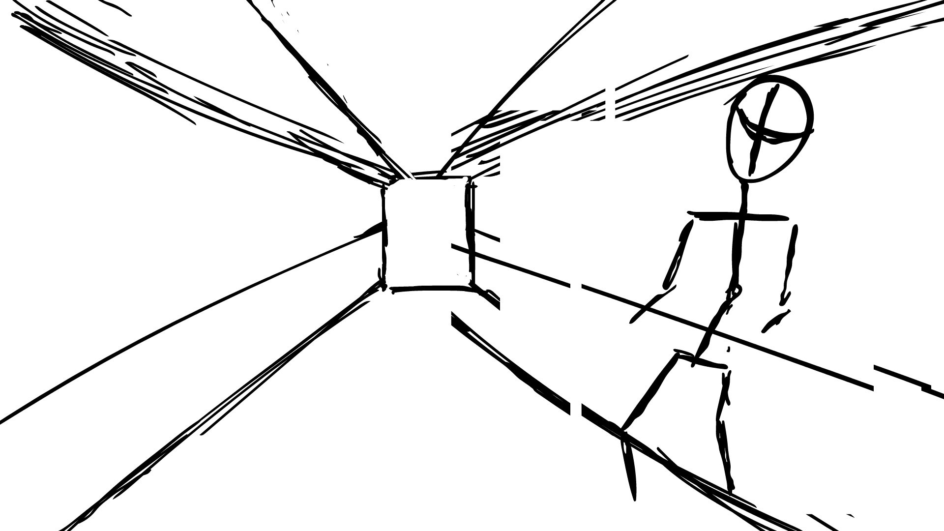
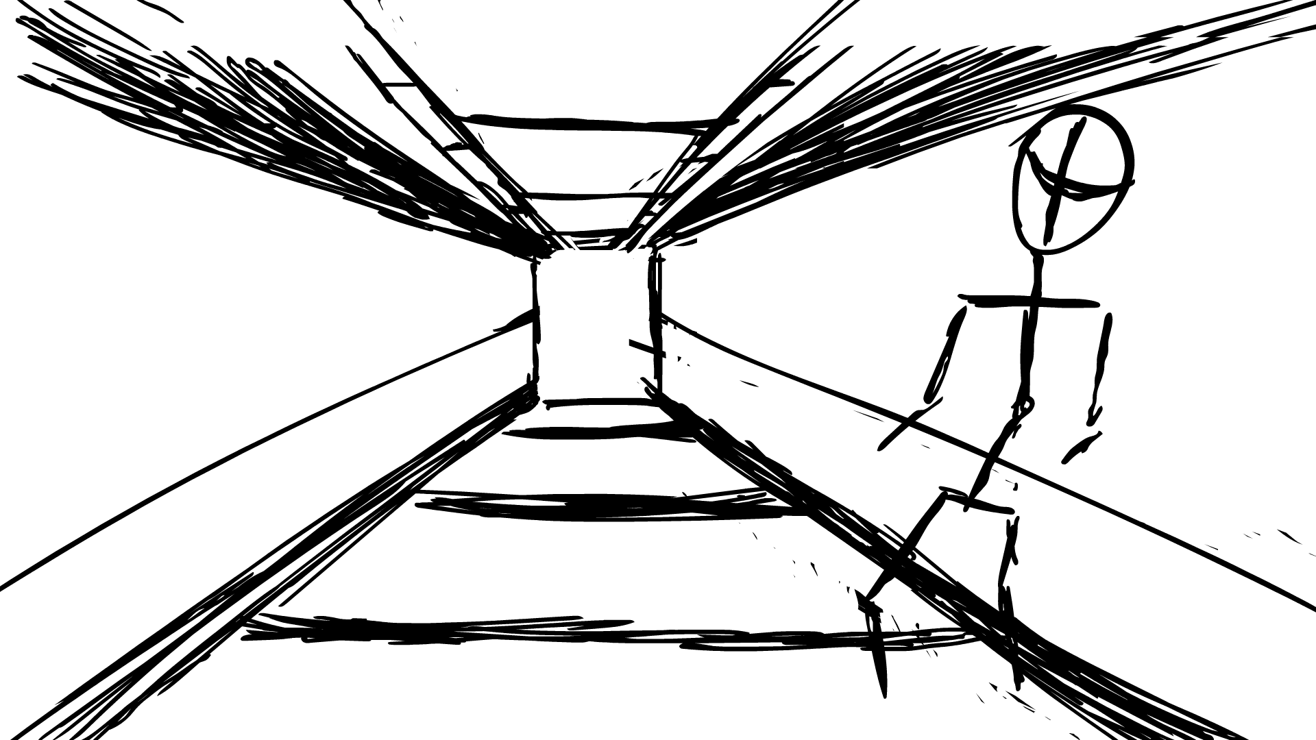
Hallway 1 - The 3D form Attempt 1 - 20/1

This is my 1st attempt at drawing a 3D background and 3D character form. It went horribly. Essentially, I bit off more than I could chew.
Before this, all my character animations would of been flat, 2D characters. Stickmen mainly and recently forms with a bit more mass.
This time, I attempted to draw a 3D character walking down a hallway. I first planned out the basic movement as a stickman and a very rough sketch of the hallway. Then I tried to draw the torso and get it to move in sync.
The key issue was that I got confused at where the front of the torso was. This meant that any turning movements were confused in direction and angle. What should of been a look left and right turned into a constant turn.
This was probably the most frustrated I got creating an animation so far. It was 1 issue after another really. Although it is new so I was expecting to have some issues. I just over-estimated the difficulty of what I was doing.
Positively, I did learn quite a lot from it. Consider it a 1st attempt at animating a scene. It made me realise I need to consider where my camera is, the perspective and my purpose. In this case it was supposed to be caution, which was loosely achieved through very rough animation. The camera was centre of the screen to match the corridor. This could of been repositioned to make the scene more exciting like above or in sync with the head movement (1st person perspective).
It gives me an idea of where my animation is currently. It also shows what areas I need to look into next. The axis lines, gestures, camera angles and backgrounds. The 1st thing I will do is get some examples of some backgrounds and study the layout. Then I'm going to focus on the character itself and it's structure.
Overall I was annoyed by the outcome of this animation but I now realise how it can be of use. It has highlighted what needs working on.
It wasn't just the character but also the background. I need to get used to animating characters in 3D spaces, but also need to understand the space to begin with. I plan to go outdoors and try and breakdown 3D environments in the real world. This will help me understand how the interaction works and how it affects the character interaction.
Hallway 1 Inspiration - DareDevil

What I like about this is how the main character struggles and gets tired out the longer the fight goes on. The power is clear in each punch and a physical effort is clearly shown to the audience. I used this originally for the shape of the hallway in my previous animation, however I tired doing too much too fast.
His movement and how the camera rotates are areas I want to explore in my own animations. If I can incorporate this into my character animations, it will be one more step closer into setting up the Plague Doctor's speed and power.
The whole reason I used this video was purely for the hallway at first. Just a basic look at how to use perspective to create the illusion of distance. A video recommended to me by YouTube. The hallway was good to use but the movement of the main character can be explored further. Maybe I can have my character fight off the user. Maybe he can break out of something. Maybe we play witness to him decimating an enemy. This will be a good avenue to explore further and will help in my adventure of understanding the 3D human figure.
Trailers, J. S. @. T., 2015. Marvel's Daredevil Clip: Hallway Fight Scene (HD) Charlie Cox. [Online]
Available at: https://www.youtube.com/watch?v=urE31pWnR7Y
[Accessed 20 January 2021].
Richmond Park PHOTOS - MoodBoard - 21/1


To help with the backgrounds and to get a more varied amount of evidence, I conducted research in the real world, covid restrictions allowing. This meant I didn't have that many places to choose from, with travel being discouraged and limited. So I went to my local park and gathered images of natural forms and how human objects interacted with them. I finally created a moodboard out of the photos collected. Angles of man made object looking up. 1 point perspective with fences. Long shots of roads going into the distance. Streams, marshes, mud and grass, all experienced in person and documented here. I plan to use the interactions with these to help my character introduction. How the camera would work looking down upon or squinting up. Certain textures such as the moss, brick, stone, mad, straw and grass were also seen and experienced.
Background photos - Natural Land - 21/1


This was a more direct way of using the photos above. I literately traced over the photos to get an idea how the landscapes worked. My hallway was very flawed in terms of shape, scale, lines and many other ways. In doing this drawing, I intend to get a better understanding of how man made and natural backgrounds work structurally and in co-existence of one another.
Man made objects have very sharp, precise lines while nature is much harder to simplify to basic shapes. However nature shaped by man loosely follows the same principles as man made objects, such as the lawns, bushes and the lay of the land.
If I can imagine backgrounds as these simple shapes then I should be able to manipulate it to show movement from the characters perspective. The road is an example of one point perspective in action. The water one shows how the landscape turns left and diverges at a single point. While the bottom one shows how one street transitions to the next through the use of spacing and angles.
In all these examples. The eye is drawn to a single point (following the main path). And the objects around it get smaller and smaller the closer they get to this point. Essentially it is making use of a single point on the horizon line.
Although I do have the question the usefulness of this. Most of these shots were taken in an open natural setting. I could incorporate one such setting in my introduction but the majority will happen in closed spaces.
Ideally, I want to find an abandoned building to explore. Maybe a parking lot or a broken house with tight hallways. However, my own safety would be compromised in such a place.
However, this will definitely help in understanding backgrounds better. I plan to use what I learnt here to help inform my backgrounds in my character introduction. Although I will need to research camera angles more to make it effective.
(17/3) This was written after. Although I didn't use these particular videos for my visual art, I did use the noise recorded in them. The photos helped me understand a 3D space. The videos let me understand how certain objects interact. Unintentionally, they also provided a lot of wind/background interference that added to my Foley and Ambient effects.

123, T. R., 2021. big rock in muddy water. [Online]
Available at: https://www.youtube.com/watch?v=3iRghg3xkS4
[Accessed 22 January 2021].
123, T. R., 2021. concrete path 1. [Online]
Available at: https://www.youtube.com/watch?v=C2En0BkyJ5g
[Accessed 22 January 2021].
123, T. R., 2021. Gate 1 - punch 1. [Online]
Available at: https://www.youtube.com/watch?v=vvjviSezZLw
[Accessed 22 January 2021].
123, T. R., 2021. grass step - wind noise and footsteps. [Online]
Available at: https://www.youtube.com/watch?v=P-SYyWf-HuI
[Accessed 22 January 2021].
123, T. R., 2021. muddy water, big ripple 1. [Online]
Available at: https://www.youtube.com/watch?v=FxKtcoCHUEY
[Accessed 22 January 2021].
123, T. R., 2021. pond ripple rock. [Online]
Available at: https://www.youtube.com/watch?v=2RI2zB_GJew
[Accessed 22 January 2021].
123, T. R., 2021. pond ripple rock 2. [Online]
Available at: https://www.youtube.com/watch?v=BWC6o9LXWNY
[Accessed 22 January 2021].
123, T. R., 2021. rail - foreshortening. [Online]
Available at: https://www.youtube.com/watch?v=E0H_i8clGM0
[Accessed 22 January 2021].
123, T. R., 2021. sign rotation. [Online]
Available at: https://www.youtube.com/watch?v=08Ntb18dk_o
[Accessed 22 January 2021].
123, T. R., 2021. stair walkdown. [Online]
Available at: https://www.youtube.com/watch?v=fbi9BiL_Xtc
[Accessed 22 January 2021].
123, T. R., 2021. walk 1. [Online]
Available at: https://www.youtube.com/watch?v=9xC78zi7p8U
[Accessed 22 January 2021].
Trailers, J. S. @. T., 2015. Marvel's Daredevil Clip: Hallway Fight Scene (HD) Charlie Cox. [Online]
Available at: https://www.youtube.com/watch?v=urE31pWnR7Y
[Accessed 20 January 2021].
These are the videos I took on the same day. Although they don't directly link, I wanted to explore the interaction of objects. For example, how grass and mud interact when being stepped on. How the legs move up and down when walk forward. How water interacts when a rock is thrown into its stream. These are small interaction that could be used in my animations.
Although there were 3 videos in particular that are helpful to my project. The railing was me experimenting with focus. How objects in the front make the backdrop defocus and vice versa. Also it was testing foreshortening in real life. This is a skill that will come in handy when interacting in a 3D environment and is one I want to develop further. Going up and down the stairs, seeing how the camera shakes as your weight transitions to each foot. And finally the sigh rotation, seeing how a shape changes depending on what angle you look at.
Loop Animation (staging practice) - 3D Form Attempt 2 - 22/1

The lesson was loop animation. The task is to use 3 or more frames to create an animation that feeds back into a loop. However I got carried away and created a 50 frame plus animation. We had to pick a basic action, so I decided to do a kick animation. Since my character is going to have to use combat in his introduction, it makes sense to test it out now to see if its possible.
The lines are very rough, but I was only focusing on the movement (not the character). I need to draw a character over the top of the mannikin. Simplifying the human form greatly helped in focusing on the movement, using what I learnt in the animation videos.
I literately had to stand in the mirror and try re-creating the action I wanted. I also had a reference from an old retro game from Capcom.
Now this attempt was a lot more successful than my last 3D form character animation. The shape holds its consistency, although the lines very rough. It achieves its purpose, basically humour, while the hallway animation got too ambitious. I was able to get the body to twist accurately, the movement speed where I wanted it and have it loop back.
Staging had the most focus in this experiment. Many of the gifs were just small staging adjustments in feedback of the teacher. The Ball showed squash and stretch. The diving board showed pass and pose. And this was me experimenting with staging.
I also had an attempt with motion blur, this is where an after image of its previous position is shown to emphasise the speed. It can also be used to exaggerate the force of the impact. Although in my attempt, I drew these in the same opacity as the line art - which meant I lost core areas of the shape within the movement.
This is a skill I want to experiment with further. If I dial back the opacity and look deeper into the overall shape of the motion blur, I will greatly improve.
I plan to keep experimenting with adobe animate and refining the 12 principles of animation. I need to research into camera angles and cinematic shots as most of my animations have just been full body.


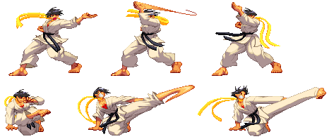
This was a small reference to keep me going, although I mostly relied on my own experience with the material art called karate.
Reference:
iammanyninjas, 2009. iammanyninjas. [Online]
Available at: https://irwt.iammanyninjas.com/sprite-anim.html
[Accessed 22 January 2021].

Motion Blur Attempt 1 - 3D Form Attempt 2 - 22/1

This is the final form of this particular animatic, a close up of my work and a benchmark of my current progress,
Come a long way from Stick Figures
Plague Doctor Design no 4 - 21/1


This is the start of my 4th and final main character design. The other 3 attempts will be used to inform this one, along with much more research and inspiration. The issue with my previous attempts was that much of the research was done AFTER the design, not BERFORE. This lead to some very generic or "off the top of my head" decisions. However, this time I have made research my main focus before even starting the design. I have used 2 characters as inspiration in terms of design alone, looked into the structure and simplification of the human body and had many small attempts at animation the human body.
This is all just at the time of these basic sketches. I plan to do more research along side the creation of this character. At least 2 more characters will be used as inspiration. More research will be done in terms of technique and shape (including Loomis Head, line of action, gestures and foreshortening). The very backstory and profile will influence the design, not the other way round.
I started off by mapping out the basic adult male body structure, using the knowledge learnt from Christopher Heart's book series, The beginners guide to drawing people and human proportions (also used in my Project 1, task 2). Several YouTube videos from (...) were used in terms of anatomy alone. Add that to my knowledge from college lessons regarding human proportions, I created the black line art sketch above. it actually felt very calming to draw and was a clear highlight of how my body drawing has progressed since the start of term (September 2020).
The blue line art is a simplification of the body, the bare basic parts that I will need to be able to animate to make my character move. If I can master these big, basic shapes. He will be capable of any drawn movement while obeying human physicality's.

FEEDBACK
After showing my 14 year old brother my black line art sketch, he pointed out some small errors in sizing. Although his input might be less valuable then an animation student or teacher, any feedback is good feedback. He does Sports Science at GCSE and in doing so has developed an understanding of human anatomy similar to my own, if not better. He noted how the torso was much longer than the average and because everything else was scaled off the torso, it lead to my character being very "long".
Furthermore, he then drew over the top of my sketch in green line art to show me how to properly scale the muscles and shape.
I was unaware at the time how much space the abs actually took and how high up the chest really was.
After doing a quick check over his drawing with the knowledge I know (light blue line art) his proportions matched up with what I learnt before.
This has greatly benefitted me as feedback has reduced the anatomy errors at essentially the foundation of the art work. Without it, my anatomy errors would of carried through and affected the whole character design.


Sketches - Early Attempts


These were some sketches I done along side the front facing body. It was me attempting to draw a 3/4 view while looking slightly above the character. Turns out I still struggler with any angle that isn't front or side view. Many came off slanted in angle, with unintentional leans introduced. Although the muscle was now in the right place, many of them looked underdeveloped and lop sided. I will need to get more confident in drawing the body in these other angles in order to progress forward. Videos in gesture will help me with overall shape. On prior research, I know I need to experiment with the lines that influence the body movement. Such as the line of action, the axis lines and the line of balance. If I can improve on these techniques then framing the body in certain poses will look more natural.


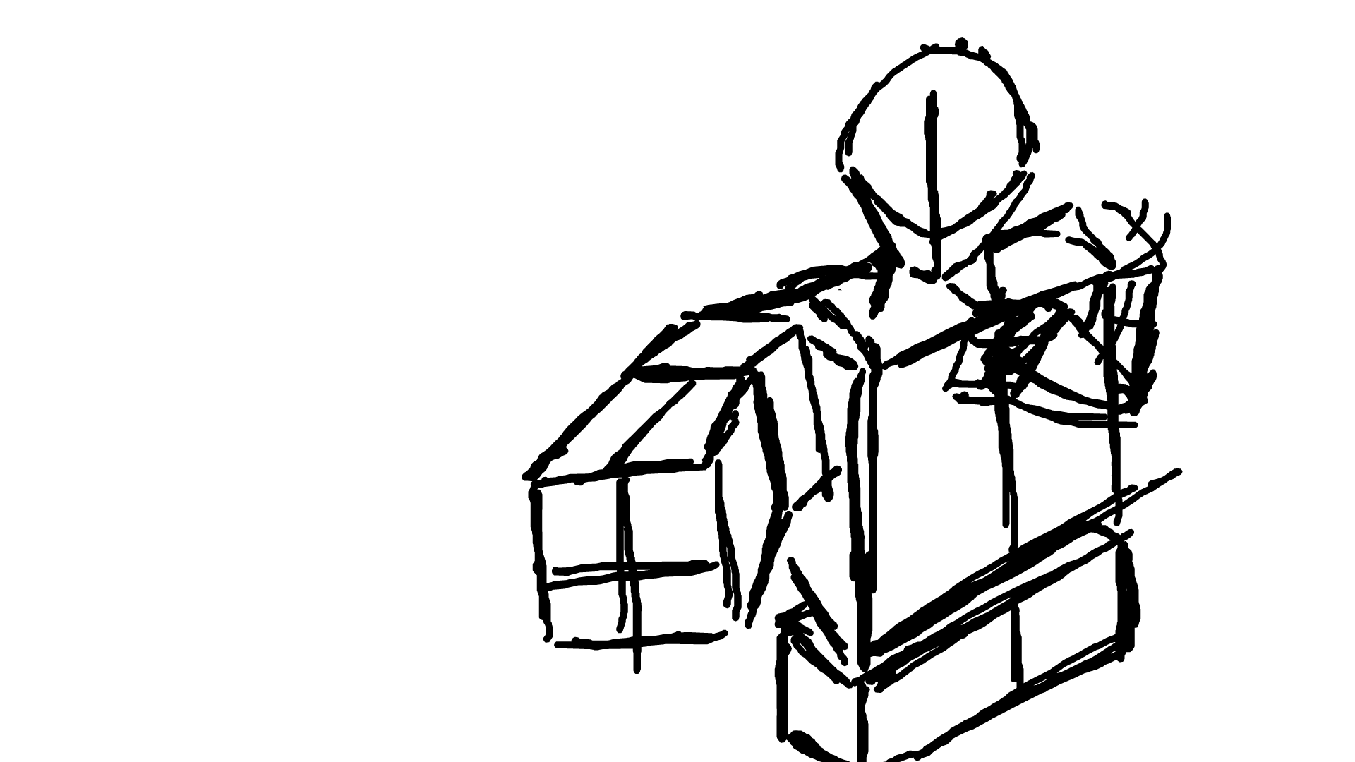
As of writing this section, this is where the character design stands. After finetuning the simplified base. I started adding my own muscles and shape on top. My brothers example was used as a guide so I could do my own version on top. The line art was done in red to differentiate from the black line art below, although this was later changed back to black to stand out clearer. The image on the right is with all the framework prep wile the one on the left is the basic character shape with added muscle and the start of weapons. This is an artist copy and not the version used in the animation itself, due to the complexity and my current skill level.
The character was purposely drawn as buff, not inhumanely massive but you still don't want to mess with him. Since the main strength of this character was close combat fighting (established in the backstory and profile), it made sense to make him physically imposing. Although a slender approach could be used to emphasise his speed, this design clearly shows his power. Most of the body would be covered in darkness or smoke anyway, giving the need to hide the monster. The spikes were carried over from the design attempt 3 (being a crucial factor in emphasising his villainess). Triangle shaped characters represent danger and evil, with influences into villain design. The spikes will also make his silhouette stand out more and make him easier to identify to an audience.
Curved spikes will make it more flashy and demonic, playing into his personality of being more arrogant and showing off, while keeping the efficiency in its job, impaling. The hidden blade is an added feature, although needs much more development to make it more individual to the design. The specialist knife from previous research was added in. The character relies on stealth and power so small, 'up close and personal' weapons will serve well. Armour is light so movement isn't slowed down, showing a greater emphasis on flexibility and speed over defence in the actual design.
M<any of the images below were used throughout my visual experimentation and development. These have already be referenced but they are also included below. Out of all my previous image gathering, these were the main ones I used in designing my character.
Main Reference Images - 21/1


Knights Warrior Body Guard Cosplay Costume For Men. [Online]
Available at: https://www.aliexpress.com/item/4000423683464.html
[Accessed 21 January 2021].
IronWoodsShop, 2021. LARP fantasy armor, leather pauldron with Valknut symbol, Norse Viking warriors custom armor, warrior shoulder pad, barbarian armor. [Online]
Available at: https://www.etsy.com/uk/listing/193704928/larp-fantasy-armor-leather-pauldron-with?gpla=1&gao=1&&utm_source=google&utm_medium=cpc&utm_campaign=shopping_uk_en_gb_christmas_Clothing&utm_custom1=_k_CjwKCAiA6aSABhApEiwA6Cbm_2F51KYyOLTlIXRtkHePxKGxlIjD8mf3HlRt
[Accessed 21 January 2021].
Pinterest, 2021. [Online]
Available at: https://www.pinterest.co.uk/pin/315463148881222325/
[Accessed 18 January 2021].
Pinterest, 2021. a ref of edwards arm im using for the ed painting im doing. [Online]
Available at: https://www.pinterest.co.uk/pin/46795283608721290/
[Accessed 18 January 2021].
Pinterest, 2021. Image result for fullmetal alchemist automail arm. [Online]
Available at: https://www.pinterest.co.uk/pin/769060073842268509/
[Accessed 18 January 2021].
larryfitzmaurice, 2020. Netflix Is Bringing "Assassin's Creed" To Your TV. [Online]Available at: https://www.buzzfeed.com/larryfitzmaurice/assassins-creed-netflix-tv-show[Accessed 18 January 2021].
Staff, G., 2017. How the hidden blade in Assassin’s Creed evolved from a simple weapon to a Bond gadget (and back again). [Online]Available at: https://www.gamesradar.com/how-the-hidden-blade-in-assassins-creed-evolved-from-a-simple-weapon-to-a-bond-gadget-and-back-again/
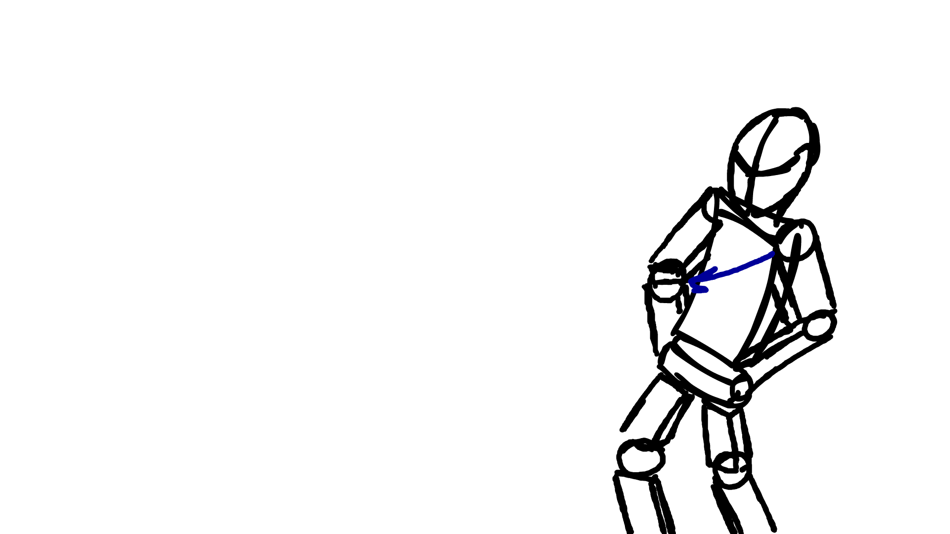
Arm Punch Animation - 22/1, 24/1, 8/2
Since my major disaster of the chest, I have been practicing animation using the 3D form of a person. My character will have quite a few dynamic actions in his introduction so it makes sense to practice now.
My attempt can be seen on the right. The secondary action of him drawing back for the punch was the main take away. There is little exaggeration and a slight stretch as it swings round to attack. I was overall very happy with this animation. I admit it is still very rough but a redo of the line art would fix this.
Positively the action is successful in its execution. Someone can see it and instantly know what the intent is. The movement itself went through some timing changes once the action was established. Negatively ,the line art is very rough and therefore looks unprofessional. Some of the angles are off, which leads to errors in the overall form. The foreshortening of the arm (the main technique used in the secondary action) may also be too exaggerated/too much.
I don't think its bad, more that the animation looks unfinished. If I was to carry on development of this I reckon there would be a mass improvement. If I was to do it again I would essentially draw my own character over the top of it.

What I plan on doing in the future is exploring animating 3D forms in the 2D medium. I want to get to the point where I can effectively and fluently draw my character in a 3d space and have him interact with it. Although as of this moment that wish is very far off, more work and practice needs to be done to reach this goal.


GaryMaldonado, 2015. HOW TO DRAW THE HUMAN HEAD. [Online]
Available at: https://drawasamaniac.com/2012/12/how-to-draw-the-human-head.html
[Accessed 24 January 2021].

This is my next attempt at animating a character like it is 3D. This is a simple head lift. I have attempted it before and just wanted to do another practice to see how I have developed. Compared to my first ever attempt. It flows much better and the head maintains its shape. However, the neck almost expands upwards rather than stretches (almost gaining length as he looks up). It is a very simple action and me just practicing body position. I plan to develop it further by making a body move along with it. Or I could draw my characters head looking up instead.
Plague Doctor Sketch - 22/1


This was a sketch of the plague doctor I did in my free time. So it was very unplanned and spontaneous (in turn making it very rough). The body was simplified down to basic body armour and the mask was altered. I was just practicing my front and side plain views, then ended up drawing over the top.
The main thing I learnt from this is how difficult it is to keep the shape consistent at different angles. What's clear from this is that the slightest change of angle can transform the face and expression. Its very sensitive in a nutshell.
Positively, I was able to experiment with the mask and further refine it to what I want. I designed it in such as way that the mouth can be shown and #hidden in the character design with a simple neck scarf. This will let me convey emotion much easier since the face was completely covered up before. The colouring in was very rushed and is the main negative of this art work. Once again they were just doodles that I learnt from so I'm personally not too fussed over the quality here.
If I was to do this again I would get looser with what I'm drawing. It was only drawing practice that branched off to my character. I need to be sketcher, have more than jus 2 attempts on the same sheet. Overall I am happy with the result of this, I just need to create a definitive design for my character.

FMA Drawing Experiment - 28/1, 8/2

Available at: https://www.pinterest.co.uk/pin/769060073842268509/
[Accessed 18 January 2021].


This is my 2nd character example. The plan was to look at existing characters and use elements from their design to inspire my own. So what better way to do this than to draw them. The anime proportions are slightly different to the normal human proportions. The head is larger as well as the eyes and mouth (easier to communicate emotion that way).
The line art went threw a few major changes before any colour was applied. Anatomy overall is good but still has a few flaws. The human arm in particular has some errors that would need adjusting. The main focus was on the robotic arm. Getting the lighting and shape correct was difficult - still a lot of fun.
The hair had to be completely redrawn. The neck up was moved over using the lasso tool. The colour was done using the grey scale pallet. The line art was refined over the sketchiness of its predecessor. Rough lines have been a major issue in the last few works so I paid close attention to how smooth they were this time. This, in my opinion, was the hardest bit of the artwork. Getting the lines to flow and not look "jittery". A way to solve this I found was to increase the smoothness setting up higher and slightly increase the size of the brush.


Positively, I was able to replicate the character in the image to a passable degree. It taught me a bit about how lighting works and how the direction affects the clothing. I will need to do more research into this before it has a noticeable effect on my art work however.
The line art is much smoother, as mentioned above. The character himself looks in proportion and closely resembles the drawing I was mimicking.
The main negatives would be the anatomy flaws. For example the muscle in the arm looks so off to me and is easily noticeable. The torso also looks off but I don't really understand why, making me feel a bit frustrated.
I plan to use the experience learnt from making this artwork for my own character design. The metal arm is the main inspiration. Ill be creating my own version of it but the general shape and lighting will be similar in design. Also the practice on human anatomy is very helpful. These examples of characters will give me an idea of what makes a design successful and how I can apply it to my own.

Animation principle - Secondary Action - 29/1, 8/2
The aim of these animations is to practice secondary action. This can be 1 of 2 things. The 1st action is when an object drags behind or is ahead of the main body, a second movement that happens with the 1st. Although this is really the drag principle. The secondary movement is to convey more information in addition to the 1st.
e.g. rubbing your hands together before picking up a box shows anticipation. going down before you push up shows that the movement requires effort.
The animation on the right is just a normal knock on the door. The unintended secondary action would be the swaying, making him look drunk.
Exaggeration Principle
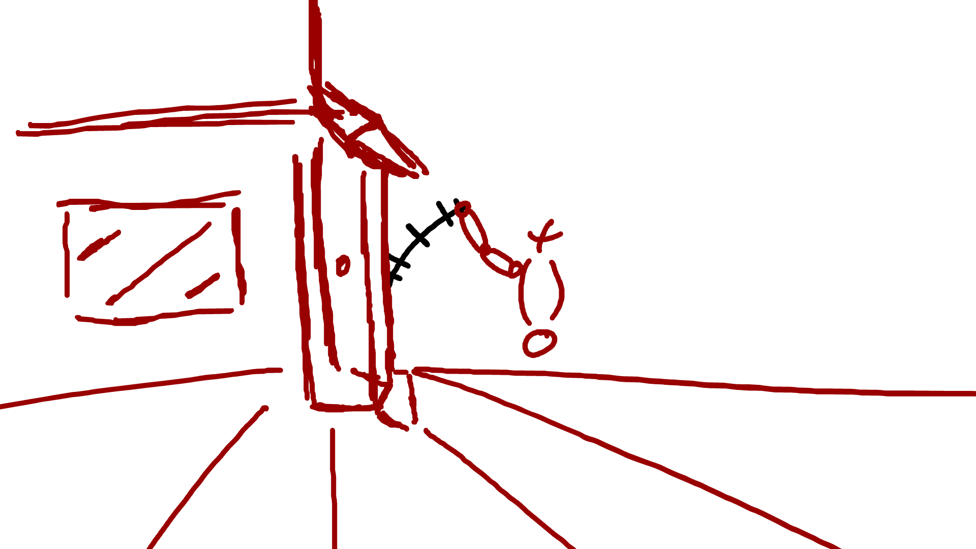

The secondary action is used to help convey more emotion, or a clearer intent in the action. So I tried to show an angry knock compared to the normal one above (the drunk one). This would be showed by having a clenched fist and using less frames to cover the same distance (more speed).
My 1st attempt can be seen on the left. I tired to incorporate many animation principles into a single animation, than isolate them for each piece like before. The plan was to use squash and stretch to emphasise the speed and use the body to show more power. Turns out, I accidently used the exaggeration principle. The way the character stretches and draws back like a spring, then catapults forwards is all exaggeration. This animation is my proudest one out of the batch today. So the weakness would be the wrong principle was used but the positive is that the speed and power is clearly conveyed.
So I had a second attempt, at this point time was getting short so I only had a few minutes to complete it. All the focus was on the arm. It started overhead and swung down, creating impact lines on the door. The shoulder also plays apart in this action. Although not drawn in, the shoulder will travel down with the arm and act as a pivot.
So after completing the door, we were shown a man picking up a box. The task was to use 1s, 2s, 3s and 4s to creating a person lifting a box. The secondary action would be him rubbing his hands before the lift. I also added 1 of my own secondary action of him moving side to side, further emphasising his preparation to lift the box. The hands going up in the air before coming down is another secondary action.
Animating the same animation on different numbers is something brand new to me. This resulted in the 2s being sketchy. The main weakness would be the line art. In all my animations, the line art is sketchy (and in turn looks unprofessional). If I can make my lines smoother, it will automatically improve my animation quality.
What I need to do next is smooth out my lines and experiment with animate further. I need to look at camera angles to draw and learn how to motion tween (as it will save a huge amount of time). Human anatomy I need to work with more. I have done still frames of simplified anatomy but my animations are
essentially stick figures, not people.
Overall, I am satisfied with my progress. My animations are getting smoother. The principles are coming more naturally and my understanding is getting better. I have already said the areas I need to work in for pure animation alone. This isn't also including my character design and style.
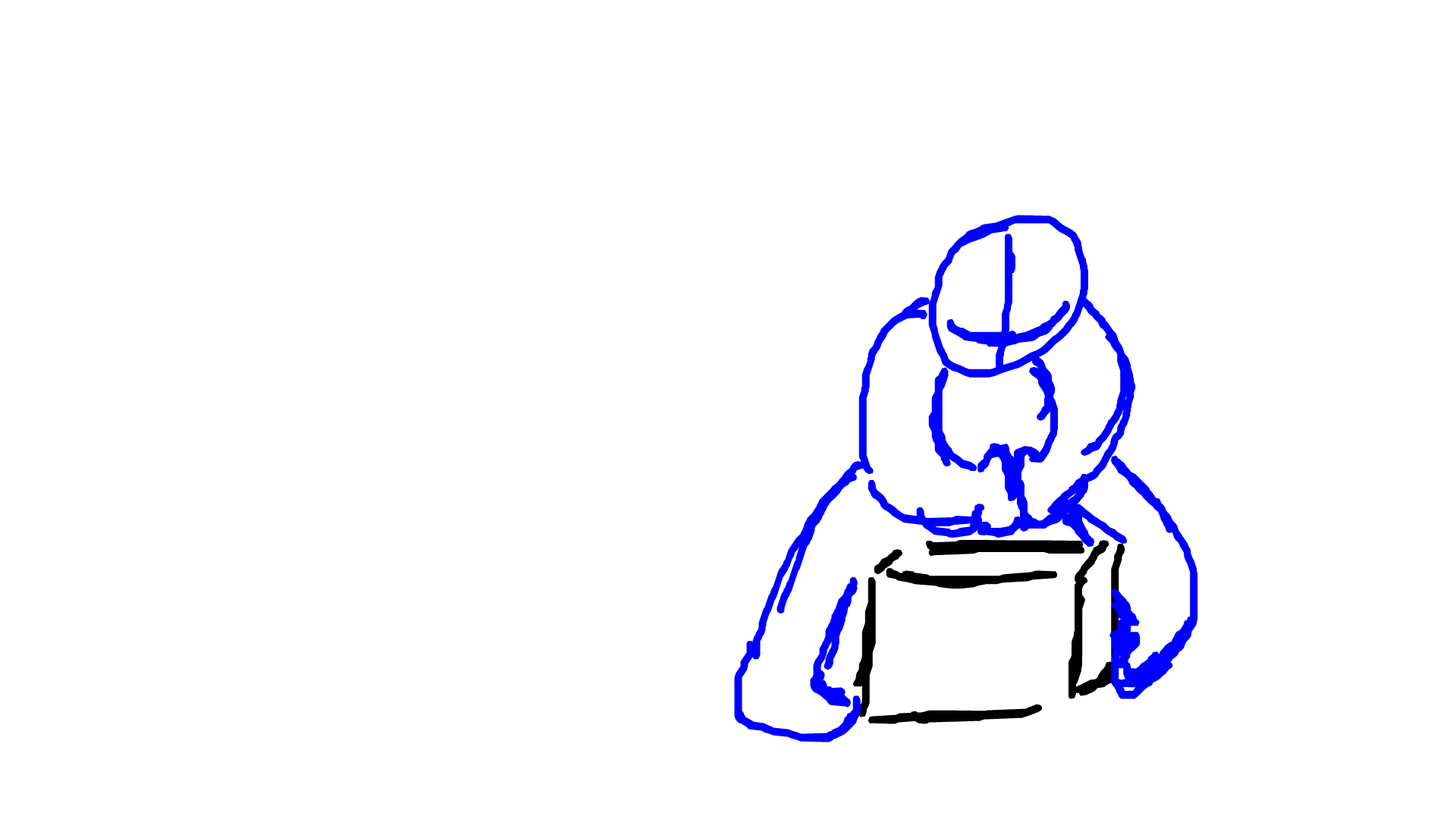
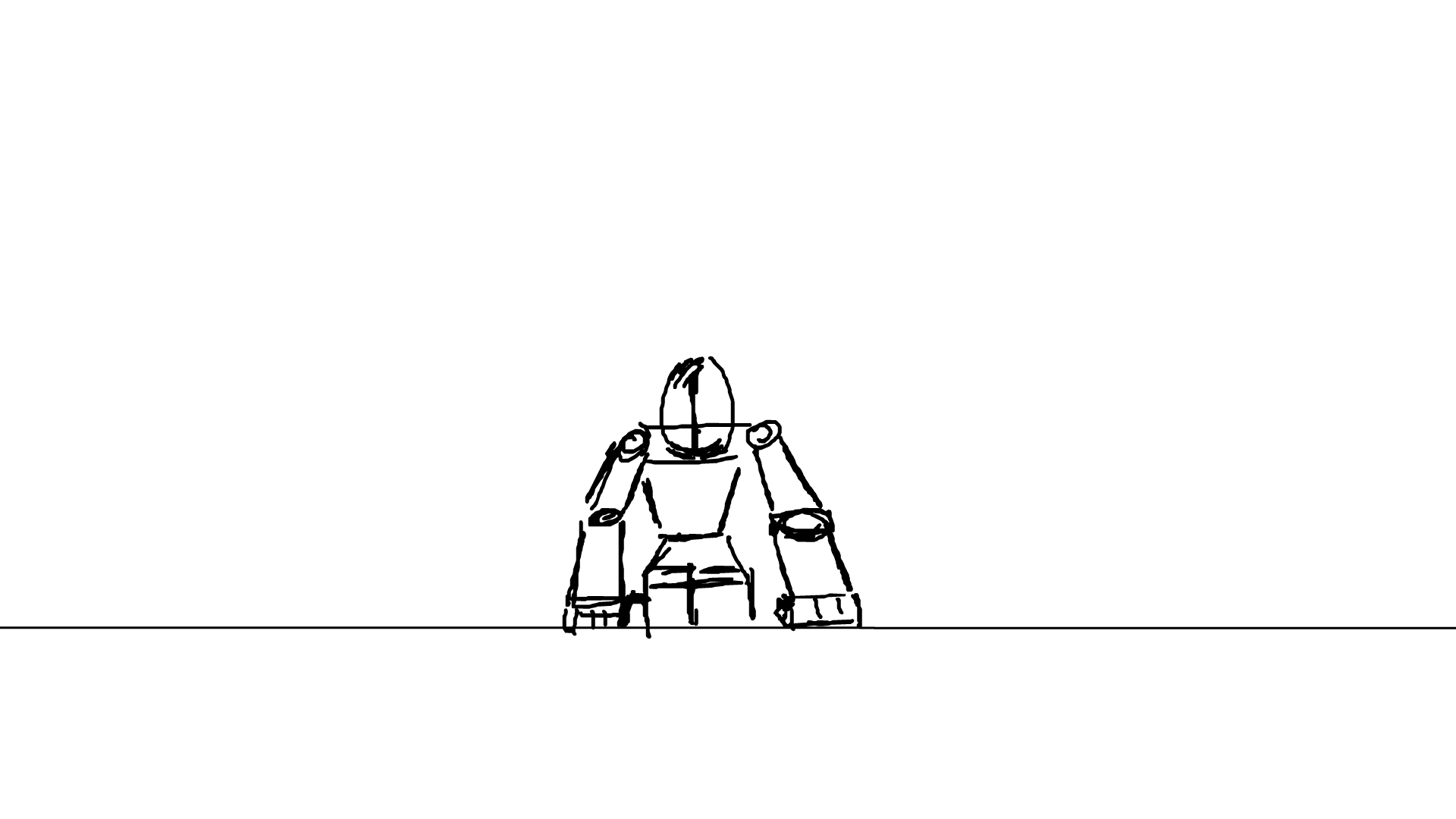
Plague Doctor Final Design
Character Design 4 - Part 2 - 29/1, 2/2, 4/3, 8/2


This is the 2nd and final part to my 4th character design. I will be using the last "exper" screenshot to help me finish the design off today. The body had several redraws to nail down the basic anatomy, an ongoing issue in many of my art pieces. I got several bits of feedback from animations students and family throughout the design. Although my families feedback may not be as good as someone's feedback in the industry, it was really good to get a second perspective on my work. They saw the obvious and pointed out what I would of missed on my own.


123, T. R., 2021. 2nd blog, character 4 expain, what i did on the 1st. [Online]
Available at: https://www.youtube.com/watch?v=vFU53qfIIqw
[Accessed 4 February 2021].
So the line art went through some massive changes. The anatomy was covered in part one of my character design above so I wont be going into it to much here (most of it learnt from the Assassin Creed drawing and the Discord Interviews). Using what I learnt from the Full Metal Alchemist drawing, I used thicker lines and a higher smooth to create the new line art. The design sparks the idea of power rather than speed. The shoulders are bulkier than before, representing more defence/muscle.
If I wanted to represent the idea of speed, the character would have to be more slender.
I used the backstory as my main inspiration in the design, that and my previous concepts. Many elements from the 3rd design were carried over. The robotic arm (now backed by research, the mask (after some experimental alterations), the hood (after character examples) and the body armour (although wildly different). The military theme from the 2nd is still the foundation of the work. This is what the 3rd design would of looked like with more experiments and research -an area I solved with the 4th.
I asked my brothers advice/his 1st impression on the character at multiple stages of development. He pointed out some main errors in anatomy early on as well. In his words, he said that the black and white image looked the most assassin, like he will hide in the shadows, ready to jump out at you. The other images with the red effects (and wings) made him look like he came straight out of hell. Both are effects I am looking for and both were successful in the character design. However it seems the bright reds make it very flashy, more of a "take a good look because I'm about to end you" vibes, while the black and white looks more like a silent death. Not flashy but practical.
I could use the colour to represent the emotional state of my character. When in anger, or when he gets too engrossed in his joy of killing, the colours can get more and more noticeable. Keep the eyes red all the time and introduce more elements the more unstable he gets.


123, T. R., 2021. 2nd, colour experimentation character 4. [Online]
Available at: https://www.youtube.com/watch?v=KfZ6-vRlPps
[Accessed 4 February 2021].
The wings were inspired by the 'Final Stand' mode talked about in the character profile. A state than practically makes him invincible for a very short amount of time. So I thought, how would I show pure power?
Wings are an idea I have toyed with in the past, a possible idea for the character. However they were scrapped early on due to wanting to keep him grounded. The Final Stand mode is anything but, so lets play into the flashiness.
Wings of energy are sign of power and a lot of it. The red colour design represent rage, anger, war, blood, chaos and wrath. Combined it create the effect described by my brother, looks like it came straight out of hell.
The wings are above and are screenshotted in its varying stages of development. The colour was made much brighter, glowing in the dark. Elements of it were made darker and overall much more saturated. They sprout out the back of the character but envelope his front like a fiery shield. Impossible to hide and impossible to run away.


The final design can be seen on the left. Overall, I had a lot of fun making this. Much more research and experimenting went into the design this time, a flaw fixed from the previous. The colour signifies evil, power and violence. The design fits perfectly in my chosen horror theme (check interactive). The mask is still capable of showing emotion while dehumanising the figure wearing it. The weapons mentioned in the profile and backstory are present in the design. The sharp objects, lack of guns, final stand mode, signature knifes and blades are all present.
Negative wise...
The wings, although an idea experimented with in the past, did come out of nowhere in terms of research and experimentation. They could also be developed further. Currently a single colour (in a variation of shades) was used. I could use different colours in the wings to represent different sides, rather than just violence and evil. At the moment, your 1st impression is he's a villain, very efficient, very violent. The redemption part of his story is completely absent in his design. No physical weakness is on display in this design. The characters flaws cant be told from the design alone, something that could be improved upon in future artworks.
The assassin grounded style is lot a bit in the flashiness of the final stand mode. The weapons are a bit generic and could of had more time put into them.
If I was to do this again, I would of tried to draw the design in a more dynamic pose. Time and research was put into manikisation, gestures and a bit on dynamic poses. So I should of used them more in the final design! I plan to implement this character in my interactive product, although a implication may be needed in order for him to realistically move.


FEEDBACK

This section is all about the feedback I got during and after the design was finished. A friend of friend found it 'cool' although had a good point with the spike. They worried that the character would impale himself if they attempted to use it. My original idea was for it to act as an extension of the elbow. However, the position suggests that it could harm the user more than help. In an re-designs, iI will need to think about the position and scale of the spike on the metal arm.


The feedback directly above this is from my brother. I have already talk about this so I wont go into it a 2nd time. So the next step was to post my art in several art discords to see what others thought. I got few responses and 1 guy reacted with 'weary' which is a bit disappointing. My mate Charlie from animation class called it 'dope' but he know me (biasing his opinion).
I did get 2 more reactions in another discord that were positive. So a mixed bag overall. No major responses outside of reactions or small compliments.
I still need to find a place where I can get effective feedback from unbiased groups. So far nothing yet.


Overall VISUAL Reflective Cycle - Student vs Teacher
This was during the social Action lesson, now postponed until half term from the time of writing this.
So Scott, the teacher, decided to do 1 on 1 interviews regarding our visual work. In this video, I refer to all my work above this paragraph - as well as the work in my interactive. I explain my mental struggles as well as the academic ones, all due to work.
Basically it is a whole reflective cycle talking about my experience for the first month of 2021.
8/02/2021
Original Teams
https://web.microsoftstream.com/video/b6b6ab61-78ae-432e-894e-999d222f4662
YouTube
123, T. R., 2021. Scott Interview - Visual Reflection - Project 2. [Online]
Available at: https://www.youtube.com/watch?v=GxJ3sbcxe04
[Accessed 8 February 2021].
Arm Punch Continued - PART 2 - 11/2, 13/2
Between the 8th and the 12thI decided to take a break for my own mentsal health to recover. I done a few small pieces to not fall behind but now I once again have a lot to do.
I decided to experiment with the arm punch animation further. The idea was to draw my character over the top of the action. This did not go well. I lasted 3 frames before it got frustrating. The proportions were all over the place and the angles were extremely difficult to create. Positively it was following the motion of the cube man form previous. However keeping the planes of the cube in a curved body was impossible for me at the time.
I wouldn't of done it any differently. Heck, it made me aware of how much I've got to learn. I'm going to go away and do some more research on this and come back with a brand new frame.
The first step I took was testing how much control I had in the 3D plane. I took a 2D drawing of a man and rotated him. This was to see how well I visualise simple shapes in a 3D space. It turns out I can with difficulty. As well as that I struggle keeping the same size and volume. This will only improve with time and practice.
The next step will be getting some feedback on what I've done.

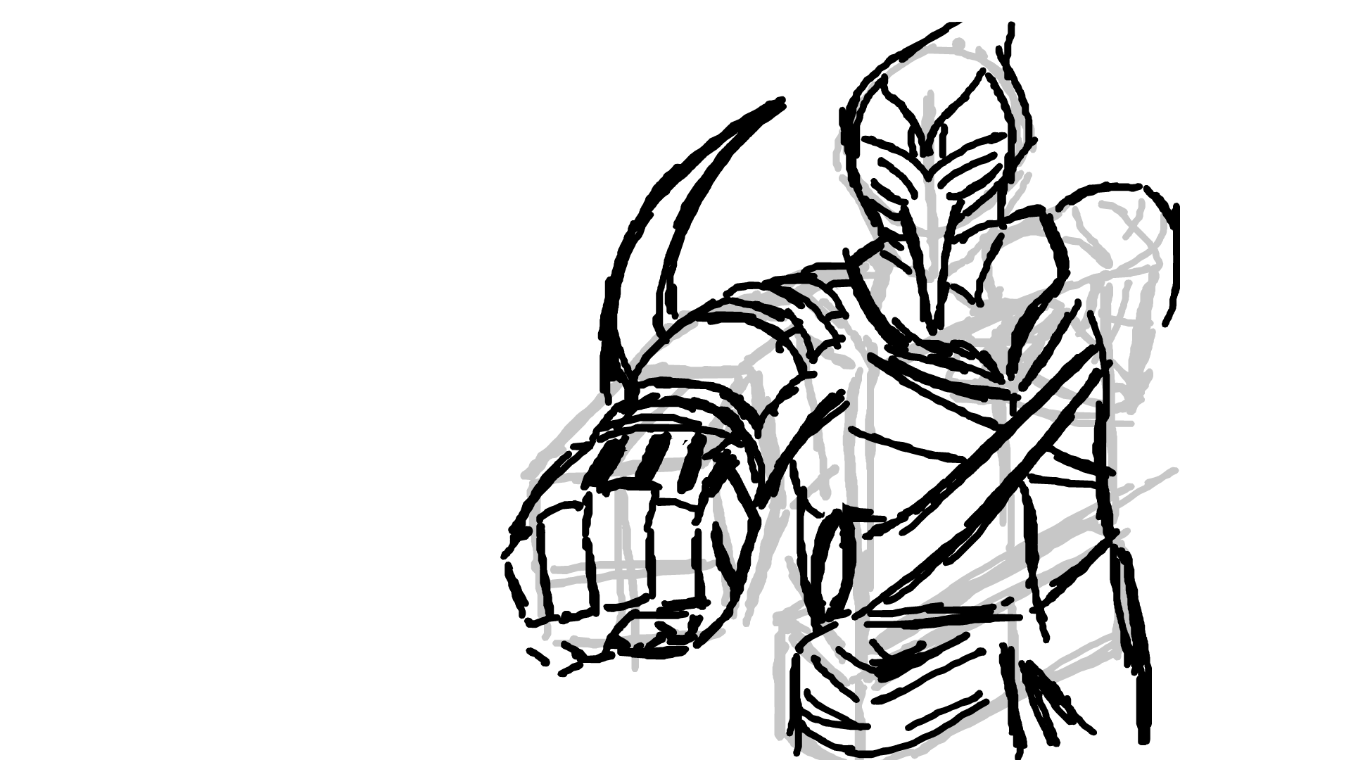

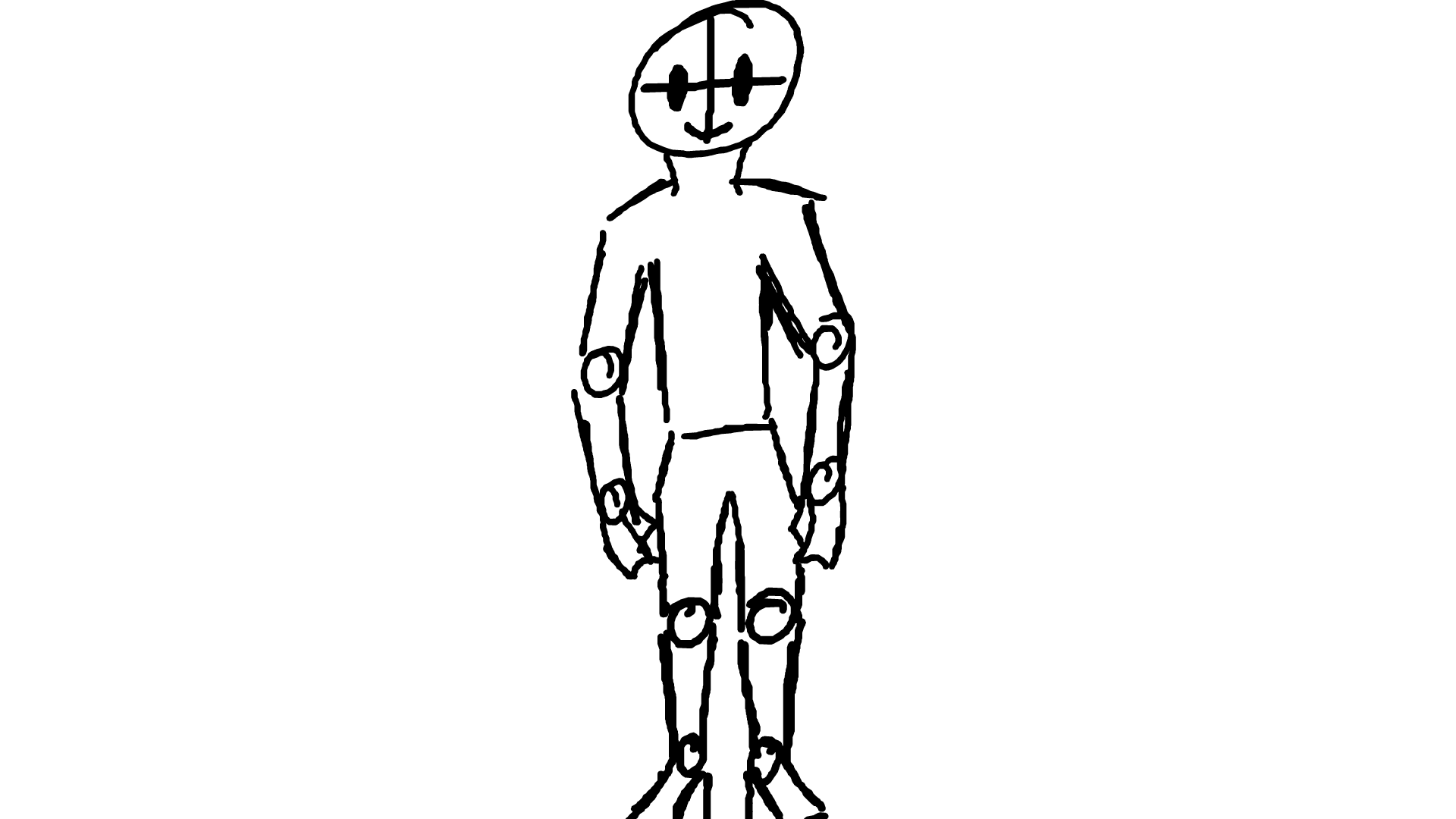

I spoke with my tutor 1 on 1 in several cases in the past. He also has MUCH more experience compared to my family or my classmates so his input is invaluable. I showed him my failed attempt and he suggested recording myself doing the action. This is a form of primary research I have not done before. I have taken photos and even videos of how object interact (Richmond park). Recording myself moving is a new one. So I stood my phone in the bathroom, pressed the buttons and explained through the process and technique of a punch. The movement will be my main reference in my 2nd attempt at 'arm-punch'.
When I initially took the video I had my phone in landscape. This meant that (unlike photos) the video didn't flip. My new reference and research was side ways. I could of done it all over again with my phone the right way up, I found another way.
By putting the video in Sony Vegas 14 Pro (the software I used to edit my YouTube videos). I was able to adjust the aspect ration and flip the video. Rendering was an issue but I found a compromise. Although I would never present a video to someone in this ration, it was fine for the purpose I had for it.
In the video itself I go through the technique of punching and compared it to 'Arm-punch 1' (attempt 1). Depending on the Martial Art depends on how you punch. In animation you set up the movement before you carry it out (1 of 12 principles). In this case it would be the draw back. My draw back was still on view. However when replicating the same action in real life my draw arm was hidden by my body. My face had little movement in terms of position and my body twisted further.
It's these kind of angles that I wouldn't be aware of when trying to draw the action. This research will be a plan for how I will break down the action. Also I can try and use the pose to pose method learnt in the diving board animation to plan the extremes.
123, T. R., 2021. arm punch video reference 1. [Online]
Available at: https://www.youtube.com/watch?v=0QM0govTAus
[Accessed 18 March 2021].

After recording and editing the video, the next thing to do is analyse it. I wanted to break down the desired movement to 4 key poses. The in-betweens will vary with each 1 depending on the time taken between each key pose. All screenshots/frames taken from the video itself. The 1st frame shows the guard about to adjust for the arm to go back. This is the earliest stage of preparing for the action. At the max drawback (when the arm is under the most tension), the punching arm is completely covered up by the body. Here there will be a slight pause before the arm is released. 1 to 2 will be the longest action. 2 to 4 is essentially a spring snapping back (with 3 being the midpoint). There are very few frames between the next stages. The frames between 3 and 4 would be a blur of movement as the arm slingshots forward.
The further the arm is drawn back, the more power in the punch (although you will loose speed). As you can see by my other attempts in the video. I can go much faster with less draw back. The power is generated by the hip twist (the core) instead. Leading to much less preparation with similar results. Although in animation I need to show my audience what's about to happen so the draw back is essential.
Momentum is mass times velocity. My mass doesn't change so I have to rely on a speed increase to hit harder.
Now that I have broken down the movement, attempted it myself and seen the errors of before. It is time to reattempt the animation.
Arm Punch 2.0 Complete - 11/2, 13/2, 15/2
This is the result of my efforts above, currently my best animation (in my opinion).
My ideas as of writing this is for my character to punch the screen (security camera) holding him. The original idea was for him to punch the viewers they attempted to flee the room.
"Arm Punch 1.0" was made out of basic squares to represent the human form. Due to its boxiness, when I attempted to try my character over the top. It made the proportions way wider than intended. This 2.0 was designed using my very body. Above are the screenshots (key frame direct reference) in designing this. After it was a matter of filling in the in-betweens. The timing was way off originally and required some extra frames to slow down the movement.
I am very proud of this animation. The quality has drastically improved from what it once was. The human figure is 3D and curved. The complexity is a far cry from the rectangular cuboids of before. The folds of my clothing was captured (a first time for me). The head is a sphere that acts in a 3D environment.
On the negative side, the line art is very sketchy. The lines themselves do not flow. They are very messy with gives off an armature look to the animation. I also got a surprising response to my Mum (feedback). Due to lockdown, I was limited in those who could respond to my art works. This meant that I had to rely on my family for feedback in some areas with online being my next option). She said that the fists look like boobs (3 boobs). Honestly this surprised me greatly and I could see what she means after taking closer look at the frames timing. The fist (by coincidence) lines up with the body to give the illusion of the said area.
This could be solved by displacing the fist further up to cover the head (making it near impossible to make the same comparison).
I intend to use this animation directly into my animation. I want to make the plague doctor break out of his cell and ill literately break the glass to do it.
The plan is to record myself doing a complicated punch/series of punches. Then edited together the video sections and take screenshots of myself (the bases of my keyframe reference). These screenshots will provide a plan for the animation to follow. Draw these, then in-between it, to get the final animation. The only jump I would have to worry about then is drawing my character instead of my body.
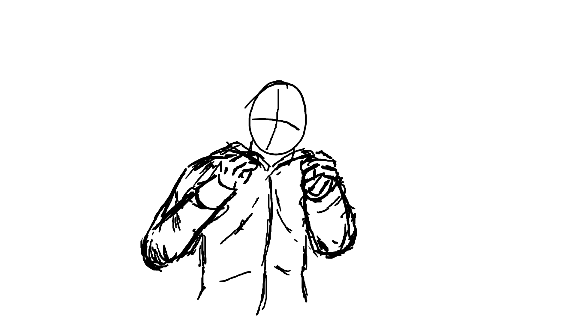


Image Editing - Clone tool (s) and (...) (j) - 26/2


This was a cover lesson taken by Scott. Although this has very little impact on the project/interactive itself, I can still use it to show experimentation of new skills in Photoshop.
The clone tools will basically create a second copy of your image but fill in the areas that you edited out automatically. The method can be seen in the screenshots above. I did find out the hard way that the lines you use to cover up the removed area plays a huge part in the quality of the automatic edit in bit. Soft line make it far worse. |Thick lines mean there is less of the original image left to do, in turn generating more and being less accurate.
After that you use the new tool (...). This lets you copy certain areas of the image and create brand new copies of it on separate layers. So for any parts of the new image that was messed up you can replace it with parts of the original.
This will come in handy greatly in image manipulation, although for anything else not so much. I feel very neutral on the topic. I was tired during the learning of this and indifferent looking back. It was fun but unnecessary.
I plan on not using this in the future for this particular project. Although there may come a time when this becomes useful.
In conclusion it was good to do as practice but not important for the task at hand.


This was my second attempt at the method above. Instead of a dog I chose a man standing in a field. This time round however it went much smoother. The man was completely gone. There was a blur issue in the original removal but using (...) tool I was able to solve the issue.
Flame Attempt 1 - 28/2

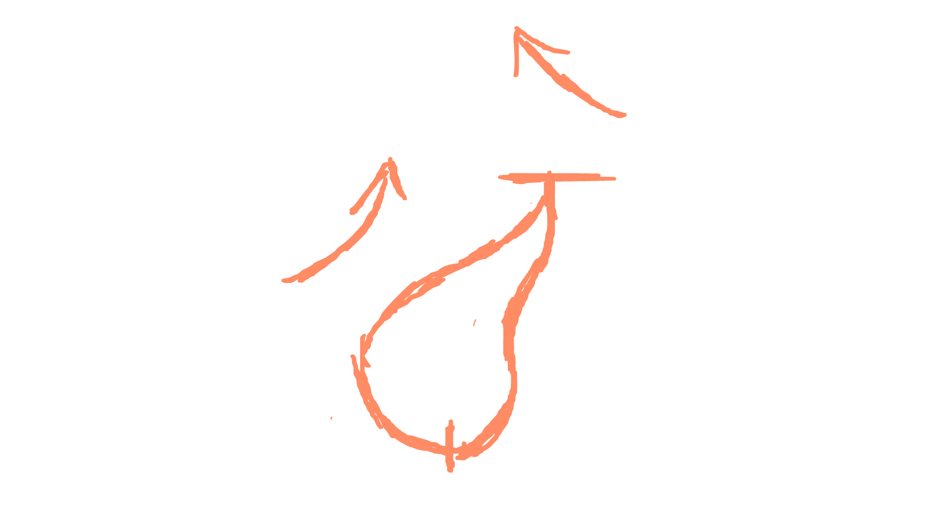

Fun fact, the first flame attempt was created on my birthday. Originally I did this as simple practice. I wanted to learn how to animate flame so I went off in my own time and did it. Then I explored more and more to the point where I included it into the interactive. Feelings wise, I felt really chill and relaxed. I did this for fun and in doing so I didn't feel like work. I spent about 4 hours in creating flam 1 overall. My main reference video is in the interactive section (Howard Whimshurst - How to Animate Fire) and taught me about the cold/hot areas as well as the sign wave illusion. I was completely unaware at the time that flames moved in this way and the news came as a shock. Positively I was able to replicate the movement of a flame. I was successful in mimicking fire. The good thing about fire is the simpleness yet the several layers of complexity (if that makes sense). On the surface it is easy to animate as the form is not fixed and is up to a huge range of interpretations. However when you start research and diving into the specifics on how it works, you realise how complex it really is. The sign wave is used to mimic the illusion of the movement. Although it looks like it is travelling up and vanishing, the main movement is actually side to side.
After getting the very basic framework into Discord to show, I got some feedback that helped greatly. Ash (a fellow student) had the idea of breaking up the shape and even provided a reference for what she meant. This gave the shape more dynamics and enhanced the range of possibilities available to explore. It was this reference that was my direct inspiration for my own fire shape.

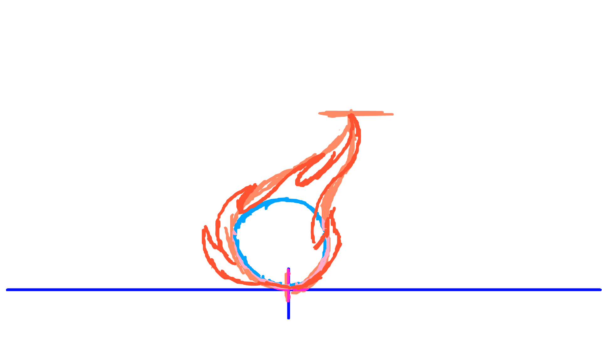

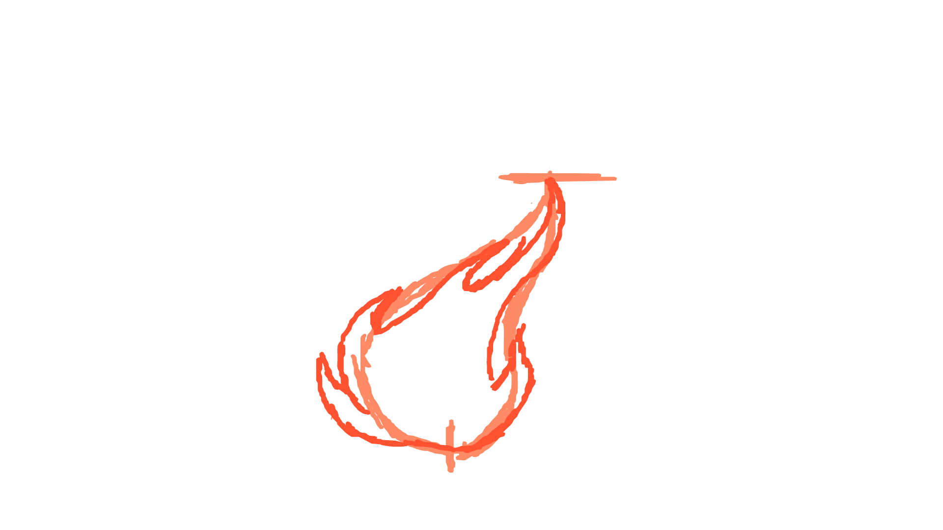
Flame Attempt 2 and Arm Punch Attempt 3
The feedback greatly improved my fire. Instead of a singular ball with an alternating tail. I created an irregular, constantly changing, shape. Bits of the flame broke off and slowly faded (away from the source). The more drastic the movement the more secondary shapes broke off. This is one of the animations that I am most proud with. Positively, I captured the essence and basic fundamentals of animating fire. The animation itself is extremely smooth. On the negative side it is only about 1-2 seconds long. Furthermore, the loop is not quite closed. The irregular timing of the movement means that it jumps slightly after every cycle (only noticeable if you look for it or have a trained eye). The shape itself is still essentially a ball with a tail. The shape can be manipulated further, pushed more and thrown into a creative spin. The possibilities it opens up is enormous. Not only changes in the shape but colour would also play a big factor in establishing the emotion/mood of the art. I intend to use fire in my interactive template. If I decide to keep it to the "ball form" then having it behind a lass tube may be a good idea. Or if I was to get more creative with the shape I can make it change state. From resting to roaring to smoke and embers...
This will play a big part in the visual elements of my interactive going forward.
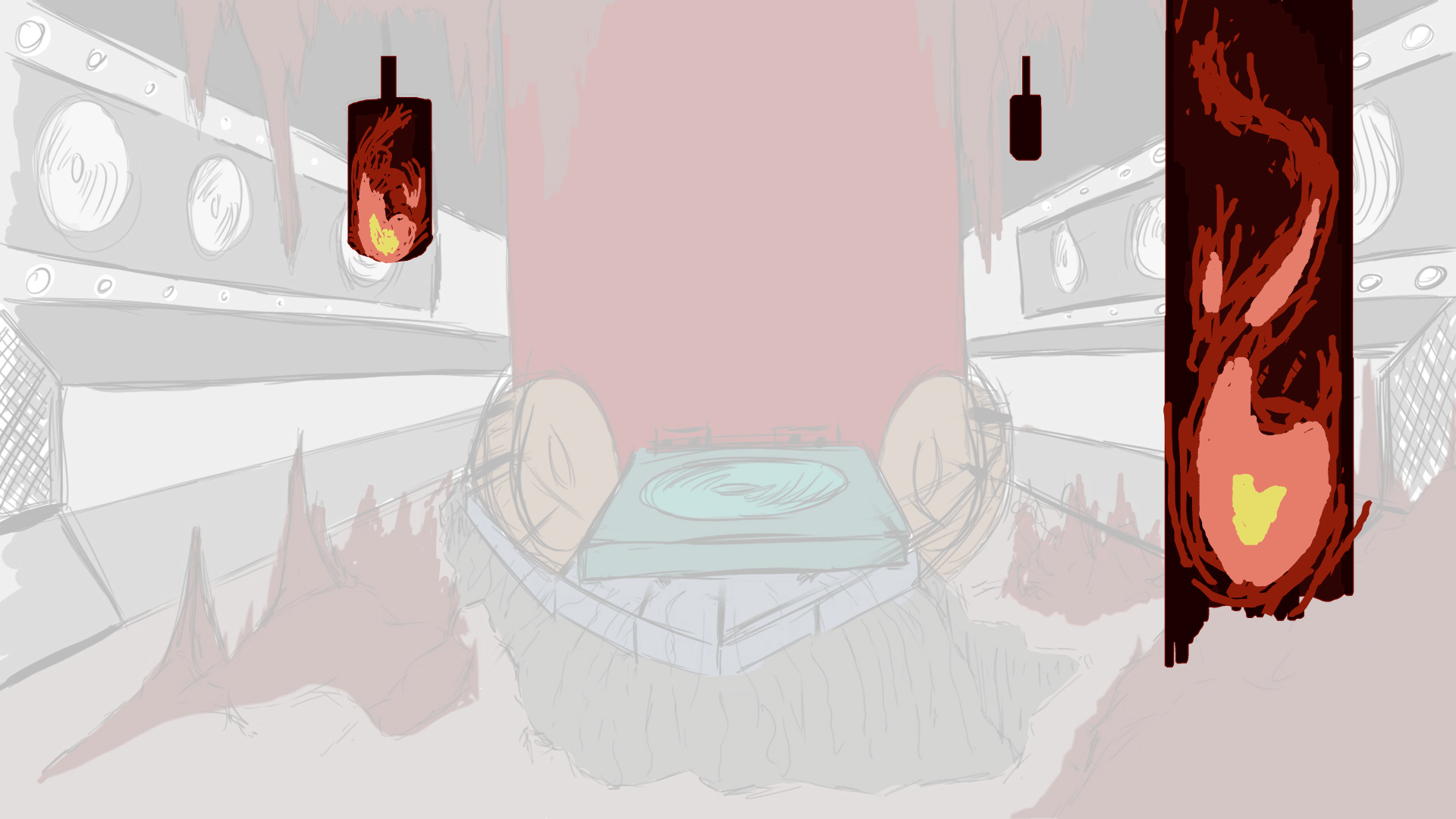
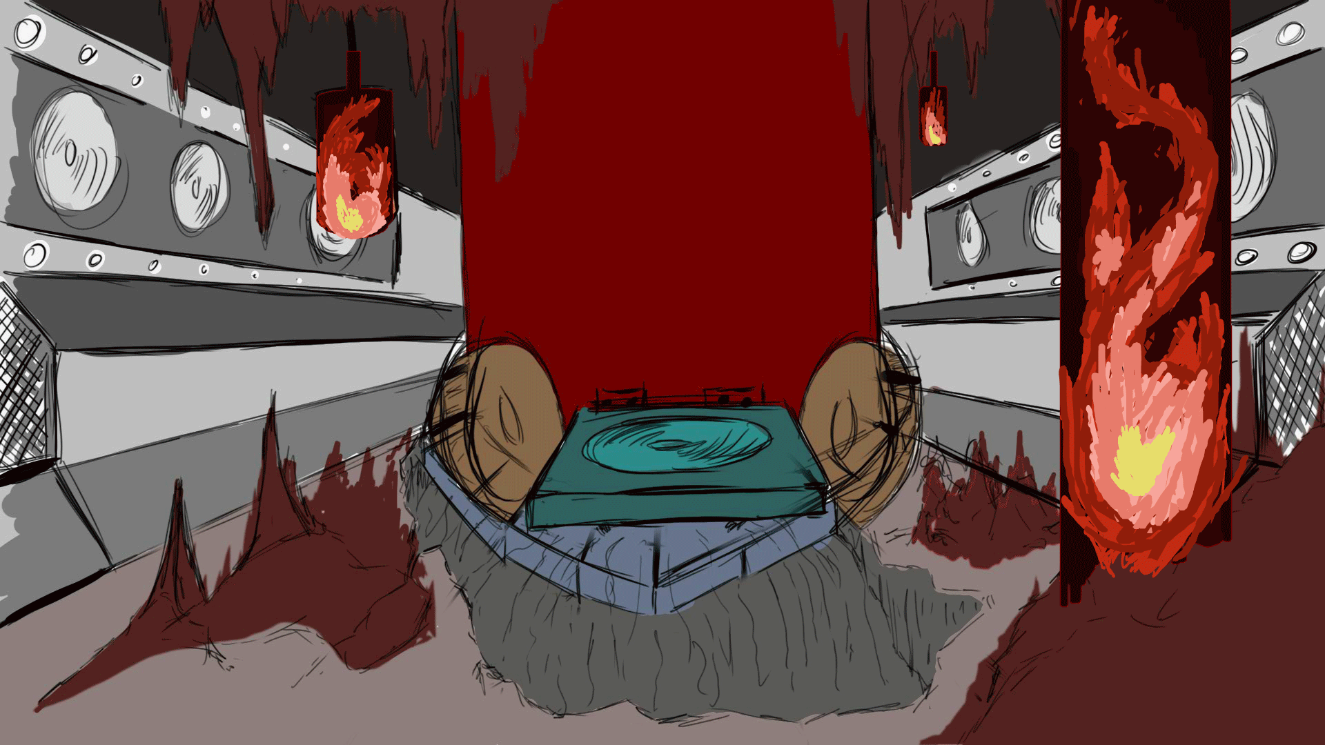
Now the "flame 2" gif has already been explored and evaluated in Interactive as part of the template where all interactions reside. It was originally going to explode upwards at the push of a button (an interaction). Although, due to time limits, the idea was scrapped for a looping animation instead. Now its main focus is to direct the eye towards the centre, where the Doctor himself is locked up in a thick glass tube.
Instead of repeating what I said last time, I will compare it to the "flame 1" evaluated above. For starters it is much more violent that flame 1. The edges are sharper, the flame higher and longer and the colour much more intense. A key difference is the use of colour. As obvious as it is, a key difference is that this is not just line art. In fact, this is the first time I've coloured in an animation since starting the course. The colours have been layered on top of each other to blend easier. Since I am limited to base colouring in Animate, The compilation of layers to imitate blending is essential in creating light/darker areas. This art style was my original style when starting digital art. It was also the same style as the Bulbasaur drawn in the interactive (block colouring layered to show light/dark). The layering of colour transforms the animation. Furthermore the complexity of the gif is dramatically increased. 24fps animated on 2s, a big jump from 15fps. The resulting effect is the same smoothness as before, although the rough colouring makes the flame look more jagged and dangerous. As of writing this (19/3), this is the second best, if not the peak, of my animation ability. I am generally happy with the final outcome. Fire is an area I will want to explore further in the future. I have barely scratched the surface and many improvements can still be made. The art style itself transforms the final flame's effect on the user. I can try softer, deadlier, more hopeful or even scarier...
Overall, for this project, I would not have designed it any other way.
Then it is time to incorporate some of my long running animation developments into the project. The 2 biggest areas I have spent my time into is the walk cycle and the arm punch animation. I will also cover this in my interactive and explore the overall effect as a whole on the interactive there. Here I am simply evaluating the animation itself as a singular entity.
Once again, due to the success of arm punch no 2, I videoed myself punching. Breaking down each action and doing many attempts to get the exact movement I want for the project. The last 2 attempts focused on the drawback and punch. This time I will be attempting to create a combination of punches (3 in total). The frame rate will be 24fps on 2s (a big leap from the fps of the previous) doing 3 times the amount of movement. This will of been my biggest animation involving an humanoid form to date.
The next step was to combine all the separate videos into Sony Vegas Pro 14. There I broke down my action frame by frame and collected the essential movements into pngs. 23 key frame, compared to the 4 keyframes of attempt 2. The animation is 2/3 of the way done as of writing this. Two of the 3 punches have been successfully animated. On top of this I decided to create the "Final Stand Mode" - referenced in my profile and audio recordings. The wings expand and the visual elements transforms as the set up for punch 3 occurs. The goal is to hit fast on the first 2 and emphasise the power in the last strike. This is the end of the introduction and likely the last time this character will be animated. So I want to do it a service by giving it my best work. Considering human anatomy was a huge problem to begin with in September. I could barely draw the human body. Then months later I learnt to draw front and side view. I struggled to imagine it in a 3D space. Now I am attempting a moving human (a 3D form) while keeping human anatomy consistent as they dynamically shift between poses.
The results are staggering.
My best work. I averaged about 4 hours for 25 frames animated on 2s. Roughly 10 minutes a frame (1 hr for 6 frames). Even at this stage there is much more to do. The quality is smooth, although the line art is very rough and sketchy. No colours of the character are included (a downside) but the shape remains consistent - a huge personal achievement.
123, T. R., 2021. arm punch no 3 video - punching reference. [Online]
Available at: https://www.youtube.com/watch?v=WJrh8CqkItU
[Accessed 18 March 2021].
123, T. R., 2021. 15th blog, arm punch no 3 and write up explained. [Online]
Available at: https://www.youtube.com/watch?v=x32OzQ6fP2s
[Accessed 18 March 2021].


I already attempted to animate my character (using my first arm punch animation as a base). I already attempted to animate a 3D character in a 3D space and failed spectacularly. This is the second time I have tried to animate my character specifically. Instead of using a base, I focused on the head. The first frame is always the most difficult to produce. The rest build off from that original frame. The positions of the hands was my guides for the arms. The legs are non-existent. The torso direction was established through the collar/chest armour of the character. The head was the easiest part to manipulate while keeping the body consistent was difficult. I could of used more of the animation principles when carrying this out. Exaggeration would of enhanced the power even more (although may come across as "cartoony"). Staging was used in timing the punches and the wings opening up, making sure the overlap was limited. I set up each section of the punch through the drawback. As the punch swings round it automatically sets up the torso for the second. Foreshortening, line of action and balance were all considered in creating this (although will have some errors). The body was simplified down to save time. Animating each individual knife would of taken far too long. Also it wouldn't make sense to have weapons on him if he's locked up.
I did have an issue with the documentation. It has got to the point that the combined gif has gotten simply too big for uploading. Discord only lest 8mb and Wix only allows 25mb. I have to remove elements from the gif just to document the animation onto my website. This is my best animation I have produced so far. If anything I excited to carry on and finish it. I plan to expand my people animations further into the future. This is the start of something bigger that will extend beyond this project. If I can master this skill then the possibilities of ideas and storytelling are endless. I want to get to the point where I am no longer held back by my own skill level. That I have the experience to meet my ambition.


What I plan to do going forward is to finish the animation. to get a greater drawback on the punch, more build-up. To finish the wings expanding and show the visual power/effect they grant. To release the punch and completely destroy the tank. On the topic of the tank itself I also want to design the cracks, to show the true damage of each blow. The final strike will lend the interactive and break the connection to the controls, almost like a flashbang. Fade to white and end the experience. If I have time (which I doubt at this point) I want to colour in the animation, to show the characters colours and how the glass shards interact with the landscape around it. As nice as it would be to explore that route further I will have to stick to my deadline and sacrifice it. To fix the issue of documentation size, I took a png export to show the full look of this particular slide - shown below.
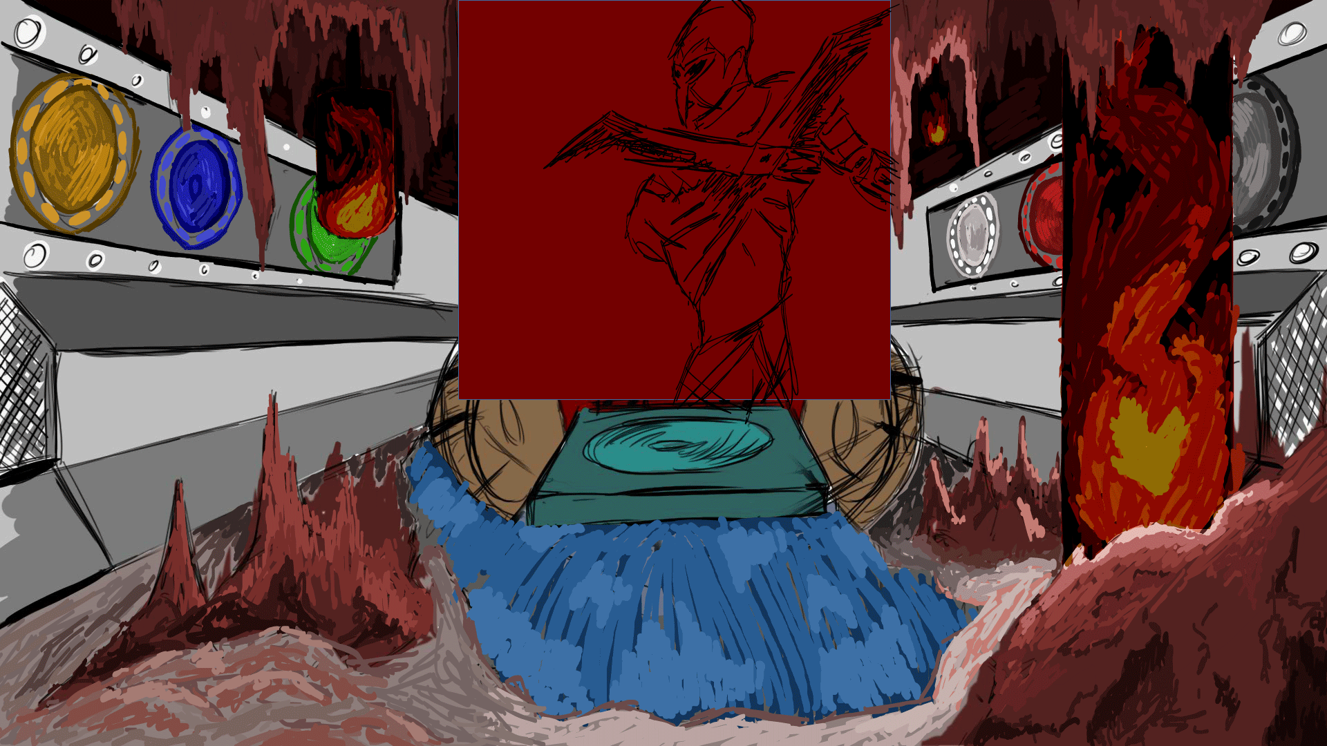
INTERACTIVE EVALUATION THAT APPLIES TO THE VISUAL ANIMATION ELEMENTS
Positively, I was able to meet all the criteria and finish before my deadline was up. I have already spoken greatly about my issue with time so I won't go into too much here. In regards to the visual elements...
The water could of used way more development. My main research source was my previous work in project 1. My concept arts were the main inspiration for the style of the water. However that is a still image. Getting that level of quality frame by frame would be nearly impossible for me at this stage (that or I need a lot more time). I should of done more experimentation first or at least found more examples of moving water to use. I had my Foley sound bathroom water, physical observation of falling water. But not rushing water. The fire itself I am especially proud of. I first did it as a "why not" outside the project. I wanted to learn how to animate fire so I did. I enjoyed it so much I incorporated it into my interactive. Through various videos and feedback, I greatly improved upon my original attempt (created on my birthday). The fire has already been evaluated above.
The arm punch animation is a different case entirely. Easily the most difficult thing I have ever animated. Considering my constant struggle of human anatomy and my inability to draw people at the start of the course, I have developed leaps and bounds from where I started. Most of my visual research was in learning human proportions, anatomy, lines of action and balance, character design... all in the service of creating a 3-4 second animation of a character punching. Easily my greatest achievement. Although it can be heavily improved. For starters the animation remains unfinished, with the character forming back into mannikin drawing at the end. Time forced me to carry on with the rest, otherwise I would of missed the deadline entirely. The animation that is finished is rough, with very sketchy lines (very unprofessional). However the movement is the most complex I've ever made it. I went from a single punch to a combination, with various hip twists, core strength, balance and much more to consider. My background in Karate (primary evidence) was the most valuable experience in this area.