CH
Concept Art of Bedroom Window View
Task 1 is to create a concept art of a chosen environment, due to lock down everyone is now doing a concept art of their bedroom window.
The Journey/diary of me learning the media processes and technical skills to carry out the task is shown in the "JOURNEY/REFLECTION" section.
WEEK 1 - Attempt of Photoshop Basics - 16/9/2020
1. What Happened
This is an account of my first experience on Photoshop. The first thing we experimented with was the brush and pencil tool. We also had a go with keyboard shortcuts including brush (b), erase (e) and the zoom in and out key. On top of that, we were introduced to the layer function - allowing greater control over our artwork.
With some experimenting, a clear difference between pencil and brush emerged. While brush can change hardness to create a more organic shape (with blended edges), pencil remained a solid mass regardless of hardness - leading to a more crisp (man made) shape.
2. Feelings
However this lead to a number of issues, which dampened the experienced a bit personally.
When drawing the brush tool would randomly convert to the zoom tool which jeopardised workflow. And if not careful, any pixels generated off canvas would be wiped - leading to shapes being cut in half. This was especially frustrating when it came to rearranging the composition.
These issues were frustrating at first, but it forced me to look for solutions to solve this problem. Turns out there was a button on the pen which converted the brush to a move tool. If you generate the whole shape on canvas and drag part of it off, it saves the whole shape instead of slicing it in half.


3. Evaluation
Overall it was a good experience, but with a brand new software, graphics tablet and computer it felt very alien. This will subside with more practice. Its always a good experience to learn new things but it does come with difficulty.
5. Conclusion
Although for everything i learnt, there are still ways to improve. For example the same default brush also has a blend mode, opacity and softness - all of which i never experimented with at the time.
Furthermore i could of also changed the colour of each circle and layered them upon each other to get more practice with the layer tool.
4. Analysis - Future
The situation that this particular task put me through will help me in the future, especially in my ongoing Project. The Brush and Pencil tool are essential for any line art and/or blending. And it also made me aware of any work that comes off the canvas (as it will be deleted). It also taught me the erase and move tool, which is perfect for re-compositing and reattempting areas of my work.
Furthermore the layers will allow me more control over my project concept art and minimise any damage shall a mistake arise.
6. Action Plan
If i ever had to do this specific task again in the future, i would take into account the improvements i can make (stated in my conclusion) and expand further on the skill gained in my Analysis - Future.
I would also experiment with other tools i have previously not used, such as opacity and brush customisation to see their impact on my work.
WEEK 1 - Concept Art 1 - 17/9/2020
1.Description
This was created on my first day of use of Photoshop, details of how I improved my media skills can be found in "lesson 1 - Photoshop basics". The only tools used was the pencil and brush tool to draw. The use of layers, eraser and gradient was used to complete the image below. Layers allowed me more control over the image below (learned through the circle experimentation in lesson 1 of journeys).
The Pencil tool was used for the line art of the work below, while the brush tool was used for the colour. Layers allowed me to move and adjust various pieces of the work (such as the window frame). All work conducted was done safely, there were breaks (with plenty of sleep) between long work sessions. Correct posture was used when sitting in a chair and steps were taken to avoid eye strain.
Concept art 1 - Description summary
Created with no research or reference, drawn purely from memory. Also drawn on the same day as my first day of Photoshop use.
Made use of the gradient tool, pencil and brush tool, eraser, brush hardness and layers

2.Feeling
However, due to my inexperience every tool used was brand new on the day. Which lead to a lot of frustration and mistakes. For example, mid process of creating the original concept, the sky looked far too flat. This was because at the time it was just a base colour with no direction.
To solve this I tried the gradient tool, which at first didn't go well.
However after a few attempt I achieved the result in the top image, which was a relief.

3.Evaluation
Personally i like the design of the lineart, especially of the driveway and fences. I attempted to do 1 point perspective and it was fairly effective. Another point i like was the sky. Using the gradient tool it really adds to the depth, showing the illusion of a pre-sun rise.
However the line art is also one of the biggest weaknesses. Many if not all the lines were sketched onto the canvas, which gives it an amateur look. However this is partly due to the new graphics tablet i used at the college itself. The new software, computer and tablet all contaminated in a great loss of accuracy.
Furthermore the road it self has no perspective, ending up cutting the canvas in half (although i like the effect of the shading personally). Add that to the block colours due to the use of only 2 brush tools (brush and pencil) it creates a very simplistic and blocky world.
4. Analysis
The situation this concept art has created has let me know that some major improvements need to be made. The line art needs to be cleaner and tighter and a greater range of colour need to be used (to avoid the blockyness of the previous piece).
Furthermore the colours used have little to no direction or meaning. And the road needs a major fix, especially its perspective among the rest of the scene.
5. Conclusion
For this original piece i could of added more structures to the horizon line to cover up where the sky ends. The fence could of been coloured in and the tree could use some more shades of colour.
6. Action Plan
When reattempting the concept i need to consider the weaknesses in my evaluation and the solutions in my analysis. Furthermore RESEARCH MUST TAKE PLACE.
Concept 1 was drawn from memory with no reference or prior research. Even a couple of photos (primary research) will dramatically alter the concept.
Also I need to consider what colours i use and what they convey in the next piece, rather than the randomness of concept 1.
WEEK 1 - Colour Grading Experimenting - 19/9/2020
1. Description
Colour grading is used to influence emotions, tell a story and make your character come to life. The first thing we learned were the very basics of how colour works. For example one colour is directly relational towards its opposite colour - complimentary colours. When used together (eg foreground/background) it allows one to make the other stand out, which is commonly used to frame the main character.
Furthermore, the range of colours used can convey and set the emotional tone for the scene. Muted monotone colours imply bleakness and sad times. Vibrant colours shows the scene on full display, a "hello I'm here with nothing to hide" way. Warm and cold colours also play a major role.
And finally, colour is used to build on the story. Certain locations may have specific colour schemes, telling the audience where they are without any dialog required. An example of this is the Matrix. The Matrix itself has a green colour scheme, different to the mainly blue colour scheme of the real world.
2. Feeling
Not gonna lie, at first all of this made me a bit confused. There was a lot of information to take in. The first revelation was the 2 sets of primary colours. Until starting this course I assumed the primary colours were red, blue and yellow (which makes black combined). Turns out they teach this because kids cant understand Cyan and Magnetar easily.
In addition to this, I didn't realise at first how much through went into a single scene for colour. The reveal of many movies using complimentary colours to make their characters stand out from the background was another new idea for me. Michael Bay took this to the extreme in Transformers 1 (2007).

The image above shows the difference in Primary colours, depending on the medium. RGB (red, green and blue) is used for screens. When all 3 colours combine you get white. CMYK (cyan, magnetar, yellow and black) is used for print. When mixing cyan, magnetar and yellow black is created, so white in this case would be the absences of colour.
3. Evaluation
Overall, this was a good experience, although I do feel that I've barely scratched the surface. At first I wasn't aware of how much work went into colour alone until now.
However, as mentioned before, there was a lot to take in. From emotion, story, character, location, I found out that colour almost impacts every aspect of creative media. And I know it is only going to get more complicated from here.
4. Analysis
What I learned during this lesson is going to heavily impact my concept art 2 for task1, project 1. In my first concept art, colour was just an afterthought. Now I know how much it can impact my work, I'm going to take areas of this lesson into my next piece.
Particularly, I want to take advantage of using complimentary colours to make areas stand out. Using cold blues and blacks for the window frame, then contrast this with warm oranges and yellows for the background.
5. Conclusion
This lesson was more about learning and describing the use of colour grading to influence emotions, character and story. As a result, the only work to come out of this is 5 examples of a range of colour grading effects (happy, sad, scary...) and a paragraph explaining the above. The only thing I could of done to improve my lesson work was to go into more detail and expand on my paragraph explanation. Include more examples or go into deeper detail when describing the emotions conveyed.
6. Action Plan
As stated in my Analysis and conclusion, I'm going to take what I've learned in this lesson and apply it to my project (task 1). I need to explore this route and experiment with possible ideas. The info learned here is the building blocks to something bigger and is important for any art pieces moving ahead.
WEEK 2 - Selection Tools, Composition Rules and Colour Craziness - 23/9/2020
Selection Tools Experiment
1. Description
After Learning the basic tools of photoshop (such as pencil and brush tool), it was time to experiment with selection tools. These can be found in the hot bar to the left (image found on South Essex College PowerPoint [made by Adam]). While right clicking these icons you can select various options/alternatives.
The Marquee Tool allows you to select a certain shape (eg a rectangle or circle) which can be manipulated. In my personal experiment I used the circle tool to experiment with colour (which is explained in more detail below). I also used it to fill in colour gaps in my mountain when messing around with the composition.
The Lasso Tool allows you to select the area you want to manipulate. Lasso Select will let you draw, freehand, the area you want to control. While Polygonal Lasso Select lets you select in straight lines - each click creating a new line. You also need to close the line created in order to manipulate the area.
The final selection tool, object selection, lets the program select for itself the area you want. It uses the change in pixel colour to guide the outline of the area, which can be an issue if the colours are too similar. There is also a second option of "quick selection", where you drag your curser and the computer will select the required area.


All three of these techniques were used to create the mountain range to the left. Once selected, the specific area can be filled with a base colour (edit, fill, colour...) and moved to the desired area using the v key.
Also below are some screenshots of "Lasso Select" used to fill in colour gaps after moving around the composition, which is explained in more detail later.
The select/deselect drop down menu was used to deselect the areas manipulated by these tools.


2. Emotion
These tools were a pain in the neck to understand at first, but after some practice they started getting easier. Even at this early stage I can see the importance and usefulness of these tools in future artworks. It was definitely a relief when it all started coming together.
3. Evaluation
Overall this went well. Like every learning experience, it is difficult at the start and progressively get easier with practice. The Lasso Tool I am particularly fond of out the three as I think it will have the most impact in my future concept arts.
4. Future
These tools will be essential for repositioning areas of my work. They allow for finer control of layers and will be extremely helpful in future concept arts, in particular its composition.
I will be doing a joint conclusion and action plan at the end of selection tools, composition and colour. It will be easier to do a joint summary than three separate conclusions.
Composition Rules
There are four fundamental composition rules that we covered during lesson (PRIMARY RESEARCH). And they are:
-
Rule of 3
-
Focal Point
-
Leading Lines
-
Depth of Field

Rule of 3:
The image is divided into a grid pattern, with the main focus lined up along the division lines.
Leading Lines:
Lines within the image that lead us to a certain point, eg a focal point.
Focal Point:
Also known as the golden ratio, is where you are being drawn to the focal point. This is normally inline with the rule of 3 division line.
Depth of Field:
The main focus it presented with the remains of the image blurred out to some extent.
The image above and below highlight the core difference in quality when these rules are present.
This is my experimentation trying to implement the rule of 3 into my mountain terrain from the selection tool experiment.
Command h = Guide
Command R = Ruler


Colour Craziness
Colour is incredibly important when it comes to concept art, as shown previously. It is used to set the emotional tone of the artwork and implies many characteristics that come with it. For example green implies nature, blue implies remoteness and red implies violence. These implications can be used to expand and improve our concept arts.


For example, I used various shades of green to imply the nature element in my mountain range. I also experimented with the remoteness of blue. This made the exact same shape give off cold, desolate vibes, contrasting against the full of life idea green portrays.
This was done using the drop down - layers, new adjustment layer, hues and saturation. I also found that by creating a folder, you can limit the affects of this to specific layers within said folder.
However, I also learned that some common conventions of colour are null and void when it comes to digital drawing. The basic colour wheel can be applied to medias such as acrylic paint. But a screen uses light to draw, not paint. This means what we thought were opposite colours originally are now in correct. This was confirmed when i tried blending colours together, which resulted in a grey mess.
Where blue and yellow are supposed to make green, it ended up in a grey mess. Similar results occurred with secondary colours such as green and orange.
I also discovered that the more you blend the two colours together, the more grey it becomes. This can be faintly seen by the outside glow of the green/orange combo.
By getting the hue and saturation feature I was able to experiment with this idea and found a few combinations of complimentary colours, for example red and cyan (when originally it would of been red and green).


How It all leads into Concept 2 - FUTURE
All three of these elements will play apart in the next concept artwork (no 2). The Selection Tools will make it easier to alter the composition of the current drawing. This will allow me to play with ideas such as the rule of 3 and Focal Points in particular. Leading lines and Depth of View can be experimented with in later concept arts. The rule of three will be essential to improving the 2nd concept from the 1st.
Colour will play the most important role in my opinion. It will set and decide the mood of the concept, this must be experimented with in multiple ways. For example I can play with complimentary colours to make areas stand out. I can use hot and/or cold colours to emphasis emotions of indoors and outdoors. Having a main colour scheme will help set the tone of the piece, such as the blue and green mountainside does.
Conclusion AND Action Plan:
Overall all three of these new areas will play a major role going ahead, not just in my concept art. I need to do more practice using the selection tools. There is also further need to experiment with the 4 composition rules. The rule of 3 can be used on a tilt axis for a more wild, exciting emotion (rather than the stoic nature of its normal form). Leading lines and depth of field are yet to be experimented with and I have only Scratched the surface of colour. I need to experiment here in particular to find the mood I want to set for my concept art.
WEEK 2 - COMPOSITION EXTRAS - 24/09/2020
1. Description
During a future lesson, composition was expanded upon. As well as the structure mentioned above (such as the rule of 3 and leading lines). We were introduced to many new styles such as pyramid, symmetry, full frame and the golden ratio. We went through the definitions and various examples, analysing their effectiveness and what techniques were used. I wont be going into too much detail since this area was already covered in a previous lesson.
However we were introduced to two new areas of composition called focal elements and balance. In my opinion focal elements held the most importance with balance being more of a side value. Focal elements can be broken down into high contrast, saturation, camera focus, motion and faces/figures. Balance was more focused on the locations of the focus point. It took into account the size, high contrast, faces and figures (similar to focus points).
2. Feeling
These areas had me intrigued but due to how long our timetabled lessons had gone on for tiredness was impacting my learning. Furthermore, eyestrain was becoming a bigger issue as time past. I would have been exposed to a computer screen from 9 in the morning to 5 in the evening. 5 to 6 hours is all I can manage at the moment.
3. Evaluation
A positive of this lesson was the sheer amount of new information. I knew some of these compositions from the previous lessons (such as the rule of 3). However focal elements were basically brand new to me. Before this lesson, I didn't know the difference between high contrast (colours contrasting with each other, eg light and dark) and saturation (shades of the same colour).
A negative however was my own state. By the final hour of the lesson I was under heavy eye strain to the point of my eyes hurting when looking at the screen. When learning, I need to make sure I'm taking correct measure for my wellbeing as well as for the learning itself. Taking the time between lessons as a break rather than staring at the screens instead will help. Also lowering my screen brightness and using an eye saver mode will also help in the future.
4. Analysis/Future
The composition and rules learned in this lesson will be essential going ahead with future concept arts. They are the absolute basic essentials in this area. Focal elements can be used to enhance the art and balance can create slight improvements. Structure is the most essential for making it look non-amateurish. I have used the rule of 3 in my early concept arts, I should experiment with other structures such as symmetry and pyramid. Full frame will come in handy when creating a character in task 2 and the golden ratio is used more for 3D projects. Colour must be experimented with further as well. The contrast and saturation play a key role and needs to be explored further.
5. Conclusion AND Action Plan
Overall this lesson on composition went really well. It was more on learning the new info and finding examples on what was mentioned, rather than creating my own piece. There is not a lot I would of changed.
If I was to do this lesson again I would take breaks throughout the day rather than near constant use to save my eyes. I could also create my own examples of each focus, structure and balance given enough allocated time. This would also boost my project, experimenting with new skills and analysing their effectiveness.
To the left is a Link that will send users to the word document taken during the lesson itself. Within it are examples of the processes mentioned above, I do not own any of the images within this document.
CONCEPT ART 2

21/9/2020 - 27/9/2020
This is the finished work of Concept Art 2. Within this next section I will explain what I done, the reflection system stuff and a comparison between this and concept 1 (look right). Concept art 2 would of taken 3 separate days to draw (about 2.5hr chunks give or take) and a 4th day to complete the write up. The remaining time was spent on lesson work, lesson write up and blended learning.


The 1st image above is me experimenting with the default brushes. The 2nd image is experimenting with the downloaded brushes. All trials took into account size, pressure sensitivity and practicality.
This style of analysis is slightly different to the reflective system in the booklet but covers the main criteria still. Its just not sectioned into its areas and flows better.

Line Art
As you can see above in concept art 1, a major issues was the lines. Many are far too thick and are almost sketched onto the drawing, a major sign of amateur drawing. They are not straight and very inconsistent. So going ahead they had to change. The lines would of been improved in my blended learning week 1 but I need to apply what I've learned into the 2nd concept. Fast, singular lines (or small sketch lines drawn over the top of) will improve the overall line art.
So to begin with I started experimenting with brushes. The advantage of using my own computer for the concept (rather than colleges) was that I was able to download brushes. Add to the fact I was also using my own graphic tablet, I was able to get greater control over what I draw. I had the whole internet to my disposal. It took a little while to get used to the sensitivity (which changes depending on the software) but this got better over time.
The 1st few days of working on concept 2 took place on Photopea (the free version of photoshop). However after technical issues revolving around the adds taking up a third of my screen I bit the bullet and brought the adobe bundle. This further helped as I could edit my layout of buttons - leading to more efficient access of necessary tools.
Planning
When beginning concept 2, I decided to plan out where everything was located before I starting drawing the line art (unlike concept 1). It will still be closely following what's objectively outside my house (no creative spins quite yet). It was also backed up by primary evidence of photographs taken by myself for reference.
I attempted something that has not yet been covered within college as of this write up called "One point Perspective". This is where all the lines eventually join up to a singular point. Its found in many man made structures. My attempt at It can be seen on the right.
The basic line art is shown in the image below this. It is evident where the lines all link back to a singular point (which is off canvas). The closer this point is to the object, the more distorted it gets - which is why its off canvas. This gives it an illusion of distance and adds to the depth of the work. Although this can be improved by using 2 point perspective in the future. The more layered the objects are the more this distance effect will stand out. I could of also used the camera focus technique to blur far away object.
There is also a window in the foreground to frame the street drawn, making it evident that's its a bedroom window rather than just a random scenery. Originally it was just the basic white of my own window but this changed after the colour lesson.


Composition


Following the Composition rules, selection tools and colour craziness lesson, I had a lot of rearranging to do. Using the lasso tool variants primarily, I moved my image around to create the rule of 3. The top half of the image (on the left) was moved down to match the 1st horizontal line and the driveway was used to match the 2nd horizontal line. This was done using the ruler (ctrl. r) and the guide lines (ctrl h), evidence of these tools used below. I also attempted to use guiding lines, with the bush and fence all leading to the top centre of the canvas. There were many small adjustments which overall improve the image using the rule of 3.
Balance was also achieved within concept 2. With everything in proportion and layered to give a sense of perspective. Sizes were correct and contrast/saturation was taken into account when colour was eventually added. This took a while to get right and was definitely very irritating in places. Although it was worth it once finally done right.
The use of better quality line and overall composition really improved the 2nd concept miles over the 1st. While the 1st looked flat the 2nd has a scale of distance as you get further away from the window. This made me feel great watching it all come together. Even the small composition changes improved the overall image significantly.
As of writing this, a small negative I have with the comp is how bland it looks. It looks good but feels very basics and formulaic. This can be sorted by messing with the rule of 3 (eg rotating the image and reference lines). However when I attempted this it was very difficult to pull off and did not fit with the linearity of the artwork.
Colour Craziness
The colour took much experimenting to get right. As shown above from a previous lesson, colour carries a lot of feeling, symbolism and generally carries the majority of the tone of the concept art.
Before this all the work went onto composition and line art. However its the colour that defines the tone of the artwork. Take the main colours of the background experiments below.
Orange (the chosen theme for concept 2) combines the power and deadly energy of red and the peaceful/happy vibes of yellow. This creating the same warmth and energy without the violent connotations of red. It gave me the most vibrant feeling of the 4, the most alive.
While blue has a calmness to it that orange lacks. A smooth sea, clear skies and open plains. However this isn't what I was looking for in my concept. Its devoid of the same energy as a busy street (too calm). It also implies a remoteness that clashes with the busy street feel I'm looking for.
Green is associated more with nature, a opposite to the man made nature of the concept. Furthermore it is also associated with unnatural evil (eg. green fire, poison...).
Purple was the final experiment and is the next most effective in my opinion. Purple is often associated with fantasy and mystery (as well as wealth and power). Although I don't it fits this more grounded scene, it is a concept I want to play with in the future.


Focal Elements - Colour

After decided to carry on with the main theme of orange, I wanted to contrast the window itself with the lively background. The complimentary of orange is blue (specifically light blue for orange). However I wanted a dark colour to show the window. So although not complimentary, the dark blues against deep oranges creates a fitting contrast (focal element). The background itself also has a high saturation which catches the eye of the viewer.
Since the theme was to create a concept of what's outside your bedroom window, I wanted to use the window itself within the artwork to frame the background. It is still a fairly object view of what I can see, this will change with future concepts.
To improve this I could increase the contrast, making the window more black than blue. It something I can play around with in the future if i stuck to the same colour scheme.
New Tools - Final Colour
There were 2 tools that came in handy that I never used in concept 1. They were the "mixer brush tool" and the brush editor". These 2 tools allowed me to have far greater brush control over the 1st attempt (done only using 2 brushes). The mixer brush tool allowed me to blend colours together. So even when doing the greens of the hedge and tree, I was still able to keep the main orange colour scheme. This in turn gave these a more sunset feel, natural warmth.
A combination of the navigation tool (found in my edited taskbar) and the brush editor (right click), I was able to get extremely detailed blending. I could zoom into small areas (such as the hedge and blend many colours together using the mixer brush tool.
This allowed me to carry on the orange theme whilst keeping similar colours to the original.
Overall colour was extremely successful on the 2nd concept and a definitely step up from the 1st concept.


The Future of Concept Arts
There were major improvements made between 1 and 2, with many references in what areas throughout the write up. I also described my feeling and evaluated its effectiveness throughout also. That leaves the future...
So far concept 1 and 2 have objectively followed what is outside my window (and the window itself). However this has to change moving ahead. Throughout 3 and 4 especially, I need to come up with a creative twist (eg my room in space, my room from a tiny persons perspective, my room with physics falling apart...).
The line art also needs tiding. Although smaller and far more controlled, I am still sketching out my surroundings rather than using strong, confident lines. Its too rough for what I'm going for. This can be fixed by sketching my picture first, reducing the opacity and redrawing it over the top on another layer.
More accuracy in the guiding lines and maybe some extras to zoom into certain areas moving ahead. The blur effect can also be used to create greater distance from the foreground.
Conclusion and Action Plan.
Overall this was a major success. The 1st concept was held back by time, my lack of experience with photoshop, a new mac computer I wasn't used too, a new graphics tablet... This new one show my current level using photoshop on the computers and graphics tablets I'm used too. This also means that going ahead it is going to be a lot harder to top my previous concept. To do this it will require further experimentation and a creative spin, this is as far as I can go with just recreating a photograph (compared to what it could be with the twist). The sky itself could have a greater colour difference, the oranges are still extremely similar and require a greater saturation difference. The window itself could be far more abstract moving to the future (rather than a basic window frame).
30/9/2020 - 2/10/2020
Mountain Range Comparison
BEFORE
AFTER


The mountain on the right was made after learning basic colour and composition. However the right mountain brought a wide range of new skills to the table. From illustrating (specifically light and shadow), surface texture and a host of custom brushes. The masking tool was also used to keep the original edges. On top of all that, the gradient tool was officially introduced, which was used to form the sky. All these areas I will go into more detail below, this is just a brief summary of what happened.
Illustration - Light/Shadow
To create shadow we used a previously learned tool called the lasso tool. It allows up to select certain areas and fill in with a darker colour (between the 2 mountain layers). The mask tool allows me to keep the original edges.
The added depth (shadow) improves the artwork by implying a directional light source. It gives the mountain a more 3 dimensional look compared to the flatness of the previous piece.
However, getting the shapes and locations of the shadow require a lot of trial an error. A negative of using this technique is basically many small inaccuracies. This will improve with time and accuracy and is easily fixed. Furthermore, on the 1st attempt at completing this task, I had a personal issue of layers. Because I wasn't careful enough, I started drawing on the wrong layer. This is an example of poor management which can easily be fixed by paying more attention.
If I was to do this again in the future I would add it to all 3 mountains, with the furthest back mountain having a greater contrast. Although this technique will be used in later concept arts as it adds much necessary depth, creating the illusion of distance and direction.

The above image was my 1st complete attempt at shadow. Below is my Home attempt (2nd time) where I show the process of using the lasso tool (then fill). The image to the left is an example of where layer masking is and how it looks with lower opacity.

Surface Texture


Surface texture is easiest to control using custom brushes. By going windows, brushes, edit brushes. you can adjust settings such as shape dynamic, scattering and colour scatter. Using this I gave the shadow a gravel texture.
It added some much needed depth to the artwork, a definite improvement over the original. Any kind of added depth will create the illusion of distance and make it less "2D looking".
However it did come with some downsides. If you overdid the texture tool then you'll loose the majority of the shadow. Too much would be covered up for the lighting to be effective.
Overall it was a good introduction into customising your brushes and will be essential moving ahead into future concept arts.
Custom Brushes
Method
The surface texture method briefly touched on this subject, now its time for a full dive. You can get any image off the internet and create a brush out of it. Essentially you erase the background, remove the colour and define the brush select.
For example take a cloud. The 1st step is to select the cloud using the magnetic lasso tool, copy and paste selected onto a new layer and delete the old one. Then use a soft brush round the edges to get rid of harsh lines. Desaturate the image to remove the colour, also invert the colour (easier to work on dark brush). Finally go edit, define, brush present. Give it a name and it will automatically save as a custom brush.
Evaluation/Feeling
Overall this went very well. It felt good to carry out and gave a satisfying payoff. The very concept of creating a brush from scratch give a huge amount of control to the artist. It would allow for an infinite range of shape and size, as abstract or as simple as you require. It will improve the creating texture process (which can be used for further customisation of brush).

The screenshots of clouds are all from my 2nd attempt at this task at home. It breaks down my method and shows the progress step by step in the "method". Using the magnetic lasso tool to select the cloud. Desaturating it (above) and inverting the colour (below).

The image to the right show the fog effect created on my 2nd attempt of this task. It was achieved using the custom brush made previously. Although this is successful, it needed major improvement (far to bland for my taste). So when I completed the sky (using the gradient tool). I went and worked onto this and created a more contrasting fog. Add a hue layer to make the mountain have colour (removing the regular black and white) and you have the purple mountain below.
Even in the finished purple mountain there are still improvements that can be made. The 2nd and 3rd mountain haven't got any shadow or texture added, unlike the 1st. Furthermore, the clouds are too uniform, which could be solved with further brush customisation. All the techniques I have been talking about will be extremely valuable going into my 3rd concept art, especially the brush customisation. Texture and shadow will also add much needed depth.


Experimentation/Pros and Cons
This particular experiment was done twice. The 1st time at school (getting introduced to the new skills) and the 2nd time at home (experimenting and improving said skills). It was significantly easier using the lasso tool on my 2nd attempt (creating shadow and for the cloud outline).. Although the magnetic lasso tool had some issues with both times around. If your not zoomed in enough it will lead to too much inaccuracy - resulting in the computer cutting essential corners off. Thankfully, I discovered that by using the backspace key, I was able to remove the last point without starting the lasso from the start.

Future
Smooth sailing using the masking tool to keep the original skyline. Although if I was to do this again in the future, I need to get a reference for how the shadow falls onto the mountain. The lighting is very trial and error in both attempts and I know this can get better with some images for inspiration. Having multiple clouds, or having multiple variations of the 1st, can be used to improve the fog layers.

Blue Mountain was first use to experiment with colour and composition especially. This was then worked on further to create orange mountain (attempt 1). This was to learn new skills such as illustration, texture and brush customisation. Finally we have purple mountain (attempt 2 from home). This was to practice the new skills learned, experiment with more effective ways of carry out specific areas and collected evidence necessary for the write up.

Research and the Animation Process
(Research Methods)
Primary VS Secondary
2/10/2020
Primary data is data that you have collected yourself. For example photographs, surveys you made, previous works you have done...
Primary research provides 1st hand data and is specific to your needs. You create the questions, geared to your target audience. Its the most up to date and therefore the most accurate. However it is time consuming to carry out and very costly.
Secondary data is data that already exists (made by someone else). For example someone else's photographs, already carried out surveys, other peoples artwork, books, movies, internet images made by someone else...
Because secondary data already exists, the collected results are very broad. They are not specific to your audience, reducing their validity to your purpose. Due to this, it also means they lack temporal validity. The time the results were recorded will heavily impact the data. Recorded too late and too much would of moved on, making them void to use in the present day.
However they are extremely quick to get and very cheap as well.

Qualitative
VS
Quantitative Data
Above is an infographic explain the design process of creating an animation. It also highlights the most important areas of market segmentation (but leaves out behavioural (targeting certain groups) and psychographic (an individuals lifestyle/personal image.
Quantitative data is factual data, with fixed answer that are easily analysed (mostly numerical data). It is mainly used for general feedback, especially in large groups.
Qualitative data is non-numerical data. More commonly used to record down feelings and beliefs. It provides more detailed data that catered to an individual level. Mostly used in small groups.
CONCEPT ART 3


PHOTO REFERENCES
Before I begin to explain my process creating concept art 3, I need to address some over arcing issues. For concept 2 I used a number of photographs as reference when drawing the main background. Currently, my main research stems from experimentation and 1st hand learning from classes (all examples of primary research). However, although these are good, it is a very narrow range of research. So I'm uploading the photos used in concept 2, which were also used in concept 3.
Furthermore, there are issues with the canvas size and dimensions. Concept 1 had the correct size, however concept 2 and 3 do not. They are fit to screen (1920 by 1080 at 72fps) even though they need to be printed off. Therefore going ahead, I need to resize my canvas and fps as it can negatively impact my work in the future if not corrected.


These are the photographs taken for references for concept 2 and 3. Concept 1 was done with no references or previous research. This was fixed in concept 2. The big image on the right was the main inspiration of concept 2. The task is to draw an environmental concept art of my bedroom window, so it made sense to try and literately draw my bedroom window. Concept 3 and 4 will start introducing a twist but 1 and 2 are more grounded/objective artworks.
Going ahead I need to try and use as many types of research as I can. Experimentation, classwork and photographs have been used (all examples of primary research). I must also have secondary research in order to meet the criteria. During concept 3, I used a small number of reference images from the internet (secondary research). Its a start but more must be done.

Internet References


Tamara Rant APRIL 2, 2. C. &. R. D. E. &. R. V. M. Q. P. R. S. R. E., 2020. The Cosmic Art of Inter-Dimensional Travel. [Online]
Available at: https://consciouslifenews.com/cosmic-art-inter-dimensional-travel/11116070/
[Accessed 3 October 2020].


Giant Bomb, 2020. Dimension Travel. [Online]
Available at: https://www.giantbomb.com/dimension-travel/3015-333/games/
[Accessed 3 October 2020].


dreamstime, 2000-2020. Creative vector illustration of realistic hurricane cyclone wind, tropical typhoon spiral storm, spin vortex isolated on.. [Online]
Available at: https://www.dreamstime.com/creative-vector-illustration-realistic-hurricane-cyclone-wind-tropical-typhoon-spiral-storm-spin-vortex-isolated-creative-image140499093
[Accessed 3 October 2020].


Lloyd, S., 2006. Almost certain escape from a black hole. [Online]
Available at: https://physicsworld.com/a/almost-certain-escape-from-a-black-hole/
[Accessed 3 October 2020].
Composition Changes
Concept 3 is an improved version of concept 2. Concept 2 is the foundation (the template) that was built upon to create 3. However there were some issues that needed fixing. As mentioned above, the dimensions of 2 were incorrect which carried over to the 3rd. Also there were some perspective issues. Concept 2 makes use out of the rule of 3, but its main identity is using a trick called 1 point perspective. All lines in a certain direction meet at a singular point on the horizon line.
The issue was that a handful of these lines were out of place and ended up unintentionally creating 2 points of perspective. This was highlighted in feedback from the tutor at college (further primary research). So before I build off it, I needed to fix any minor errors (as they would become bigger overtime).
The images to the left is the evidence of my changes. Overall it went smoothly but it took many attempts to get right. Furthermore the original colour don't line up in the changes which is an important negative. Although on the positive, the changes were successful, creating only 1 perspective point rather than 2.
In the future I want to experiment with multiple perspective (2 or even 3 point) as well as some of the other composition rules such as symmetry, pyramid and close up.


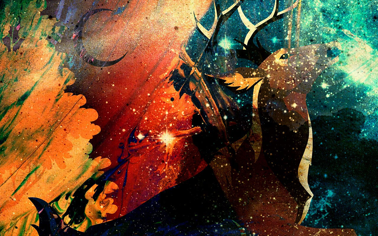
Colour - Orange to Purple and WHY


I used an online website to further research into the emotions/associations that colour conveys (as well as my previous notes). I do not own anything on this site and used it for merely research to inspire my concept art
Colour plays an important factor when creating the tone of the concept art. Each colour conveys a different emotion. For example orange represents warmth (pleasant, not as intense as red), joy and happiness. This was why I made it the main colour scheme of concept 2. However when experimenting with the background I noticed that purple also worked well, but for completely different reasons.
Purple is a mysterious colour and far less natural compared to orange. It is "the colour of shadow". Associated with riches and magic (suited for more fantastical elements). Orange will make you feel a warm joy while purple will act as a veil. Powerful yet unknown. The twist I'm going with is impossible in reality, so I needed to create an unnatural mystery. The audience cant feel too comfortable with this (Orange was simply too inviting and peaceful). They need to feel it power and be unsure weather its on their side.
However I didn't want to loose the tone of the original. So by removing certain colour layers, dialling down the opacity of certain layers and overlaying multiple background, I was able to create the effect to the left. Overall, I was very successful. I got the desired effect I was looking for and made use of new tools like the opacity slider. Layers and folders were essential to keep track of this artwork.
I will be going through overall theme and tonality on concept 3 at a later point. But in summary, I wanted to create the feeling of chaos and corruption. Taking a warm joyful artwork and putting it into conflict with polar opposite ideas and tonality.
The use of the above steps created a scenery not set in reality. It looked more out of a dream than a bedroom window. The removal of some layers made the original background look like it is floating in a void.
Now that the artwork is set in a made up world, I no longer have to adhere to the rules of reality. The original twist was to have the scenery warp to give the illusion of travelling (a portal effect) but the idea of drawing my bedroom window if it was in a dream opens many possibilities going into the future. The warmth is still present along with the added mystery and unnaturalness. Now to add some chaos.

Custom Brushes, Texture and the Golden Ratio


Custom brushes was touched upon in concept 2 but that only focused on size and hardness. They were heavily experimented with in my mountain task and now have been applied to my latest concept. The 1st screenshot to the left was my first attempt at creating the background. It had little sense of direction and was very pale. The 2nd screenshot shows what happens when you add "wet edges" making it look like you have dipped paint into water. However the issue was I merged too many layers together at the time and had to start fresh, which was very disappointing and annoying.
So instead I experimented with the golden ratio. The rule of 3rd was effective but what happens if I try to use 2 composition methods together? So it turned into a spiral and became more focused on direction and texture as it got improved on. Below is the spiral in its many stages of development.
Thinner, harder lines created the illusion of a deep (almost scratched in) texture compared to the smooth fog of previously. More pronounced lines gave it a solidity not previously achieved in earlier attempts. Finally, the golden ratio would naturally direct your eyes into the bottom right of the concept, creating a much needed focus point.


This was the exact chaos I was looking for. the purple was more deep and pronounced, it demanded your attention. A feel of chaos and danger were emphasised especially with the harsh line and rough texture of the spiral. It gave me a sense of pride, watching it all come together. The orange warmth was still beneath the surface but is at the mercy of this new corrupting colour. The identity of the concept 2 is clearly there but the tone has completely shifted.
However it wasn't without fault. Due to how built up the spiral had become, it completely shut out the scenery outside. It took control of the whole screen, subduing everything else. Therefore (using the same opacity skills as earlier) I had to turn it drastically down in order to not loose my previous work. Although this fixed the problem, it meant that a huge portion of my spiral was basically erased from view.
Luckily the spiral was created in many layers so by scattering them among the background layers, I was able to create the image on the left. The golden ratio is still present along with the corrupting shades of purple. However now there is resemblance of the previous concept ( the once held peace). These 2 ideas create an visual conflict, with purple being the dominant colour.
This particular section was a rollercoaster of challenges and constant small improvements and solutions. It was draining to carry out but the end result was worth it. I also experimented with further customisations such as the cloud effect from mountain range and a custom brush used for the mountain texture. These however made the concept too busy and did not make the cut. From further experimenting a glow effect (using a soft brush) achieved the same goal of highlighting the spiral with much less destructive interference.
Window Experiment
The window was tricky to pull off and was easily the biggest problem of the concept. It had me frustrated on many occasions trying to figure out what to do with it. In concept art 2, it was the foreground of the image and framed the scenery behind it. The dark blues contrasted the vibrant oranges which made it clearly stand out. However blue and purple are too similar for this affect. Add that to the very unstable, dreamlike background which is the complete opposite to the solid structure and we have an major issue.
Originally I hid the colour with the intention to change it to a more suitable one. However I realised that the solidness was interfering with the main piece too much. With the addition of the spiral it was becoming too crowded again. It covered up much of the scenery. So I reduced it to its line art and attempted to have the frame get pulled by the centre storm - did not go well.
So then I tried a different approach. instead of having the original window being destroyed by the spiral, I decided it to fade it in and out of reality. Dreams are very unstable and do not adhere to normal rules. I used a mixture of opacity and custom brushes to create the image on the right. The glow gave it a more spectral feel (not quite solid but definitely tangible). The purples were similar to the hidden background spiral, keeping it consistent with the corrupting nature of the concept.
Using a soft brush and a range of colour, shape and scatter. I was able to create highlighted areas on the window. Personally it looks almost like mould or rust, eroding the window into nothingness. This was all done and built upon the original window.
Although this was all effective and achieved the desired effect, I was still not happy with it. For starters it framed the chaos unfolding outside, giving me the idea that it was all contained somehow. It makes the viewer a spectator to the scenery rather than in the thick of it. Personally, I also felt like concept 3 was too similar to concept 2 (just with a colour change and some small extras).
So I made a hard decision


I decided to remove the window completely. With the desired focus now on the spiral, the centre piece of the art, there was no need for a frame. It gave the 2nd concept character and a pleasing contrast of colour but this is once again unnecessary here. The aim is for the audience to feel the imbalance, the conflicting emotions, the chaos reigning in front of them. The concept could of easily carried down the window route but I decided to drop it from now.
Brand New Tools - FX and BLUR
BEFORE

AFTER


Its already clear that I am trying to recreate chaos and emphasis a darker version of the previous concept. By removing the window the main focus is now on the spiral. However the colouring and the staggered layers made it blend into the background, this has to change. A tool I discovered by accident called FX was used to distort the selected layers. By right clicking on a layer and going "blending options" you get a menu that allows you to add lighting, shadow, texture... similar to brushes but for your whole artwork.

All the options selected (which is shown in the image on the right) were applied to the background. By darkening certain areas, it allowed the bright colour and glow of the spiral to stand out even more. The inner glow created a darker frame on the outside. Rather than framing the scene (like the window) it added to it. The "dark frame" guided your eyes into the middle of the scene (similar to leading lines) and provides a tightening effect. It creates the illusion of concentration rather than containment. Personally this gives of claustrophobic feelings. It forces you to the middle and keeps you contained. Add that to the faded spiral a spiral highlights (evident of the golden ratio).
Overall, it provides a small improvement to the artwork. By making it closed in, it emphasises the feeling of being trapped. This truly made me happy, as the desired effect was now finally being achieved. To improve I could experiment with the fx more, what I have done so far has only scratched the surface.
This next bit was a suggestion to feedback among my class mates (primary research). A suggestion was to use the blur tool to improve the warp effect being made. This was done in the drop down filters then blur. This was completely new at the time and I wouldn't of done any prior research into this tool before. Using an "iris blur" it distorted the background except for the centre. This would add to the effect of the background fading from view. It also (once again) guides the viewers eyes to the middle, increasing the focal point elements.
Honestly this one was a shock and it definitely improved the overall concept. All these new methods create many small changes that overall improve the concept. A negative is the fact I have barely used this. My lack of experience mean there is a great room of improve to be made. The filter tool needs to be experimented with and used in my later concept arts.

The Future of Concept Arts
There was a huge jump between concept 1 and 2, it was a completely different artwork. They were also the most objective telling's of my bedroom window. Concept 3 fixed the errors of 2 and added a twist. It changed the whole colour scheme of the 2nd and has a completely different tone. Many new tools were used such as fx, filter blur, opacity, merge layers, custom brushes. Many new techniques were also used such as the golden ratio, texture, shadow and many new types of research was carried out such as internet images, tutor feedback, class feedback, photographs…
However, even with all of this, I believe it is too close to its previous concept. Concept 3 was built of the template of 2 and because of this I think it is too similar. It tells a different story and shows a wider range of skills. The next concept needs to be completely original. With a different theme. Elements of what has come before it can come back but the artwork itself needs to be new. I want to carry on down the idea of chaos, corruption, claustrophobia and mystery. But in a new direction. There is still a significant jump in quality but more innovation needs to be made.
Conclusion and Action Plan.
Overall, concept 3 was still a success (despite some glaring issues). While concept 2 only had to compete with concept 1, there was a high bar going into concept 3. There is 2 main routes I can go down. The chaos of the 3rd or the warmth of the 2nd. Hardware is no longer an issue. I did say that "going ahead it is going to be a lot harder to top my previous concept. To do this it will require further experimentation and a creative spin, this is as far as I can go with just recreating a photograph (compared to what it could be with the twist)." That creative twist was achieved and concept 2 was topped. However I reckon that I need to go bigger on my twist. A new idea that takes the best of 2 and 3 must be formed.
Besides that I will keep improving on the tools I know and try to learn some new ones. My work will naturally improve overtime with practice, its only been 3 weeks so far and already improvements are clearly evident.
REFERENCES - 7/10/2020
HOW TO:
This lesson we learnt about how to reference. It uses the "Harvard Referencing Model". The easiest way to use this is through word. You do this by going word, references, insert citation (making sure its set to Harvard angular) and filling the information box below. Remember, your giving credit to the source of the image - not necessarily the creator of the image. For example when referencing a website image you credit the article author or if not the corporate author of the website - not the artist who made the artwork image (unless you referenced it at a gallery). When doing books, use the latest version to include changes.
"...." are used to show speech (speech marks)
'.....' are used to show written quotes (quotation marks)
Once your reference is filled in, click ok then the bibliography option above to get all the information.

For the 4th concept I need to go down a completely different route. I want to do outside my bedroom window and do something water associated, theme is still being decided. Due to this, I need to collect concept art. This is the 1st piece. I particular like the rocky elements that frame and direct the water. The way the water crashes down and the sense of powerful danger created.
Feedback from a classmate when asked about what they can infer from the concept.
“looks like a loud image”
“fire compliments the dark colours”
“really good image”
Rosie, J., 2020. Q and A between R.J and C.H regarding concept art [Interview] (7 October 2020).

Personally, the concept gives me the feeling of power, a cold dark power. It makes me feel on edge. The dark colours give the concept a cold nature. The waterfall creates a powerful spray that crashes down on the water. The only warmth within the image is the glimpses of sunlight coming down through the spaces of the waterfall and the small fire in the centre.

Bibliography
Concept Art World, n.d.. The Jungle Book Concept Art by Seth Engstrom. [Online]
Available at: http://conceptartworld.com/news/the-jungle-book-concept-art-by-seth-engstrom/
[Accessed 7 October 2020].
Following this and some advice from my tutor, I have came up with the idea for my 4th to 6th concept. The twist in concept 3 was rather lacking, with little left to explore. I'm going to design a concept art of my bedroom window but at a costal setting. For example, I could submerge the houses within the sea itself. I could turn them into beach houses. I could have them built along a rocky cliff face. I could be on land facing the sea, houses as canal boats and the road marked with buoyancies.
WEEK 4 - Natural and Stylised Foliage
We had 20 minutes to create a tree as best as we could. I did what I could within the time allocated and it resulted in this. The work to my right (called attempt 1) consisted of a thick trunk with layered foliage. It consisted of 3 layers with the darkest layer nearest the start of the branches. Light direction was taken into account and a variation of the custom brush from mountain was used. The greens are generic but still have much meaning. It represents nature and harmony. However, the deliberate choice to use a bright/pale green indicates sickness, creating a more dangerous quality. The background (although not apart of the assignment) was done using soft brushes and mixing brush, rather than using the gradient tool.
Comparing the two methods of creating the background, the gradient tool would of been more time effective while custom brushes allow me more control. Considering the background was not apart of the task the gradient tool would of been a more efficient option.


This experimentation will improve upon my 1st attempt and will create a more natural tree, compared to the block like style of the one above. After getting the preferred canvas settings (art illustrator, 1000pxl grid, 50% background colour...) The 1st step was to create the darkest area of the canopy. This was done using a custom brush at a low opacity. The darkest area would be at the bottom of the canopy. Ideally you want to break up the shape of the tree, otherwise it lacks depth (which is what happened to me in attempt 2 on the left).
Brush 174, 30% roundness, max size jitter, 50% angle jitter, 60% scattering, 40% opacity to create the shadow brush.
The next stage would be to get the colour you want and start layering it on top of the shadow layer. You need to keep using the same brush to keep the style consistent, otherwise it wont click.
Do a combination of taps and strokes to build up the texture and lighter areas. Its at this stage where lighting will come into play. You need to pick a direction where the light is coming from and decide how the tree will react to this.
Transfer then opacity jitter of 90% on top of previous settings for canopy. Hold alt to select colours on canvas
When I done this myself for the 1st time I struggled to get the necessary depth from the light/dark contrast. My tree canopy was basically a single shape which meant judging how the light fell was difficult. It was frustrating at first but couldn't be corrected without a major restart. It was simply something to be corrected when attempting this again at another point.
Once the foliage is complete, its time to create the trunk. Attempt 1 resembled a regular oak tree, while attempt 2 would be more commonly found in swampy areas. Its single mass shape meant a straight oak log wasn't going to fit well so it was adapted. By slighting increasing opacity and decreasing brush size creates a more solid look.
Honestly no new tools were used to create this, just better use of already known tools. The custom brushes allowed for a more scattered approach to the tree, making use of multiple layers and low opacity to create depth. Light and shadow was used more effectively, although can be improved on my chopping up the single shape. Its a completely different style of drawing. This will come in handy when doing concept 4. The extreme use of light and shadow will come in handy creating depth in the scenery.


Stylised Tree
Attempt 2 focused on getting a naturally looking tree. With irregular shapes, layered depth (using light and shadow) and natural lighting. This time we are creating a stylised tree.
The shape was created using the "ultimate charcoal pencil" brush. This gave us the solid fill to create the basic shape and had a uneven outline to keep it looking not cartoonish. Any major outline and t will no longer look apart of nature. By ctrl clicking the layer you can select the entire shape (quicker than using any selection tool). This means we wont have to worry about going outside the shape.
For the shading, select a Hard round brush with an opacity of 10 or lower, hold r to rotate the canvas.
This will allow me to develop the shadow further. as the graphics tablet, nor my wrist, move effectively the canvas has to change position. Start with a light, mid and dark colour and use the mixer brush tool with the above brush the blend them together. After that a new custom brush is needed for the dot texture.
Size jitter 100%, scattering 152%, spacing 160%, opacity 50%, size 15pxl with a hard round brush.
This will create the dot affect of the image above. By holding the alt key, you can select already existing colour on the canvas, use them to blend the dotes into the shading to create texture.
After there is just the leaf brush. In special effect brushes, select Kyles foliage mix 2. Click the sample all layers box found in the top bar of photoshop (it will take colour of all the layers underneath. Select the middle colour and carry on developing the tree.

Above I explain what I did and why, with a few mentions of pros and cons. Here I will say how I intend to use this in the future as well as a conclusion. The brushes used above I will save to use later in my concept pieces. They created a more natural feel to the trees, more than I have ever done before this experiment. The use of layering different styles of brushes (use the stylised tree as example) adds much needed texture. The use of layering with a single brush enhances the light and dark areas. This I I need to pay attention of the most. Even know it was extremely effective, it can very easily go wrong. My attempt at this above resulted in the tree becoming a single shape, which resulted in a lack of depth. This is just 1 way it could go wrong. From the lighting to the shades to the opacity to how built up an area becomes, you need to be careful to get this right. I plan to use these processes learnt today to carry out my concept 4 piece. Although very coastal (with more sea than trees), there will still be opportunities to use this technique going ahead. Overall this went very well and gave me valuable insight for the future.
Howard Wimshurst - 8/10/2020
Howard Wimshurst is an award winning filmmaker, animator and artist. His youtube channel has many tutorials on animation production, art and creative storytelling.
It was from this that I found a video on how to animate water. Its not a finalised concept art but I believe I can use it to improve concept 4. It goes through the stages of water rising and coming down as well as extra areas that bring it to life such as ripples, secondary splashes and overall form.
The feelings it conveys to the audience all depends on the style of water. For example a more Anime style will have the water sharp while a Disney style will have more smooth/peaceful edges. This is evident in the screenshot (taken from the same source) on the right. General shape seems to be the main factor for deciding the emotion. However, I recon once we get some colour and texture we can create our own emotions to the audience.
My goal is to show a powerful, dangerous scene, not a tranquil or safe one. Sea spray, storms, damage and other ideas can be used to enhance this. This youtube video will give me an idea on how to portray the sea spray itself.
This video taught me many things about water. From general shape to how it rises and falls to how it impacts on landing. Although the actual animation wasn't as helpful as I thought it would be for this particular piece, which was a bit disappointing. It taught me many fundamentals for interpreting water and a few ideas of how I can achieve certain tones and feelings.
Darker colours will give the scene a more dangerous vibe. As long as we have enough light sources to balance the image otherwise it will come across as bland. Lighter blues are more peaceful and generally too stable to get my desired outcome. I found this out in my experimentation below. Too build on this effect of danger and chaos, sharper lines and uneven spacing also contribute. While Howard's work will be vital when making the water move, it wasn't needed

Bibliography
Wimshurst, H., 2018. Learn This Trick Before You Animate Water. [Online]
Available at: https://www.youtube.com/watch?v=MeQLbPW1S2Q
[Accessed 8 October 2020].


Image Manipulation - 9/10/2020


The image above is a collection of multiple internet images that have been altered using the new tools. The image on the right is the original background and below are the animal used to enhance the art.
Trickett, C., 2018. 5 places to escape reality. [Online]
Available at: https://www.andbeyond.com/magazine/5-places-escape-reality/
[Accessed 9 October 2020].
The aim of this experiment was to learn to edit and manipulate images and create a brand new image out of pre existing images. The first image was of a snake called Fred. We used the quick selection tool to select the snake, then I clicked the "select mask tool". This will remove everything besides the selected area. You can use the brush and eraser tool to add and remove certain areas to clean up the image edges. Copy and paste the selected image onto a new layer to remove its background. Go edit then free transform, it will allow you to change the scale. By clicking image, adjustments you can alter the colour, light, shadow, saturation and much more. Make the animal look like it belongs in the background. After This you can use burn tool to add shadow and the dodge tool to create lighting. Merge the layers and go image, adjustments then curves. This will allow you to adjust the overall light and darkness.


Above goes through my method and the new tools used. However it wasn't smooth sailing. When using the mask tool you have to erase extremely close to the selected object. If you don't then any colour manipulation will highlight any shoddy masking. This is evident in the sloth animal that was cut out and rearranged into the background below. This was very frustrating as I didn't realise after the colour changes, which lead to the bright greens and reds surrounding the cut. Later on I found out that any object with an undefined outline (such as an animal with fur) will lead to this affect. I am aware there is a specific tool to deal with this issue but it take a greater amount of skill to pull off. I will be attempting this if the same issue arises in the future. Positive wise the jungle background has greatly improved. By greatly increasing the saturation and light/dark areas the image really pops. Although the sloth crop didn't come out well the other 2 creatures did. The slickness of the snake made it easier to cut and was able to be transformed easily.

If I was to do this task again in the future I would experiment with some of the other masking tools and attempt to get a smoother edge. Furred animals will be a point to focus on when practicing the cut. Also the image I chose was already very involved with very few opportunities to import animals into the photo. To put them into the foreground I would of had to make them much smaller to blend into the jungle.
Pinterest, n.d. Sloth. [Online]
Available at: https://www.pinterest.co.uk/pin/527624912564171512/?nic_v2=1a5QnymG7
[Accessed 9 October 2020].


I plan to use the image adjustment tool in my concept art. It gives a wide range of control over colouring and saturation. It will allow me to adjust colour to match the desired tone of the concept. Overall this particular task went well, although it is still brand new. I was introduced to the tools, but I also feel like I've barely scratched the surface. I have already stated where I went wrong and what I would improve on in the future.
Concept 4 Research Experiments - 8/10/2020

Haitao Guo, G. ". L. S.-J. G. T. C. U., 2020. Snakes Could Be the Original Source of the New Coronavirus Outbreak in China. [Online]
Available at: https://www.scientificamerican.com/article/snakes-could-be-the-original-source-of-the-new-coronavirus-outbreak-in-china/
[Accessed 9 October 2020].
Vandette, K., 2019. Snakebites declared a ‘hidden health crisis’ around the globe. [Online]
Available at: https://www.earth.com/news/snakebites-hidden-health-crisis/
[Accessed 9 October 2020].
So far I would of had a range of photographs of my bedroom window, internet images I used for reference, tutor and student responses to my previous concepts and my own experimentation (college and home). Recently I would of looked at an animator on YouTube called Howard Wimshurst to learn the basics of how water works. Because of the complete change of direction, I needed to experiment with creating water and spray before I commit to my concept 4. I found 2 images online and spent about 6 to 7 hours in photoshop trying to draw them.
So below I will be going through the stages I took to represent water, sea spray, rocks and sky as well as how I achieved the texture, depth and tones.


Pixels, 2018. Sea Spray on the Rocks. [Online]
Available at: https://pixels.com/featured/sea-spray-on-the-rocks-sandra-francis.html
[Accessed 9 )ctober 2020].


Exper 2
Exper 3
The 1st thing to do when trying to replicate a scenery is to roughly draw it using basic line art. You need to have either a light colour or a low opacity otherwise you cant cover it up. I personally found it was easier to hide the layer instead. Get the base colour with a soft brush and build texture on top of it. A major weakness of my early attempts (shown in exper 2) is that the opacity was way too high. It looked too unnatural and completely covered up the smooth layer. As you go further into the distance the colours get paler and less saturated. So to build up the colour using this particular custom brush did not work very well. So frustratingly I started the water from scratch (shown in exper 3,4, 5 and 6).
I mainly used the soft brush tool along with heavy use of the alt key. Exper 4 was my 2nd attempt at building up texture. The colours of the waves and lines got brighter and paler as you got further away. The main light source was weak, the image representing dusk, so establishing a direction was difficult.
For exper 5 and 6 I was able to bring back my earlier attempt in exper 2 to add depth to the waves. Exper 6 was the final sea after opacity was adjusted. The rocks and spray had a lot more work at this point.


Above is a small breakdown of the spray itself. I used an edited version of "Kyles spatter brush - supreme" to do the spray. It took many attempt of getting the right size and opacity, with light blues and white being used. Later on I added the spray seen above on top to give it more depth, as before it could of been mistaken as a cloud. The rocks themselves were simple to produce, although at this point I needed a break. It would of been about 3 hours in and I was starting to show it.
The eraser was also very handy creating less dense areas to show the sea underneath. However, if I was to do this again then I would add lighter areas to the spray as it still looks very solid in areas. Furthermore the rocks themselves need at least a thin outline, as in their current state they are not defined enough, far too smooth and blurry.


Exper 4
Exper 5

Exper 6

Exper 7
Overall this was good progress for my concept art. It taught me some of the potholes you can fall into when creating water, spray, rocks and sky. Creating the difference between solid rock ,liquid water and almost gas like spray is tricky. Its all to do with density, use of jitters will give it a more natural shape. Soft brushes will get the liquid/gas shape while harder brushes will be needed for solids.
I will take these things into account when doing future artworks. Although I thing that kept bugging me as it went on was the tone. My concept piece needs to be powerful and dangerous, but this was much more calmer. The water barely has any ripples. Most of the colour is very blended, very few sharp edges in shape and very light tones used throughout.
It would be perfect for a natural tranquillity. I want my audience to feel the wind on their face not a cool breeze. So although very effective, it is not the tone I'm looking for.
Concept Research 2 - 9/10/2020

The previous art work was a great step into understanding how to draw water and spray especially. However the tone is completely different compared to my concept 4 idea. So I had a second attempt before I tried concept 4. I wanted to experiment with the techniques first and gather more research from internet images (specifically those 2).
The tone was much more rough and cold. Darker blues turned into blacks. Mountains and waves were sharper shapes. Even the rapids had darker hues and there was a clear sense of light direction.
Rather than going for opaque lines or lighter colours, I decided to use the line art as the main shape. Without the line art the image would be a blurry mess. After getting the base shape I then went over the top in an opaque white to finalise the shape. With the base shape now already there, it was a matter of using the smooth tool.
Overall, the lines themselves were a success. I went over the lines with a smooth, low opacity brush to make them glow and it was very effective. However I would say composition was difficult to maintain. Since I was replicating an existing image to practice my skills it was already planned out for me. So keeping the correct spacing between certain waves was tricky.


Pinterest, 2013. Painting by Stemmelen Matthieu (France) | Artmajeur. [Online]
Available at: https://www.pinterest.co.uk/pin/519954719464049967/?nic_v2=1a5QnymG7
[Accessed 9 October 2020].
Exper 1
Exper 2
Exper 3

Exper 4
This artwork used very similar skills to complete as the artwork above. Sharper edges made the waves seem more violent along with a greatly varying shape. The darker colours conveyed a much more powerful/sinister tone to the audience. In my eyes , it is a major step up. The spray turns into more rapids, this gives the work a sense of speed and direction. Overall tone is exactly what I'm going for and practicing the skills now will greatly impact my concept 4 art work. The water is also a great step up from previous experimenting. A wider range of colour was used and the shape now holds importance. The previous attempt was much too smooth, too calm for the affect I was aiming for. The layered line art with the wider range of light and darks creates the unstable nature I was looking for. Anyway enough with the positives, its time for the negatives and how to improve/fix them.
However it can be improved. The sharpness of the waves was lost in my artwork compared to the original image. this can be fixed in the future by having a 3rd set of line art over the top of it. Furthermore, certain areas lack depth and appear far too hazy for a solid object. The mountains have no real depth, merely a base colour. To fix this, more work has to be layered on top to give it texture. A rough brush or one with a big size and angle jitter should do the trick. For the sky, this hazy style works well, but it still appears flat. Even though the artwork is rough the sky is the smoothest part. This can be solved in the future by breaking up the shape and adding lighter areas to contrast against the shadows.
This was the final outcome of my experimentation. It used very similar techniques to the spray experiment above so there's not a lot to say as far as method goes without repeating myself. In summary, I started with a low opacity line art, then created multiple layers to get a sense of direction. After I worked into the sea with a soft brush to get the base colours - start at the bottom and work your way up on different layers. Going over the line art with a custom brush to get the soft glow and emphasis certain light and dark areas. Use the alt key to bridge the gap between shades. Then finally finish up on the mountain and sky.
Positives and negatives were covered in the paragraphs above, with how to fix them if I was to do it in the future again. Which leaves my overall conclusion and my actual plans for the future.
Overall I would say the two artworks formed out of my experimentation were a success. The 1st was chosen for its spray, but lacked the emotions I was looking for. It was an introduction to drawing water and gave me an idea on how to create texture. The 2nd fit much more tonally and allowed me to explore how to draw water further. Letting me experiment with rapids, mist and much more exaggerated wave forms.

I will further develop the water going ahead in concept 4, as its the main focal point of the artwork. From my experimentation, the more line art I overlay and the sharper the edges, the more rough the sea becomes. So If i was trying to recreate a storm, I can achieve this by using multiple line arts over-layered with the smooth base (the shading) of the water itself. The rapids will be carried ahead as it gives some much needed direction to the water. My first attempt was far to smooth and directionless. However, I do need to be careful of other objects within my artwork. Both the mountains in the rough seas and the rock in the spray suffered from a lack of depth. This was due to time management and how little of it I had left. In the future this area must be worked on and I need to allocate more of it to improve the quality of my concept art.
CONCEPT ART 4
10/10/2020 - 12/10/2020

Aim
This is the official point where we need to put a creative twist on our concept art. True fully I jumped the gun in concept 3 and although I'm pleased with the result, I didn't think I could progress with it. It was too abstract of a concept to carry forth. So I decided to draw my bedroom window but at a costal location. I will take elements from costal environments (such as sea, sand and rocks) and incorporate them into my bedroom window. However It must still be recognisable that it is my bedroom window so It limits what I can do as far as composition and arrangement of objects, although substitutes are still on the table. I wanted to capture the same noise and violence of the jungle book concept art, the emotion conveyed in that artwork are very similar to my personal goal.
Sources
I would of had 2 previous attempts in my experimentation trying to achieve this effect. I basically attempted to mimic 2 internet images as close as I could. It gave me valuable insight into how to draw the sea, rapids and other objects layered on top. Another source came from an animator on YouTube called Howard Wimshurst, who broke down how water worked in his video. He also gave some tips on how to change the shape to get various emotions. Sharper edges created a more dangerous look while smooth lines were much more peaceful. On top of the internet images and YouTube I also had my own photographs to refer to. The photos were of the bedroom window itself, while these new ones are of various beaches scattered round the country - with the exception of a few in wales.
Line art
Like in the 2 experiments, I started with the line art. In my opinion this is one of the most important and most stressful areas to get right. Everything done in the future will use this as a frame, any mistake will create a ripple effect in any future progress. In the end it took me 3 attempts to get right. I used concept 2 to help me here. With a bit of problem solving, I copy and pasted the complete concept 2 image back into photoshop (on a separate layer) and lowered the opacity to about 5%.


This can be seen in the middle image above. Although some of the lines were incorrect (which was fixed in concept 3), it still acted as a template for where certain features were located - saving valuable time. Without it I would of had to completely redraw the north side of the street again. A negative I noticed in my experimentation was that many of the waves were still too curved. That sharpness gets the violent affect I'm looking for. The top image shows the original wave shape (much rounder in comparison compared to its peers). This was fixed in attempt 2 and 3 of the line art. The final image above is actually image 1 and 2 layered on top of eachother.
The image on the right was the finalised line art for the concept 4, the final frame. Concept 2 can barely been seen here. The houses were redrawn with the correct changes made in composition, to maintain that 1 point perspective. However with the decrease of solid objects in this concept, in comparison to its previous attempts it wont be as obvious. Also there are now clear objects in the water itself, with the fence as an example. The more objects that are recognisable from my bedroom window the better. The flood, being the main focus of the image, needed to be broken up to not be as bland.
Composition + Comparison to Concept 2 and 3
The rule of 3 was the main composition used in this concept. The golden ration was experimented with in concept 3 but wasn't as affective. The rule of 3 is more commonly used in 2D and concept 2 is proof that it works well. I took into account the prior location of previous objects (such as the trees or fences) and made some slight changes. For example the angle of the middle house in concept 2 was incorrect for the perspective used, this was changed in concept 4. The lines of the houses were edited going from 2 to 3, in this case they were completely redrawn for 4.
An issue I did have was that the grid lines were interfering in concept 4. If I used the brush and drew over the grid lines (hold ctrl g) then it would leave an indent in the artwork. This was also evident in my experimentation with the internet images copy and pasted on top of the artwork. I solved this by holding shift and drawing the grid lines over the top on a new layer. That way it wouldn't interfere with the work underneath.


Concept 2 and 3. Concept 2 uses the rule of 3 while Concept 3 uses the golden ratio. By comparing the two I decided to carry on with the rule of 3 for Concept 4


Its very faint but there is interference in the middle image. This, I believe, is caused by using the brush tool over the image. When you hide said image the outline is still visible. From what I can tell, something similar happened using the grid lines in Concept 4.
Colour, Canvas and Line Build Up
Now its time to get the base colours. All the brushes used were edited, so every brush was custom made for its particular task. The sea itself was broken into 3 main layers. This would give me more control over any editing that has to be carried out. The darkest areas would be at the very front, with the colour growing lighter and paler as you go back - a technique I learnt from the mountain exercise. Gridlines are shown as proof of the rule of 3 being used for the composition.
Shape dynamic, colour dynamic, scattering and transfer were the commonly edited areas of the brush. Using a smooth brush with heavy use of the alt key, I was able to blend the colours together. Something I can consider in the future is using the gradient tool to get a base and editing that layer instead, a possible time saver. But using this alone won't be enough, the spray experiment shows that if the smooth brush tool is the main technique for the sea, it will be far to peaceful. While the rough sea experiment showed that the more I built up the lines the greater textured it becomes. So throughout these screenshots you will see the sea get more and more built up along with the other key areas. The images on the right are evidence of this.
Like the rough sea from my experimentation, the main colour of this work is dark blue. Dark blue represents power and depth. Although the colour itself may not be suitable for the colour of danger, I will need to review this going into future concept arts.
The canvas of this was also set to print. Concept 2 and 3 had some issues with canvas size. Both were set to 1920 by 1080 at 72fps (screen). However the 6th concept will be printed out. This was mentioned at the start of concept 3 and I can safely say this issues was sorted with Concept 4. Concept 4 has a 120 by 40 pxl per inch (A4) at 300 fps and CMYK colour.


An issue did rise from this though. Due to the majority of the extra line work being on the same layer as the extras. I wasn't able to put the colour behind the waves without loosing the outline. This resulted in a lot of the extra objects appear directly on top of the waves, rather than partially submerged. Although this wasn't an issue with the trees, as there wasn't a clear outline to follow in the first place.
Sky, Extras and Professional Health
The sea will get slowly built up as the images progress. This was done by increasing the quantity of the lines with varying opacity. However during this, I would of created the base and texture of the sky. I specifically used the cloud brush from the mountain exercise to break up the shape of the sky. The base colour established the light direction while the cloud brush built the texture. Furthermore, I used the layer masking tool to make sure the sky didn't bleed colour into the sea. This didn't take very long, no where near the time spent on the water. Personally it was a relief considering it would of taken about 3 hours to do the water.
I put my mental health first when completing this. Instead of working tell I no longer could I monitored my head and eyes as I went. About the 4 hour mark of the 2nd day of work I started getting tired again, this time I came off since it was near complete rather than spending any longer.
The house colour was created using concept 2 as a template once again, but at an very low opacity. That way the background will impact the colour, making the houses become apart of the scenery. It gave it a dullness which was emphasised by the bright rapids of the flood.
After this the only thing to complete was the extras, the buoyancies, fence and trees. 2 of the 3 here are important landmarks to let the audience know this is the same bedroom window as before, just flooded. The trees (unlike before) were created using the same techniques from the tree nature exercise, which heavily contributed to the realism of said trees.
Positives and Negatives
I will start with the positives firsts. The tone of the piece was what I was looking for. The image looks loud and chaotic. The dull colours emphasise the bleakness of the situation. The rapids deliberately bright colours stand out from the rest of the scenery, creating the main focal point for the eye using bright saturation. The sea near the front is at its darkest while the further away waters are much brighter in comparison. Out of my 3 artworks including the use of water so far, this is the most effective by far. The rough texture was achieved and with it a sense of speed and direction to the waves. It incorporates the majority of the custom brushes learnt so far and shows a wide range of tools. Colour wise all the objects on the canvas work really well together. Nothing looks visually out of place. Personally, I especially like the effect of the trees. While everything else in the scene has an outline (in turn losing realism) the trees do not. The colours of the trees blend nicely and look the most natural of the entire artwork. Composition was used effectively and got the job done. The rule of 3 was loosely used in this case to position the houses and the few objects in the water. It is simple yet effective.
However there are a few glaring errors. A handful of line art from the wave build up escape the water and end up crossing into the buildings. An overlap is fine but some of these look completely out of place. This can be solved with using the erasure tool, a simple fix.
The houses fit the background but lack any real solidity to them. Once again it goes back to the rock effect - using a smooth brush makes solid objects look much too hazy. Add that to the fact it all in the same flat colours. This can be fixed with using lighter areas on top, which could help determining light direction.
The trees give off a great affect. However they are of a completely different style to the rest of the concept piece. It makes them look out of place almost. However unlike the other negatives I'm currently not to sure what direction to go about this yet...
I do think that adding some spray will make the object look less flat. However I'm not to sure if it will make the image too busy, like the situation in concept 3 originally with the window. Furthermore, I did experiment with the hue and saturation, as well as other filters and effects. However due to time restrictions I wasn't able to find anything that improved the image, although I know it can be done. This time management is slowly being fixed, it being an essential skill within the animation industry.
Overall I don't have too many issues with this concept art, To get a more objective tell on how effective it really is I need to get feedback from others in the area. Any improvements/ fixes mentioned through out this write up would be what I WOULD DO IN THE FUTURE IF I HAD TO DO IT AGAIN.


Action Plan / Conclusion
There are many things from Concept 4 and my experimentation I want to carry on and develop in future concepts. The rapids and spray will be a big help and the water has improved each time I've attempted drawing it. The overall theme of these twist will be costal settings, mainly water based sceneries. A lot of what I mentioned above will either be developed or changed where necessary. I intend to keep track of any flaws in my previous concepts and make sure to solve them by the next piece (for example the canvas settings).
I have already got 2 ideas I want to explore for the 5th and 6th concept. The 5th I'm going to set my room underwater. I plan to keep the same tone and use what I have learnt so far. Although representing movement and direction underwater will be a lot tougher than above. The 6th and final concept I am entertaining the idea of setting the houses on top of a steep cliff - although this is not finalised as it all depends on concept 5 and how it performs. Overall, I am proud of this concept piece and have a lot of ways I can explore the coastal setting.
Concept 4 Photo References


Interview's / Concept 4 Feedback - 14/10/2020
When analysing my current work I noticed that my task was lacking some much needed primary research. I have much photo evidence but I lack other methods with few exceptions. So, I asked college students in my animation class 4 questions regarding my concept art. These questions were the same for all entries.
1. What feelings do you feel looking at Concept 4
2. What do you like about Concept 4
3. What do you dislike about Concept 4
4. How would improve Concept 4
These questions will provide qualitive data and will make me aware of much needed improvements to make (or errors to solve) for Concept 5. It made me realise some much needed fixes need to be made and how much room for improvement there is. Instead of my previous idea for concept 5 and 6 im going to further concept 4.

I interviewed Cherona first, all these interviews were done with college students. She liked the overall structure. The "waves acted as guided lines and point towards the houses". She described it as "raining" and "depressing". However she didn't like how the waves suddenly end at the houses. It jars the image, so she suggested to put "waves behind the houses". When I asked how she felt about the image she responded that it was "overwhelming" and "intimidating". She also suggested adding sea life to the image, "sharks" specifically.
The next person I interviewed was Esther. She liked the overall feeling and the "house flooding" The detail in the waves and the "depressing" sky. When asked asked about dislikes she did bring up the houses again. Although this time it was due to their completeness. If they are in the middle of a flood then at the least it should be damaged. They "needed to collapse". Furthermore, she also said the storm looks like its coming to an end - she want to be in the peak of the storm ("more heat"). For improvements she suggested having more debris in the water including cars and people. Rain was also an needed addition. Feeling created for her was "scary", almost a feeling of "drowning".
The 3rd interview was from Kyle. He liked the fence, buoys and clouds (specifically the gloomy tone). Although he wasn't a fan of the lighting. He said it was "hard to tell the light source". Its direction and location were too uncertain. When I asked for his feelings on the image he responded saying it looked like the "end of the world". Recommended improvements included having lighter areas and greater shadow.
The 4th interview was from Charlie. He liked the debris in the water. However he didn't like certain line art mistakes, as there were certain out of place lines that were not erased in the final product. There was some confusion with the fence, as it looked like a boat in his (and many others) eyes. He felt "intense" and "scared" looking at the concept art. He also recommended corpses in the water, although personally I think this is going too far for my audience.
The 6th interview was with Emma. She liked the water due to its "scary" affect. However she didn't like the houses due to a "lack of depth". Although possible ways to improve this included brick outlines, flooding and windows with reflections. Other improvements suggested were more sea life and bigger buoys. When I asked her how she felt Emma said feeling of claustrophobia, deep and scary. She also mentioned about the feeling of drowning.
The final person I interviewed was Aaliyah. She described it as "calm yet scary". In my eyes this is contradictory but that was how she felt. The blue tones made it softer, so ill have to change the main base colour to solve this. She disliked the line art mistakes mentioned previously. When asked about improvement, surprisingly the trees were mentioned. She said that they needed branches as possibly reflections.

Examples of mistakes below mentioned above. Including the fence/boat mix up, light sources, trees, line art mistakes and house flatness.


The information I collected was invaluable. Many of the flaws highlighted above I would of never been aware of, if not for the feedback. It allows me to improve and carry on with this concept in concept 5. Overall tone and feeling were a success. Many described it as scary with the general ideas of intense and chaotic. Many ways of improvement have been stated above. I was surprised to find out that the blue actually calmed some. My teacher, when discussing needed improvements also mentioned lighting and specifically sizes. The trees need to be bigger (being close to the front) and the back waves smaller as well as some other minor changes. Overall this is incredibly helpful and will greatly affect concept 5 going into the future.
Bibliography
Aaliyah, 2020. interview between Aaliyah and Callum Highfield regarding Concept art 4 [Interview] (14 October 2020).
Charlie, 2020. Interview Between Charlie and Callum Highfield regarding Concept Art 4 [Interview] (14 October 2020).
Emma, 2020. Interview Between Emma and Callum Highfield regarding Concept Art 4 [Interview] (14 October 2020).
Esther, 2020. Interview Between Esther and Callum Highfield regarding Concept Art 4 [Interview] (14 October 2020).
H, C., 2020. Interview Between Cherona Hart and Callum Highfield regarding Concept Art 4 [Interview] (14 October 2020).
Page, K. L., 2020. Interview Between Kyle Le Page and Callum Highfield regarding Concept Art 4 [Interview] (14 October 2020).
WEEK 5 - Vector Tools - 14/10/2020 - 15/10/2020
Although the chances of me using the vector tools are unlikely in these next 2 concept pieces, there was still a lot I learned from this lesson. It introduced me to the filter gallery for pre existing images (going filter then filter gallery) and showed me how to improve depth in my artwork. The image on the right is an image that's been manipulated by the filter gallery.
Once again there are a ton of ways to implement this new tool, I was merely introduced to it. Its incredibly effective at building texture and automatically formats it to what ever style I want. It will be especially helpful for having a head start, I could use it as a base for my future work.
Method
This lesson focused on using vector layers, overlapped with each other to create the illusion of distance. We stated off with the rectangle tool and changed it to the "custom shape tool". From there we selected leaf/tree and created several different tree shapes among the canvas. Gridlines were used to keep the trees on a horizon line. The lasso tool (free hand) was also used to fill in the space underneath the trees with the same tree colour. This was repeated 5 times to build up depth.
After the layers were complete, we used a soft round pressure opacity brush to create the light. As you get closer the light rays get bigger. Increasing the brush size and lowering the opacity was the most effective way to accomplish this.
After that we got a mushroom image and used the "pen tool" to draw dots around a specific mushroom. These would create curved shapes between the dots that could be manipulated - tip is to drag it fowered to create better curves and to draw along the shape.
Once your shape is selected you can right click the "selection tool" to get the "direct selection tool", which allows you to edit and move/delete/add dotes into your original. They turn white as well.
The gradient tool is the best method to shade the selected area. The selected area is usually filled in onto a created layer while the dotes themselves exist as a "path". Be careful to not fill on the existing image as you will loose everything underneath it.
Finally copy and paste the layer into the forest image and you job will be complete.


Positives/Negatives and Future Ideas
The tree build up went really well but I still made a lot of mistakes. Originally the furthest trees were white, the moment I added the light they would be basically erased from the scenery. Also composition was a strong influence when crafting my scene. You must be aware and place the trees with purpose, if placed randomly the art will look amateurish. It made me aware of size and colour when creating the illusion of distance. The further away the smaller and lighter the colour.
The light itself is the main idea I'm taking away from this experiment. One of the main issues in my concept 4 art was light direction so this is a good first step into correcting this. Although I found out that going to excessive will erase too much of the image, this can be solved by lowering the opacity.
Although the vector tools are not going to be used during concept 5, it was still an experience to use. These tools were especially difficult to use but will improve with practice. Trying to line up the curves took many attempts to get right.


Conclusion
Not going to lie, I don't have too much to write about this. I plan to use the light idea in concept 5. However in this particular case a lot of the new tools are not going to come in handy for the next 2 concepts. Although I can see in the long term these skills are essential. I have had an introduction to all the main tools, now it is a case of practice to improve. From this point I plan to use my feedback to research other concept pieces and artists to improve concept 5.
1 and 2 Point Perspective - Photoshop Gridlines -
16/10/2020
This lesson we had a brief overview of 1 and 2 point perspective as well as the dutch tilt. Specifically, how to use grid lines in photoshop to help carry out these perspectives. By clicking the polygonal tool with certain settings (no fill, stroke has colour, 1pxl, gear set to star at 99%, side 100) you can drag down the canvas and create this shape. This will create a 1 point perspective template.
To get 2 point perspective, select the arrow (Direct selection tool), select the centre of the spiral (click between the lines) and click then drag it across. It will bend the lines to create an angle on the perspective, moving the vanishing point. By duplicating the layer and repeating the process you can have 2 or even more, vanishing points.
After this you can draw what you want. For this exercise I decided to draw a building scenery, as man made objects are a lot simpler compared to nature. I attempted to draw this image without the perspective template, then done a second attempt with the template. The results can be seen below.
It allows you to draw much more accurately in the desired perspective. Eyeballing it alone could lead to major unnoticed errors. Although I did have trouble with the line art itself, very frustrating. Even with the template, drawing lines in perspective doesn't become easy. All the normal rules such as thickness and weather they are sketchy or not still apply. Getting a consistent thickness at the right angle was extremely difficult - even with the base. It did teach me something though...


The grid lines act as a mere template, it won't produce amazing results on its own. If you over rely on this template your artwork will look stiff and unnatural. To counter this, I attempted drawing the base line art without any template, then used the perspective lines for the 2nd attempt. The small images above show my progress from left to right. Using the gridlines, the angle of the buildings became much steeper in comparison to attempt 1. It also let me use thinner lines as I could plan out their location in advance, rather than making it up as I went along. Although it did restrict me on what I could do. To get it in the same proportions of the original image, I had to be strict on line placement. Lines below the horizon line were especially hard to get right and took multiple attempts to do so. On occasions, I had to draw between the set lines to get the positioning right as it simply didn't line up in places. This was the trickiest part for me personally.
Although the use of perspective is essential within art and media especially. Any photograph or artwork done professionally will use some form of perspective effectively and with purpose. 1 and 2 point perspective are the introduction to this field and are the building block to a wide range of pieces. Even my own concept art (Concept 2,3 and 4) had a form of 1 point perspective - with varying degrees of success. This was before we would of officially covered the topic, done in week 4/5.
This is a technique that will greatly improve my concept art in the future. It will allow me to create perspective with a much greater accuracy than just trial and error alone. The concepts themselves are restricted to 1 point perspective due to the limitations of drawing my bedroom window. However future works will use 2 and even 3 point.


The windows in the final image was created using the transform tool. By drawing it once in perspective, it is easier to duplicate the drawing and scale it using transform rather than redrawing it all over again. With it you can alter size, rotation and distort the drawing. These were particular successful
Overall this was very successful. All the tools used today were either learned or improved upon and will be useful in the future. I plan to use the perspective template in my future concept art, as well as the transform tool if the needs arise. Issues such as the line art will improve overtime and
"I went to a Beach" Photos
16/10/2020


Because my Wix website was lacking some primary research, I decided to go to a local beach to take some photos. As proof I am in these photos, no internet images here. All of my current photos were taken during the day, so I also decided to go down there after dark. This gives me some variation and is also closer to my chosen tone. Going in the dark is closer to my depressing/stormy and dangerous tone that I'm going for. The only way I would be able to get more tonally appropriate photos is during high wind weather (for bigger waves) or in a literal rain storm (puts professional health at risk).
Originally they were taken using flash but it resulted in grainy/poor quality photos. So in the end the photos were taken with 1 phone, and the light was provided with a torch from another phone. We found the quality improved as the light source was provided by another device. The photos that made it to the site are the highest quality ones I could get, 38 were taken and 20 made the cut.
Unfortunately the tide was out at the time which meant there was no sea to take pictures of, only muddy banks. However I was able to get some close ups of sand, rocks and a beautiful sky. The sky is a major area that needs improving in my concept 4. So the more references the better in that regard. My findings show that the sky is actually brighter near the horizon line. My previous work had the brightest area high up - this must be changed in concept 5. The rocky elements can be used to break up the sea along with more debris from regular highstreets.
I felt very chilly, being in the open. Beaches are especially cold places in October. Although I took the necessary precautions such as many layers in order to maintain health. I got a lot of photos and a first hand experience on the form of the beach's and open skies. Although If I was to improve this then I would have to go back when the tide is high and choppy, in order to get better photos. I plan to use these for inspiration in my next concept art, specifically the sky structure and how the light falls.


Pluvias YouTube Video - Digital Colouring Tutorial (objects in water video)

Like Howard Wimshurst, Pluvias is a YouTuber who does a lot of work on digital art. This YouTube channel contains speed-paints (digital & traditional), art tutorials and animations (picture videos). The video I took inspiration from specifically was the 'digital coloring tutorial'.
This was specifically showing me how to draw objects in water. Granted the water itself was a completely different style to my previous work but the principle are still the same. To the right are screenshots of the video.
In order to make object float in the water, and not directly on top of it, you need to do many layers. If you build layers of water on top of the object and lower the opacity, you can have the original colour shine through. With the right mix of brushes and colours, you can create the effect on the right.
I tried a very basic example of this in the experimentation lower down, using a bottle for an example. It does not have the amount of layers shown in this video but the concept is still the same. I had it match up with the tone in my experimentation leading to concept 5 - this is written about in more detail later.
Overall, although a different style with a complete opposite tone to my concept, this video was very useful. Positively it helped me make my objects appear to float rather than sit on top. My only negative with this was the fact I cant use it for anything else. There wasn't a lot of information I could apply from this video (in comparison to the previous vid).


Bibliography
Pluvias, 2017. Water Painting【Digital Coloring Tutorial】| درس تلوين الماء. [Online]
Available at: https://www.youtube.com/watch?v=OypsHFBAHj8
[Accessed 15 October 2020].
Concept 5 Experimentation - 17/10/2020

Before I start with my concept 5, I wanted to experiment with certain areas of the work that will go through major change. Specifically the sea and object within the sea. The blue colour from Concept 4 created a calming tone - contradicting the overall 'scary' tone of the artwork. So this time round I am changing the main colour scheme of the water to a green base, with a blue tint.
Green represents jealously and envy, but according to many sites it also has some of the traits of blue. Its definitely a step in the right direction, although a more drastic colour change may be required. I intent to use this colour as an alternative to blue in concept 5, depending on the feedback I may have to go much more abstract with my colour choice.
The roughness of the water is still present, although not as developed as in concept 4 yet. I wanted to leave some room for the objects so I could experiment with less interference. The bottle is the main focus. An issue with concept 4 was how objects seemed to be on top of the water, rather than floating. I used a simpler version of the technique used by artist Pulvias, to cover the bottom of the bottle in a dark hue (lowered opacity). Its surprising how effective it it. Already it looks likes its in the water rather than on it. However it does need much more of a build up. So in later experimentation, I added some ripples around the bottle. They get thinner and less defined the further away from the object. This can be seen in the screenshots below. It also provides some extra needed depth to the bottle.


The sky is another area that needs great improvement. In Concept 4 it appeared much too calm compared to the roaring waves below. It gave the impression that the storm was coming to an end, in reality we want the audience to me in the peak of the chaos. So I attempted the sky in the concept 4 style (image above on left) and then re-attempted it using what I have learnt since (above on right). The photos and experience from the local beach I visited the day before showed me that the horizon line is actually the brightest point in the sky. And the internet images of rough sky showed much clearer lines that broke up the skies shape. I used the same brush throughout to get the sky, drawing on top of a base layer colour. By reducing the brush size I was able to get a much rougher texture. Sky 1 followed a clear direction but sky 2 has multiple directions overlapping with each other. This creates a much rougher, more chaotic, tone that is much more similar to the rest of the artwork.


The last major area I wanted to experiment with was the light. In concept 4, the light sources was unclear of direction - it looked like there was too sources. However in the 'vector tools' experimentation, we used a new technique to create light. By using a range of size and opacity between the layers, it is possible to create natural looking light. It would provide a single source (counteracting my previous mistake) and look more realistic in comparison. However when I tried this for the first time (above on left) it completely shifted the tone of my work. The light made the image look to soft, more rays of hope rather than waves of despair. It did not match the tone of the artwork.
Since I used a different colour for the sea to get rid of it's calmness, what's stopping me doing it to the light? By changing it to a murky green, it completely changed the tone (in comparison to attempt 1). It made the sea look dimmer and rougher. There is nothing inviting about this light.
Overall these improvements were a huge success. The sky, sea, light and objects were all improved to some capacity. All these techniques shall be used in concept art 5 but on a bigger scale. The sky looks rougher, the sea less calm and more deadly, objects are "in" the water and the light adds much needed depth to the overall artwork. Although the waves could be rougher and the light harsher.
I went onto Instagram and asked college students who are on the same animation course (meaning they had more of a grasp on the subject compared to random people). Due to time constraints I only got feedback from 2 people. They recommended more destruction caused by the waves. More debris, more thing destroyed, more ripples and splashes and maybe even whirlpools. A thunderstorm was also mentioned, using lightning to enhance the terror below. Feedback, so far, has been my biggest help in identifying area of improvement. While I'm biased towards my own work, others can bring up ideas you haven't even through of. It through this method that I have so many new ways to expand my previous concept art (rather than changing the theme once again).


All the improvements made above I plan to use in concept 5. I will also be going through the same feedback process so I can make major adjustments for concept 6. Although I need to get some other people. College student only know so much. And me knowing them before hand could bias their answers. A wider range of voices must be used in further feedback.


CONCEPT ART 5
CanStockPhoto, 2010. Message In A Bottle. [Online]
Available at: https://www.canstockphoto.com/message-in-a-bottle-3083785.html
[Accessed 17 October 2020].

17/10/2020 - 19/10/2020
Aim
Concept 4, 5 and 6 follow the same idea of "what if I flooded the street". They follow the same tone and use fairly similar techniques. The plan is to build off each one and improve it as much as I can. The original plan was to give each piece its original concept (such as underwater) but this wasn't an ideal route to go down.
Concept 5 is an improved version of concept 4. In summary, the base sea colour was changed to green as blue was too calming. There was major lighting changes and the sky was completely redesigned compared to concept 4. The trees have been redrawn bigger to emphasise distance and more debris were added. The houses themselves went from complete to semi-destroyed and electricity polls were added in.
Line Art
As normal, I started off with drawing the basic shape of the sea - as it's the main focus. The 1st attempt was more similar to concept 4. However, I believed that it was "too calm", I want to focus on ramping up that chaos. So I managed to achieve this by making the wave lines much sharper, darker and more pronounced. This will give a much more defined edge which will work on creating rougher waves down the line. There is also evidence of the rapids starting to form at the same time, although at this stage I was only planning out the direction.


Sky, Rapids, Trees and House Colour
Instead of creating random lines in the sea itself, I solely put all the extra line work on the rapids. They all originate from the main rapid path then branch off and get weaker. Using thinner (yet brighter) lines, it makes it more natural in comparison to the bright, fluffy lines of Concept 4. On top of this, I used a combination of the spatter brush from my concept 4 experimentation and cloud brush to add spray to the waves. As the rapids crash with the water's waves, the spray is formed. It also allows me to mask some of the objects, making them a part of the scene - rather than on top the water like last time.
Ripples were also used round objects to add to this effect, although they may be too small to be clearly seen. These can be madder bigger, if needed, in concept 6.
The sky itself needed major changes compared to other areas of improvement. For starters I fixed the light source issue , it now's has 1 instead of 2. Also I brought over what I learnt from my beach experience and experimentation. The horizon line is actually lighter and gets darker as you travel up. This I was not aware off in concept 4. Also using the same cloud brush, you can create the rough effect by making it smaller and using varying opacities. Also I found (looking at different internet images) that rougher skies have a near defined line that breaks up the light and dark shapes. Calmer skies are a lot smoother and generally blend much more.
This is a major improvement, although I feel like its almost too rough. It looks almost solid in areas. This could just be me nit picking at this point but I believe there is a way to further improve the sky.
The trees were drawn much bigger. Originally they were far to small, which made it frustrating to look at as it gave the impression the debris were the same size. I used the same techniques as last time so not too much change here.
The houses, in my opinion look too soft. Next attempt at the houses the line art needs to be more opaque. Its just too blurry in comparison to the rest of the image. The water is liquid (so blend is good), the sky is a gas but the house should be the most solid area. I also reckon they could be more damaged, even know there is a storm they are very much intact.
Sea Base Colour
A piece of feedback from concept 4 caught my attention, it was the fact that the picture made them feel scared yet somehow calmed them as well. To me these are complete opposite emotions, so I done some research. Turns out the colour blue represents stability, wisdom and basically 'calmness'.
So to change this, I experimented with the colour green. The 1st attempt at colour is the 1st screenshot on the left. This was the effect using similar blue colours from concept 4. However as I layered darker green over the top, the tone changed dramatically. While blue shows stability, green represents greed, jealously and ambition (much more negative emotions). Due to the blue colour tint, certain aspects of blue still show. However, they are almost corrupted by the green. Personally it looks much less inviting as you scroll down the screenshots.
This does give me the idea to completely change the colour. For example if I use a colour with deliberately violent qualities. Red is know to represent war, danger, strength, blood and is know to hold a lot more energy than the cold blues and greens.
Dark Red represents even stronger emotions. Rage, wrath, anger, malice and great willpower.
The screenshots to the left showed my progression of the colour change. The darker colours remain at the front while lighter shades remain at the back. Its at the back where I let some of the original blues shine through, as light gets paler and lighter the further away.

Templates, Houses and Random Objects
Now that the main water is finished, it is time to draw in the other areas of the scene. I used the same technique in concept 3 and 4, dragging in previous concepts and lowering the opacity. It also highlight where the new sea level is compared to concept 4. The houses have been moved forward so the sea extents behind them. In concept 4, it looked like the sea just stopped in front of the houses (brought up in feedback). After I used a new tool from a recent lesson. It allowed me to use a template for 1 point perspective, giving me much more accuracy than previous attempts. Grid lines give me a temporary horizon line to work with.
This allowed me to draw in the houses much easier than previous attempts, which was a great relief. There were, in my opinion, the most difficult part to pull off in the artwork. While the sea can be done in broad strokes and many layers, the houses are much smaller and more detailed. The difficult part was to work out what areas to leave damaged (another feedback point).
I attempted to make the line art as thin as possible, as it was much too thick in places in concept 4. Although it means that time was lost in several areas. It felt like I was using a small brush to paint a landscape. If your not careful you will get much too detailed in the line art and because you zoom far out, most of it is lost.
It was at this stage that I planned out where all the objects were going to go. I had to have much more broken objects in the sea, last time it was much too clean and controlled. Even now I would say a major negative is how un-cluttered the sea looks. The buoys are to scale (smaller) and the trees are bigger (much too small last time). I added more varied objects such as power lines, branches and wooden planks. The fence looks like a fence now. Although in concept 6 I could consider doing some upturned boats ,since buoys could make it this far in land after all.


Light
The final area that I worked on was the lighting. This technique was used during my experimentation and learnt during my vector experimentation. Originally, I used white light but it made the image too soft (during my experimentation). Green light worked well for the tone. However, when using this for concept 5 it only dimmed the artwork. It took me 3 attempts to get the lighting correct. I used lighter greens and made them closer together. The 3rd attempt actually used a low opaque black brush to enhance the light, framing it in shadow. All 3 attempts are above this paragraph.
Positive
Positives and negatives, as well as my attempts to improve and fix certain elements, are scattered throughout the text above. This is a summary of what I have mentioned above as well as a few new ideas. The rapids are my favourite element. Smaller lines make it much more rough and coupled with the spray and cloud and you get the results above. Making all the extra lines source from the rapids rather than just aimless direction adds so much to the waves for me. The wave shape is much sharper compared to concept 4 and took 2 attempts to get right. Overall colour is much better and fits tonally more than the original blue colour.
Negative
The trees were good. However besides the size, not much has changed. In the next piece I want to improve it somehow. Maybe I could add some lighter areas or use a smaller brush to work in extra details. The houses were definitely a step up from concept 4, however they lack in comparison to the rest of 5. Its just to soft for a solid object - which can be fixed with stronger line art. Also they are not destroyed enough. It was definitely a step in the right direction but they still looked far to intact. That brings me to my next point. More debris need to be in the sea. There is definitely an improvement from concept 4 but it still looks sparse.
Future
The colour is definitely a step up from concept 4 but I reckon it can be pushed further. The colours are realistic to some extent and effectively conveys the theme of dark, danger and chaos. The overwhelming fear and the feeling of drowning. I think that If I push the colour specifically to fit the tone, regardless of realism, I could create something better. Above I give the idea of turning the main colour scheme to dark red. The houses could be turned into ruins and I can increase the debris yet again. Lighter areas can be added to the trees and the lighting itself needs some more experimenting. I could add some lightning to the clouds and rain was an idea in feedback I haven't yet attempted yet.
Conclusion
Overall this concept art went really well with major improvements from concept 4. This twist is worth exploring further and as a result, there will be 3 concept arts all building from another. Many improvements have been made and a lot of areas can still be fixed.
Feedback
20/10/2020
I have 4 days to the deadline at this point. My first feedback (Concept 4) was carried out in person with other college students. However due to timing, I don't have this same opportunity. So I turned to social media. I put posts up on Snapchat, Instagram and Discord. Screenshots of this are on the right.
However I found that posting online you don't get the same feedback. Talking face to face you can read the person and question based on their responses. More people see it online but most of them don't care or are too busy. Discord got no responses. Snapchat had 100 views on story but only 1 response and Instagram got 6 responses (all from college students).
Many responses were just praise, saying they liked certain areas or saying it was amazing. And although the praise did make me feel great, I wasn't given any thing I could use to add to concept 6. That's a good sign that my concept is getting there but I'm looking for ways to make it better. The 1 person on snapchat did give me some feedback about adding more debris but this was already an idea.
So even though It got more eyes, I found responses were better when asking in person.


However, I did find some decent feedback. As well as putting it on multiple social media, where I got few responses that were mainly compliments, I emailed my tutor. He will have more experience than the college students and Randoms on the internet. This was useful as it gave me some insightful feedback that I can use to improve concept 6.

CONCEPT ART 6

19/10/2020 - 23/10/2020
Aim
This is the 6th and final concept art, the one that will be printed off at the end. So I used the same techniques as in concept 4 and 5 but better. The sea and sky have went through drastic change. The quantity of debris have increased and the houses have had major development. The aim was to create the best concept I could, without straying too far from its previous alterations.
Over on the right are some internet reference images I used for inspiration when doing this particular concept. The rubble scene was used to create custom brushes and the buoy was used as a reference when creating the buoy in concept 4, 5 and 6.

wikipedia, 2014. Buoy. [Online]
Available at: https://en.wikipedia.org/wiki/Buoy
[Accessed 23 October 2020].

SCHNEIDER, M., 2019. A year after Michael, Florida community still in crisis. [Online]
Available at: https://apnews.com/article/0d260a9ec44545458ab1f25b6f969a5a
[Accessed 23 October 2020].


Sea and Rapid Lineart + Lineart Concept Comparison
When starting my concept art, I always start with the main lineart. In this case the main focus is on the sea itself so the 1st step is to map out the waves. I didn't want it to be a copy and paste of my previous concepts. Concept 5 is an improved version of concept 4, but it didn't bring that many new ideas. It fixed previous errors and optimised good areas to improve overall tone and quality. The wave shape is the main focus here. In concept 4 the waves almost part on two sides to create a direct middle paths for the rapids. Concept 5 broke up this pattern to make sure there was no clear path to take. It also included much sharper and steeper waves in comparison to concept 4. However a criticism of concept 5 was that the back waves were still to big - from my tutor.
So concept 6 had a few changes,. There was a greater volume of waves to emphasise the chaotic mess of the scene. It still had concepts 5's sharpness and steepness. However, there is now a clear size difference between the front and back waves. It took 4 attempts to get right and all 4 attempts are screenshotted above. I found that by laying out screenshots in this new way I can get much more information in the same space. The 4th attempt is a combination of the previous 3 with certain areas highlighted in a deep red. A second point of feedback was to remove all outlines from my concept, as it looked unnatural. An mentioned alternative was to use light and shadow to emphasise the sharpness. So by going over my outline template in other colours, it masked the outlines into something more natural. The several layers of lines gave me a greater sense of direction and were a key starting point to how to form the rapids.
Instead of 1 main route, I split the rapids into three different routes. I have found in previous experimentation that the more layered the lines, the rougher the sea becomes. The screenshot above shows the base colour of the rapids. Multiple layers were added later throughout the concept creation to add more light and dark areas. Overall this was satisfying to carry out. It wasn't a new technique, but my previous experience made it seem much more familiar. Instead of focusing on getting the technique right, I could focus on its overall effect, how to change it where it should flow. If I was to improve it yet again, I would of added even brighter lines to highlight certain rapid areas.
Sea Colour and Colour Comparison
As the waves get further back, the colour get lighter. This is true for the base colour as well. The closer you get to the bottom of the canvas, the darker the waves become. Essentially, it is the same technique used as in concept 4 and 5. Using a soft brush with colour dynamic and transfer, I am able to blend multiple colours together to get the effect on the left. Except this time I made a conscious effort to make it obviously lighter and darker in the required areas. I also took into account the direction of light at this stage (much earlier than previous attempts). Because I knew it was going to be in the centre of the canvas, I deliberately made this area of the sea lighter.
Those are the more subtle difference between this concept and the older ones. However there is a key difference; this one is red. From feedback all the way back from the 4th concept, a student told me the blue colours almost calmed them. This was the exact opposite effect I was looking for. So in concept 5 I made the overall colour a murky green. Although successfully creating a much more dangerous tone I knew I could take it a step further. Green still has some of the connotations of blue. So I eliminated that whole idea of keeping it semi-realistic and turned it into a dark red (a living hell).
Red is commonly associated with blood and fire. It represent war, power and danger (much more tonally appropriate emotions for my tone). Now dark red is a different board game. Dark red is associated with rage, wrath, malice and willpower. It is an extremely hot colour, full of much greater energy than blue. This simpler colour change dramatically changed my tone. The blues were too calm to the rough waves. The greens fixed this issue, making the waters dangerous and uninviting. This red sea gives off the feeling of life threatening danger, of anger and hatred. Any undertone of hope or an escape has been demolished. The tone of fear and chaos has been ramped up to 11.
In another note, I deliberately left the end of the waves a hazy red. That way it sea looks like it goes on beyond what you can actually see. Beaches in real life act like this too, The horizon line of the sky and sea almost merge, their meeting point hazy and undefined. This was found out in my beach trip. The waves (now much smaller) also get more faded as they approach the horizon, all creating a illusion of distance.
The rapids had an undertone of a lighter red below them. Due to how similar the colours were to the sea (instead of white on blue) it needed a bottom base. This makes the rapids almost glow as it races across the water, the lightest area the central route.
Overall, I was especially proud of the final effect the waves gave off. It is easily my most violent result and is the most successful in my tone. While concept 5 was much more subtle in its danger, the threat is on full display here.
Sky Development
The sky was a major area that needed improving, highlighted by the tutor feedback at the end of concept 5. I can gladly say, I have achieved that. While concept 4's sky was much too smooth (too calming) and concept 5's sky had the texture of sandpaper, concept 6 combines the best of both.
It took 4 separate attempts, the 4th being a combination of the other 3 and some extras. I realised my sky looked far too rough looking. Although effective, it looked too unnatural, any smoothness had vanished. Light bounces off the sea and reflects onto the sky. So a red sea would create a red sky, however I needed to find a way to differentiate the two main forms. The 1st attempt was like concept 4, much softer with gradual shades. This resulted in the same smooth effect as before, although it acted as a good base to start with. I then tried the same method as in concept 5 over the top. But it was starting to look too gravelly again. An issue was that many of the darker areas were being lost in favour of smoother transitions of colour. Using the same brush I created attempt 3. It looked better but suffered from the same issues as previous attempts. It was at this point that I turned and asked for help form other students. They gave me the suggestion of using the same brush but much bigger, to remove the gravel effect. Surprisingly this worked very well. It worked even better when layered up with the roughness of previous attempts, thus creating attempt 4 on the right.
the sky was surprisingly frustration to get right. It took many tries to get the result I wanted. Due to this being the final attempt, I wanted to get it to the best of my ability. It still consists of that red tint from before, but now the sky has much more pronounced contrasting areas of black and white. The light source (like concept 5) has a clear direction. I took previous advice and made the sky darker, created rough layers underneath the shadow and added a red tint. The multiple added a much needed layer of depth to the sky. It looks the most natural, in my opinion, out of concept 4 to 6 and had the most work put into it.


Houses and Objects
The houses and object have always been the most complex part of my concept arts. In most of my concepts, I use the previous concept to act as a template so I can gauge the size and location of each structure. In 4 to 6, they have slowly been getting more and more destroyed - leading to more debris. Evidence of this can be seen on the left. Feedback in concept 4 suggested the houses were too perfect to have just survived the storm. Concept 5 showed houses with minor damage. Concept 6 is a much more escalated version of 4 and 5. More dangerous sea means much more damage.
The houses took multiple layers to carryout (about 3 line art layers and 4 colour layers). It required me to zoom in to great detail, using line brushes of about 9 pxl. Instead of just wooden planks, bare beams of the house foundation are exposed. The surviving wood has been severely damaged and is in process of rotting away. Many of the concrete foundations lay half destroyed and barely jutting out the sea, abused to the point of being unrecognisable. I made it a personal goal to make the damage of each house significantly different. The right house is just a shell of itself, with only parts of the roof surviving, the rest swept away. The middle house is a mesh of concrete supports and decaying lumber. The left focused on the bare metal foundations, being the only thing to hold what's left of the house together. 3 layers of colour was applied at about 50% opacity. I then erased using a soft, low opacity eraser to create lighter areas (negative space).
However, line art was still an issue. I needed to get rid of the outline of the house, a major weakness of concept 5. I made sure to work in darker areas to define shape but not nearly enough to support the image. In the end I lowered the opacity of all lines to 40% its original and increased darker layers to blend the more obvious areas.
The houses are what I'm most proud of in this artwork. They have always been an area I'm not fond of in previous concepts, all the way back to concept 2. Even recently in concept 5, they were easily the most negative area. To finally have an effecting looking "house" that matches the rest of the scene is very satisfying for myself.
The debris has also been developed. Debris are very complicated to get right. they are the smallest area of the concept and done wrong they stand out like a sore thumb. Returning features like the fence, trees and buoys were present. However the planks and smaller objects were done differently. I created a custom brush using the rubble image at the start of this write up. It was my main inspiration for the house ruins and a helped me with the lumber as well. This brush then had a 100% angle jitter and a small size jitter. Using the erasure allowed me to change the shape of many of these areas. It was the trickiest bit to pull off was was the most awkward bit of the concept, due to their size.
By duplicating the fence/tree layers, I can use the selection tools to move them into more areas. Couple this with the free transform tool (allowing me to adjust their rotation and size), I can create more varied debris without having to redraw entire sections. This was an especially good timesaver.
The same techniques used in concept 5 were also used here. Drawing over the top of objects with a soft brush and lowering the opacity meant the objects looked like they were in the sea, not on top of the sea. Added sea spray on the biggest waves also masked up some of the debris. Due to distance, many of the debris turned into basic shapes (black on red). You don't get as much detail as you get further away from the object.
The trees consisted as the same technique as before. Although this time I made extra effort to make the trunk visible underneath the foliage. You can clearly see the direction of the branches and where the trunk starts. The greens used beforehand would not work at all with the colour scheme of the concept. So I decided to use autumn colours, when the leaves are dying in preparation for winter. The lasso tool came in handy. I was able to duplicate the leaves layer, select with the lasso tool and use the free transform to adjust it to maker the back tree. Many debris and other objects were created using this method.
Light
I attempted to use the same light technique as in concept 5. However this didn't have the same effect. For starters the direction was completely different. While concept 5 had its light source in the top left, concept 6 was directly in the top centre. This meant the rays would scatter and be at the forefront of the artwork. My attempt at this was a mess. It was just too overwhelming. It covered up too much of the artwork and made the image much softer than intended, many dark areas were covered up. I lowered the opacity and added bigger shades to create the right screenshot. However this did not solve my issue.
In the end I opted out of adding extra lighting. The sea and sky was already designed to infer the main source of light and its direction. The red light just covered up the sea rather than add to it. However I was able to use same technique in a different way, with shadow. Using a big (low opacity ) soft black brush, I darkened the corner of the artwork. No lighter colours were added. But the pre-existing light areas looked even brighter as a result (greater contrast). This method made it easier to darken already existing shadow and create even greater depth than before. So I was able to turn the works biggest weakness into a strength.


Strengths and Weaknesses Summary
This is a summary of all the above points, for a more in detail response, read above...
A positive of concept 6 was the complete change in tone. The combination of the destroyed houses, harsh light and red sea completely changed the intensity of my art. While previous version were dark, depressing and scary. This is immediate danger, shock and pure terror. The rapids themselves had multiple layers of lineart , with much lighter areas, to enforce the waves speed and danger. Spray on the biggest waves was used to mask the objects and overall colour was much more efficient. The bronze oranges of the trees and fence, the deep reds of the buoys and the browns and blacks of the houses all contribute to the overall tone. This tone of immediate danger and scary atmosphere was what I was going for since my twist, each concept art developing this idea further until literal hell emerged. The houses are a personal positive, as they were always a struggle to get right, seeing them now in all its glory is incredibly satisfying.
However this art is not without flaw. I reckon the colour could be pushed further. Starker light reds on deeper blacks could make this concept much more terrifying. Use of filters and fx could be used to enhance the final outcome. Yes, the debris have increased but it is still sparse compared to the amount of damage present. More variation of actual damage could also be shown, since it consists mostly of sharp wooden planks and spiky metal. Lighting needed further experimentation. Due to time constraints, I was only able carry out 2 attempts. In the end I added shadow instead of more light. If buoys could be added. Then other objects such as boats, sea life and even bodies could of been added. Concept 6 would of been the only concept to get away with human bodies, adding to the terror created.
Future
If I was to do this again, I would fix the weaknesses stated above. More debris, a greater change in contrast and saturation and more experimentation with lighting. Maybe some highlights to the foliage of the trees and an even more developed sky. If I was to properly attempt a concept 7. I would have to do more research and get multiple sources of feedback. With the research I have, I can only do some minor improvements. My next actions consist of writing up the evaluation and completing the skills summary.
EVALUATION
21/10/2020 - 23/10/2020
This is a summary of everything I have wrote about above. Below is the structure of my evaluation and how I will summaries...
Below I will be evaluation tools, techniques and processes. I will be highlighting the most and least positive impacts created by these on my concept art. Finally I will justify the biggest overall impact on feeling and meaning caused by these.
This will then be repeated for Primary and Secondary Research, going through their impacts (least to most) and their overall effect on meaning and feelings on my concept art.
Tools and methods will also undergo this process of most to least positive. Except I will discuss which of these had the biggest impact on improving the concept art overall, instead of just feeling and meaning.
Finally I will say what I would do differently if I had to do this task again. I will also say what I will do in task 2 to improve my site, concluding my evaluation.
Tools, Techniques and Processess
Tools
Many tools were used creating my concept arts and these steadily grew more complex as the concepts progressed. Concept 1 consisted of the most basic tools (for example the brush and pencil tool, colour and limited use of the gradient tool). The lines were far too thick and incredibly shaky. The pencil tool itself was extremely laggy when using photoshop and (in my opinion) was the least effective tool.
However the brush tool had the biggest impact on my concept art. It was used from concept 1 all the way to concept 6. Its a very basic tool, but without it my concepts wouldn't of been possible. The use of custom brushes created much needed variation as I progressed. Evidence of this can be seen on the right. Use of opacity and hardness adjustments can be seen from concept 2 onwards, allowing me to blend colours easier and greater much finer line art. Areas such as scatter, colour and shape dynamics allow variations of the same brush tool. What I'm saying is the brush tool is the foundation to creating my concept art. For example, take the sea in concept 4 to 6. I would have used a soft brush to blend the base colours (emphasising light and shadow). Then by layering harder (sharper) brush strokes on top you get the effect of the rapids (of speed and power). Using custom brushes allows you to get the spray effect (spatter) and ripples created by the objects. The more I built up the lines, the rougher the sea gets.
Tools such as the lasso tool and the marque tool are important for adjusting the work, but to make the work in the first place you need the brush tool. Although tools such as the gradient tool are more suitable in specific situations and fx and filters can enhance your previous work. These all improve on the brush, but without the brush there's no work to begin with. That is why the brush tool had the biggest positive impact on my concept art, because without it I would find it impossible to carry out with the same quality
The least impactive tool was the pencil tool. Out of all the tools I experimented with, the pencil tool produced the least results. The pencil was used in concept 1 for the linear in places such as the driveway and pavement. When everything blends the lines come across harsh and out of place. I attempted to use it again in concept 3 to get sharper line in comparison to the houses, to create the spiral. However, photoshop itself seemed to lag whenever I used this tool. The lines would come out uneven and much too shaky, this could be due to my hands rather than the software. Overall this tool gave me the most issues and was easily replaced with a custom brush (high hardness and small size), therefore being the least positive tool I have used.
Technique
While tools were the function themselves, technique is how you use the tools. For example soft brushes can be used to create the sea to the right. This was touched upon in the paragraph above. The sea is the main feature of my later concepts arts and being later versions they have the most developed methods. The process of using the brush to create the sea was my most positive impact. The same soft brush technique mentioned above has been expanded in concept 5 and 6.
The soft tones were separated into 4 layers, darkest at the front and lighter at the back. Transfer allows me more control of the brush tool and lower opacity allows me to layer colours much easier on top of each other. The same technique of using the brush tool was used in concept 4 to 6 when creating the sea. However, colour changes, shape and line placement all create improvements. You needed many techniques all combined to create the process to make these concept arts. The lines were made with thinner (smaller) brushes which gave the sea its depth and direction. The more built up the lines, the rougher the sea becomes.
All these techniques used become the process that created the sea in the first place.
The least positive technique was using certain tools to create the houses, specifically the technique for the line art. The houses were the hardest part of the concept to pull off. Line art especially (using a hard, thin brush) was difficult to manage. If the lineart is too thick (an issue in concept 2 to 5) then it will come across as cartoonish. Considering the rest of the image docent contain the same thick lines, the houses stand out for the wrong reasons. However too thin lines and it will blend into the sea. Without enough lines, the base colour will turn into a smudge on the sky. The issue was brought to my attention in concept 5 feedback by my tutor. This was fixed in concept 6. Getting it into perspective took many attempts aswell. It was genuinely the most frustrating bit to do and was one of the weaker areas of my concept. That is why I put the house processes as my least positive impact.
Processess
Processes are the collection of tools and techniques used to create the artwork. For example how I used a soft brush in a certain way to create the sea. The sea process was my most useful. Without repeating the above, the sea is the main focus of my concept and required the most techniques to improve. I have already went over the technique to blend the light and dark colours - this provides the overall tone. However, without the several layers of lines, it would be an undefined mess. The technique used to create the rapids got more and more complicated and built up over each concept. The basic wave lines got steeper and rougher. The rapid themselves got deeper with much more variation in colours. Even the light would of impacted overall tone of the sea in concept 5 and 6. Therefore the process of creating the sea was the most useful (had the most positive impact) out of all my processes.


However, my least effective process was the creation of the debris. Even know I would of added more and more debris as the concepts progressed, it is still very basic and sparse. Concept 4 was the first to introduce debris, in the form of fences and buoys. However they were few and far between. Not only that, their creation only consisted of very basic techniques. One layer of line art and another layer for colour. This was improved upon in concept 5 and 6, adding ripples and sea overlay on top. Even with this they were still basic compared to the rest of the image. In concept 6 I attempted to solve this by creating a custom brush using a wreckage scene. This allowed me to draw in damage much quicker. I also erased certain areas to get variation. However, even with all these new techniques, I could not get it to the same standard as the other processes - such as the sea, sky, light and house. That is why my debris process was my least useful (least positive).
Research
Overall, it was the colour and shape that created the biggest impact on feeling and meaning. The colour was a huge factor when conveying emotion, blue conveyed calmness while red conveyed anger. Simple colour scheme changes would completely change the tone of the concept art, this is evident in concept 4,5 and 6. Shape decided how rough and chaotic the art became. Tool wise the brush tool would of created the biggest impact, being the tool used to create the rough shape. The rough, sharper shapes create much more of a chaotic feeling. Technique would go to the colour selector tool and using it to blend the sea colours together. The light and shadow created heavily impact the illusion of distance and light direction. Creating the sea itself (a blend of the tools and techniques above) will be the most impactful process. It the combination of colour, line, shape and lighting that create the sea before yous.


Primary vs Secondary. This section talks about the main impacts of primary and secondary research. I also discuss whether primary or secondary had the biggest impact on improving feeling and meaning in my concept art.
Primary Research
The primary research that gave the greatest positive impact was the interview that took place between concept 4 and 5. I interviewed college student, also taking the same animation course, and asked them what they like/don't like and how they would improve it. The feedback I received ranged from a massive help to not so helpful. Many areas got highlighted from the sky to the colour to small things like the fence. Any reoccurring statements meant a major changed needed to be made. For example more debris needed to be added and my light source needs to come from a single direction. From what I learnt here, I was able to use to make major improvements to concept 5 and it also gave me ideas for possible changes in concept 6. Other primary methods like photos and going to a location was also very useful. They taught me valuable information such as how the sky and sea would interact in a natural setting. However their contribution (although needed) was no where near the impact created by concept feedback. That is why concept feedback was my most positive impact.
Out of the 3 primary methods, photos were the least useful. Like internet images, they provided a reference when drawing my concept art. It would also give me ideas on how to carry out my ideas. However looking at a picture of the sea and going to the sea are completely different experiences. The photos were just evidence of my trip, but all my valuable information was gained by being there myself. Going to a location made me realise many things such as how the sky work and the lighter horizon line. It informed me of how my scenery would function in a real life setting. And the feedback was invaluable for creating concept 5 (which is just an improved version of 4). Overall this technique isn't bad, just not as effective as the other two.
Secondary Research
The secondary research that created the biggest positive impact was the internet image experimentation. This was when I took an internet image and attempted to replicate it. This can be seen in experimentation for concept 4 and 5. Doing this research allowed me to experiment with techniques and find flaws before they even make the concept art. The 1st attempts at creating water can be found here. My early attempts were much too smooth and calm. It was here that I realised I need much sharper and steeper lines to create the rough effects. These techniques can be developed as my concepts progress. Just looking at the images for reference will get no where near the effect of experimenting with them before the concept. Overall this had the biggest impact as the methods learned here were the foundation of much later techniques, giving room to integral parts of my concept art.
The secondary research that left the least positive impact was the internet images. I know this sounds contradicting to my above paragraph but without the same experimentation, the images become merely references. There are examples created by someone else. At least with photos you created them yourself and it gets the same job done better. The artist research was very helpful in finding new techniques and tools to improve my work. It gives me ideas for future experimentation and was the foundation for many new techniques. The experimentation meant that I had practice before I applied it to my concept, meaning I could make improvements to past mistakes. Compared to the impact of these methods, The images on their own had little purpose. They could be used for reference but that's only a small impact, therefore internet images provide the smallest positive impact.
Both research methods had major impacts on my concept art. I only started research at the beginning of concept 3 - meaning I have to start earlier in future tasks. Comparing the least useful of both, in this case photos against internet images, there is a clear difference. Photos I would of taken in person and had much more control over. They were more useful than mere images someone else made. Also the shear volume of photos in this task compared to internet images meant I had a much greater range to take inspiration from. In quality and quantity, photos are better than internet images in this case. If we compare the best of both, class feedback and internet image experimentation, it becomes a lot harder. The feedback was essential when improving the later concepts, when the basics were well established already. However the internet image experimentation established the original route of my concept arts. Without the secondary research, my concept wont be as near as good. I would have to learn as I went along, although I reckon it would eventually get back to standard by the 6th concept. The feedback (primary research) could never be replaced. Yes, due to them all being in the same class, there will be a small bias. However a lot of the feedback allowed me to make great leaps of improvement. The sky was completely transformed, the sea much rougher and the sizes altered to fit the composition. It also inspired the colour change idea that became such an important factor of concept 6. So even know the secondary research made major contributions, the primary research was most effective in the end.
Tools and Methods
Tools is how you carried out your method, what you used. For example social media, phone, camera, in person, pen and paper...
Method is the overall approach you took to do your research. How you did it. How did you use social media, how did you use your phone...
For example I used 2 phones to take photos of a beach in the dark. Flash alone from 1 phone made the photo blurry and patchy in darker areas. This was solved using 1 phone as a torch and another to take the photo, which made it a lot clearer. The phones would be the tool and using them like this would be the method.
The biggest positive impact of using a tool would be interviewing people in person with a pen and pad. Using other tools, such as other social medias, got me less feedback and it was also less useful (mainly just praise), many more people would have seen it but few actually respond back. Interviewing in person I not only got more results but they were much more useful. They gave greater detail with me facing them. Based off their awnsers, I could push for greater detail and get more info out of the. You can Taylor the questions depending on their previous answer, providing more qualitative information. For example, ask them to explain in more details... They allowed me to carry out major improvements which impacted concept 5 and 6 heavily. The tool itself was the pen and pad while the method was how I asked the questions and used the tool, there will be overlap. Although simple, I got a bigger positive impact using the pen and pad method than using social media.
Honestly the internet was my least useful tool when it cam to research, with some exceptions. Social medias like snapchat, Instagram and discord got me little feedback in comparison to in person. The internet images were good inspiration but I could of achieved the same results with the primary research (specifically photographs). The upside of the internet was finding other artists and adapting their techniques for my own concept. That was useful. However there were so many other tools that impacted the research more. Even the artist study was more method than tool to begin with. That is why the internet was my least positive impacting tool.
The most positive impactful method I carried out was going down to the beach and taking photos. Photos allowed me much more control over my references and the natural element showed how my concept would act in a real life setting. The camera method above was how I got around the bad camera quality due to the dark. The sky gave me much insight into how I could improve my own, for example the brighter horizon line. The photos are only evidence of the trip, it was the trip itself that benefited the most. The tool would be the camera while the method would be how I used it. It was due to the double camera method that I was even able to take photos in the first place. Me going to a real place and seeing how waves and sky interacted in their natural environment was more impactful than any internet image.


I'm not to sure on my least impactful method, every method used benefitted my work in some way. My least positive impactful method would how I managed my time in places. For example some of my concept arts and my write up were done in huge blocks. Even this very paragraph was written at 11 at night. Although I was able to meet deadlines, it was very stressful to carry out. You almost forced yourself to do it because you wouldn't get it done any other way. I need to space my work out in the future to avoid this. Professionally, I could change this so I don't impact my overall health. Want to avoid lack of sleep as it would negatively impact my work going ahead.
Many of the tools and methods mentioned above was for my research specifically and my health. There were also many methods and tools in actually creating my concept art. The double phone method allowed me to get much clear photos of my beach experience. However it was me going down there that gave me the most helpful information. Doing the interviews in person gave me the biggest impact. They were my direct source of improvements and gave me the most ideas going from concept 4 to 5. It was a method that I carried on multiple times in my future concepts due to how impactful it was. I have already went into great detail about this above so I don't want to type to much here.
Future
If I was to do this task again, I would start research from week 1. In this case, I didn't start any research tell week 3. All work previous to week 3 was experimentation. Furthermore, I would change my 3rd concept completely. Concept 1,3 and 3 should all be objective tellings of your street. However I attempted to do a twist on the 3rd (dimensional travel). This rushed my work ahead and it wasn't a concept I could go very far with. gathering Primary research would of been a nightmare. I want to experiment with more tools and techniques, especially the use of colour to covet tone. Considering how successful it was in concept 4 to 6, I want to explore this further as slight changes seem to make huge impacts.
In task 2, Im going to do research from the start and use as many sources as possible. Other methods such as books, movies and surveys were not used in task 1. On top of that, I reckon if I went looking for a wider audience to get feedback from I can significantly improve results. I also want to improve my lineart as it was a significant issue until the last concept. It needs to either been deliberately thick for a more cartoon feel or barely visible for a more natural feel. Besides that I will do what I have done above to get the best results I can. Although next time I want to pace my time so I don't end up doing big blocks of work. Lots of smaller blocks will reduce stress and improve my overall mental health.
ALL CONCEPT ARTS


TRANSFERABLE SKILLS
Transferable Skills are the tools used to deal with everyday life. They are essential for any workplace environment and if you lack any one of them it could lead to some issues.
These skill include but are not limited too:
Listening
Research and Analytical skills
Autonomy (self motivation)
Work Ethic
Resilience
Integrity (strong morals)
Written communication
Verbal Communication
Ability to learn
Time management
Open-mindedness
Empathy
Patients
Adaptability
For example, verbal and written communication skills are used to tell people your point. To professionally convey the purpose your getting at. Whether its at a meeting, pitching ideas or just making friends in general.
Another transferable skill is empathy and teamwork. You need to be able to understand your colleagues and fellow workers. You have to work as a unit to get the job done, as you cannot do all the required tasks on your own at once. Empathy is the ability to understand your teammates emotionally. For example if the mother of ones of these people die you need the skill to confront them about it. With deadlines looming, they still need to produce the needed work, you need to convince them to carry on. Giving them the hard truth in this case would be the wrong decision.
Although as well as working as a team, you need to be able to work individually. If you are constantly reliant on others then you won't have the skill to do anything yourself. This over-reliance on others will be an issue if you don't possess this skill. I can personally work well alone or as a team.
Finally, a very common yet essential skill needed for animation will be simple time management. If you cannot stick to deadlines or get to work in time, then you stand no chance. You need to be reliable and turn up when expected. Any deadline must be met, otherwise you will be replaced with someone who can meet it. To do this you must have motivation to get it done. This is the skill of autonomy.
So far, throughout this project. I have shown evidence of the above list of skills. My written communication is very clear if you scroll up and look at my concept analyses. I have had to pitch and lead small teams of people in classroom exercises ,showing verbal communication. I have also managed to stick to all the deadline that have come my way (time management) with this task being the main example. Also just being in a class of 16 different people from all different ideologies, keeping an open mind is essential. You wont agree with everyone but that doesn't mean their opinion is invalid. Work ethic links back into time management. There were time I had to work long nights to keep on track (especially the final week of this task) showing resilience and autonomy. Working as a team forces you to listen to others and take on board what they say, if you want your team to function. And finally research and analytical skill, this is evident in all the research carried out to support the concept arts above. That just leaves the ability to learn and integrity. If you look at concept 21 and compare it to 6, it is clear my ability to learn is high. There is a great leap of improvement. And as far as integrity goes it all comes back down to how you act and present yourself in an given environment (especially professionally).
I believe I possess all the skills listed above, some more than others. However the ones highlighted in bold text I rather lack in comparison. Empathy is the skill I struggle to carry out. I find it difficult reading peoples emotions. When their emotions are clearly unstable and huge in quantity, I don't honestly know the right action to take. I'm more likely try to solve their issue than to give emotional support. Patients is a skill I have but needs a lot more work. For example, when using the college computers for the 1st time, I was unimpressed with their performance. They were slow, partially broken and due to being apple (not windows) completely alien. All of this combinates with me loosing patients and automatically writing it off as simply, inferior. That bring me to my final missing skill, adaptability. I needed to adapt in this scenario, and I eventually did as the weeks went on. To be able to accept and manage change is an important skill. Patients and adaptability in this case go hand in hand.
Myers-Briggs Personality Test


To confirm what I said above I took a free personality test on the internet, a recommendation of 1 of my teachers. Turns out, for a free test, the results were very accurate (about 80%, maybe 90%). It capture my work ethic, charisma and resilience to get the job done. It also highlighted my lacking empathy skill and my lack of patients, which was very scary.

Animator Job Screenshots

I got 2 screenshots of advertisements for animator jobs in the UK, the 1st a 2d animator role in Belfast and the 2nd a creator of gameplay animation. The aim of this was to see the desired skills listed by these companies to see how many of these transferable skills emerged. The 2D animator job listed qualities of collaboration (teamwork), competence of skills, great visual communication and excellent communication skills overall. The 2nd job stated skills such as a creative approach (problem solving), interpretation (listening and common sense required here), organised, proactive (motivated), teamwork, independence as well.
These are all skills necessary for an animators role. Teamwork is needed to work with others to create the desired vision. Regardless how good you are, you cant do everything yourself. Also you must be independent, when your set a task to do, you are expected to carry it out and get the job done. Communication is key, without it your group will be disorganised and mistakes will be guaranteed. Organisation is a area that keeps getting mentioned, how can you stick to a deadline without it.
Skill Development Plan
I need to work on my patience, adaptability and especially empathy. Patients and adaptability are essential for handling change and keeping a cool head at all times in the workplace. If you get a new software, you need the adaptability to learn and the patients to make mistakes and errors within the process. Empathy is more of a human skill, needed for handling your colleagues. If one of them is emotionally damaged and is affecting workflow, you need to be able to comfort them and get them back on track. It all stems from leading your team and making sure every member can function to the best of their ability, while actually being fine with your leadership. If you force them to work harder they wont like you very much ,which will lead to issues later down the line.
How do I gain these skills? Well patients will come by putting myself in more frustrating situations. For example using unfamiliar programs, computers and other technologies. Try out new experiences that I'm not used to, where mistakes are bound to happen. This will also help my adaptability as I would need to accept and invite change in order for it to work. Empathy is a difficult 1 to handle, being my weakest skill. Its not a skill you can learn by study or practice. You just have to be more aware of other peoples emotions. Make a conscience to try and feel what someone else is feeling and comfort them in any way you can. Be less analytical about it and just use your heart rather than your head, easier said than done.
Available recourses will be real life and the expanse of the internet. YouTube videos will be available, tutorials and guides on how to improve these qualities. Try new programs and do experiences your not familiar with. Visit a new area, try a new club, talk to new people... Interact in forums with strangers, ask people questions on how they improved their skill. Read a book, complete a course, get feedback from professionals. Personally I don't want to set an exact time to carry out these practices, rather I want to set a goal to do 1 hour a week to improve. For example doing character drawing and development, a new experience where I have little knowledge in. It would be the perfect way to test my patients and adapt to oncoming challenges. Empathy isn't something you can learn with research alone. The best way to improve empathy is through human experience. talk to more people, go out more and get to know everyone better. Be more aware of my own and other people emotional state.