PRODUCTION PAGE
So the goal by the end of this project is to have a complete 3D background with the theming of vertigo. I will also create traditional and digital artworks to support it's development and compare between the two mediums. When doing something similar for the previous project, I became curious about the translation between each of the mediums. So although I only intend to create a full scale 3D background, I plan to explore and analyse the translation of 2D to 3D. This means experimenting in Photoshop and my sketchpad. So the 3rd week is officially the week of production. I have 1 week to create a rough outline of how I want my scene to look visually. This means rough sketches of assets and layout on paper and in photoshop. I will also use multiple recourses to help support my development.

So to begin, I started to gather visual references from the Internet to use for my designs. I already began to create sketches during my proposal development. I want to break down each section and play with the layout, as well as the specific design of each asset.
When talking to one of my mentors/teachers. The first thing he said was the moodboard is no where near diverse enough. There is no exploration of ideas and that it's far to linear. We have plenty of examples of canyons and scenery. But not much else in the ideas of development.
In order to solve this, I shall do a deep dive into areas of the interne to collect a range of new research sources. While largely secondary research, this will help be fine tune my idea and narrow down my vision.
MAD MAX: FURY ROAD - 9/3/22
As a response, I began to diversify my sources. When thinking of desert scenes, especially in film. One of the first movies to come to mind was Mad Max: Fury Road (Lorens, 2017). The atmosphere screams chaos, absolute anarchy at the core of the scene. The scene on the left shows great examples of cars, costumes and the extreme stylisation. It also consists of massive wide shots to establish the environment. This is a massive help in reference hunting for my own environment. To see a similar setting in the industry itself is highly important. I can see first hand what others have made before me. In order to create a successful artwork, we need to learn form all the creators that came before us and make it our own.
The screenshots below are still frames taken from the YouTube video referenced above. I also kept the url and title of the vid in the screenshot to clear any confusion of source. The wide shots in this film highlight many small details about the world this car chase is set in. The rocky landscapes rise and fall, layers of depth overlapping into each other. The further away an object is from the camera, the smaller and more distorted it is by the angle. Roads and other well used surfaces seem to be smoother compared to the wilderness that surrounds it. The colour of the sky bleeds into the land below, creating a gradient at the horizon line. With such a wide camera, you really capture a sense of isolation and huge expanses of space beyond the shot.


These references could come in handy when creating the floor of my 3D scene. By studying how the landscape changes and flows, I may be able to replicate the natural chaos present in this scene. Although not as important in an isolated context, finding a combination of like minded sources will definitely be of importance.
MAD MAX: FURY ROAD - ENVIORNMENTAL MESSAGES - ACADEMIC - 9/3/22
When researching into the wider sources surrounding the film, I stumbled upon an academic article. This was titled "Max Max ‘Fury Road’: Environmental Ethics in Filmic Texts and Production", released in May 13th 2015 by Steve Rust (Rust, 2015). It is important to investigate the wider context of my sources. If I am creating my background for similar intended audiences, it is important to be aware of issues close to them.
The scenery of Mad Max takes place in a broken world, where resources like fuel and water are incredibly rare. "As in the original Mad Max films, director George Miller has set this film in a world plagued by environmental disruption, including oil and water shortages, species extinction, and climate change." (Rust, 2015) The article goes on to say how the director created an environmental message within the subtext of the movie. Miller said that "The sad thing is that it doesn’t really require much exposition for the audience to buy a degraded world, because we already see evidence of it happening all around us.” (Rust, 2015)
This is the beginning of market research and the wider issue associated with my design choices. Important social issues need to be debated and taken into account when creating any design/product.
If I was to continue with the post-apocalyptic/disaster theming of my background design, I want to think how best to present it. After reading this article, I don’t want to glorify the beauty of a broken world. So, my artwork could act to bring light to such disastrous events. That is 21 possible direction I could take this based off similar audiences. Although more research needs to be done before I can give an definitive answer.
Nambia - The Country of Filming - 9/3/22

BBC NEWS, 2018. Namibia country profile. [Online]
Available at: https://www.bbc.co.uk/news/world-africa-13890726
[Accessed 9 March 2022].

"The production initially planned to film in Broken Hill, Australia, where Mad Max: Road Warrior was shot, but two years of record rainfall had made the landscape too verdant. Gibson found the ideal location in Namibia, in southwest Africa. The country offered a diverse range of environments and an ideal climate for shooting." (Stamp, 2016)
This is a direct quote taken from an article written by Elizabeth Stamp in 2016. Although unclear whether this counts as an academic reference, I found this incredibly useful when researching into the production of Mad Max. It lead me to the discover that it was filmed in Namibia, Africa. This lead me to find the desert reference images below. It means my visual references are grounded in real life locations, used by professionals existing in the film industry. This diversifies me sources of research and is a welcome collection to my fmp.
The Desert dune above was found on google images. Although in doing so, it lead me to none other than the BBC - a credible news source. This page gave me more information on the cultural and social aspects of Namibia as a country. I found that this particular image was a photo of "dunes at Sossusvlei in the Namib-Naukluft National Park" (BBC NEWS, 2018)
It also delved into the history of the country and how it gained independence from South Africa. Although the context is nice, it is not as useful for this particular task. I discovered it is "one of the more media-friendly countries in Africa". (BBC NEWS, 2018) All of this gave a wider context of Namibia as a country. This quick dive is admittedly shallow, although it gave me much insight into the filming location of Mad Max. While the film serves as a direct visual inspiration to what I am planning out, The location and country is equally significant.
BBC NEWS, 2018. Namibia country profile. [Online]
Available at: https://www.bbc.co.uk/news/world-africa-13890726
[Accessed 9 March 2022].
Daily Southern and East African Tourism Update, 2018. Namibia receives funding to revitalise environment. [Online]
Available at: https://www.tourismupdate.co.za/article/namibia-receives-funding-revitalise-environment
[Accessed 9 March 2022].

desk, N., 2019. New research study looks to empower Namibian communities to champion environmental conservation. [Online]
Available at: https://africageographic.com/stories/empowering-namibian-communities-champion-

TOPGEAR: BOTSWANA SPECIAL - 9/3/22

IMDb, n.d. Botswana Special. [Online]
Available at: https://www.imdb.com/title/tt1136573/
[Accessed 9 March 2022].


When exploring the BBC website that I spoke about above, I discovered something else. Botswana is located on the border of Namibia. Now this immediatwely sparked an old memory of a TopGear special from 2007. I watched this on a re-run and eventually a specials boxset, the TopGear Botswana Special. While the tv special focuses around the journey as they cross the country, it also reveals some magnificent scenery. This is filmed and presented completely different to the chaos of Mad Max. This differing tone bathes the scenery in a completely different light.
I even watched the entire special again from start to finish. So my experience will be of primary research. I intend to use this as a direct visual reference for my art directin.
Shekhar, A., 2020. Top Gear Botswana Special: Cocking About the Spine of Africa. [Online]
Available at: https://www.dailyhawker.co.uk/top-gear-botswana-special/
[Accessed 9 March 2022].

DUST STORMS - 10/3/22

With the enviornmental questions posed to the director and the clear dystroyed world shown in the film, I began to wonder about the climate of this scene. And 1 aspect that came to my mind was duststorms. All the smoke, fire and engines that make the scene utter chaos are mostly man made. But what about natures chaos?
Luckily, the climax in Mad Max consists of attempting to drive through just that. Although heavily styalised with the flashes of camera and direction, I could use this as an element of my scene. I intend to use a dolly zoom for my project, to emphasise vertigo. If I covered up the edges of my shot with a dust storm, I could use the direction to further lead the eye into the centre of my scene.
Right now, this is just an idea. And i would argue the research sources above are more useful. This is just a matter of I found a relating topic to associated with deserts and it happened my main film source had a scene of one. Much of the research so far has been into potential audiences, existing artworks/inspirations in the industry and cultural context. This is arguably the weakest research source of my fmp at the moment. If I am to directly mention key documentation, I need to explore it in greater depth.
ARTIST STUDY - MAURICE NOBLE AND CHUCK JONES - 10/3/22
CriticalCharm, 2019. CHUCK JONES, MAURICE NOBLE & THOMAS ROMAIN ARE GIANTS. [Online]
Available at: https://www.criticalcharm.com/blog/2019/8/art-giants
[Accessed 10 March 2022].
"Maurice Noble is best known for his with Chuck Jones. It’s the flat, cartoonish backgrounds of these works that is one of the inspirations for the skyboxes. He really pioneered this style in American animation." (CriticalCharm, 2019) Chuck Jones was well known for works such as "Looney Tunes" and "Merrie Melodies". They are most well know for the sharp edged cartoony style you can see in the images below. I intend to use and experiment with this style in my traditional sketches. IF those are successful I will directly use this art style in my 3D artworks. Creating realistic scene in 3D is incredibly difficult and may not be possible with my deadline and experience. So a stylised approach would be a great way to solve the issue. It needs to be different enough from the cell shaded version of my previous background design project, more complex than before yet subtle enough to pull off. This inspiration ticks all those boxes.
The sharp edges and simple shapes would lend nicely with my dolly zoom idea. A simplified shape will only enhance and further exaggerate an extreme perspective. The overall art style will be incredibly useful in achieving a sense of verticality.

i plan to use Road runner as a direct inspiration for this style. This could also work with my previous artist research into Grayhams acrylic painted style discussed in the proposal. By combining and taking elements from multiple established artists, I may be able to create a new version. Learning from the greats is always a great way to create something new. Likewise, getting a variety of inspirations from all levels of profession is essential. The greater the variation, the more diverse and different the outcome will be from the original. If I was to mimic the Loony Tune style, I would be attempting to convert a 2D scene into a 3D medium. Likewise I would be attempting to convert Grayham's acrylic tradition style into 3D. It will be important to talk about and analyse the transition of mediums. Through breaking down what works and what dose't ill be able to improve the final artwork.
Amidi, A., 2013. Layout Artist Maurice Noble Didn’t Get Along With Chuck Jones. [Online]
Available at: https://www.cartoonbrew.com/animators/layout-artist-maurice-noble-didnt-get-along-with-chuck-jones-86696.html
[Accessed 10 March 2022].


ARTIST BREAKDOWN - CHUCK JONES - 17/3/22
Alameddine, R., 2018. Maurice Noble, Animation Background from a Wile E.Coyote and Roadrunner cartoon. [Online]
Available at: https://twitter.com/rabihalameddine/status/1018220530732679168
[Accessed 10 March 2022].
This video was discovered on the Critical Charm website. it breaks down Chuck Jone's work in great detail. Although while I am focusing on the background design. This video explains his process in character animation, facial expression, jokes and his general process. It talks about many useful principles such as discipline. Because you can do anything in animation, you need to set yourself rules of what you won't do. He built most of his comedy off the idea of assumption and reality. What the viewer expects to happen vs what actually happens. Likewise, the video stresses the importance of studying the source, to study real life.
Reading was heavily emphasies as a form of research. This is to explore new ideas and to deviate from the normal throught patterns.
These are areas I must consider when applying animation to my own 3D background design. My research sources have so far heavily involved the use of secondary research. Exploring works that already exists and deep dives into other artists. Currently I am lacking a varied range of Primary sources, research that I created and explored. This is so crucial to my project that without it there will be many theoretical issue to tackle later down the line. I still need to do something new with all this information. Make it my own and not just a copy of Maurice Newman or Chuck Jone's work. I still need to experiment and explore and adapt and change to prefect my idea. I have a destination, so why limit myself to a single path? It is the diversity of my methods and route of achieving my goals that will dictate the quality of my artwork. This video has reminded me of some great advice over the last 2 years of my education. Such as real-life sources, limitation and the constant process of make, evaluate, research further and repeat.
This experience into the first research sources of my fmp project have been amazing. If i was to do this again, I would attempt to not rely so heavily on the Internet for inspiration.
MOODBOARD NO 2 - 10/3/22

We technically have a moodboard already to use for my initial sketches. Although when showing it off to my mentor, a massive issue arouse. The idea simple consisted of landscapes. There wasn't a hook or anything to make it unique. So to solve this I began to explore multiple new research sources. From films, tv shows, enviornment articals, geography and much more. The combination of all of this lead to the creation of the new moodboard.
Now this attempt is MUCH more diverse. Not only have I managed to find a greater source of visual reference, it also lead to an expansion of ideas. Each image contains a website link that leads to a new research source. Each time the ideas branch off, the original idea becomes more distorted. I will delve deeper into this in the week 3 blog and the sketches below.
This visual reference will be the corner stone of the next generation of sketches. The previous sketches largely consisted of ravene scenery with limited variation. This was created using moodboard 1. Although with the new moodboard, these next few sketches are going to be incredably diverse. I enjoyed every moment of this deep dive and im excited to see where it leads next. If I was to do this again, I would incorperate more primary methods of research into my work.
IDEA CHANGE - WE NEED TO TALK - 11/3/22
There have been a few changes of ideas since the last piece. After completing my sketch experiments I realised a very simple yet important point. I may be biting off more than I can chew. The original brief written up is built to explore background design in multiple mediums. The theme of vertigo was a previous idea in an older version of the brief. After beginning creation of my artwork, I realised that creating 3 complete final pieces may be too much for my timeframe. The deadline must always be taken into consideration.


I can still meet the idea of my brief. I can still experiment and compare mediums when creating backgrounds. I can still explore vertigo and retain the same styling of the previous moodboard. I simply have to shrink down my intended outcome to meet my deadline. A great way to do that is to focus on 1 final piece, not 3.
They say it is always better to scale up from a small idea than to shrink down an over-ambitious one. So what I propose to do is to use traditional pen/pencil and digital painting to experiment and support the 3D artwork. They will develop alongside the 3D piece without taking the focus away. Comparisons between the mediums will still take place. I can even analyse the combination of using multiple mediums in order to achieve my results.
Currently, much of my sketches have been a few minutes long at most and in sketchy pencil marks. So to develop the sketches further, I began to experiment in pen. Pen marks are a lot sharper than pencil marks. They show up much easier, the smudge thicker and you are unable to rub out any mistakes. I initially experimented on a singular rock formation to test out my mark making. Hatching and cross-hatching create a very rough texture. Likewise It is a great way to add depth to the areas covered in darkness. When done lightly, the rock parts remind me of smooth stone over the roughness of previous. Although this may be due to the direction of the marks. Line travelling in a singular direction could be the cause of the smoother surface. So I took an egg like shape and began to light it. This was to test my theory about directional lines. I explored a greater range of shades - this time making my marks much more chaotic. As expected, the constant changing direction leads to the image of roughness.
Finally I took 1 of my sketches and developed it in pen for 15/20minutes. The results can be seen above. I learnt some valuable fundamentals from this exercise. For instance, you won't see hills above the horizon line unless the top is completely hidden from view. When my objects didn't quite match the planes of the horizon line, the scene did not work. I had to convert the hills into rockfaces to solve this. Likewise, if too much of the foreground is shown, the background and main focus on the image is lost. The rocky mountain in the front takes too much attention from the ravine. So the foreground elements cover up to much and need to be shrunk. I do particularly enjoy the layered ledges of the ravine. It creates another reference point for how deep it truly goes. Overall this was a success, making me aware of some clear issues within my layout. I'm and starting to think I ran head first into the theme and layout of my background. The quick sketches helped incredibly in establishing an idea. Although the layout required further experimentation.
The contrast of pen and pencil is fascinating. I have experimented with a combination of both in the past. When creating the traditional version of my artwork - I should experiment and design using both. Although a drawback to this evaluation is the fact of duration with both mediums. The sketches lasted around 2mins per artwork - the pen 15/20mins. Which such a big gap between the 2, can I really compare the 2 successfully? I question the validity of my sample and experience. So I will continue experimentation in both and will begin to create 5-20min sketches of pencil backgrounds.
TRADITIONAL SKETCH EXPERIMENTS - 12/3/22
Using moodboard 2, I began to create 5/10min sketches based of the previous idea - ravene landscape. Although I did achieve a sense of verticality, there were many issues discovered. In attempting to capture the vast world that lies beyond the drop, I created a sense of openess and space. This directly contrast with the clastrophopic and closed in nature of the ravene. If I was to get a sense of vertigo, I need to narrow my vision to a single point of interest. These 2 elements are conflicting with eachother and weakening both effects. If I was to go with the open expance landscape, I would simply be re-treading old ground from the prior project. If I am to achieve a sense of vertigo, My camera angle and overall theming has to dyrastically change.
So when reporting my findings to my art tutor Dean (external artclasses at barleylands), he showed me 2 new camera shots to play with. He created two small sketches in my book and I created 4 more.
Sketches 7 to 11 contained an inconsistent sea of ideas. Sketch 7 built of the classic 'looking over skyscraper edge' trope. Sketch 8 consisted of 4 mirrored rocky pillars suspended over lava. With no 7 (and deans 1st sketch), you create a difinative floor. This fixed point emphasises just how high up you really are, based on the angle. While no 8 (dean 2nd sketch) has no definitive bottom. This makes the shot appear endless and almost suspends the viewer in mid air. While the addition of a floor keeps the scene grounded and acts as a reference for how high you are.
Sketch 8 also plays with the idea of mirrioring. This reduces the naturalness of the scene but provides a greater exxageration to the flowing lines.
Sketch 9 and 10 play of similar principles and act as a experiment of concept and theme. While creating a more sporatic version of the pillars - I got the image of teeth. So the next sketch consisted of a sea monster with the character on the tounge.


All 4 new sketches have a greater sense of vertigo compaired to all the sketches that came before. All that was left to do was to create a better version of 1 of the themes. Considering how the pillar idea developed from each, I went with another rendition to further. This background took twice as long to complete (20/30 mins over 10). The pillars became much more varied in shape, the mirrored concept being dropped. Likewise, I played with the depth of field and the distance of each pillar. This created some much needed chaos compaired to the previous sketches.
I still want to use the dolly zoom to intensify the feeling of vertigo. The overall idea of filling the audience with dread and nauser has not changed. Although through this excersise, the theming of the artwork has dramatically changed. A storm will cover the majority of the ground except for the centre. Debris will fly with the circular current, drawing the eye closer into the middle. Rock will be crumbling with destruction physics. Lights will be animated below the clouds/smoke vfx to signify lightning. Through the experimentation of the visual scene with the intention of capturing the intended emotions, my idea has completely shifted.
I will use 3D as my primary medium. Although with so many animated elements involved, I will scale back the traditional sketch and painted version. I allready expressed interest in create a singualr final piece over 3. I reckon I can use the other 2 mediums to support and directly develop the 3D artwork. Even if it is not a complete, finished state at the end, it is the journey that counts.


Using moodboard 2, I began to create 5/10min sketches based of the previous idea - ravene landscape. Although I did achieve a sense of verticality, there were many issues discovered. In attempting to capture the vast world that lies beyond the drop, I created a sense of openess and space. This directly contrast with the clastrophopic and closed in nature of the ravene. If I was to get a sense of vertigo, I need to narrow my vision to a single point of interest. These 2 elements are conflicting with eachother and weakening both effects. If I was to go with the open expance landscape, I would simply be re-treading old ground from the prior project. If I am to achieve a sense of vertigo, My camera angle and overall theming has to dyrastically change.
So when reporting my findings to my art tutor Dean (external artclasses at barleylands), he showed me 2 new camera shots to play with. He created two small sketches in my book and I created 4 more.
Sketches 7 to 11 contained an inconsistent sea of ideas. Sketch 7 built of the classic 'looking over skyscraper edge' trope. Sketch 8 consisted of 4 mirrored rocky pillars suspended over lava. With no 7 (and deans 1st sketch), you create a difinative floor. This fixed point emphasises just how high up you really are, based on the angle. While no 8 (dean 2nd sketch) has no definitive bottom. This makes the shot appear endless and almost suspends the viewer in mid air. While the addition of a floor keeps the scene grounded and acts as a reference for how high you are.
Sketch 8 also plays with the idea of mirrioring. This reduces the naturalness of the scene but provides a greater exxageration to the flowing lines.
Sketch 9 and 10 play of similar principles and act as a experiment of concept and theme. While creating a more sporatic version of the pillars - I got the image of teeth. So the next sketch consisted of a sea monster with the character on the tounge.


This experience has lead to some massive development of concept. The ravine idea has basically been scrapped. Although I would say this was a very early idea to achieve vertigo. The concept of the ravine was extremely rough and not through through as much. Through the experimentation of sketching, I have discovered ways to create more and more depth.
Not only has the angle and perspective changed to enhance the effect, but the concept along with it. Everything in my scene is serving the purpose of filling the audience with the sense of vertigo (outlined in my proposal). I reckon I can continue to follow the theme of verticality while sticking to my 3 medium comparison.
The next stage would be to take this into a 30 minute sketch. However I don't want to jump the gun. At this point, a concept has been outline with a clear vision. It is time to take this into Blender and begin 3D production. Then alongside this I can develop the sketch and asset design to improve the 3D artwork.
If I was to do this again, I would create several variations of the same snippet. That way, I could explore slight differences in my scene from layout, perspective, camera focus...
Experimenting with different traditional mediums would also help a lot towards my final piece. Completing a copy/variation in pen, chalk/charcoal, paint even. The greater comparison I can generate, the clearer I answer my brief. The pencil sketch completed in this time is still barebones, although now on par with the pen sketch. I can now get a better grasp between the 2 mediums. So while assets on their own would likely be better to design in pen, I will keep the main background as pencil. This could change with further revelations. The pen will match the sharpness of the 3D shapes and stand out on print outs. The pencil may achieve a much softer look. Lighting may also translate better in pencil, although that could be achieve in both. Overall more tests needs to be carried out, both having plenty of room to develop further.
WEEK 3 BLOG - 13/3/22
123, T. R., 2022. blog week 3 - fmp year 2. [Online]
Available at: https://www.youtube.com/watch?v=Km60LnT3qzU
[Accessed 16 March 2022].
3D EXPERIMENTS BEGIN - 14/3/22


So far, all of my research has been in the development of the idea, the theme of my scene. Throughout all my versions, the ideas of a rocky outcrop has remained. So in a very simple fashion, I began experimenting with rock designs. This is the part where I experiment with several different methods in achieving the same goals. I created the old design of rock from my previous 3D background design "pyramid" - can be seen in proposal. This is very blocky by design and doesn't even attempt to be realistic. The shapes are made from simple extrusions and left as squares. Although this results in faces overlapping, which will be a massive issue with any later texturing.
So I attempted 2 different yet similar methods. I added 2 cubes, cut them up with loop cut to add poly faces and transformed outwards. 1 was with vertices and the other with faces. The faces transform came out much smoother, it flowed nicer. While the other method lead to sharper results. I also experimented with the sculpting tool. This is the first time I used it with my assets. The 1st attempt came out looking like jelly. I had a lot of fun with adding and taking away. Although when you loose the sharp edges - the model begins to look sculpted out of clay. So instead I used sculpt mode to pull out the existing mesh - rather than adding on. This broke up the shape much better, while keeping defined edges. The results of this experiment can be seen above.
A massive issue occurred. Because I started designing in class, the blender file was saved onto my memory stick. However for an unknown reason, the school network wipes anything saved on an external device the moment the pc shuts down. This has never occurred before, although once it started it never went back to normal. It meant I lost 3hrs worth of work and experiments - along with all screenshots of evidence. My solution to this practical issue was to begin saving all my work to a cloud storage (OneDrive). That meant I could transfer work between college and home, while being able to work on it at either end. A simple issue with a massive impact. Now I no longer trust my memory stick in school computers. Although this never occurred on my home pc.
ROUGH NOTES
Block out 1 lost – 3hrs work removed
All screenshots wiped
Forced to begin and gather new evidence
Restart – more practice
Further experiments with rock stylising and pillars

MOODBOARD NO 3 THEMING 15/3/22
I'm enjoying the workflow and progress is being made. However it does not fit my idea. I don't think the above models are currently fit for blockout. While the place and size would work for a simple filler, the theme and emotion would not match. The aim is to fill the audience with unease, dread and other feelings associated with vertigo.
Smooth edges will create the opposite effect.
To solve this, I created another moodboard. This time focusing on the formations of landscapes in media rather than real life. Many example of existing rock models are shown, concept art, films, colour experiments...
There is a much needed range of recourses present here. And it lead to some major adjustments seen below.

This is the point where no new techniques/tricks were used. I took my assets and begun the layout stage. My overall goal is to achieve a sense of vertigo. And thanks to my sketches, I already have a basic idea of how to achieve it. The initial idea was to replicate the sketch line by line. The pillars were extruded in random directions to build up the sharp look again. Small rocks were modelled, this time with the aim of up instead of out.
These models were rotated to face outwards. To further add to the effect, the size of each model was dramatically altered. The huge pillars were currently all the same size - leading to the effect of a framed scene. Variation of size was visually achieved by see how zoomed the mesh faces were. The closer the face, the bigger the object.


The scene is currently being built on the idea that it's a fixed image. Although if it is for games design, the world and models need to be explorable. Until I firmly decide on my target audience and area of media. I need to consider both.
Im currently lining up my rocks with a fixed camera. However in the 360 Blender view, all rocks remain on the grid floor. Rather than using distance to emphasise the contrast of big to small, I will use size. The 6 models would be scaled down, rotated and transformed to add variation. These will then be scattered on the rock floor to create variation and fill the dead space.
The image below is the final point of my scene at day 1 of creation. The massive rocks frame the scene but no longer look like a border. There is also a clear illusion of distance present. The rocks have also been rotated at an angle to create a loose 1 point perspective. With most models angled to a singular spot, the audiences eye are drawn to the centre. And the contrast of the massive rock/pillar in the foreground only deepens the contrast with the centre rocks.

This experiment has essentially resulted in the first draft of my final scene. This is amazing considering week 4 has only just started. Now I have a 3D draft and a traditional pencil draft. My plan is to further improve both and develop both. At the end of the project, I can compare the 2 mediums. Although the 3D artwork is my priority with the traditional and photoshop backing it up. Overall this was a major success. Much more research needs to be carried out. Although I have established a theme, I need to begin exploring techniques to achieve my desired effect.
BOOK RESEARCH SOURCES - 15/3/22, 5/5/22


Group, T. a. F. ed., 2009. MASTERS COLLECTION: VOLUMN 1. In: DIGITAL PAINTING TECHNIQUES. Milton Park, Abingdon, Oxon: Focal Press, pp. 44-46.
Currently, much of my secondary research has consisted of internet websites. Granted they are mostly of articles, films, tv shows and reference images. I wanted to branch my research methods out further, hence why I began to look through books. Books, like websites, contain a slew of information. You can easily stumble upon something useful by complete accident. So in this book of digital painting techniques, originally intended for new photoshop methods, I discovered an artist breakdown of an art piece. This went through the methodology of how the artwork came to be, as well as thoughts of the artist at each stage.


The first step this artist take is to create thumbnail sketches of their main piece. This is to play with their initial idea and establish the core elements. The idea of starting with small thumbnail sketches came from my experimentations in the pyramid project. Although this book shows it's common practice. And if I hadn't done it already, this book would be the inspiration for the methodology. They then play around with the angle of their subject. This is similar for when I'm experimenting with composition and overall laypout.

Most of my sketches only consist of linework. This artist leads with establishing light and dark areas. Then they make final shape adjustments and add colour and light changes.
I intend to use this as an example of methodically building up the scene. Currently, I have a 10min sketch version of my scene. However it is only at the concept stage/idea stage.
I have an idea of what I want I am going for. And after experimentation, the camera angle has been established for maximum verticality.
I enjoy how the artist explores the theme of their shot and how it infulences their character design decisions. I want that for my work. Although my theming keeps changing. It originally stayed as a ravine. However, the last traditional experimentation lead to jagged pillars of rock reaching into the clouds. I need to decide and stick with a constant theme to work with. Until that stage, my scene will be wishywashy at best.


Group, T. a. F. ed., 2009. MASTERS COLLECTION: VOLUMN 1. In: DIGITAL PAINTING TECHNIQUES. Milton Park, Abingdon, Oxon: Focal Press, pp. 44-46.
RESEARCH TEST - PHOTOGRAPHS - 15/3/22


Currently - much of my research is placed in the secondary sources category. Whilst this varies greatly from films, games, articles, tourism sources and artist studies. By studying what has came before, you understand the market and landscape of the media your creating your artwork for. However, there is a noticeable hole of primary research in my FMP at the moment. To rectify this, I experimented with the use of photography. While the pictures above may not be as impactful or useful as other research sources, I wanted to experiment with the idea of photographs. For example, I especially liked the texture of the leaves. How the sharp angles overlap and fold into each other. The leaves flowed and remained similar in shape. Compare that to the bark, where the shape is chaotic and constantly fighting for dominance with each strand. I also noticed the colours of nature are a lot paler than expected - which could be used as a direct translation into my 3D background. If my goal is realism, it would make sense to mute the colours more. If my goal is styalisation and eye catching, then a more vibrant set of hues would work better.
THEMING DEVELOPMENT - WHAT NOW? - 15/3/22
Right now, my background is at an extremely early stage of development. It still has the potential to expand and change. The reason why the ravine idea became so prominent from the start was because it was a suggestion from a Hertfordshire Uni tutor. I explained my idea at the interview (with the goal of verticality) and he suggested a ravine scene. Looking down into a rocky pit. Rocks are easier to texture due to simple light interaction and lack of reflection. It means shrubbery and natural greens would be limited. It was the easiest setting to play with for what I was going out to make.
Issue being, I jumped straight into the idea. The majority of my proposal had the theme of ravines. Little to no research was carried out prior to the idea. So that made me think, what theme would best suit my idea of vertigo? Right now, my scene is diverging from that idea. While the desert theme remains, the 3D piece is no longer about ravines. So what's to stop me from going completely nuts with the theming? Why not a river? Why not a rainforest?
So the next set of research will stray away altogether from the initial theming. I want to explore what I could turn my scene into and make it visually appealing to my audience. There is also the topic of who is my audience and what industry am I creating it for. All this must be answered before I can move on.
FILM SOURCE - HOW TO TRAIN YOUR DRAGON - 16/3/22

Beskow, C., 2016. Structure: How to train your dragon. [Online]
Available at: https://www.thestorydepartment.com/how-to-train-your-dragon-structure/
[Accessed 16 March 2022].
How to tame your dragon is an amazing film, one I watched many times as a child. The world is well structured, the story has great pacing and the journey the characters take is really well done. Although this is all nice, my focus is on the backgrounds and geography of the world. How the enviornments are shot and the design of their rocky structures. The shot above is one of my favourites. The rocks lead the eye right into the dragon. The shot is well balanced, relying on the rule of thirds to fill the scene.
Even looking at the small detail of the rocks in this scene, how the light interacts, the shrubbery at the top...
The shapes are unique and eye catching, yet flow seamlessly together. The overlap and the stark contrast of light increase the depth significantly. Although If I was to place why the rocks work so well, I would put it down to the lighting. The shape is also significant, leading the viewers eye into the bring colours. Although it's the lighting that really sells it for me. The bit I need to be careful off is what part of the scene actually sells it, why I find this appealing. The rocks are a great reference. Although they are deliberately not the focus, with their role to guide the viewer to the dragon. Maybe I love this scene because of the dragon, sunsets, reflections on the water... At which point, the rock reference many not even be good, more satisfactory. I need to be aware of why this works so well and which parts are responsible for it. So to be honest, I reckon that it's the bright sunlight on the water's surface that I love most. This will definitely contribute to the overall tone of my artwork. However it's impact is still under debate until further development.
GAME SOURCE - SKYRIM, 15-20/3/22

"Porn", r., 2011. Forest Pillars. [Online]
Available at: https://www.reddit.com/r/SkyrimPorn/comments/4mkrqw/forest_pillars/
[Accessed 16 March 2022].
Throughout this project, I have attempted to include a diverse range of sources. While many of my current images have came from websites, articles, YouTube and existing films. I haven't got to many from social media. So I went onto reddit and found this. It was the mention of pillars in a game that got me interested. The pillars shown here are low res. And with a bit of time and experimentation, could be replicated. There are a lot smoother than my current stylisation. And a lot smaller. Although the way this is shot (low angle, rule of thirds), makes it much more attention grabbing. When looking at which game, Skyrim, it immediately made me think of an old video I watched years ago.
In follow up to the reddit post, I took to YouTube to gather further examples of landscapes in game. That lead me to re-discover a YouTuber reviewing the VR version of this game. The format alone will provide significant changes to how I approach this. VR games and regular gaming have different intentions for how they're designed. Same way as the intent of a film is different to a game. A regular game is built for the best interactivity and control for the player. The viewer views the world through a fixed camera - through their tv. However when it comes to VR, the viewer is standing in a 360 version of the world. This will bring on many more challenges and will likewise offer different experiences.
UpIsNotJump, 2018. Skyrim VR is An Absolute Nightmare - This Is Why. [Online]
Available at: https://www.youtube.com/watch?v=u1n2rqNf04I
[Accessed 17 March 2022].
So I can't analyse this the same way I have done with regular gaming. Add that to the fact Skyrim was originally made almost a decade ago and ported into VR! Still, for as old as it is, the graphics still hold up well. While lower resolution (because of the age or the fact it's in VR), the theming and emotions translate perfectly. The time bars below indicate where the landscape scene are in the video. This video is especially good because 1, the humour. And 2. The direct comparisons it makes with the Witcher 3. Both games are fantasy inspired, with similar visual intents. Difference is that the Witcher 3 looks gorgeous, but is very "similar to reality"(6:50). Or shall we say, Skyrim leans much heavier into the stylisation. Overall, you could argue it is more polished. However, this is very subjective. So I recommend you watch the montage at (7:00) to decide for yourself. Visual appeal seems to be a huge factor in the viewers emersion. This could even apply to a still frame. Even if my 3D background is not as technically advanced, if I can achieve visual appeal and lean heavily into my stylisation, I can still make up for it with tone and emotion.
The mod section of the video is also helpful. For example at 3:00, he shows the game with and without improved lighting. The effect is amazing. So a good set of lights means my textures can remain basic. Currently my texturing experience is limited, 2 weeks of trial and error. So tips and tricks like this can enhance the visual of my scene.
This is a YouTuber I have been watching for years. And when looking for examples of great landscape design in Gaming, this video immediately came to mind. There are newer games with much more enhanced graphics. I just know my background will be low poly. So looking at an older 3D game will be a little closer to what I intend to make. Not a lot closer considering how many years and professionals it took to make Skyrim in the 1st place. I need to decide weather I am making my environment/background for a gaming audience or a film audience. My research has carefully straddled the line until now. Although now the 3D process of creating the art work has begun, a decision must be made.
ROUGH NOTES
0:46-1:00
1:27-1:38
7:00-8:30 - montage - great example of skyrim landscapes vs witcher 3 landscapes
what he says after 8:30 sums it up best
14:53-15:20
GAME OR FILM - WHATS MY PURPOSE? - (16-24)/3/22
This is a very important section of my project. The question of what media am I designing my background for? Is it for a game or a film? This is a question I have debated for the entire project and answered from many angles throughout the fmp so far.
Although I need to give a definitive answer going forward. Because the response will affect my research and how I tackle the bulk of my shot.
So much of my experience for this question would of been discovered throughout a previous project of mine. During year 2, I carried out a critical case study project focused on environment design. This lead to a 1000+ word essay and my first 3D environment art. The project had the purpose of being a test bed (or a trial run) of my fmp for year 2. So much of the research into both industries has already been carried out once. And therefore instead of repeating the same research again, I will be re-using old research to justify my point currently. I will also form my opinion based off past experience for the last few years. Any old work will be references.
So essentially I will be designing my background for a film over a game.
That is for a number of reasons. For starters, creating art for a game has to require a completely different mindset to normal. You only have so much space in a game, so you have to be extra careful of polycount and file size. I don't want to be restricted by such limitations. On a technical level, I am not practiced with modelling for a game.
There is also the question of how other users will interact with my work. A game is built for user interactivity, while a film the audience is simply an observer. In a game, the character's eyes will be the viewers, and they will want to be able to explore the world. While in a film, the viewers see through the camera. For a game, it means the world needs to makes sense by the rules set in place. Everything in a 360 degree scope would need to work. A film I can control by the direction and angle of the camera. For example if the walls are not complete, I can show just the parts that are. While a game, everything would be completely exposed to the curiosity of the individual. It was also means I would need to consider gameplay and what the player could interact with. The pacing becomes MUCH more complicated. While a film is controlled by a set, singular route. The individuality of people means that there would be MANY more routes to take than just 1. Level design would become a factor. Rendering would become a massive issue. As a game has to render almost to real time. The player interacts with the world, every time the camera so much as shifts, the software would have to update the shot. A film can be rendered in advanced. The render is already complete before the viewer even looks at it.
Not to say real-time rendering would be a issue. It's just this aspect is the exact reason why file size and poly count need to be low. Because the bigger the size, the slower it will be when updating the next shot. And lastly, a game would have to have a form of user interface.
All of these extras mean more time, recourses and energy in a very unknown. When my time is so finite with 12 weeks to complete and present everything, this is just not as viable.
CHINA ENVIORNMENT - 16/3/22, 2/4/22

McKalin, V., 2014. Forest pillars in China [Wallpaper]. [Online]
Available at: https://dottech.org/144876/forest-pillars-in-china-wallpaper/
[Accessed 16 March 2022].
With my theming in a constant changing state, it was time to look at another geographical location. Because it worked so well with Nambia and Botswana, I began looking at China. When looking for pillar references, I stumbled upon this image. It is the "Zhangjiajie National Forest Park" in China, according to Wikipedia (Wikipedia, 2022). So immediately I got off Wikipedia and began looking at holiday reviews. In making an artwork, it is important I research about my target audience.
And the best way to do that (in such an early stage of production), would be to see the reviews of my main references. So tourist information about the real life location would actually come in handy for my artwork. So with a quick search of customer reviews, I discovered a site called Minube. This provided me with first hand accounts of people who actually visited the destination! This is huge for my research. I can now get a glimpse of how people reacted to a scene with similar theming. Although an artwork and a towering landscape in person are 2 different things. So I can't completely translate the response from this experience as the response for my artwork. Merely use it as a rough idea.

Out of the 7 reviews on this site, there were 2 that stood out for me. The first one because of the immediate name drop of Avatar 2009. Take in mind, this is a random image I found on the internet. And with a small amount of searching, I just stumbled into yet another movie set! Turns out the formation of the pillars is incredibly exotic and very few other places in the world exist like this.
They not only describe the effect the pillars have on them. This is amazing for understanding what feelings I'm trying to evoke in my artwork. "Hundreds of pillars emerge from nowhere giving the feeling that these sharp mountains are floating. The fog that fills the landscape helps make this place even more mysterious and special. "
(Minube, 2007)
Minube, 2007. Zhangjiajie National Forest Park. [Online]
Available at: https://editor.wix.com/html/editor/web/renderer/edit/87626b01-8195-4ea3-a729-84c7e4ec1d31?metaSiteId=9c686ea4-4226-44d2-92c3-0d21ef736557
[Accessed 17 March 2022].

It is boiled down to sharp and mysterious. Sharp has similar connotations to danger, lethality, to the point. While mysterious give more of the un-earthly vibe, which may be why they used it to film Pandora (a different world on another planet).
The 2nd review gives a full insight of how the experience is structured. From the overall atmosphere, how they arrived, accommodation and the viewing areas. It is a brief version of a diary entry.
Although a quote from the text got me really excited, "the strange rock formations shaped pinnacles that rise hundreds of feet and cutting the huge cliffs that make some Sometimes you get to feel dizzy."
That feeling of dizziness I attempted to describe and capture in my proposal is present here! If I can translate this into my artwork, we will successfully captured the proposed theme and complete the fmp!!!
Minube, 2007. Zhangjiajie National Forest Park. [Online]Available at: https://editor.wix.com/html/editor/web/renderer/edit/87626b01-8195-4ea3-a729-84c7e4ec1d31?metaSiteId=9c686ea4-4226-44d2-92c3-0d21ef736557[Accessed 17 March 2022].
Wikipedia, 2022. Zhangjiajie National Forest Park. [Online]
Available at: https://en.wikipedia.org/wiki/Zhangjiajie_National_Forest_Park
[Accessed 17 MARCH 2022].
PINTREST IMAGES - SECONDARY VISUAL SOURCE - 17/3/22
While the films, games and tourist destination provided some good visual referencing. It was not enough, nor direct enough to be used on their own. I am starting to feel the knockback of relying on secondary sources so much. And without further primary experience, I worry my research will become stale. So to gather more images, I did what many college student do and turn to Pinterest.
What I especially love about Pinterest is the algorithm of suggested posts you get after a search. Each image leads to hundreds of different images with slight variations. Go down the rabbit hole deep enough and you can easily find yourself in a completely different section of the internet. It's great for diversifying visual associations for your topic. Although Google Images has the exact same function. And I tend to find greater variety of source locations. This leads to articles, documentaries, film clips.... While Pinterest mostly leads to more Pinterest. Sometimes there is a source of the image, where the uploader found it. Although google images provides a deeper source of research, as well as provide the image. I found, especially in this project, that I enjoyed stumbling around the web looking for new sources in google images. Otherwise half this research I wouldn't of even considered exploring. Pinterest provides a lot of new themes to explore and (in my opinion), more visually engaging images. This makes Pinterest amazing for mood boards but not so much outside of that.


Sarah Seabaugh, n.d. i'll make ya famous. [Online]
Available at: https://www.pinterest.co.uk/pin/337066353334065555/
[Accessed 17 March 2022].
Gail, n.d. New York From Above. [Online]
Available at: https://www.pinterest.co.uk/pin/432416001703311834/
[Accessed 17 March 2022].

Bolton, C., n.d. Gears of War 4 | The Coalition - Art Dump. [Online]
Available at: https://www.pinterest.co.uk/pin/351914158390741732/
[Accessed 17 March 2022].


Knuutila, A., n.d. Mountain Texture. [Online]
Available at: https://www.pinterest.co.uk/pin/294634000633564137/
[Accessed 17 March 2022].

ArtStation, n.d. Rock, 口天. [Online]
Available at: https://www.pinterest.co.uk/pin/651755377329369710/
[Accessed 17 March 2022].
ArtStation, n.d. EVOLVE, Peter König. [Online]
Available at: https://www.pinterest.co.uk/pin/408349891215022957/
[Accessed 17 March 2022].


Campbell, J., n.d. What Are You Working On? 2015!!! - Page 97. [Online]
Available at: https://www.pinterest.co.uk/pin/604115737523367198/
[Accessed 17 March 2022].
Wagstaff, P., n.d. Rawk - Post any rocks you make here! - Page 20. [Online]
Available at: https://www.pinterest.co.uk/pin/511299363948798189/
[Accessed 17 March 2022].
The 2 highest images in this section are perfect examples of the perspective my art tutor, Dean, was trying to tell me. How the buildings warp into a single point, with the ground acting as a grounding anchor to show just how high up you really are. It is this classic perspective known as "the fish eye lens" that I wanted to take inspiration from the most. My camera idea consisted of a Dolly Zoom to enhance the difference in distance between the foreground and background. This fish eye lens could exaggerate this significantly. The rock images above varied in complexity and style. While some looked incredibly stylised, with square and sharp edges. Others attempted to mimic reality, composed in a literal cliff face. Other had incredible shapes, such as the lowest left in the form of a spire. The Gears of War rock (top left) was closest to what I was imagining. It shared the same leading line and clear direction as how to tame a dragon did. It was simple enough with very distinct edges. The overlap gave it a good sense of depth, while retaining a sense of complexity. I intend to modify my rocks to create greater variation and use these already existing 3D models as reference.
3D EXPERIMENTS PART 2 - 17/3/22

With all the new research that's been gathered. We can begin to create some amazing work. In order to get a better perspective of my work, I began to view it from multiple angles. This is a benefit to working in 3D digital over traditional methods. I can change the perspective, camera angle and manually move my assets. A drawing is stuck in the same position, essentially requiring a re-build every time a location change occurs.

So saying this, it's time to put the camera research to good use. A dolly zoom works by zooming into/out of the scene while moving forward/back simultaneously. So how could we exaggerate the foreground to the furthest point, the centre. We achieved this last time by re-positioning and scaling our models. But what if we began to play with camera settings? In my research, I discovered another method to achieve the vertigo effect without camera movement. We change the lens and go for the "fish eye lens". This is where we reduce the focal lens to 10-15mm to create the effect in my screenshots.


The screenshots around show the effects of the small adjustments a few millimetres make on the camera lens. It also shows how a slight re-position and greater contrast of size helps further the effect. Now we are achieving a great sense of vertical distance. Even though the scene is crude, the desired emotions are already present.

The next big step used the drawing pen to act as reference. We used a new tool to mark a loose ring around my rocks. this was the 1st time I've used this tool. I found it treats whatever camera angle/position as a flat plane. So when you adjust the angle, the writing remains on the original flat. The effect I'm going for reminds me of a space warp, just like you see in Star Trek. That would make an excellent area of research to explore if we build upon this. The pillars were angled so the bottom is now close/on the ring. This only furthered the warp created by the fish eye lens. It also meant every pillar was angled towards the centre.


The fish eye lens in combination with the pen markings and repositioning all combined together to create my 1st render. This is the 1st official draft of my 3D environment for FMP project year 2. To create a link and to show the comparison to how far I've come. I simple mimic the lighting from my spider animation. This was simple so I had a light source, which is needed to pick my models up in a render. Considering I struggled to even work out the controls of rendering in my spider project, a lot has changed. The monochromatic light (created by the blood red point light), has similar effect to before. it signifies danger, war, blood and rage to the viewer. Couple that to the sharp, triangular/square shapes of the pillars and you have a terrifying piece. This is simple using what we learnt on shape and colour theory from the year 1 projects. The red lighting originally researched in the FMP year 1 project and the shape connotations learnt from the 1st character design project (project 1, task 2, year 1).
Both of these avenues will be a great source of research to explore within this project. Although until I find something new on these theories, they will remain as a mention. The technique's used are there to merely highlight how much we have developed in the 2 years of this course.
Going back to this artwork, I added more rocks in to fill the dead space. I don't want these to take up the attention, so they are smaller and blend with the huge existing pillars. This lead to the centre becoming even more eye capturing. Now you know of my methodology and thinking behind the work, here are 2 massive issues encountered. The first had to do with the camera. I initially had it set for the clip to start at 1,000,000 and end at 1. This lead to an inversion of my pillars. Although the camera was angled down, the software considered it to be looking up. Which lead to some major issues seen in the screenshots. Seeing the bottom of pillars and inside them at points. This was fixed by starting at 1 and ending at 1,000,000 instead.
The next big issue was the size of the actual models. I talk more about this below.


When working in 3D, you want to scale the assets to a similar size of their equlivant. My massive pillars were actually only a few metres tall. This meant the warping of my camera lens was not having as strong effect as it could have. It also means that any physics to the scene would be completely messed up. it was basically a miniature of my landscape. A simple rescale would fix this. Although a scale to this extent would completely screw up the spacing of my pillars. It would mean a completely new layout. This was patched by joining the assets together into a single object. It kept the spacing but caused several small issues later down the line. the camera also needed re-positioning. The lighting also had to be MUCH stronger to light up the scene.
So it was time to overhall the lighting.
My original idea was to create a ravine in the desert. The majority of my research is in desert environments. So to bring purpose to the current lighting. I made the point light white to remove the initial connotations. Then I switched to an area light. This illuminated the entire scene, much more practical than an over-charged point light. The colour was changed to an orangish brown to associate it with desert terrain. It also made the rocks look like it had a block texture! The scene will be low poly so block colour doesn't look that bad. This may be a massive time saver. If I don't need to spend weeks learning and messing with texturing, it will give me much more time to get the models and positions correct.
ROUGH NOTES - new ideas
golden ratio
wooden rotting walkway
national treasure 1
3d
moss
tree roots and trees jutting out of rock
WEEK 3/4 BLOG - 20/3/22
123, T. R., 2022. Week 3 BLOG - FMP YR2 - turn volume up!. [Online]
Available at: https://youtu.be/4yjSSJ6z584
[Accessed 27 March 2022].
WEEK 5 - 3D EXPERIMENTS PART 2 - LIGHTING - 21/3/22


So the lighting is very, under-developed shall we say. Currently, the entire scene is lit with an area light. This was done simply for the purpose to show my models in the renderer.
Although it is about time we created some lighting with purpose. I did experiment with a new type of light called the sun light. This reminded me of the spotlight except much more powerful and has greater radius. This is great for a single point/source. Although I want to breakup my lighting a bit. So I added spotlights and adjusted the colour and power to blend with the area light. Then finally only the spotlights were left on.
Spot lights are a source I have used previously several times. While the area and sun light are new - they didn't achieve the effect I was looking for. With spotlights I can highlight particular rocks and lead the eye using directional lighting. This adds another layer to the scene.


3D PART 2 - DEPTH METHOD - EXTRA ROCKS - 21/3/22


This is where I use the medium of 3D to it's full advantage. Unlike traditional or even digital, I am able to freely move the camera around my scene. This would of otherwise required a full redraw or several transformations of layers in photoshop. 3D allowed me to create depth via distance by actually creating more distance between each pillar. Not only can I scale the sizing of each to create the illusion, I can physically move each to be further away/lower.
This is an advantage to creating my scene in 3D. Any other medium would have several problems in achieving the same action. Through further development, I will go on to talk more about the advantages of 3D over traditional. And I shall also explore weaknesses too.
ROUGH NOTES - 22/3/22

3D PART 2 - PHOTOSHOP EDITING + COMPAIRSON - 22/3/22


To show evidence of my planning and ideas at the time of creation, I will be constantly creating "rough notes". These will track my basic understanding, ideas and where to explore in the future.
So to further explore the possibilities than other mediums offer, I decided to take my 3D render into photoshop. The initial idea was to create a completely new artwork in photoshop alongside blender and traditional mediums. Although due to time constraints and spreading myself too thin, this won't happen. As an alternative, I began attempting to improve my render through filter layers. These allow me to adjust brightness, contrast, levels and the overall qualities of the image. I used photoshop to enhance my artwork rather than to make a new one. This translation of mediums.
The combination of layers I used to create these can be seen in the screenshots around this page.


FEEDBACK


I did initially try drawing over the top of this. Using the 3D image as a base, I wondered how difficult it would be to simply use it as a rough line foundation. Turns out it's more complex than I gave it credit for. Although it can very easily be done. It would require another huge research section on this area alone. The majority of my research is looking at design inspiration of new 3D techniques to try out. This would only add more strain to an already strained schedule. The use of an iris blur kept the focus of the artwork at the centre, the focus point of the verticality. It also meant the entire shot was not in focus, mimicking real life camera a little better.
I also noticed how a slight change in the vibrancy of a colour changes the entire mood. When I made my lights bright and intense, it felt more like an action scene. Although when muted, the shot slowly leaned into a horror vibe. Eerie over energetic.
At the end of my experimentation, I began to gather feedback on my current progress. My wix site consistently show secondary research, so it's time the primary research also got some spotlight. I began by showing my work to another student in discord, on the games dies. They had much more 3D experience than I did. The first thing they told me is hat absolute darkness (flat colour) don't look good in 3D, even stylised. This may of been because of my lighting or lack of a floor or walls. The lighting improvements definitely helped with the atmosphere of the piece, although many more tweaks need to be made.
CLASS FEEDBACK - 22/3/22


The photoshop experiments looks good as a standalone art piece. Although in terms of a 3D piece, not so much in my opinion The art is still very barebones.
Because of that exact reason, it is still in a position where it change change dramatically. So I conducted one on one interviews with others in the class and began to record their feedback in rough notes.
What I can safely say is that the sense of vertigo has been achieved. The proposal has been met. Esther said she "don't like heights" and that the art was "very intimidating". Participant no 2 said they were "scared for their life". While Alric described it as a feeling of being "trapped" and "broken".
The vertigo effect has been completed.
That don't mean there isn't issues to fix. Because of how early stage this scene is currently, a lot of the feedback said how there is no reference point. There is nothing in the scene except for some rocks, nothing eye catching. Likewise, the darkness of the scene is still a major issue. So any steps forward my shot will have to be MUCH brighter.
Although an interesting fact became known. Because of the sporadic spot lighting, many people immediately got the sense of an underground cave. Over half of the participants made a comment along the lines of a cave scene.


If I was to explore this route, it would mean changing my theme yet again, using all my prior work as a foundation. The fundamental idea will still be there, verticality.
Research on similar environments that existed before, real life examples and individual assets will need to be researched into.
If people are getting that strong of an impression of this with such few objects, why not play into it.

The 2 possible routes above outline a plan for 2 possible ways forward with my scene. One focuses on combining flat 2D elements, created in photoshop, with the 3D ones in blender to complete my shot. The other goes for a sort of 2.5D approach, where we use composting to layer up each and re-using the filter idea from earlier.
Both would require a vast amount of research and experimenting to get it right. Neither one of them is easier than the other. Heck, as this develops, a third option may become more apparent.
PLAN
So What I will do from this point is to research further into the idea for a cavern. The original theme was ravine, then it coverted to pillar. And now finally Pillar is being developed into cave. So an example off the top of my head is Wario's GoldMine on Mario Kart Will. I will also inact upon the possible research mentioned throughout my rough notes. They act as a plan or guideline for my next actions. So it counts as a loose form of planning. In preparation for more scaled up tasks, such as asset creation. An asset list will also be necessary to create.
Overall, progress is going smoothly and I only have to worry about my deadline when filling in extras for my project.
ROUGH NOTES
cave idea convert to
warios gold mine
INACT UPON THE RESEARCH OUTLINED
3D PART 2 - FLOORS AND WALLS - 23/3/22


There are 2 glaring issues that must be fixed before we can move on with adapting my work to fit a cave scene. The first being the lack of floors and walls. It means the lightning has nothing to bounce off of and creates this empty void around my pillars. The rocks are literately floating in mid air. This is likely why Alric described this as looking apart of another dimension altogether. The floor will also ground the work and help in establishing the size of the scene for the viewers. Much of Chuck Nobles Road Runner, when looking down from cliffs, almost always has a floor for direct reference with distance.
The lighting itself also needs to be fixed. Many in the previous feedback stated that it was far to dark, even those who know little to nothing about 3D said that. With both experienced and casual viewers repeating similar feedback, you know it's a serious problem.
So this section is all about addressing those issues. Because there are so many screenshots, it made sense to group them together rather than elongate the page further.


The floor was particularly difficult to get right. It took no less than 4 different attempts, all of which can be seen above in vary states of completion. The overall premise remained the same. Create a plane, cut it up and transform outwards to fit around the pillars. This would create a floor and walls in one, while adding to the vertical landscape. Issue was, the original scene was 1000s of metres tall to where the blender modelling view could not see it. So I had to create a new blender scene, export the landscape in, group the objects together to keep the same spacing (which will cause issues later down the line) and scale them down. Then I could build the rocky walls and floor around it and scale it back up again in the original blender scene. It them became a matter of filling in any missing gaps in the rock. Simple methodology, just a pain in the neck to pull off.
The shots above show various ways I created the landscapes. From extruding uniformly to create a cone, to random mis-matched extrusions and using the in build "ANT landscape" add on to create a prebuilt landscape. Each one had it's drawbacks. The ANT looking like jelly and clashing with the sharp styling when enlarged. The cone far too plane and kept mostly out of view. And the random extrusions not covering up the entire void. The void could be covered up with some precise extra extrusions though, which is the route I took. The other screenshots show how I slowly adjusted it to better fit with the scenery at such a huge size. It essentially required more loop cuts and further extruding. Some areas were also scaled in or out to add extra randomness. I hoped the extra chaos would help it to look more natural over man-made and artificial. The early stage pillars were deliberately artificial, with a sole purpose on achieving verticality. But now that has been successfully achieved. It's about making it fit within the theme.
With the light power all ramped up, now in an enclosed space, you can see for the first time what the shot looks like with no void. The far down floor make this terrifying to look at. The lights will be adjusted to not look so overwhelming to the eye. In a nutshell, both issues are now fixed.
And because of that, 2 new ones have appeared. And they have to with the positioning of the pillars and shadows.
3D PART 2 - SHADOW CAPTURE - 23/3/22
TutsByKai, 2021. SHADOW CATCHER TUTORIAL - BLENDER 3.0 EEVEE. [Online]
Available at: https://www.youtube.com/watch?v=gzAr3VyLMOY&list=LL&index=3
[Accessed 23 March 2022].
The pillars are floating. And now they have a definitive floor, it really stands out that they are floating. And because they are floating, none of them cast any shadows on the rocky floor or walls, which breaks the emersion. So I had to find a way to either connect the pillars to the floor without breaking the design too much or adjust how shadows work.
So a teacher pointed me to the direction of shadow capture. He found this video and let me get on with it. I then proceeded to watch it fully and then follow along for the 2nd viewing, applying it to my background. Then if there was any issue after I followed and adjusted everything, I would then ask for help to see if they spot any new issues to fix. This meant I was able to work independently whilst being guided by more experienced people in the field.
Surprisingly, there were few issues in applying it to my scene. If anything, it was interesting seeing how the technique shown on a cube looked on my rocky pillars. Images of my experience can be seen below. The first real improvment made was activating the "ambient osculation". Although very simple to turn on, it had a dramatic effect on my scene. It essentially means that my shadows can collide and interact with each other. This makes the shadows interact much closer to real life than before, resulting in significant improvement.


The addition of the shadow capture also dampened the lighting of my scene. A previous issue was the fact it was not only bright enough, but certain area were to harsh. It was also my first time using nodes. Very simple, you go into the node view, which I access in the shading layout, and create new connections. Depending on how you wire it and what nodes you use, you essentially have unlimited interactions. Because of this, 1 wrong string and it will simple not work. This is similar to rigging, how a single part out of place will destroy the entire model. As of current, my understanding of nodes is still very small. Without a tutorial, I would not feel confident enough to create my own connections. Although the more I practiced, the easier it became to navigate. The tutorial would just be mimicking a set up node build and activating the right settings. The harder part was adjusting it for my background.

The altered opacity meant you couldn't see the plane. When looking out of the scene frame, you could see the shadows playing on the walls. However, they don't reach the very bottom. The floor and walls form a cone around the pillars, which are floating in mid-air.
The floating rocks are causing the most issues. To solve this, we either have to bring the floor closer or extend the pillars down. Scaling the pillars was problematic. As half the pillars were grouped together, any edits would affect them all. I did notice that the spot lights actually reflected off the shadow plane. This leaves the other option. I created a new plane and created a new temporary floor. This immediately improved the shot. The pillars actually cast shadows, intersecting across the floor. This grounded the pillars on a solid base, fixing the floating issue.
I did lose a lot of vertical depth in the process. Many of the small pillars were hidden by the new floor. Not only that, the distance from the top and bottom was cut in half. What it does do though is provide a reference point for the eye, a fixed floor. Now there is a definitive bottom and top. With a few edits, the drawback mentioned will no longer be an issue. The small rocks, most still separate, was raised above the floor, And to keep the same effect as before, many were shrunk down.
The difference between the 2 images can be seen night and day. The roughness of the cave walls gives off more danger than the floor version. But the floating pillars are a massive eye-sore. The shadow capture attempts to blends the pillars with the walls, thus creating the illusion of a connection. This reduces the issue but does not fix it.


The main issue with this way of doing it will create a new problem later on. This theoretical problem comes in the form of other assets. As of current, my shot is only filled with rocks. There is nothing to currently direct or capture the eyes attention. With no fixed floor, we technically have no end point for these models to go. Furthermore, when we introduce smaller assets into the scene, it will only highlight how the pillars go half the distance.
It is for this reason I will have to keep the fixed floor, even if the previous shot has more verticality.
To the left of this text are my rough notes and ideas. It also outlines my future action plans and how I will further this scene.
Overall, the work done at this point is a massive success. We have successfully captured verticality. We have successfully filled our audience with dread and terror. The bare bones are now present. What we need to do now is fill our scene with small assets to draw the eye. Once this has been done, we will officially have our first complete 3D background. I still need to develop the traditional background though. Most of our research has been in the theming and overall design of our background, rather than technical techniques or new methods. New methods for the 3D background include using nodes in the shading view, shadow capture, camera lens (focal length), ambient osculation and experiments in the sculpting mode. While traditional creation has more or less remained in skills I already knew.
The traditional background is still within it's 15 minute creation stage. On top of that, the idea has developed significantly since then. Back then, the Pillars were floating in empty space without a defined theme (except desert). Now it has turned into a deep mine and cave. So what I intend to do is to make another push of the 3D scene and begin creating/designing smaller assets. Then I will use that to inform my traditional artwork, which will need a completely new re-design. We could copy the layout of my 3D shot. But with some experimentation, we can make a better composition.
FEEDBACK - 3D EXPERIMENT +
ROUGH PRESENTATION EXPERIMENT
25/3/22


Facebook 2022, by Callum Highfield, accessed March 25 2022, titled College Work - Final Major Project
In my quest of looking for feedback, I accidently started presenting my work earlier than planned. Most of my feedback has been through in person means, interviewing tutors or participants one on one. This was the first time I uploaded my work on social media during this project. This provided some much needed


Now in order to properley fufill the presentation part of my project, I need to carry out research. So consider this a trial run or sorts. Closer to the time, when my artworks are complete, I will upload them again. Although this time it will be backed up with research sources in the "presentation" tab of my project. The rough notes show all the possible research sources I brainstormed to explore - an example of very rough planning. The facebook post had little interaction, with a single comment from my nan. 6 likes show it went to more people, but that metric dosen't really provide me with a lot of information. However, I got more success with Instagram .So on that fact, ill be more likely to present my work on their. Instagram also has a built in feature to automatically post it on facebook too. So a combination may fair off better.

torrent_art, 2022. Background "Mineshaft PART 1.. [Online]
Available at: https://www.instagram.com/p/Cbfa9uKgkYa/
[Accessed 25 march 2022].
The post above makes use of a lot more hashtags. This lets my post appear in more places and narrows down my target audience. For example if I was to post this for young adults, I could use certain tags to make it kore likely to appear on their feed. The tags I used for this post associate more with blender and environment art. So I am more likely to find 3d artists and background artists - the target audience in this case. Hashtags will be an area of greater research as their impact is deep on the growth of my post. This is a trial run, which leads me to find patterns like this.
Furthermore, this post also lead another artist to dm me personally. This person says they went to an art school and is more than happy to provide feedback on my work. This may provide a new form of feedback not previously collected before. What this little experiment has shown me is where to begin research for my presentation as well as overall factors that affect my posts. Much more needs to be done and I intend to look into it further.


WEEK 5 BLOG - 27/3/22
123, T. R., 2022. WEEK 5 - FMP YR 2 BLOG. [Online]
Available at: https://www.youtube.com/watch?v=prDm1NEJL3k
[Accessed 27 March 2022].
WEEK 6
ROUGH NOTES
minecart and oil lamp moodboards
other mining features research
traditional asset design - CHECK
3d asset design - CHECK
a4 landscape tracing paper - CHECK
3d contiunation - water, lighting, shadow capture adjust, shading view, nodes... - CHECK
blue period, composition
a4 tradition to 3d background NEW layout idea?
PHOTOSHOP BOOK - grey scaling, use as res for traditional layers.
NEW WEEK 6 BLOG - HALF WAY IMPORTANT!!!! - CHECK
Stylised Water Tutorial - 1/4/22
SouthernShotty, 2020. Toon Water Shader - Blender Tutorial. [Online]
Available at: https://www.youtube.com/watch?v=P99WGAZf20s
[Accessed 1 April 2022].
The last new technique I investigated was the use of shadow capture. This introduced me to the node view. And although my understanding of it is currently extremely limited, I am aware of possible paths to expand it. One such path is this tutorial found on stylising water. Now the idea of introducing water into my shot was brought up as far as my 15min traditional sketch. Although taking to Scott, he said about how difficult implementing it properly will be in my scene. So in my theming discussion I decided to leave water alone. Weeks later, my tutor Mitch showed me this tutorial to investigate. This acts as a work around and simplifies the process of creating water imagery. What I did notice with a quick search is how many methods exist in creating water.


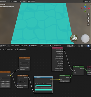


The more I delve into 3D, the more I realise how fluid the method is in creating certain creations. Anyone can create a rock. Although there is hundreds of ways to do it. Because of this, these YouTube tutorials can act as a guide. Although their methods are not set in stone and leave room for interpretation. I will use this to my advantage and make it my own. While they apply this to a flat plane for the sake of demonstration, I will be applying it to my shot.
While the shadow capture evaluation focused more on the final result and any issues that needed fixing, this will go slightly differently. I will go through a brief version of the method to highlight my understanding, then talk about scene applications and even alternative methods.
So you add a plane and go into material view (shading view). You would create a new material and begin applying the nodes to it. The emission node means no light or shadow effects it. This may not be idea if we want it to work with our existing scene. Adding a light path will create light interaction. Then using texture nodes, we can adjust specifics aspects of the qualities of the material. For example roughness, noise and variance. Adding a colour ramp will allow us to adjust the colour. MixRBG was especially useful. This let us mix colour information and it significantly contribute to the layers of depth. We can then begin to add mapping nodes to adjust the scale, rotation and transforms. The value nodes will change the scale of the water. Finally use multiplier nodes (math nodes) to multiply values together. If I wanted to make them move, I could use these value nodes to animate the water.


The node maps can be seen in the screenshots around my wix page. It was at this stage that I began to adjust the plane to fit my scene - where I make it my own. The scale of the water slabs was significantly scaled down to fit more in. The colour was changed slightly to a less vivid blue. Using the light/dark value on the colour ramp, I adjusted the brightness. The dimmed look definitely helped merge the water with the rocky pillars. That made my scene look like a natural fish bowl.

It did highlight an issue. Where the plane clipped into the rocky walls, a sharp outline occurred. It presented a clear issue that shattered emersion. My rocks and objects had no interaction with the water material/plane. This made it look severely out of place. The addition of the colour blue is refreshing and adds some much needed colour variation to the browns/oranges. However, it is because of this that the water stands out so much. It becomes the centrepiece of my work - which will immediately draw the viewer to any faults. Lastly, due to the emission node, none of the shadows the rocks cast affect the water. Thus making the shadow capture useless except for extra shade. With the barren floor, blended colours from the light and casting shadows, the scene worked better. The water takes away too much while feeling incomplete itself.
Moving the shadow capture up made it interact with a middle light. This spotlight creates the look of sunlight breaching the centre of my shot. An accidental discovery. It also explains the sharp line caused by the shadow capture with the pillars. It can now be explained away as a water line, with the rocks being damp from hightide. Narratively, it makes sense. Although visually, I personally don't like it.
To fix this, I did experiment with modelling the plane further. Seeing what that would do to the material. It did create some randomness. However, it now looked broken. Yet somehow the messiness made it fit better in the scene.
WATER SIMULATIONS - ALTERNATIVE METHOD - (1/4-5/4)

As stated before, there is more than one way to achieve the sense of water. So lets try a completely different method. This was new controls, taught to me in an extra 3D lesson. Lets try and use particles to create water instead of a material. We could even apply the existing material to the new form.
So this worked by creating an emitter (source) and domain (area of interactivity). We had to refresh the domain for the water to update. When going into the physics properties of the water, we can bake the mesh. So the water itself becomes a mesh. When this then comes out the emitter, it will interact with the existing models in my scene. That solves the interactivity issue. We do need to go back into (physics prop, fluid, type = effector, collision and refresh) in order for it to work.
This got as far as the screenshot above. Although shown by a teacher, I struggled to replicate the same results. And for whatever reason, the settings implemented in this shot did not save. Whether they were intentionally deleted during a demonstration or a lots save file. I didn't have this and began from scratch at home.
The biggest issue at first was the fact my scene was simple to big. Even with the settings of my emitter increased, there was simple to much space to fill. That meant the last bit of progress in this time saw my entire scene shrunk yet again. Except this time I simple re-selected all components rather than combine them. It just meant my camera and light will need re-adjusting before more progress can comence.
ASSET DESIGN - MINECART PLAN + CREATE - 29/3/22

MINE THEME EXAMPLES IN MEDIA - WARIOS GOLD MINE, POKEMON SWORD/SHIELD
MINING THEME MOODBOARD
MINECART RESEARCH
The state of my 3D background is going smoothly. However, it remains in an in-complete state so far into the project. While the backbone is present, so many key elements are missing. For instance, there are no key assets outside the base structure of the scene. There is still nothing to divert/capture the eye. So it's about time we began to model some smaller features to fill up our scene.

TurboSquid, n.d. Low Poly Mine Cart. [Online]
Available at: https://www.pond5.com/3d-models/item/96470271-low-poly-mine-cart
[Accessed 29 March 2022].


Terremoto, O., 2013. Rusted Mine Cart PBR 3D Model. [Online]
Available at: https://free3d.com/3d-model/rusted-mine-cart-pbr-9765.html
[Accessed 29 March 2022].
3DRcreation, 2018. Mine Cart 3D model. [Online]
Available at: https://www.turbosquid.com/3d-models/cart-car-3d-model-1306088
[Accessed 29 March 2022].


Now rather than dive straight into the 3D modelling like before, it's time I planned out my initial design. So I got to my sketchpad and begun experimenting with the design of my minecart. The minecart will help establish the mining theming of the scene much stronger. It will also act as a great point of scale, being similar size to a car in real life. Combine this with some TNT, oil lamps, rail tracks and other associated features, we can create a strong and deliberate setting. Thus, boosting the visual appeal of my scenery.
While I used many internet references, the 3 main inspirations can be seen above. Their influence can be directly seen in the sketches as the cart changes shape and structure.
The trickiest part was how to show the cart in multiple views. AS the model will be in 3D, I needed to design an object from multiple angles.


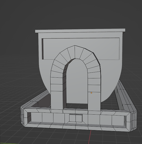
This lead to a rough model profile of a minecart in front, back, top and 3/4 view. Designing the model with multiple views in mind was a new experience but extremely useful in the long run. These traditional sketches were then translated into a 3D medium. Some aspects had to go through major adaptation. The simple existence of a u shape bend in the front and back connectors was proving difficult. I had to extrude via cursor, add in extra loop cuts and bride to the other connector. Then eyeball it from multiple views to make closely symmetrical.
If anything, the roughness accidently helps the model. Minecarts, in this case, are banged up after a long time of use. The mid-matched shape could be considered dented and distorted. The bottom frame also took many attempts to get right. From a simple rectangular bed to a steel beam like shape, it went through a lot. Although visually appealing it has a few structural issues.
The issue with hard modelling is you have to be wary of any facial overlaps. Extruding can quickly destroy the model and cause several major issues later down the process if not addressed. I learnt this the hard way with my spider model in the earlier project. As you can see in the screenshots, the face connectors got majorly screwed up. It would require me to completely remodel the lower part of the cart to fix. Consider it is not leaving blender, and the texturing will be very basic, it shouldn't be an issue. However, it is now extremely limited to what it can be used for. UV will not work and exporting it to other software will prove difficult. For the purpose of my scene (with a greater distance), the error will be covered up. Although outside that purpose it will simple not work. I have to be extra cautious when modelling for this exact reason.
ASSET DESIGN - OIL LAMPS PLAN - 30/3/22

This process was also started with the oil lamp. Although no 3D modelling has begun as of writing this, the initial sketch design are still present. Although these design follow directly with their image, while the minecart was adapted from multiple images. As a result, I would argue the design is not original and no where near as effective. Although I still created the sketch, so no reference is needed here. I will re-design this before implementing into my scene.
OIL LAMP MOODBOARD
NATIONAL TREASURE
INDINA JONES
I found that drawing out my assets before designing them in 3D really helped. It forces me to design for a 3D perspective before any digital software has been used. It means that by the time I model it in Maya/Blender, I already have an understanding of how each face will look. If anything, designing for a 3D model affects the traditional. I have to think how difficult it would be to replicate the drawing. Complex shapes need to be modelled whilst maintaining good topology. Pencil is much more free in comparison. I can draw any shape that comes to my head. Although I personally struggle creating a sense of depth. If I am not wary, my drawing will only exist on 2 planes, while I want to give the impression it lives on 3.
WEEK 6/7 - TRADITIONAL BACKGROUND FINAL
BACKGROUND COMPOSITION - 24/3

One of the key points that has nagged me for a while is the lack of focus point. The eye goes straight down into the centre, with all the pillars leading to that exact point. The floor itself is very smooth and featureless. I experimented with smaller assets, but where do I place them? the middle? To top it off, although the floor grounds the scene, much of the verticality is lost with the flatness. Where do I put these assets? While verticality and vertical depth has been achieved and pushed to an extreme, there is not a lot going on with horizontal depth. While the old pyramid 3D design had horizontal depth, it lacked vertical depth. I hypothesise that in order to look visually appealing, I need a balance of both elements. So it's time to break down the very core of my artwork and build it back up.
BLUE PERIOD COMPOSITION BIT GOES HERE
GOLDEN RATIO + OTHER EXAMPLES
This is where my project takes a massive turn. Up tell this point, my 3D scene has taken most of the spotlight. Although my proposal says to explore verticality and the comparison of multiple medias. Verticality was achieved in the foundation of my 15min sketch and my 3D renders. I even began to compare software's like photoshop and blender. While traditional techniques have been compared together (example pen vs pencil), there has been little comparison with the 3D software blender.
My main comparison will be between 3D as a medium vs dry traditional techniques such as pen and pencil. Heck, I could even further the pen and pencil debate further by combining the mediums to create an A4 traditional artwork.

COMPOSITION, BLUE PERIOD - RESEARCH - (24/3 - 29/3)
BACKGROUND DESIGN - TRADITIONAL - (24/3 - 29/3)
Composition is a key weakness of my art piece. Without an interesting composition, much of the visual appeal is lost. So how do I go about fixing it. Luckily 3D allows me to move my objects around the scene. Traditional methods would require me to start from scratch (or erase) and re-draw the new position. 3D gives me more freedom of manipulation of the assets in my shot. The issue being at the moment, half the objects are stuck together. That means I am still bound to a set shot. While some elements can move, the core would remain the same. So how do I make my 3D scene interesting?
To tackle this theoretical question, I decided to try a more experimental solution. Rather than move my scene around in 3D. I decided to go back to an old render. This highlights the foundations of my artwork before any issues arose. I then printed it off in order to annotate over the top of it. I am aware that blender has pen tools that done a similar job - maybe even better. As I found out, pencil is extremely difficult to see over ink, therefore not showing up in the camera shots.
So I got the print out and analysed my current composition. The perspective is a clear 1 point. This directs the eye into a singular direction - straight down. However, the way the rock warps, puts the shot in a double pyramid. My rocks triangulate into the point. This is great for leading the eye to the middle. Issue being there is no point of interest at the centre, nothing to grab your attention. Likewise all the surroundings only reinforce the middle, with little extra to offer. Using the print out, I could also draw a small version in my sketchbook (5-10min) and compare it to the previous 15min pillar sketch. What I noticed immediately is that the angle of the old pillar sketch is MUCH more angular than my 3D rough sketch. The original effect is not only achieved early, but better. I manually created a better warp of the camera in traditional than in 3D with settings.
The 3D sketch can be seen in the above screenshot. I also played around with similar shape, adjusting it into a star composition. This created a varied effect to before. The fact every pillar had a visible top, it made the viewer look much higher up than the pyramid sketch. Furthermore, the fact I let more breathing room in, gave the eye more room to wander. The pyramid captures and forces the attention to the middle, while the star distributes it evenly around my scene.


So we have established how slight changes of composition leads to dramatic changes of the artwork. What if I pushed this further? It would mean completely dis-regarding the layout of my 3D shot. Definitely a gamble at such a late stage of development. Although the pay off could be immense. I began lots of short sketches, breaking down what worked about the older piece. How overlapping objects creates depth. How size creates the illusion of distance. How much you can see the top of objects dictates the angle of viewing and how to build up the rocks to look more natural.

This lead to a small 15 minute sketches of a new scene. It still uses the same theming of a mineshaft. If anything I used the theme to directly inspire the composition. With a pre-established theme, I can use it to enhance the structural features to work with it. In this case, how the minecart track curves around the shot to guide the viewers eye all over the place. This directs them with purpose. When I become more experienced, I hopefully will be able to achieve the same technique more subtle. Right now it bold and direct.
BACKGROUND DESIGN - TRADITIONAL - (28/3 - 5/4)
TRACING PAPER IDEA - OTHER EXAMPLES
EVALUATION VIDEO - WEEK 8 BLOG
Below you can see the development of my traditional artwork. As of writing this (3/5/22), I have already recorded my evaluation. I would be simple going over what I talked about in text form. Granted, it would make it much clearer. With long videos, it is very easy to miss important details. Although I want to explore multiple angles to view my artwork. The video delved into the methodology and issues to tackle making this artwork. I wanted to focus more on the comparison of tools and techniques, 3D to 2D.


For example, deciding the shape of the rocks. The foreground rock changed shape multiple times during the creation of the traditional artwork.
For pencil, it required me to rub out several areas and re-draw over the top. The tracing paper layers made this easier. As any rubbing out marks left on the previous layer would be completely hidden.
Compare that to 3D, where a re-shape would simply require me to select the right faces and push/pull it in. Pencil requires to either draw on top of or completely remove and replace, while 3D allows me to retain the original object. A copy and paste will keep the exact og position.
In order to get multiple perspective during the creation of my work, I propped it up at multiple angles. Using paper weights, I would frame the work at my art class and walk backwards. I wanted to see my work from another angle. When staring too close, you will only focus on little details. Looking further back will let you see the picture as a whole. Now this was very tedious to prop up the work as it's stuck in an sketchpad.
In 3D I can simply move in a 360 degree movement to view any angle I want. This gives me much more opportunity for such an example. It means I don't have to adjust myself in order to see my work further away. Likewise, there is no danger of my work falling over and causing damage.


The tracing paper was directly inspired from photoshop layers. When I was applying the effect layers to my 3D scene, I began to wonder how I would translate this to a traditional medium. Tracing paper was one of the few ways to see multiple images overlaid upon each other. Without drawing over the top of and losing the work underneath it. Using paper would mean the work underneath would be completely covered up. Tracing paper is thinner and see-through. It reminded me of a 50% opacity setting.
3D, by nature, allows you to overlap and overlay assets upon each other. However, these layers of detail for specific areas are expanded upon other ways. When it comes to a single asset, you can add detail through the use of modifiers and materials. Materials open up the world of texturing to draw on detail onto your assets. I went for a simpler approach of applying base colours to selected faces to enhance the details.
This means I have the capacity to draw in traditional techniques, scan it onto pc and layer those upon my 3D models. Likewise, I can print off rendered images of my 3D an draw over the top in traditional techniques. The more I worked, the more ways I discovered how to combine the 2 mediums. This was surprisingly to be sure. As I had the mindset of them being 2 completely different art forms before this project.
The evaluation of my traditional vs 3D digital will continue in week 7.
WEEK 6 BLOG - HALF WAY MARK - 5/4/22
123, T. R., 2022. FMP YEAR 2 HALF WAY MARK - WEEK 6. [Online]
Available at: https://www.youtube.com/watch?v=lFfxmBx687Y
[Accessed 5 April 2022].
WEEK 7 (4th to 10th April)
TRADITIONAL COMPLETE - 6/4/22

This is the greyscale layer of my art piece. It was my first attempt in establishing my light direction and my basic shapes.
The line art (pen) layer, re-defined the shape. Areas I was happy with were given sharper lines. And other areas would go through complete re-adjustment. It also meant I could play with line thickness to highlight certain areas. That is something that I would struggle to do in 3D with my current knowledge. The thicker lines made the darkest areas stand out significantly compared to the rest of the scene. I did make the mistake of cross hatching the middle area of the dark scene. While this did deepen the contrast, it also lead to texture where it wasn't needed. I had to go over the top and attempted to redefine the shape, but at that point I could only minimise the damage.
Likewise, first attempting to establish lighting was very difficult. My first attempt was far to flat. While I showed a clear light source on the right of the shot, illuminating the left, there was far to little contrast. Even the final result I would argue it is far to bright in context of the setting. The scene is set underground, so unless natural light is breaking in, so the lighting doesn't work. I was able to increase depth through the placement of detail. Rocks in the foreground have a lot more detail and texture than rocks further behind. Likewise, areas of visual interest (such as the cave and minecarts) also possess extra details. The path is deliberately kept plain. This is to provide a clear path for the eye to navigate the chaos of the landscape.
And finally, I added in smaller assets to emhapsise the mine theming.


To help fix the cross hatching texture issue, as well as the flat lighting, I decided the final layer will be to sharpen the darkest areas. I can cover up the cross hatching with a thick layer of pencil, which would be no where near as effective without the layer difference. I can also use the bottom greyscale layer as a map for my lights and darks, emphasising the contrast further. And I also added small touches of pen on the top layer to solidify the shapes underneath. With each new layer, detail is lost. So sometimes it is important to redo previous details.
In a nutshell, I can only describe this as a balancing act. Any details can be covered up but not easily removed. While I possess more control with the extra layers, it is still difficult to keep the balance.
Tracing paper has a very soft texture. So multiple layers of tracing paper created an 'old film' like quality. Shapes would be smoothened due to the texture and decreases in opacity. The paper is also not colourless. Tracing paper is a creamy/light brown. The more layers you add, the more apparent it gets. So while small and less significant at first, it builds up with each new layer.
I would argue this adds to the artwork. it gives this scene an old timey effect and adds to the overall theming. It feels dusty and dated. I personally get associations with old western films. This may be to the rocky, dryness of the overall shot.
In a way, you can even make a case for the old 3D scene. The ovular hole on the right could be where the decent begins for that extreme vertical camera angle.

Feedback for Traditional Artwork + Brief Comparison to 3D digital
This is covered in greater detail within the next blog.
Much of the feedback for this piece was verbal, so it is difficult to document onto Wix. However, there were common trends amongst what was said. For starters, everyone preferred this to the 3D render (render 4/5). Much of it had to do with the new composition. Composition is a fundamental piece of an artwork. A good composition can save a bad artwork. Very simply, the 3D render has a very basic composition. It is a view straight down, with everything leading into the centre. Whilst it enhances the verticality to extreme levels, it also destroys any chance for horizontal depth. there is no where else to explore, nowhere for the eye to wander. Whereas the traditional mine scene contains both elements. And while there is an intended path, I have created small indications of sub paths to explore.
WEEK 8 - 3D DESIGN BACKGROUND
3D PROGRESSION: 11/4 - 14/4

With the feedback of my traditional artwork in mind, it is time for SEVERAL MAJOR CHANGES to our 3D piece. It is difficult to compare 2 artworks when 1 of them is unfinished.
So we need to get it to a state of near completion. Cause at the moment it is not a fair contest.


For starters we are removing the water. It was a good idea in theory. Although I soon learned how tricky it is to get right. With the blue complimenting the orange hues, we could of had something special. Although because of this, all your focus is on the water. And because the water is incredibly un-refined, it brings down the artwork massively. So the most time-efficient thing to do is remove it.


I also experimented with click extruding a path around the rock, bringing aspects of the traditional composition into my work. However this was incredibly difficult to control and led to a huge mess of meshes. So we will tackle composition another way.

This section is all about solving the issue we currently have, rather than creating new part to the scene. Once the base of the shot is fixed, we can build off it.
Another huge issue that plagued my 3D scene was the damn floating rocks. Since the very beginning of creating this, much of the rocks have been floating in mid air. That is exactly why we created the floor and later the water in the first place.
Although when we added the floor to stop all the floating, much of the smaller rocks were completely covered up. So at last I discovered a compromise. The floor was lowered to re-add the missing assets. I then copied and pasted more rocks directly underneath the old rocks, further altering the shape by rotation, scales and slight transformations.
Finally, I altered the material of the walls to a deep red, distinguishing the walls from the floor.


The stalagmites were also changed to contrast with the colour of the rocks. To top it all off, I also transformed the camera to go further back, creating more distance between the viewer and the shot. All of this created and achieved exactly what I was trying to do. The effect the old 3D background (verticality exaggeration) has been refined and pushed as far as it will go - without new techniques that is. Any change from here will be to add something new to the scene that was not present before. It is at this point that the most drastic changes will take place.
Furthermore, I added block out concrete pillars for the fire to reside in. These are simple rectangles atm with a little detail. Although what it does at this stage is give the lighting a direct visual source. We now have an item giving off light in our scene. Rather than the scene being lit by nothing. This adds some more clarity to the world I am trying to create.

What I loved about the scene, prior to the floor being added in, was how deep it sucked you in. Your attention was drawn to the centre, a bottomless void of an area. Although once the floor was added in, even with the camera adjustments, much of the original verticality was lost. I also wasn't a fan of how smooth the floor was, almost looking like glass over rock - incredibly unnatural.
To solve this, I began to cut up the floor using the loop cut tool. I went completely random in placement. The only rule I gave was to have more cuts in the middle and less on the outer parts. The complexity of the shape will help guide the eye. Then I carefully began to extrude up and down. Overlapping extrusions could cause huge issues later down the line - learnt that lesson the hard way.
This lead to a new form of world building. I was creating a path through the ground the guide the eye, similar to the traditional piece. I had to be aware of how my viewer would react, where their eyes would wander and how to direct them round my scene. I used the same method of thinking in my traditional and applied it to my 3D. My main goal was to create areas of rest to help navigate the chaos. Before there was simply no where else for your eyes. This at least would create platforms to focus on. I especially like where I extruded down, as the big void has now been scattered into lots of smaller pieces. This did go wrong at first, extruding along the edges created this 'honeycomb' effect. So extruding along the face is a must. The viewers attention has been divided up and scattered around the page. The initial verticality is now back. Although the rest of the shot has been transformed. There is now a clear path to direct your eyes across the artwork. There is the introduction of horizontal depth, very much missing before this experimentation.
3D PROGRESSION FEEDBACK + PRESENTATION 2 - 15/4
Once again, I put it into discord. So this is yet another way to present my work down the line. Instead of sending to people in private messaging, I instead posted it in public servers. This gave me more potential viewers and meant I don't know anyone who sees it. This will hopefully remove any previous bias from my last feedback - where they know me personally.
It also classes as a form of presentation, as I am showing off my artwork to an audience, this case being other amateur artists.


I showed my 3D background at different stages of progression and screenshotted the response from other artists/viewers. While there was a lot of praise, which means my visual appeal is increasing, there were also many questions. For example, "what's this for?" (alexmitchell, 2022). This could imply that the purpose of the art is still unclear. Another asked if "this an underground mining type of environment?" This is great as there was no queue except for the artwork, to imply this was a mine theme. That means my theme is being communicated successfully even without the smaller assets.
I then posted a later version of the artwork. The responses can be seen in the screenshots below. The lighting was praised by 'seven cats...'. The vibe was praised by 'georgina/Genie'. Me and 'Alex had a string of messages talking about the work, asking questions such as what software. And finally 'Siren!!' saying "I'd so play a game in this style omg" (Siren!!, 2022), which was my personal favourite responce so far.


I noticed that posting in Discord got me a lot more messages than posting in Instagram or Facebook. While more people liked the Instagram post, showing proof that more people saw it, more people on discord (dc) commented. This provided more specific responses and highlight what aspects people loved. Both were posted with a similar audience in mind, art students. Or shall I say, people with an interest in art around 13-25 years old. That is the audience my Instagram art account and this DC server targets.
Although In Instagram, I can look up the analytics of my post and see exactly how many views, likes, impressions and overall interaction I get. Discord doesn't provide such data. So while discord may be better for feedback, Instagram would be better for gauging the overall interactions and response to my artwork. That is why I am leaning towards Instagram for my main presentation.
That don't mean there is no drawbacks to this. An issue both Discord and Instagram share is who sees it. Just because I have 5 random people love it, that don't necessarily mean my artwork is good. I have little to no way to gage the experience/credentials of random strangers. Furthermore, both audiences ALLREADY HAVE AN INTEREST IN ART. That means they are more inclined to like what they see through association alone. This clear bias could mean my results are not as useful. I back this up by bring attention to the fact that all my feedback in public servers have been positive. No one either sees, or is willing to say, anything bad about the artwork. The only time I have received critique on my artwork has been in private chats or face to face interviews. My hypothesis as to why is the introduction of anomality. People don't want to be judged by others. When there identity isn't attached to what they say, the response changes. People aren't afraid to kick the hornets nest if no one knows who they are.
Some of my most useful feedback has came from one on ones. Even if I know who said it, no one else does. This also applies to private DMs. It is confidential between me and the person I am questioning. There aren't any other eyes. So going forward, I could always conduct an online survey to proof this idea. Until I back it up with more evidence, it is only guessing. I am personally still on the mindset of posting it on many social medias at the end. The more I post the artwork, the more potential viewers to see it. Although I also need to evaluate weather social media is the way to go or if there are better alternatives. That is where my presentation currently stands.
WEEK 8 - BLOG
3D VS TRADITIONAL: 11/4 - 17/4
123, T. R., 2022. fmp 2 - week 8 blog. [Online]
Available at: https://www.youtube.com/watch?v=8UECEu7alk0
[Accessed 2 May 2022].
Rock Photographs - 21/4/22


During a school trip that I went on recently, I took some photographs. The site in question was a mic of modern and industrial design, post-modern. It also emphasises nature significantly. This section will be gone through in more detail in the 'presentation' tab of my Wix site.
Now I played with the idea of photography weeks ago during my project. I initially photographed a stick with leaves on my drive way. The reasons for why can be seen in that section. Although in a nutshell, I wanted to explore another direction of primary research. At the time, my project was secondary research dominated.
This is that idea put into action. There was a public park located on site containing big rocks. It was simple a matter of right place at the right time. The sun was strong with little clouds in the sky. That meant the shadows were clear cut and interference was low. The rocks were also separated into their own spaces, so none of it's shapes were hidden. This meant I had many clear examples of in real life rock to act as a visual reference.
The rocks are sharped edges with clear angles. Although the corners are not jagged, worn down by weather and humans. Compare that to my incredibly sharp rocks. We are going stylised, although I still want mine to make sense. I also got some close ups of the texture. While it wouldn't fit my scene at all to go for realism, it is still a great comparison to make. The surface is smooth with constantly changing colour. There are still rough patches and the shape is constantly rising and falling at a small level. My rocks are much more exaggerated, with steep surfaces. The planes are also uniform until you hit an edge, unlike the changing shape of the irl rock.


Likewise, I also took photos of this steel beam. It is build to dangle heavy things off it to be used by the stage/floor below. The experience of travelling and touring the backstage centre was incredibly fun and useful. It provided me the opportunity for much photographic research and great insight into branding. The branding and business side of the experience will be talked about in the 'presentation' tab of my project. As I visited in person, my experience of the day is primary research directly helping my project. That means I now have 2 new primary sources of research directly supporting my project, on top of the feedback I initially had.


TEACHER FEEDBACK - BACKGROUND RENDER 5 - 22/4

ROUGH NOTES
Far too much information, every rock stylized and eye-capturing.
scene is too busy/chaotic.
colours are extremely similar.
Solution
Group together clumps,
like the space of top right.
Smaller assets will fill in the space.

The rough notes are the feedback I received from my teacher Jay. At this point of development, I fixed many of the issues plaguing my scene before. All the original ideas have been refined. However, I am at a point where I would struggle to see what to do next. In other words, I need the unbiased opinion of other to see fault with my work. Personally, I know I am too invested in my artwork now. This tends to look at it with rose tinted glasses. While I can add more to it, for example the mining theme object, I need someone to point out the issues. And that is exactly what Jay did.
The shot is simple too crowded. The rough notes point out exactly what needs to be done and I intend to address each point. Combine that with my new asset plan and this shall be complete.
MINECART PART 2 - 25/4


As expressed earlier, there was several modelling issues with the frame of the last minecart. If not fixed now it could cause several major issues later down the line.
Luckily, we are at such an early stage, I can simply restart. I took what I learnt in attempt 1 and tried a new form of my methodology. For Instance, I first tried making a rectangle and cutting a hole in the centre. This time I decided to model the frame with the hole in mind, rather than cutting into the shape.
Small changes like this added up to a more structurally sound model. That means that I if decide to go into a UV unwrap or a form of texturing, I won't have visual issue unlike before.
The rest of the changes were more for the practical sense of the cart, rather than fixing prior issues. For examples, it makes sense there will be metal guards to protect the wheels. While there is still significant space to allow the wheels to turn. the wheels and lower frame did not exist before, that is all new.
The wheels are modelled to they fit either side of the bar to guide the cart. There is a bar an axle underneath the cart to keep it steady. You could argue you won't see the bottom, so it is only taking up space. However, it gives us more options and angles to play with.
I would love to turn this upside down in my shot. I would love to destroy it partially. if I can tell a story through my assets, then my work will increase to another layer of depth.
For sizing, I used the block out of the top part with the frame. Although there is now a clear stylisation difference between the 2. This means a third day will be needed to finish this asset.


WEEK 9 - BLOG
Minecart and College Trip: 18/4 - 25/4
123, T. R., 2022. fmp2 - week 9. [Online]
Available at: https://www.youtube.com/watch?v=eK1RZ7yIfME
[Accessed 5 May 2022].

27/4/22
The rough notes I made during the creation of my work have been screenshotted above. These act as a form of diary and reflection of my work. What I have done, my own thoughts and what I plan to do next. It acts as a outline for my evaluation and of each section/. I do intend to write up each as well. As the above can be developed to greater detail.

So the biggest issue with this current render is how busy the centre is, especially the top left/middle. it is too crowded and much visual information is lost in chaos. There is an overload on the viewer and it detracts from the overall affect.
I designed it so the further away from the centre you get, the more space opens up. Likewise the centre would be the busiest area. However, the middle is too busy.
So to solve this, I began to move smaller rocks that were not serving a purpose, only taking up space. I need to de-busy my scene and also make room for other assets later down the line. I then started experimenting with modifiers to reduce the information shown. When every individual object is eye-catching, everything blurs into one. We need areas of rest in order to define areas of busyness. We need dull areas to make other areas more appealing.
A bevel modifier reduced the sharpness of the main pillars and walls. The rock photographs from the backstage centre day had clear 'smooth' edges. They are not glass shards or blades. I also went onto the blender website and searched through their manuals. It was there I re-learnt how to assign materials to objects. This meant I could manually change parts of my objects to now possess multiple materials. Using this, I changed part of my middle rock into similar colour of the walls. This created a divide in the rock that breaks up the most chaotic area.
Blender Manual, n.d. Assignment. [Online]
Available at: https://docs.blender.org/manual/en/latest/render/materials/assignment.html
[Accessed 27 April 2022].


The specific cave area was slumping into the scene, loosing much of its shape. So I extruded on top of this to give it a hard edge again. Combine that with the material change, that entire area was transformed.
I also noticed the walls needed MUCH MORE WORK. For instance, I can tell the extrusion were random, cause there was a ridiculous amount of overlap in the material. Luckily this doesn't affect a rendered shot of a fixed camera. However, if the camera was to move, it could reveal some nasty issues out of frame. Likewise, my scene was desperate for a entrance. I want my shot to make sense in the world I am creating. it's a mine scene, so how do the workers get in?
I took the walls, selected certain faces and dragged them back into the darkness. A combinations of extrusions and transforms later, I have formed a cave entrance. I even re-aligned the stalagmites to frame the cave entrance further.
The extrusion issues are clearly evident in the screenshot on the left. That is the overlap I am talking about. It is out of shot, but if animated elements became prominent later down the line. It could cause some issues if they are seen in my camera shot.
To add even more room, I did attempt to create a 2nd opening (smaller than the first) in the far left. However, the topology was in ruins for this section and after much deleting and extruding, it only worsened the scene. I was forced to delete all this and cover it up. Modifiers can also cause the render to slow much more considerably, with much more information now to process per image. This will have to be monitored with further changes.


FIRE TUTORIAL - 28/4/22
IdowhatIwant, 2022. Blender Stylized REALTIME MESH FIRE TUTORIAL. [Online]
Available at: https://www.youtube.com/watch?v=3m0JkeK4m8E&list=LL&index=4
[Accessed 28 April 2022].
The rough notes below show my understanding of the method shown in this video. Similar to when I wanted to create water, I turned to YouTube for a new skill. And I stumbled upon this tutorial. Now this was a bit different to the water tutorial. For starters, it is only a few minutes long. The creator went at breakneck pace through the steps. They assumed you already had a solid understanding of the software. This made some steps extremely hard to follow.
I turned back to the blender manual to discover what emission was. While I could add the node easily, I had no idea what it was.
Blender Manual, n.d. Emission. [Online]
Available at: https://docs.blender.org/manual/en/latest/render/shader_nodes/shader/emission.html
[Accessed 28 April 2022].


There were many new tools that I would NEVER of used until this point. For example, the Displace modifier. This essentially re-distributed my mesh into a new shape. The soft select, while I knew before, I completely forgot how to use.
Versluis, J., 2015. How to use Soft Selections in Blender. [Online]
Available at: https://www.versluis.com/2015/04/how-to-use-soft-selections-in-blender/#:~:text=Soft%20Selections%20are%20those%20that,(as%20in%20the%20letter).
[Accessed 29 April 2022].
So I had to slow down the video at 0.25 speed to see exactly what buttons were activated. I also onto other websites to support my solution.
Turns out it was the buttons in the above screenshot to this text. And once I knew the control, the method was easy.
The displace could also be altered in the lowest tab. I essentially assigned a 'marble material' to it. This altered my tear drop shape to a 'ice cream cone' shape. In the location tab, by typing #frame/10, I could auto animate it and pair it to an empty.
Blender Manual, n.d. Empties. [Online]
Available at: https://docs.blender.org/manual/en/latest/modeling/empties.html
[Accessed 29 April 2022].
When the empty moved, the model changed. That is how the video created the movement of flame.
The rest of the magic occurred in the shaders. Similar to the water tutorial, it was a matter of following the nodes. Then it was just a matter of adapting the settings to my own needs.


The last node web can be seen in the above. I didn't follow the tutorial to the end. I took at as far as I needed to. I learnt and discovered how to create a stylised flame, with ideal animation and art style.
The flame I created can be seen in the video below. While I enjoyed the process it still had issues. I initially could not find the bloom in render settings. Or the alpha blend and no shadows. These steps were not shown in the video and I have never used them before. so I had to spend 10-30min exploring tabs just to find these tick boxes. Instances like that made this process extremely slow to learn. But once I have done it once, it will be significantly quicker to make.
The tricky part is what comes next. I need to adapt this to my shot. I first attempted to export this directly into my blender shot. However, none of the nodes saved. The only thing that transferred over was the mesh and animation.
So I decided to completely re-make it from scratch. The outcome was yet again different. This new skill took multiple days of experimentation to learn and days more to get right. I had a lot of fun learning this. And in a way, my journey is coming full circle. I attempted to learn 2D fire in my fmp year 1. And now i am doing the same in 3D.

Art, T., 2022. Fire Animation - 3D Blender Shaders | Torrent Art. [Online]
Available at: https://www.youtube.com/watch?v=aKQY1Ev5zMQ
[Accessed 13 May 2022].
FIRE APPLICATION TO SCENE


manual, B., n.d. Material Settings. [Online]
Available at: https://docs.blender.org/manual/en/2.79/render/cycles/materials/settings.html
[Accessed 29 April 2022].
So the flames in my final shot were create from scratch in the shot blender file itself. This was because of extrusion issues as mentioned earlier. The mesh and empties were both re-sized to better fit the scene. Initially, they were far to big, to the point where they were the same size as the minecart. Torches are not the same size as vehicles. And this lead to the scene becoming far more flat than before. If the scale of the items that fill the scene do not make sense in scale, it will lead to everything becoming flat.
Likewise it seemed that the scale of the mesh (or maybe another factor) affected the speed of the animation. When dividing the #frame command by the normal amount, the mesh moved much slower. So instead of doing/10, I decided to do /2. The more time my animation goes on for, the longer it will take to render. And the longer that takes, the less variations I will be able to create.
And finally, I animated the point lights (specifically their power) to give the illusion of alternating strength. This method, although simple, opened up a wide variety of combinations and results. I could use the lights to control the eye around my scene. When a light gets brighter, the viewers attention immediately is drawn to that area. Like wise, dimmer lights will mask other areas, creating an effective contrast. And the possibility of animation means these areas are not set. So it was a matter of fine tuning and small adjustments.
LIGHTING EXPERIMENTATION


This change in lighting wasn't without it's faults. For instance, the rendered image was far more lit than the viewport version. It completely altered the atmosphere and destroyed any small fine tunes made earlier. Turns out that the render picks up on all emitting light sources, even if they are hidden in the viewport. So I had to manually delete any excess lights to make sure it was only the fires giving out light. The difference can be seen clearly in the screenshot above.
The rough notes above and below apply to this section.
An issue I discovered earlier with the flame size is that if the scaling don't make sense, the shot looses a lot of it's depth. This was even more clear where I began to add the minecarts to the blockout.
Because the 2 carts were exactly the same size. The shot became more flat. That is because the difference in height is not enough to sell the vertical distance alone.
So when I add in the finished assets, I will need to make sure they are not taking away from my scene, rather adding to it.
To further guide the viewers eye. I also added 2 smaller flames next to each model. By faintly illuminating both, it should hopefully draw the viewers attention there. But the effect of this will all depend on the brightness of the rest of the shot.


MINECART AND TRACK


This was the point where I decided to just get the cart done. I have spent to long on a single model, on and off for weeks. This will get done today!
So with the lower part completely re-modelled, the cart no longer worked. The frame was angular and sharp, based off the steel frame photos. The top was still very smooth and rounded, based off the mine theme moodboard. Also my background is still incredibly sharp. While elements have been softened, the overall shapes used are still triangular.
The part of the frame to hold the cart was also simplified down. Because of the amount of topography issues with this action before, it wasn't a risk I wanted to take.
My methodology was also different to before. I was more focused on the appearance of the model in object mode. This should of been a factor before. However much of my prior attention was in face mode.
Overall, I was extremely happy with the final minecart. The different material colours will help it stand out from the background. The little circular rivets really give it character. One of the few circular objects in my scene.


Hopefully the slight differences in shape used help it stand out amongst my other assets.
The minecart track was also modelled slightly differently to before. The metal tracks were made thinner to match the new wheels. And the planks of wood were made thinner, yet have a greater surface area. So now they look like wooden planks instead of wooden blocks.
I initially grouped together the cart and the track in the export. I did this to avoid the problem of lining the cart up once the track was added in. Issue being was angling the cart afterwards to better suit the camera angle. So I re-exported it as separate objects, which worked much better.
There was a few issues to fix with adapting them to the scene. For instance, when tampering with the model in the background shot, I accidently created a visual glitch in the render only. This was where I deleted one of the planks. It ended up staying, growing twice as long and at a funny angle. Surprisingly, this actually helped my shot, making the rail tracks look even more out of commission. This is what we can a happy accident.


The lighting on the cart worked brilliantly! The varying materials off the object brought so much more clarity to the shape than the other assets in my scene. And because of this, it stands out amongst the rest! I did have to change the inside so to distguinish the rim. But beside that a great success.
And in doing so, I stumbled across yet another problem, this time to do with rendering. As you can tell, rendering has been a subject in the back of my head for a while. And after messing with the settings, I realised just how deep the issue can go. By simply converting it to cycles instead of eevee, it would take a literal hour to render a single frame of my animation. The light and shadow information (with the varying and constant changing lighting) was too big. Eevee does not produce the same quality of render, although for a simplistic art style, this won't be an issue. If I was going for a realistic art style, this would have been a huge headache.
We are getting to the point where the artwork is almost finished. With only a week or tow left, I feel relieved to see the light at the end of the tunnel. It has been a massive struggle to balance the tasks this project provided.


Art, T., 2022. Torrent Art | 3D Environment Design - Render Shot 1 - No Audio | 1/5/2022. [Online]
Available at: https://www.youtube.com/watch?v=7QQ1Xvbe5KY
[Accessed 1 May 2022].
A key element that I need to talk about is scale. I have already evaluated how the size of my flame affected the flatness of the artwork. Well I took what I learnt there and applied it to the minecart. With both now in the scene in a finished state, I took a before and after shot of scale. With the minecarts the same size, that flatness returns. However, when i make 1 slightly smaller and the other scaled bigger, the depth is enhanced.
To immerse the viewer further. I animated a basic zoom into my scene. This immediately brought back a lot of the previous verticality from the beginning. As you watched each item get closer, the contrast of sizing is shown more.
WEEK 10 - BLOG
3D FINAL PUSH + PRESENTATION: 25/4 - 1/5
123, T. R., 2022. fmp2 - week 10 and 11 BLOG. [Online]
Available at: https://www.youtube.com/watch?v=GZWjUGGWBFs
[Accessed 5 May 2022].
WEEK 11
UNPLANNED ADJUSTMENTS: 1/5 - 8/5
Art, T., 2022. Mine Tunnel - 3D BLENDER Environment Part 2 - 2/2 Progress. [Online]
Available at: https://www.youtube.com/watch?v=BZiXC6p8zpM
[Accessed 8 May 2022].


Problem solving is an important part to any project or artwork. Every action will have consequences, these results will always cause another new challenge to solve. All the previous experiments in lighting has caused some major issues on their own. And with all the new changes to my scene, now is no exception.
For a full breakdown, watch ALL THE BLOG VIDEOS.
The final touches of my work saw me changing the material colour of my meshes greatly. I also done several experiments with lighting. While the lighting from before was good, it was very basic. There was little colour variation to the artwork, all oranges and reds. I wanted to add clear variation and contrasting colours to my artwork. So I looked at a colour wheel and found blue to be complimentary to orange. With this information, I added 2 separate area lights to cash a blue hue across my artwork. This can be seen in the screenshots on the left.
I also experimented with different colour light at the bottom of my scene and slight variations of hues. This all eventually lead to the very bottom screenshot on the left.
DOLLY ZOOM
FINAL EXPERIMENTATION
Finally, I wanted to link this back to the very beginning of my project. I decided to research and study Alfred Hitchcock during my proposal. And although the writing section was lacklustre (something I would definitely change given more time), I did dive deeply into his film work. And his dolly zoom seemed to be the prefect solution to creating the sense of vertigo I was aiming for.
Since then, I found other ways of introducing vertigo and playing with verticality. But I wanted to see what my scene would look like if I acted upon my original idea.
Turns out the dolly zoom itself is easy to achieve in Blender. You simply animate the camera to travel in 1 direction, while you adjust the camera lens up or down to counter act the distance. This leads to an almost 'trippy' effect, seen in the video on the right.
The hardest part was to get a sync between the 2. While I can animate both, the distance travelled in the given time is not linear. There is ease in and out for both. So timing them to match up with each other became surprisingly difficult.
When comparing the dolly zoom and the regular zoom in, I prefer the basic zoom. It is easier for my eyes to track. it also gives me more time to appreciate the artwork. While the changing lens completely alters the shapes of all objects until it comes to a stop. This is likely because I modelled my meshes on a set lenses, so changing that lens creates drastic changes.
CloudMixer, 2020. Blender Tutorial: Dolly Zoom (Vertigo Effect). [Online]
Available at: https://www.youtube.com/watch?v=rYv7qImA_RM
[Accessed 8 May 2022].
Art, T., 2022. dolly zoom attempt 1. [Online]
Available at: https://www.youtube.com/watch?v=aln3MUUE2cM
[Accessed 8 May 2022].
WEEK 11/12
FINAL BLOG - ENTIRE YEAR 2 FMP + WEEK 11/12: 1/5 - ?/5
123, T. R., 2022. FMP YEAR 2 - FINAL EVALUATION. [Online]Available at: https://www.youtube.com/watch?v=bEubw0Z2VBQ[Accessed 12 May 2022].
BIBLIOGRAPHY - PRODUCTION
DeWeese, M., n.d. nammiches. [Online]
Available at: https://www.pinterest.co.uk/pin/384143043199261492/
[Accessed 10 March 2022].
Amidi, A., 2013. Layout Artist Maurice Noble Didn’t Get Along With Chuck Jones. [Online]Available at: https://www.cartoonbrew.com/animators/layout-artist-maurice-noble-didnt-get-along-with-chuck-jones-86696.html[Accessed 10 March 2022].
CriticalCharm, 2019. CHUCK JONES, MAURICE NOBLE & THOMAS ROMAIN ARE GIANTS. [Online]Available at: https://www.criticalcharm.com/blog/2019/8/art-giants[Accessed 10 March 2022].
Alameddine, R., 2018. Maurice Noble, Animation Background from a Wile E.Coyote and Roadrunner cartoon. [Online]
Available at: https://twitter.com/rabihalameddine/status/1018220530732679168
[Accessed 10 March 2022].
123, T. R., 2022. blog week 3 - fmp year 2. [Online]
Available at: https://www.youtube.com/watch?v=Km60LnT3qzU
[Accessed 16 March 2022].
Group, T. a. F. ed., 2009. MASTERS COLLECTION: VOLUMN 1. In: DIGITAL PAINTING TECHNIQUES. Milton Park, Abingdon, Oxon: Focal Press, pp. 44-46.
Beskow, C., 2016. Structure: How to train your dragon. [Online]
Available at: https://www.thestorydepartment.com/how-to-train-your-dragon-structure/
[Accessed 16 March 2022].
"Porn", r., 2011. Forest Pillars. [Online]
Available at: https://www.reddit.com/r/SkyrimPorn/comments/4mkrqw/forest_pillars/
[Accessed 16 March 2022].
UpIsNotJump, 2018. Skyrim VR is An Absolute Nightmare - This Is Why. [Online]
Available at: https://www.youtube.com/watch?v=u1n2rqNf04I
[Accessed 17 March 2022].
McKalin, V., 2014. Forest pillars in China [Wallpaper]. [Online]
Available at: https://dottech.org/144876/forest-pillars-in-china-wallpaper/
[Accessed 16 March 2022].
Minube, 2007. Zhangjiajie National Forest Park. [Online]
Available at: https://editor.wix.com/html/editor/web/renderer/edit/87626b01-8195-4ea3-a729-84c7e4ec1d31?metaSiteId=9c686ea4-4226-44d2-92c3-0d21ef736557
[Accessed 17 March 2022].
Minube, 2007. Zhangjiajie National Forest Park. [Online]Available at: https://editor.wix.com/html/editor/web/renderer/edit/87626b01-8195-4ea3-a729-84c7e4ec1d31?metaSiteId=9c686ea4-4226-44d2-92c3-0d21ef736557[Accessed 17 March 2022].
Wikipedia, 2022. Zhangjiajie National Forest Park. [Online]
Available at: https://en.wikipedia.org/wiki/Zhangjiajie_National_Forest_Park
[Accessed 17 MARCH 2022].
Sarah Seabaugh, n.d. i'll make ya famous. [Online]
Available at: https://www.pinterest.co.uk/pin/337066353334065555/
[Accessed 17 March 2022].
Gail, n.d. New York From Above. [Online]
Available at: https://www.pinterest.co.uk/pin/432416001703311834/
[Accessed 17 March 2022].
Bolton, C., n.d. Gears of War 4 | The Coalition - Art Dump. [Online]
Available at: https://www.pinterest.co.uk/pin/351914158390741732/
[Accessed 17 March 2022].
Knuutila, A., n.d. Mountain Texture. [Online]
Available at: https://www.pinterest.co.uk/pin/294634000633564137/
[Accessed 17 March 2022].
ArtStation, n.d. EVOLVE, Peter König. [Online]
Available at: https://www.pinterest.co.uk/pin/408349891215022957/
[Accessed 17 March 2022].
ArtStation, n.d. Rock, 口天. [Online]
Available at: https://www.pinterest.co.uk/pin/651755377329369710/
[Accessed 17 March 2022].
Campbell, J., n.d. What Are You Working On? 2015!!! - Page 97. [Online]
Available at: https://www.pinterest.co.uk/pin/604115737523367198/
[Accessed 17 March 2022].
Wagstaff, P., n.d. Rawk - Post any rocks you make here! - Page 20. [Online]
Available at: https://www.pinterest.co.uk/pin/511299363948798189/
[Accessed 17 March 2022].
123, T. R., 2022. Week 3 BLOG - FMP YR2 - turn volume up!. [Online]
Available at: https://youtu.be/4yjSSJ6z584
[Accessed 27 March 2022].
TutsByKai, 2021. SHADOW CATCHER TUTORIAL - BLENDER 3.0 EEVEE. [Online]
Available at: https://www.youtube.com/watch?v=gzAr3VyLMOY&list=LL&index=3
[Accessed 23 March 2022].
torrent_art, 2022. Background "Mineshaft PART 1.. [Online]
Available at: https://www.instagram.com/p/Cbfa9uKgkYa/
[Accessed 25 march 2022].
123, T. R., 2022. WEEK 5 - FMP YR 2 BLOG. [Online]
Available at: https://www.youtube.com/watch?v=prDm1NEJL3k
[Accessed 27 March 2022].
SouthernShotty, 2020. Toon Water Shader - Blender Tutorial. [Online]
Available at: https://www.youtube.com/watch?v=P99WGAZf20s
[Accessed 1 April 2022].
TurboSquid, n.d. Low Poly Mine Cart. [Online]
Available at: https://www.pond5.com/3d-models/item/96470271-low-poly-mine-cart
[Accessed 29 March 2022].
Terremoto, O., 2013. Rusted Mine Cart PBR 3D Model. [Online]
Available at: https://free3d.com/3d-model/rusted-mine-cart-pbr-9765.html
[Accessed 29 March 2022].
3DRcreation, 2018. Mine Cart 3D model. [Online]
Available at: https://www.turbosquid.com/3d-models/cart-car-3d-model-1306088
[Accessed 29 March 2022].
123, T. R., 2022. FMP YEAR 2 HALF WAY MARK - WEEK 6. [Online]
Available at: https://www.youtube.com/watch?v=lFfxmBx687Y
[Accessed 5 April 2022].
123, T. R., 2022. fmp 2 - week 8 blog. [Online]
Available at: https://www.youtube.com/watch?v=8UECEu7alk0
[Accessed 2 May 2022].
123, T. R., 2022. fmp2 - week 9. [Online]
Available at: https://www.youtube.com/watch?v=eK1RZ7yIfME
[Accessed 5 May 2022].
Blender Manual, n.d. Assignment. [Online]
Available at: https://docs.blender.org/manual/en/latest/render/materials/assignment.html
[Accessed 27 April 2022].
IdowhatIwant, 2022. Blender Stylized REALTIME MESH FIRE TUTORIAL. [Online]
Available at: https://www.youtube.com/watch?v=3m0JkeK4m8E&list=LL&index=4
[Accessed 28 April 2022].
Versluis, J., 2015. How to use Soft Selections in Blender. [Online]
Available at: https://www.versluis.com/2015/04/how-to-use-soft-selections-in-blender/#:~:text=Soft%20Selections%20are%20those%20that,(as%20in%20the%20letter).
[Accessed 29 April 2022].
Blender Manual, n.d. Empties. [Online]
Available at: https://docs.blender.org/manual/en/latest/modeling/empties.html
[Accessed 29 April 2022].
Art, T., 2022. Fire Animation - 3D Blender Shaders | Torrent Art. [Online]
Available at: https://www.youtube.com/watch?v=aKQY1Ev5zMQ
[Accessed 13 May 2022].
manual, B., n.d. Material Settings. [Online]
Available at: https://docs.blender.org/manual/en/2.79/render/cycles/materials/settings.html
[Accessed 29 April 2022].
Art, T., 2022. Torrent Art | 3D Environment Design - Render Shot 1 - No Audio | 1/5/2022. [Online]
Available at: https://www.youtube.com/watch?v=7QQ1Xvbe5KY
[Accessed 1 May 2022].
123, T. R., 2022. fmp2 - week 10 and 11 BLOG. [Online]
Available at: https://www.youtube.com/watch?v=GZWjUGGWBFs
[Accessed 5 May 2022].
Art, T., 2022. Mine Tunnel - 3D BLENDER Environment Part 2 - 2/2 Progress. [Online]
Available at: https://www.youtube.com/watch?v=BZiXC6p8zpM
[Accessed 8 May 2022].
CloudMixer, 2020. Blender Tutorial: Dolly Zoom (Vertigo Effect). [Online]
Available at: https://www.youtube.com/watch?v=rYv7qImA_RM
[Accessed 8 May 2022].
Art, T., 2022. dolly zoom attempt 1. [Online]
Available at: https://www.youtube.com/watch?v=aln3MUUE2cM
[Accessed 8 May 2022].
123, T. R., 2022. FMP YEAR 2 - FINAL EVALUATION. [Online]Available at: https://www.youtube.com/watch?v=bEubw0Z2VBQ[Accessed 12 May 2022].