WEEK 7


123, T. R., 2021. looking up - old work fmp. [Online]
Available at: https://www.youtube.com/watch?v=-zo4waoU11g
[Accessed 9 May 2021].
So for a reference to where I was, I uploaded some of my old animations from months ago. This was where I was. Here is where I am now...
The above animations are very simplistic, lacking many features of a regular face. The line art is either incredibly thick and extremely sketchy.
Now this is not a clear representation of my skills now, more of where I once was.

Animation Progress 9/5 - 10/5
Now this new head animation is arguably even more sketchy. However I would say that there has been a huge improvement since. You can see my progress and ideas in the blog to the right.
For starters there are over 100 frames, a huge jump in sheer quantity. It took around 4-6 hours to animate (which is a long time considering it's just a head).
A clear issue is that the sketchiness is even worse than before. I would argue that the animation is too early in process for this to be a big problem. The ideas was to go over the shape to draw in my character anyway. However I need to evaluate what I made, not what I was going to make.
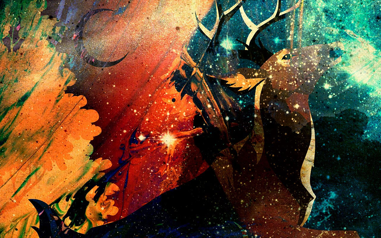
The movement is extremely unnatural, this was the aim. The women is a demon, I wanted to unsettle people and show that although it's human shaped, it is very not human.
I have already talked about exporting issues on the previous production page of my wix site. I also visually cover this in my blog. On a different note, I did attempt to incorporate animation principles into my animation. The main focus was squash and stretch on the vibration rebound. Exaggeration was also used on the way down. Although they are effective in the purpose of making the movement more dynamic, I reckon I should of leant into it more. If I was distorting the shape, I should of gone all the way. Also the vibrating head.
The animation itself is also seen on the right. I would say that the biggest issue is how incomplete it is. This is because a major change of direction occurred when I received the feedback below regarding my illustration.
Positively, it made me realise how big my ambitions really were. The original idea was to tell an entire story, then a 30 second story and now a 3 shot animation. The first shot of 3 ended up as 130+ frames. This means that my idea would likely turn into 400+ frames, a tall but manageable order for my current time. What I intend to do is to carry on with my animation into a more complete state so I can gather feedback and improve it further.
123, T. R., 2021. 9 to 11th May Blog. [Online]
Available at: https://www.youtube.com/watch?v=aJce_sr6kms
[Accessed 11 May 2021].
Art, T., 2021. 2D Animation Practice - Head Movement - 9/5/21 | Torrent Art. [Online]
Available at: https://www.youtube.com/watch?v=CfHEv6r9DOg
[Accessed 9 March 2021].
Camera Angle - 10/5

Now most of my research has been with still images whether it is poses, still flames or Japanese references. There has been very little in terms of movement. In previous projects, my attention has been focused with animation principles and the movement of fire in particular. In terms of cinematography, very little has been done. So I sat down and explored camera angles. Camera angles can add so much more meaning and emphasis to a shot. My front facing drawing could look dynamic and dangerous given the right angle. Likewise, a character can look fragile and vulnerable. The plan is to explore examples of camera angles and see how I can incorporate it into my animation.
Video Rough Notes
Camera angle examples
Low angle – eyeline looking up at item (makes subject more powerful, heros and villains) – lion king
High angle – beats character down, used with low angle a lot. Exaggerates imbalance between characters. Used to diminish character (weak, vulnerable) Example, avengers 1
High angle aerial shot – establish environment/world
Overhead shot – 90 degrees above subject (birds eye view). Great for showing complex movement, connection to divine, capture detail.
Dutch angle – skews horizontal axis of shot (off kilter). Unease, mania, terror, bewilderment Example, mission impossible 1, magnify tension. Angle increase with tension.
Eye level shot – shot directly eye level, most common, most natural. No judgement. Example – wolf of wall street. Great for 4th wall break.
Shoulder level shot – 2nd most common shot, illusion of low angle, more subtle. Used for ots (over the shoulder shot). Emphasise height difference (could use for power difference), example – Deadpool 1. Barely upturned eyeline = affectionate glance. Example = westworld
Hip level shot – well known in western movies, gun holsters. Example – good, bad and ugly.
Knee level shot – camera placed at subjects knees height. Doubles as a low angle. Great way to track environment while following character. Showcase specific details missed in wider shots. Example – forest gump, matrix…
Ground level shot – camera right on the ground, sometimes below. Doubles with low angle. Stylish way to trach character through scenes. Details found in setting. Example – infinity war, shining.
Consider how angle/height affects the messaging. Be creative with choices, not just what is expected.
StudioBinder, 2020. Ultimate Guide to Camera Angles: Every Camera Shot Explained [Shot List, Ep. 3]. [Online]
Available at: https://www.youtube.com/watch?v=wLfZL9PZI9k&t=1s
[Accessed 10 May 2021].
The original source was from a website online, this branched off to multiple YouTube videos on their specific channel. For each video, I took rough notes while watching, then I watched a second time and paused it and any useful sections I missed. The rough notes can be seen. in black boxes (on this case on the left) on my wix site.
Now these videos were very informative. YouTube videos have been extremely useful when gathering videos to support my work. While I could of found this information in a book or a person if I was lucky. However the sheer accessibility and easy to use nature of the Internet makes it very useful as a research source. Also YouTube has been around for over a decade at this point, meaning that the range of recourses available is immense.
However quality varies greatly, ranging from armature videos to professionally made videos from companies. In its own, it cannot be relied upon. There is no system to vet for false info. Someone could make a video that is entirely lies and still be uploaded. Videos are incredibly helpful but needs to be back up by external sources.
The video above in particular was very helpful as a ground base, a starting point. It was from here that I explored high and low camera angles further.
What I could of done to support this research was to find an object and take photos of my own, exploring camera angles further. This would of given me some real life experience with camera angles and to test the effects described in the video. What I intend to do from here is to explore camera angles further and adapt them into my animations.
Low Angle - 10/5

Binder, S., 2019. The Low Angle Shot [Best Camera Angles in Film] #lowangleshot. [Online]
Available at: https://www.youtube.com/watch?v=HnZsFS8I4bQ
[Accessed 10 May 2021].
Video Rough Notes
LOW ANGLE
Camera points up at something.
Used to make character powerful, vulnerable or both… convey power. Makes character intimidating/frightening because of power. Angle just below eyelevel, subtle low angle (more heroic).
Can combine shot with movement for greater effect
Low ceiling/high floor. Room can make a sense of entrapment. Lord or the rings uses power and vulnerable at the same time.
The low angle was the first of 2 angle types I explored form the video above. High and low angles are extremely common in many films across the years. For example lion king uses low angles frequently when showing Mufasa. Low angles are used to convey the power of a character. But it can also imply vulnerability, intimidation and a frightening sense. You also have extreme low angles and subtle low angles. A subtle low angle can make your character seem heroic, powerful, sturdy even. Many western films use this for their protagonist to seem even more heroic, for example Clint Eastwood.
Using the room to box your character in. To be much lower than before can show confinement, vulnerability and weakness.
To make my character look powerful, a low angle following the flames up into an explosion would work nicely. A low shot would convey the power of the blast. This would be ideal for the third shot of my 3 shot animation.
High Angle - 10/5
Binder, S., 2018. High Angle Shots: 3 Towering Types of Camera Angles. [Online]
Available at: https://www.youtube.com/watch?v=b-nqxw9mvn8&t=1s
[Accessed 10 May 2021].
Video Rough Notes
HIGH ANGLE
Camera points down at something
Tight or wide. 3 main functions – narrative info, emotional responses or convey character.
Narrative shot – big and dramatic, sweeps over scenery. See more of world. Establishes context. Good for crowds and landscapes. Doesn’t draw too much attention. Shallow angle. Example – gladiator.
Visceral high angle – designed for vertigo, example Deadpool 1. Essentially an birds eye view or overhead. Camera points sharply down from a high place. Uneasy or anxious. Example – matrix 1.
Character driven high angle shot – makes character smaller or weaker. Used in many storytelling. Shows they are in trouble, on the run or mortal pearl. Example – hitch cock films. Shot screams danger.
Now a high angle is opposite to the low angle. Essentially it makes the character smaller and weaker. However it shares 3 core functions depending on how it is used. As told in the rough notes above, the high angle shot is separated into the function of a narrative shot, a visceral high angle or a character driven high shot angle. Their definitions and purposes can be found in the rough notes box above. Now this camera shot would be perfect for my first shot of the 3. Where the character is chained up and struggling to break free, a character driven high angle could emphasise the desperation and vulnerability present.

During this I decided to write my rough notes in word, then copy and paste it to my wix site. Due to how wix lags during save every 10 minutes it was easier to record notes this way. Now here is how I will adapt my idea for these camera shots. instead of having a 3 shot piece, it would make more sense to reduce it down to 2. Have shot 1 be a high angle shot to show the vulnerability and trouble the character faces braking the chains. Then flicker the shot to black, followed by silence. A close up of the character in a mass of energy and noise. Enter the next shot with a low angle, snap the chains and build into the explosion rocketing upwards. This contrast will enhance the effects of each while simultaneously cutting down on the workload.
This will streamline the timing better than a 3 shot and improve the overall effect of the animation. The weakness contrasted with strength, desperation contrasted with power and rage. This idea honestly fills me with excitement thinking about it. The camera research was an excellent addition to the fmp and will impact the final animation in a big way. I do think I could of done more though regarding camera angles. For example I mentioned above about taking photos of an object and document it's effects. I could do that with buildings, humans, animals... Although I am satisfied with where I got to, there is much more room to expand on this further.
Camera Movement - 10/5
Video Rough Notes
LOW ANGLE
Camera points up at something.
Used to make character powerful, vulnerable or both… convey power. Makes character intimidating/frightening because of power. Angle just below eyelevel, subtle low angle (more heroic).
Can combine shot with movement for greater effect
Low ceiling/high floor. Room can make a sense of entrapment. Lord or the rings uses power and vulnerable at the same time.
StudioBinder, 2020. Ultimate Guide to Camera Angles: Every Camera Shot Explained [Shot List, Ep. 3]. [Online]
Available at: https://www.youtube.com/watch?v=wLfZL9PZI9k&t=1s
[Accessed 10 May 2021].
Low Camera Angle Mood board - 11/5

These are examples of a low camera angle. Many of these examples come from films/film franchises such as Harry Potter, Batman and the Hobbit. Western genre films are especially famous for this, magnifying the heroic nature of Clint east wood. This can be used for villains as well. It emphasises their power and threat, Darth Vader is a great example here. On top of this there are also some low angles used for locations to vary up my collection. Mood board help me gather many example to draw reference from in a short amount of time. They are extremely easy to carry out and weald a good result. For most of the work I produce, I create a mood board for a selection of varied references.
High Camera Angle Mood board - 11/5

A benefit of using mood boards along side my camera shot research is the fact I now have visual reference to use along side the paragraphs of text that come with websites. Yes videos are also visual but mood boards allow me to show 40 still images at once over the 1 video pause. A high camera angle makes the character look vulnerable and much smaller than they truly are. Forced in the shadow of something greater. Backed into a corner against something far stronger than themselves.
My Previous Animations and Research - 11/5
12 Principles of Animation - Alan Becker - 15/1/21
This is a video on all 12 principles of animation, a video from a youtuber that I have been watching for years. Alan Becker is best known for his stick figure animation (for example his animations vs animator series). This particular breaks down the 12 principles in a beginner friendly way. I intend to use these principles when it comes to my own animations and my final character visual animation.
ROUGH VIDEO NOTES
1 Squash and stretch- animated objects will get longer and flatter to emphasise speed and mass. More squash and stretch, the softer the object. Keep volume of object consistent. Longer makes it narrower. Flatter makes it wider.
2 Anticipation – prepares for the action, makes it more realistic and tell audience what he’s about to do. E.G. Draws back arm to punch. Prepares them for the next action. Viewer has to notice the key info. Use it to control attention. Multiple levels available.
3 Staging - the presentation of any idea to make it clear – very broad. Control where the audience is looking. Far away is good for big actions. Close up good for expressions. Put in main or thirds of the screen. Has to be simple, proper timing. Let action finish before starting another. Text, read 3 times. Convey ideas, go over the top.

REFERENCE:
AlanBeckerTutorials, 2017. 12 Principles of Animation (Official Full Series). [Online]
Available at: https://www.youtube.com/watch?v=uDqjIdI4bF4
[Accessed 15 January 2021].
The notes above covers the main informative points of the video. Overall I was aware of about half the principles above, although I struggled to apply it to my work. It felt good to have all 12 layed out in a simple order. The one I want to try out in particular is the 'pass and pose' technique. I would of just used the 'straight ahead' technique up until now. This method works by drawing the start and end frame (the keys), establishing a destination, then drawing the extreme frames. They are the highest and lowest points of the movement. After it is just a matter of adding breakdowns (connections) and in-betweens, while getting the correct timing. Below you will find my attempt at incorporating this method in my diving board animation
4 Straight ahead a pose to pose- straight – animation as you go, could lead to character changing size. Although much better for being unpredictable, eg fire, water…
Drawing the beginning and end of each pose, more control. Do general shapes.
Overlap the 2 wien it comes to moving parts (eg ears, hair, clothes).
Keys, extreme keys, breakdown poses.
5 Follow through and overlapping action. Body parts drag behind the main body, drag. Follow through, continues to move when the body stops. Drag = delay. Tip of appendage, late to stop, follows through with action and goes back to rest. Drag says about his mass.
6 Slow in and slow out – how all movements start slow, build speed and end slow. Take extreme poses, draw in-between them and then them and… Make it non-linear (quadratic). Drawings evenly spaced
Arcs- most move in circular path. Slow in and out. Most movement follows arc. When fast, draw arc as a smear/fragment.
7 Secondary action- describes gestures that support the main action.
8 Timing – personality of animation is affected by the number of frames for each actions. Few drawings far apart – faster. Many frames mean slower drawing. 1 drawing made for every 2 frames is called 2s, at 24fps.
9 Exaggerations- every action, pose and expression can be taken to the next level. Need to exaggerate, if a character is sad, make him sadder. Wild – wilder. Not more distorted but more convincing. Make it bigger. Few extreme frames (make it more or longer). Go over the top and draw back
10 Solid drawing – make it feel like it’s in 3 dimensional space. Spears, cubes and cylinder to construct characters. Perspective lines. Be mindful of overlap. Avoid symmetry, too flat. Avoid twinning. Show it has weight and balance
11 Appeal – make characters appealing to look at. E.g interesting to look at. All standard different. Use variety of shapes. Play with proportions. Magnify what’s interesting, shrink what’s boring. Blow up parts that define personality. Keep it simple, drawing it 100s of times. Emphasise key details, don’t use too many.

Highfield, C., 2021. 12 Principles of Animation - Alan Becker - 15/1/21. [Online]
Available at: https://50543926.wixsite.com/mysite/task-2-1
[Accessed 11 May 2021].
For an animation, it is essential that I consider the 12 principles. Their importance cannot be understated as the make the very foundations of 2D animation. However, at this stage, time is a great issue. In order to complete my animation to a good standard, I will need to allow myself at least 2 weeks to finalise it.
So to save time, I decided to reuse some old work. The 12 principles (like the shape of story research) was already completed in a prior project. Simply copy and pasting it onto my wix site, acknowledging when and where I made it, is easier than redoing the same job all over again.
You could argue it cheapens my fmp, using work I have already completed from months ago. In terms of skills (such as writing, research and the overall process) I have improved greatly since I made this. If I was to delve into the topic once again, the quality would be a huge improvement over before. Also I know that this topic goes much deeper than I have covered above. It's just the fact I need to consider where to spend my time. Overall I still feel guilty about doing this but it is a necessary evil. I intend to reuse these principles to improve my new 2D animation going forward.
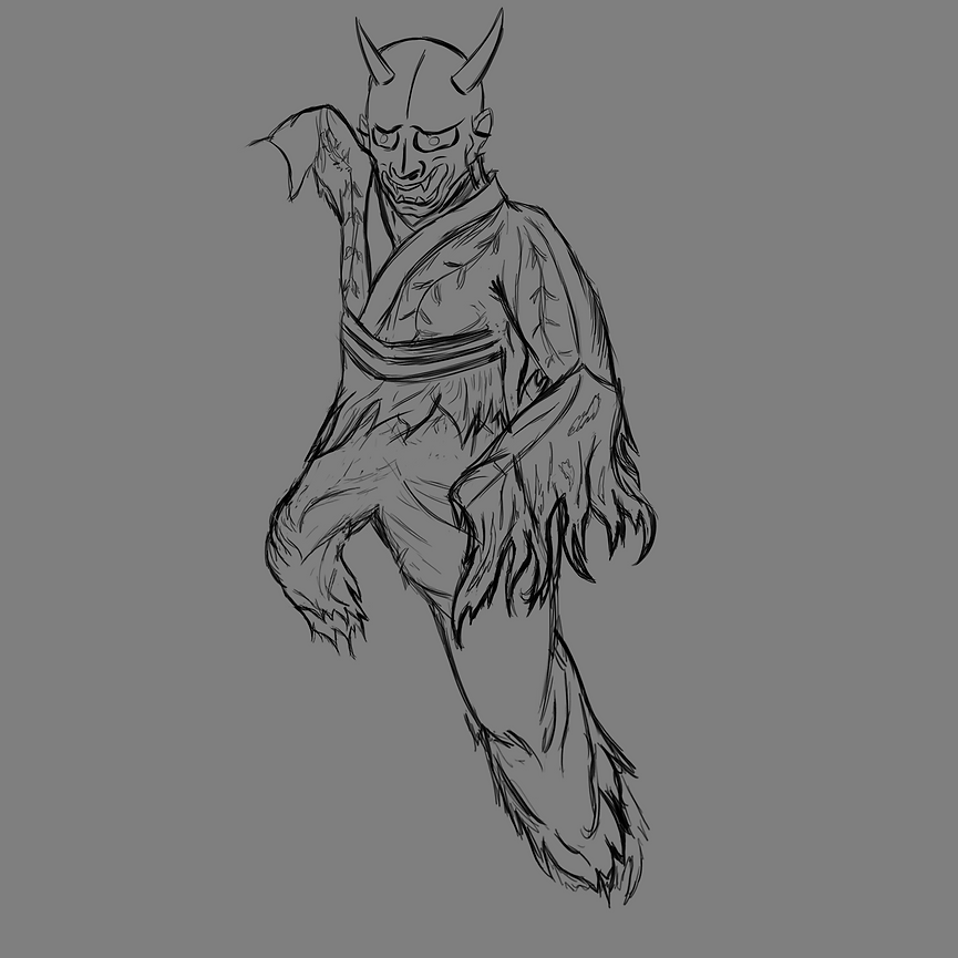
Adam's Feedback (Character No 4) - 12/5

This is the beginning of many redesigns when it comes to my character illustration. A lot of research has been completed leading up to this point, now it is time to produce some results. Although I struggled to find fault with this design initially, feedback from tutors made me aware of several errors. Most feedback leading up to this point was positive with only some minor concerns with the body position. However Adam shattered this illusion and tore it apart. Although it hurt to see my creation destroyed I will admit it was worth it. His feedback has lead my character to drastically evolve over the space of a few weeks. I was initially a bit hurt and definitely annoyed but overall I knew it was for the better. I fell in love with my own work and became too attached, I needed someone to point out the errors in order for my to improve.
For starters, he said the fire looked like fur. The flames were built up overtime using long, fine, strokes of colour. This lead to the flames being very brittle and cursed with the resemblance of fur. This may come in handy when drawing any kind of fur or hair down the line.

This is a easy fix that will take a lot of time. I need to make the fire "blockier" and although easy to carry out, will require a full redesign of my flames. Another issue with the fire is it's structure. Flames are heavily concentrated at the hottest point in the lower parts of the flame. It expands outwards as it goes further away from this point. However the argument can be made that my low flame is not built up enough at the bottom. The opposite issue occurs at the higher parts of the fire. It should be less built up, more wild and definitely expand out more than it has. The third issue is to do with the colour. Adam didn't like purple. I did not understand at first. It was later down the line that I realised what he meant. There is just too much colour here. Not only are they highly saturated the sheer quantity and range of colour hurts the eyes of the older generation (or adults for short). While kids love colour, those that have grown older find colour good in quality, rather than mass. The simple fix to this is to use colour with more intention rather than for the sake of using it.
It is becoming clear that a full change of art style is required...
The issues don't stop there. Having multiple sources of flames is a bad thing. With the flames caused by the lava and the fire of her hands, it results in a confusing mess. Not only that, but it is hard to make out where the fire hands start, it's origin. Because how the fire is placed (hands area), it is not clear if the hands are the source or the clothes are the source. The fire will have to be thought through before I proceed.
So the new plan is to re-attempt the illustration using the feedback gathered above. For starters it is clear that the whole art style needs to be re-vamped. A suggestion from Adam was to lean further into the Japanese art style. He was already aware of the influence because of the dress, mask and line art. However by altering the overall style I will be able to fix many of the errors told above. So examples of Japanese work will be essential moving forward. And a final suggestion was to use cherry blossoms instead of flames. This would force me to use a "splodgier" style (fixing the fur issue) while keeping to the idea of my Japanese influence. Overall this feedback was invaluable for progress and I intend to act on it. If it wasn't for this interview with my tutor, my project would look completely different.
New Plan - Illustration and Animation Idea - 12/5
So the new plan going forward with my project is this. I will keep developing my illustration while reducing the animation significantly. I could do a 300 frame animation which would come out extremely rough and maybe rough round the edges. Or I can do 12 amazing frames of a fully designed character in an art style similar (and just as complex) as my illustration. It would be the most complex thing I have ever animated. I'm not just talking about line art but colour, shading, lighting and dynamic movement. The drawback is the fact it's a single second long. However each frame will be a master piece and take MUCH longer to produce than normal. I can still show a range of skills and show how I have progressed in such a short time. However before the animation, I need to improve the illustration, that is my priority at the moment.
CHARACTER NO 5 - Wednesday Lesson - 12/5
The same day I received the feedback, I was told by Adam to produce a new illustration. Normally I would wait until I got home and use my set up. It's what I'm most comfortable using. However he was adamant I start immediately which meant I had to produce a illustration on unfamiliar equipment, which meant even the most basic of tools became more difficult to use. The most annoying issue that resulted from the equipment change was the drawing tool. My graphic tablet has a screen at home, it was just a touch pad in school. Instead of looking at my stylise to draw, I had to look at my pc screen instead. It essentially comes down to personal preference but I personally prefer a screen. This combined with all manner of inconveniences made this incredibly hard to draw, although it lead to some of my best character designs.


The biggest obstacle to overcome was the art style. I was told to lean into the Traditional Japanese art style greater in order to convey my theme better. The previous design had Japanese influence but was largely my own style.
However before all this I needed to draw the base line art and establish my idea. Using the principles I learnt from blended learning, I started with the line of action. The pose was already established in a reference photo that can be seen in screenshots of my character. A key issue with the old design was that the pose was incredibly stiff, which was the point with my character being locked up. However this is no longer the case and therefore the pose must change. I will be making my own pose further on in my official illustration. However, while at school, using an existing pose was easier. The Pose isn't the focus, establishing the new art style is. On top of the line of action, I also sketched the basic shape of the character.

Pinterest, n.d. This item is unavailable | Etsy. [Online]
Available at: https://www.pinterest.co.uk/pin/232287293264937115/
[Accessed 12 May 2021].
After this was all created (top left), it was time to draw the base line art. This was when I started to notice the drawbacks of the 'different' set up. As said above, I mostly struggled on the small pressure pad. I am used to drawing on a bigger surface and being able to see my hands when drawing. These issues had to be overcome but the solution itself was merely practice. The more I did it the easier it got, simple as that. This was a huge relief as the unfamiliar hardware was what originally throwed me off of drawing in class. Now I know I can adapt I feel much more confident in doing this is class.


The next part was applying and experimenting with the new style. Intentionally drawing in a different style is an experience I have had little off. It was touched upon in Project 1, task 2. That was a long time ago. The first thing I noticed was how the reference image (the cherry blossoms) conveyed shape. The lightest areas was bordered by a thick line. Actually the entire trunk was bordered by thick, splodge lines. It was the fact that the darkest part of the shadow matched the same shade of the lines, which was why I didn't notice it until further reflection after this particular illustration was complete. For this style, I was forced to create brand new brushes. Now personally I prefer to use the standard set of brushes (with small variations) or download brushes online. Custom brushes was a skill I have that hasn't been developed. I have had to create them in the past but have generally avoided it since Project 1, task 1.
This illustration forced me out of my comfort zone and as a result, I have improved significantly.
The thick lines were created out of many variations of 2 key brushes. This leads to another point. All the brushes I created in this lesson could not transfer over to my home computer. This meant that the experimentation I completed will have to be replicated or completely redone. The shading on the character had more focus on texture and lighting. Speaking of lighting, I had a small problem. At the very beginning of shading I started using the lighting from the reference image. However, my light source was angled differently to the reference. This meant I had 2 different light sources conflicting with each other. An easy fix but a frustrating one.
The next technique was actually a suggestion from Rosie. She reminded me of a tool called dodge and burn, a technique I discovered in project 2. The circle below was her example of how I can use this to show light/shadow. The key issue was the white areas. When shading a drawing, you intend to fill up all the space. Even in the light areas, pencil (or my case brush) can be seen. Only the smallest of areas have pure white for the brightest point.


The Japanese style has a much simpler colour scheme in comparison to my previous illustration. A huge issue with the previous attempt was colour, it was far too random. This design stripped down all the colour to it's essentially components. It plays well in maintaining the painted Japanese style. I also found that the lava simply did not work here. In maintaining the original style. For starters I couldn't find any depictions of fire in old Japanese art. The old lava style, even simplified did not sync with the new 'statue like' style.
This was essentially an experiment on all the brand new ideas that Adam introduced to me. The plan is to make another version of this at home where I have the time to refine and prefect the design. Overall I am happy with how this turned out, even with the limitations imposed upon myself.


TV Paint Brushes - 13/5
Now the illustration is important, however the animation is the main goal. A benefit of TV Paint over Animate, the biggest selling point, is brush selection. Technically, due to the fact you can import brushes externally, I have access to an infinite amount of variations. This is compared to Animates 2 custom brushes.
I have little to no experience in making brushes for this software. Although I am comfortable with making brushes in Photoshop, TV Paint is much more complicated. So I found a brush pack that would be ideal for the new art style.
This pack, downloaded form a link in the video on the right, contains enough variating brushes to produce the Japanese style proposed by the teacher and adapted by me. There are brushes ideal for sketching and line work. Some brushes blend well to create a more textured "oil pastel" effect. Others are great for splatter (will do wonders creating blossom).
What I like about this brush pack in particular is how many options I have to play with texture.
Positively, downloading a brush pack is an effective way of mimicking the new art style created in Photoshop. However, it would be a greater benefit (although take a lot more time) to make them myself.
Overall I am happy with my selection and this would contribute towards my animation nicely. I intend to use these to produce my animation and will likely explore more into custom brushes as the fmp progresses.
kdsketch, 2019. FREE TVPaint Brush pack / Sketching, Painting and Textures!. [Online]
Available at: https://www.youtube.com/watch?v=umsBRXlea2I
[Accessed 13 May 2021].

Japanese Art Research - 13/5


Japan Objects, 2019. Japanese Art: Everything You Might Not Know. [Online]
Available at: https://japanobjects.com/features/japanese-art
[Accessed 13 May 2021].
Japan Objects, 2019. Japanese Art: Everything You Might Not Know. [Online]
Available at: https://japanobjects.com/features/japanese-art
[Accessed 13 May 2021].

Japan Objects, 2019. Japanese Art: Everything You Might Not Know. [Online]
Available at: https://japanobjects.com/features/japanese-art
[Accessed 13 May 2021].

Japan Objects, 2019. Japanese Art: Everything You Might Not Know. [Online]
Available at: https://japanobjects.com/features/japanese-art
[Accessed 13 May 2021].

Japan Objects, 2019. Japanese Art: Everything You Might Not Know. [Online]
Available at: https://japanobjects.com/features/japanese-art
[Accessed 13 May 2021].
The next action was to look into traditional Japanese art styles further in order to help me make my own. This was a quick piece of research with much more opportunity to dive into further. Really I just required the visual references in order to gain what I needed.
Once again, although this was helpful, I should of done more research into this. I found 2 websites that had a small amount of background information on these images. However there was so many avenues to explore. For instance, if I was using images alone, then a mood board would of been more suitable. It would of provided a much greater pool of references to take note from. Other research sources would of also been more valuable such as a book or even a museum trip.
Many of the colours are very stripped down and muted. Fire is no where to be seen. What striked me as unusual was that people in Japanese paintings are completely different to the cherry blossom style I took inspiration from.
Some of the paintings are actually Chinese but with Japanese inspiration. Overall this isn't my most impactful piece of research but it did make me aware of 1 key fact. The new style I am working in isn't a traditional Japanese style. Mind you it fits the theme much better than my "character 4" illustration above. If anything it means that instead of being bounded by this very specific style, I can experiment more and slowly make it my own overtime. I intend to explore more images to use as reference to inspire my illustration.
Dynamic Pose Research - 13/5


Pinterest, n.d. Epic Struggle Poses for Genesis 2 and Genesis 3 Male(s) and Female(s) | 3D Models for Poser and Daz Studio. [Online]
Available at: https://www.pinterest.co.uk/pin/425308758564391516/
[Accessed 13 May 2021].
Pinterest, n.d. Stock Desenhos/Referencias: Referencia - Vista Superior e I. [Online]
Available at: https://www.pinterest.co.uk/pin/806285139520231660/
[Accessed 13 May 2021].

Pinterest, n.d. Drawing The Human Figure - Tips For Beginners - Drawing On Demand. [Online]
Available at: https://www.pinterest.co.uk/pin/806285139520086289/
[Accessed 13 May 2021].
Pinterest, n.d. Standing Base (Male) by SeishinHermy on DeviantArt. [Online]
Available at: https://www.pinterest.co.uk/pin/679551031265964423/
[Accessed 13 may 2021].

Pinterest, n.d. 3 Ways to Draw Spiderman - Improveyourdrawings.com. [Online]
Available at: https://www.pinterest.co.uk/pin/687361961859083852/
[Accessed 13 May 2021].

Now in the previous illustration, the body position was hastily thrown together with very little thought. So I decided to collect some reference images. Now the next illustration I designed was still based off an old image I collected. However I am much more happy with the new position. The images above were important in maintaining proportions and it refreshed my knowledge in human anatomy. It would of been a long time since I carried out the blended learning so any help available was great. You could argue that these images have little impact on the project. However this is not the case. The bulk of this research section was created between 2 illustrations that were a day apart. If anything, these images were quick references that I used alongside my next illustration. If I needed more body references, I would find pose images (like above). If the cherry blossom style was my main influence, then I would gather multiple references to use instead of just 1 (hence the mood board below).
The research was hastily put together and was effective in short, sharp bursts. It did the job I intended and I am satisfied with the result. If I was to do this again, I would delve deeper into each areas and attempt to find a wider variety of sources, not just internet images.
Cherry Blossom Research - 13/5

The very centre image is the main reference I used in my previous illustration. I broke down the style in the evaluation for character no 5 but ill go over briefly here. the cherry blossom artwork is very "splodgy". Most are painted, lines are very thick and bold. Colours are very minimal. The cherry blossom was the main inspiration for the new style and a recommendation from Adam, this provides many more references to pick from which in turn benefits my illustration.
CHARACTER NO 6 - 13/5


I pride myself in the pose. The first pose was essentially a carbon copy of an image, a very rushed idea as well. This pose is still highly referenced from an existing image but will evolve overtime with redraws. With all the illustrations to come from this, essentially redraws of the this particular one, the body is adapted into something more original.
Like before, I start with the line of action and map out the arms and legs from there. This gives me a rough guide to my body position. After the lines of balance are implemented I can roughly get an idea of body position and angles especially. Line art is finally drawn on top of all this and can be seen in the first 3 images.
Now the next stage, like last time, was to establish my light direction and start on the thick outside lines. The lightest areas have a very distinct thick outline that isn't necessary completely straight. To mimic the paint effect, I created a new brush that splodges, rather than just a singular thick line. It provides much needed texture and is closer to the main reference of the cherry blossoms.


Using a brush I can only describe as "gravel", I begun on the shading. The previous attempt used more of a "cloud" brush in shading. This new brushes has many small circles that provide a more "grittier" feel. These ways of describing the brush may not be the common way, merely how my mind interprets each. It felt good to use and I had a lot of fun in the making of this art work. Whiting out the character gave me a greater idea on it's silluette. Also be selecting that specific layer, I was able to keep my shading within the character line art and not worry leaking into the background. The shadows were built up over many layers, as you can see in the exported shots. Dodge and burn was essential in keeping lighting consistent and without it this artwork would of been much harder to create the necessary tones.
Looking at this after the artwork was finished, I would say this is also an area of improvement. The lights could be much lighter in comparison to what was made. Likewise I would argue the darks need to be darker, but only in selected areas. The shadowed areas all merge as 1 due to a lack of variation. Certain areas could be darkened further to help break the shape up more.
In terms of anatomy, I am happy with how it turned out. I did notice through feedback that the head is much longer than normal. The mouth and nose are oversized. These features being out of proportion lead to the character looking less visually appealing, more villainous. By skewing the features, I accidently had the happy surprise of making the character look more evil.
The flowers of love were still added to the design, although difficult to see amongst the mostly greyscale art piece. The biggest difference (besides the style refinement) are the legs. The last 2 illustrations had lava flowing from the waist. However this lead to several issues. For starters, according to feedback from before, having multiple sources of fire is bad. Not only that but I would also be forced to have the fire travelling straight up. And on top of that, the colour choices just clashed with the greyscale minimal colour aesthetic (evident from the previous attempt). The final nail in the coffin was the pose. It worked when the legs were covered by the dress. However having the legs on display really gives me the opportunity for far more dynamic poses. The advantages of the posing with the issues of visual conflicts lead to the lava being cut from the illustration.


The last area of note is the flames themselves. Having the fire originate from the hands was also experimented with in the previous design during lesson. However at the time my own mental state held me back. I was exhausted by the end and was not able to use my head to think at all. This lead to the tutor having to spoon-feed me the design idea for me to understand, which lead to a very basic design previously. This time I focused on the flow the most. Where it originated from the hands and how it would travel as it travelled further away from the body. The flame was most focused at the source and broke up as it got further away. The flames themselves were designed more as smoke trails with flashes of red. The muted colours gave the artwork a much colder colour design, despite using a colour as hot as red. In my personal opinion it makes the fire look mystical and unnatural.
Overall I am happy with how this design turned out. It takes all the ideas explored in the lesson attempted illustration and refines them down to make something truly special in my eyes. This is my best character design so far in terms of research and visual aesthetic. If I was to do this again, I would of experimented more with the flame. The style was very random with it being a final thought over having proper time to develop digitally. What I intend to do is to gather feedback to see what other say. This is a huge step up over character 4 (the multi coloured design before the lesson one (character 5)). This is officially my 6th design.
Character No 6 FEEDBACK - 14/5


Now the first place I looked for feedback was Instagram. I uploaded a post (as you can see in the screenshot) as well as sending it to some dms.
This was one of the few that got back., They preferred the brighter colours of the 4th attempt. Warm was the way to go.
Likewise, having the flame shape and style of the 4th was preferred over this new one (the 6th). Overall they didn't see to many issues with it, most of the issues came down to personal preference.
Now I showed 2 of my 3 tutors the new design and got a LOT of feedback. Adam's feedback was done over google teams while Scott's was an interview that took place in class.
Adam tore it apart. The biggest issue was the silluette. A successful silluette has both arms and legs visible in the shot once the character has been covered up. The arm was positioned in such a way that it folded in on itself, making the lower arm vanish in the drawing.
There was also a glaring issue in terms of angles. It was not clear which leg was in front. How the character is drawn, the left leg should be in front. However I drew both legs at the same distance form the camera, which meant neither were significantly bigger than the other.
Those were the 2 biggest issues. Scott agreed with the problems Adam brought up and added some more on top. The right leg looked like a block due top the mass of darkness covering it, the shape will need to be broken up.
Also he mentioned the thick outer line of the light area. Because of how thick it really is, it gives the impression of a shadow rather than a thick line.
All this will need to be fix going forward.

For a more detailed explanation of what each person said, these screenshots act as proof and an elaboration of what happened. The interview only consists of rough notes. Although the interview documentation is limited in comparison to the other method of social media, the benefits of talking face to face in invaluable, providing much easier communication.

ILLNESS - 15/5, 16/5
Now I have deliberately made sure I am doing a little bit everyday to not fall behind. However, it was at this time that I came down with illness. This meant I was in no condition to do any school work when there was a week tell the deadline. This was a huge issue and completely screwed up my plans. Also with all the new feedback I need to do a lot of huge changes to my character 6 design. This means that the actual animation will be tight to complete in time. I don't know until character 7 is finished but I might have to scale it down again. Which will be disappointing to say the least.
IF it comes down to perfecting the illustration and shrinking the animation then it'll just have to be.
WEEK 8
Character No 7 - Feedback Improvements 1 - 17/5
OLD LINE ART

NEW LINE ART

So character 7 is an improved version of character 6. While all other character attempts have very different designs and identities, character 7 is the most similar to it's previous counterpart. I removed all shading, textures, lighting and background to reduce the drawing to basic line art. Re drawing the body from scratch will take much longer. I wont to keep as much of the original design as I can.
Although the changes in body position and line art is clearly evident in the screenshots above.


When looking at proportions, I immediately noticed the left arm was smaller than intended. I had to rotate it anyway to fix the silluette issue from feedback. It lead to completely redrawing the arm. However I also reckon that I drew the top half of the arm far to big. The cloth should hang off the elbow, it sticks out far to much! Speaking of cloth, the torn up, hanging areas, were also redrawn to be less stiff. It was definitely a step in the right direction but more work would need to be done here at a later attempt. The head was one of the few line art elements that was either redrawn or transformed to fit the new body.
Not erasing the lines of balance was a huge help when scaling it back. I was able to use old layers from the character 6 design to help maintain the body pose of the original. Character 4's body was incredibly stiff while character 5's had many issues in it's silluette. I intend to fix both of those in this art work. The body was redrawn for a "nicer" shape. While the chest is more front on, the clothes twist much more than the previous attempt.
I made a huge discovery that should of been obvious from the start. THUMBS! They were the wrong way round! A simple fix at this early stage but a very necessary one. Most of my time was spent fixing anatomy issues and re-angling the body. I will say that it looks much more natural than the previous pose. It is still heavily inspired by it but flows much better.
The legs was another huge issue from before and took many attempts to get right.


As you can see above, I redrew the legs (on a separate layer) and used the lasso tool to readjust it's position on the canvas. The left leg stuck out far too far for any human. There was also the issue of size. To make 1 leg stand in front of the other, a size difference must be clear. So the left leg got enlarged whilst the right shrunk (with minor angle changes). It came down to a matter of trial and error. It made the character look like they were crouching rather than a very wide squat of before.


The feet were also drawn from scratch. The feet of the previous attempt were more like claws. However the Hanya demon is sourced from a human, not an animal. However I found with a simple reference, this was an easy enough fix. The biggest problem of the redraw was the shading. I did not expect the amount of line art adjustments that had to be done in order to fix the anatomy errors of before. With the legs, chest and both arms redrawn, none of the original shading fit into the lines anymore. The above screenshots show the only original shading left from character no 6. The rest of it had to be done from scratch. This was done by creating duplicate layers of the character and erasing everything except the needed areas. I would then lower the opacity of the shading and move it above the new line art. Use the transform tool to resize it and erase everything outside of the lines. This work particular well for the legs and the left arm, but did not for the rest. I found that because the shape changed so significantly for the torso and right arm, the light and dark areas no longer matched the body. The light source would affect these areas differently. So only around half of the shading was transferred across. It also meant to my original art style for character 6 was adapted yet again into a new variation out of my judgement. It also means that my artwork was slowly becoming more distant from the original art style in class.


Pinterest, n.d. pink birb. [Online]
Available at: https://www.pinterest.co.uk/pin/490118371938120387/
[Accessed 17 May 2021].
Taptara, X., 2011. How to draw foot 5 different ways. [Online]
Available at: https://www.youtube.com/watch?v=8HHnwNkvISQ
[Accessed 17 May 2021].
Character Feedback Improvements 2 - 18/5


The shading was redone with the same brushes as last time, with a few new ones to help merge with the old shading better. I attempted to break up the shadow in the right leg to remove it's "blocky" nature. Screenshots of my attempts can be seen above and how it progressed to the final shot below. The line art was also doubled up to retained the drawing in detail, otherwise it would be lost in darker areas.
The hair was also redrawn, much more wilder. This is a creature that hides in caves and travellers paths. It won't be well kept. Clothing is already torn, so the hair should also look unkept and mad.


ORIGINAL PLAN:
17th and 18th - illistration work. using feedback above...
18th and 19th write up
20th to 26th - aniamtion
27th/28th - evaulation
Did it work... No, instead I finished the piece on the 18th and was told info on the 19th that completely changed my plans, again! It seems every time I set a deadline it overruns and the idea changes/evolves in a completely different direction to what is intended.

Everything I have said above all combinates into the design you see on your let.
This design fixes many problems with the prior attempt while keeping a very similar design. However I can see the style slowly adapting overtime. Compared to character 5 illustration, the shades are far smoother in comparison. The art style has adapted overtime and although this is good, I feel like the intend behind the original Japanese style attempt has been lost. Mind you I am still very happy with how this came out.
Positively, I have been able to fix many of the errors from before (silluette, legs, thick line art...) while improving on existing areas (torso, position, hands, feet...). The leg is also no longer a block. If the last illustration was my best 1 yet, this improves upon and fixes the flaws of the original. However I also feel like in doing so, I have created an entire new set of issues. The right hand just darkens into oblivion. I actually prefer the long left arm tares of before over the new set.
The hand has little shading and show little impact from the diagonal light source. The hair has definitely improved, it's much longer and messier for starters. Compared to how thick and unrefined the last set of hair was, this is a clear step up. If I was to do this again I would of done the colouring/shading completely from scratch. Cutting up, transforming and merging layers together lead to far to much hassle than needed. With so much line art changes, it would of made sense to redo all the shading instead. Also I missed the flame part of the illustration in this. Granted the last fires needed a lot of work but it's missing altogether here. I am happy with the result but in my opinion, far more needs to me done to this illustration. It is a good piece but an unfinished one at that.
Adam Feedback - Improvements 1 - Char 7 - 19/5

The redesign took into account the feedback of before. The left leg was brought into the front, the arm moved to fix the silluette issue, the bold lines thinned, the right leg shrank and adapted to not look like a black block. Almost all the feedback I received I acted upon. The plan was to complete the fire today but I got new feedback from Adam unexpectedly. I showed him the wix website with my screenshots above. I showed him the comparison between the old and new line art and how I fixed the errors of before.
He had 4 big issues with the drawing. The first were the legs. Although the size of both were changed he said they are still too similar in size to deduce which was more dominant. The right arm was far too big for his liking and looked out of proportion with the rest of the body. The knee of the right leg jutted out far too much as well, the cloth should drape over the top of it, not stick as far out as it does. In this regard, the left arm is far to small. Because of how similar each side was to each other, the drawing looks flat once again with only a vague idea of which side is in front.
The problem is depth.
Depth is the reason why all my character drawings look so flat. I originally thought it was the slight off angles coupled with the perspective. It is depth that my drawings lack. If I can fix the body position (e.g. the size of the features in relation to how forward they are to the camera) then my character illustration will significantly improve.
To tackle this the tutor took a photo of me in the body position I wanted to draw. Turns out my original position is far to stiff and unnatural to hold. The side has now changed, the legs are closer together and, as expected, there is a clear view of which side is now front and which is back. This photo will provide me the depth necessary to improve my character. Once the pose has been fixed, the character redrawn and shaded I can begin to experiment with the fire design. Cherona's feedback suggested the fire in my character 6 (redesign 0) was far to cold compared to character 5. There have also been several mentions of using petals (cherry blossom leaves) instead of actual fire instead. However I have currently not experimented with this yet.
What it does mean is that I may run out of time to animate. If I have to spend my time getting the illustration to a greater standard then so be it. I would much prefer to have an amazing illustration than a good illustration and an unfinished, mediocre animation. So the plan is to now focus purely on the character. Master the body position, prefect the shading, create a beautiful flame and refine it as much as I can leading up to my deadline on the 28th. In terms of the strengths and weaknesses of such a decision, I won't know the full effect of this until the end.
FINAL ILLISTRATION - Character No 8 - Part 1 - 20/5


Now the animation has essentially been scrapped due to timing and the fact I need to redo the illustration AGAIN. However, as I have already said, I would prefer an amazing illustration and no animation than a good illustration and a poor/rushed animation. It does mean that I have a week to draw the new one (proper time to experiment, feedback to and improve). I will not be making the mistake I made last time. By basing it off so closely to the illustration before it, character no 7 shared the same issues as its previous attempt. Even after fixing many of the mistakes, by attempting to reuse most parts, it did not sync will with the new additions. This attempt will be designed from scratch, which I am very excited for.
In many of my past attempts, many of the issues can be seen to originate from the foundation, the pose and proportions. I need to spend time to get the pose perfect before I start with any colouring or effects. This meant that the body was drawn in several time in many different ways (screenshots above).


The photograph of me was the main inspiration for the body, using a position that I got in myself (over a mere internet image) provided wonders. I had the physical experience of creating the position with a guide to help me adjust. This was invaluable and allowed me to understand much clearer how I want my character to stand, a huge improvement over the "borrowed" poses in internet images.
I started my sketching the rough position and worked into it to refine the anatomy, angles, depth and proportions. because I'm basing this off myself, the body will be very male in comparison to previous body attempts. It will be based off my own anatomy and adapted to closer fit the character. However the mask covers up the face so it's impacts will be minimal. It may lead to some confusion on weather it's female or not in the future. The lines of balance and action (taken from my blended learning notes) were a huge help. I also took the human body and broke it down into simple shapes to help understand depth better. Using boxes to build my character helped me understand which plane was facing where.


The first line art of the character can be seen in the above image. This is a very crude version of my character. However now i can abandon my own anatomy in favour for my demon's anatomy. The position of the arms and legs already add so much more depth than my past 2 illustrations. The character looks like they part way through a jump, just about to land. Now I can take specific elements and improve them slowly overtime. The head needed a lot of work. The face looked like it was dragging and dripping of the head. By sharpening the features I was able to fix the face in place while making the character look far more menacing. Drawing the very basic shape to establish angle and direction was the right call in fixing the head, a huge relief to get right.


I have also noticed that the more illustrations I have done, the smoother my line art has gotten. The above shows some still rough lines. However compared to all of my previous works, it is a big improvement. The previous body attempts underneath helped me keep it to intended pose and revealed any errors that needed solving. For instance, the shoulder dipped far to low and looked broken. An easy fix. By duplicating layers, I can erase any unnecessary parts and separate the body into movable pieces. It is just a matter of transforming from there. Transforming has been amazing throughout this fmp and without it I would of struggled greatly to draw human forms. That is a benefit of using digital over traditional.
So by the end of the 20th I had the base line art and a good idea of how my character will look. The torn kimono dress, hanya mask, claws, fangs and horns have been consistent even as far back as the 4th character design. The line art could use some tweaking. It is still very messy and can be much smoother. If I can simplify the character then animating her in the future would be much easier, given it gets that far. The flowers of love are still present as well on the dress. I am content with the stage I'm currently at. If I was to do this again I would go over the line art on a new layer and remove much of the mess. Also I would include the hands and feet, they are important in the design and right now are missing. I intend to act on what I just said above in the next stage of the design before I start colouring.
ADAM FEEDBACK - Improvement 2 - 21/5
ROUGH NOTES:
head face direction
silluette
arm frame
So my tutor, Adam, saw the design I just produced and made me aware of several ways to improve it. If the head faced directly at the viewer, the scare factor would dramatically increase. Also in my photo I am looking forwards, not down at the ground. Furthermore, another old issue resurfaced. The right arm is hidden in the silluette - creating almost the exact same issue as illustration 5. I will need to fix this before I progress any further. The final piece of feedback is the frame of the character. The shoulders should flow from 1 side to the other and smoothly transition to the arms. However the shoulders in my design don't align correctly which gives the impression of a brake.
I will act upon and improve my character using what I have learnt above. It is feedback like this that will dramatically improve the design and allow me to create the best illustration I can.
WEEK 9 FINAL
FINAL ILLISTRATION - Character 8 - Part 2 - 24/5

The head was the first of the 3 issues I tackled. For examples, I screenshotted the original head and the final head with all the other attempts in-between. It took many different methods to get right. I originally tried to keep the og head and redraw the eyes to face forward. This didn't work the way I wanted it. SO I decided to redraw the entire head. The base head shape was drawn far to thickly and the head shape kept changing with every draw, very frustrating. I even traced the reference image (middle row) to get a better understanding of the shape. The bottom and top row was entirely freehand.
I also tried transforming the original head to make it face forward. This lead to a "pancake" head. Although it did give me an idea of what my goal looks like. I used this to create a new head shape and attempted a new way inspired by students in my class. Draw half the head and transform a 2nd copy (on a different layer) to create symmetry (which is visually appealing). After a few touch up to connect the head I finally achieved what I set out to do on the bottom right, what a relief. Constant redraws were getting very annoying at this point.

I also done a slightly different method of layout and documenting my stages. I essentially doubled my screenshots to better show my stages of development and shrunk the images onto my wix site. This lead to the layout below. The new head, to put it bluntly, was oversized for the body. If I made the head bigger to fit the body, it would turn into a bobble head. I had to move the arm anyway so why don't I just completely redraw the body again? This would solve any syncing errors and would avoid the issues I had with the last illustration attempt. The new body got redrawn twice before I was satisfied. You can see when these 2 attempts overlap in the top right image. I was able to refine the lines to the smoothest I have ever got them in a character design. The simpler design would make animating MUCH easier. The right arm was also moved to fix the silluette issue but will be moved later on down the line.
Right now I am tired but very proud of what I have accomplished. It is very clear how the last 3 illustrations have progressed from 1 another and how much it has evolved from the character 4 design.
The 22nd and 23rd was spent writing up my designs and filling in the many gaps on my wix site.


I whited out the line art to distinguish the character from the background -0 making the shape much clearer as a result. The basic shape of the hands and feet were also drawn in, fixing the monumental issue of missing limbs. A lot of resizing took place to keep the depth aspect of the artwork.
Now it was time to finally focus on the background. Across my last 3 attempts, the background has either been non-existent or completely unchanged from the base cloud effect from before. The background will frame the character and set the emotions present when the audience views the art. A big problem I had with previous designs was how cold it came across. The lack of colour made what little colour available incredibly effective. However the main colour was a murky grey, very little emotional impact I found.


The light source also had to be established. Once again, little thought was put into this in previous attempts. It was done on the basis of, why not? it also constantly had issues as I would instinctively use the lighting in the reference image rather than my own direction by accident.
I wanted to attempt a light source that was behind the character. I have never attempted this before and I thought it would frame the character nicely. To get a rough idea of how it would look, I created a basic white light using a soft brush to illuminate the background. The dodge and burn tool was very handy in controlling the light and dark areas on the character.


BLOOD MOON and LIGHTING - Background Research - 25/5

This gave me an idea, lets do a blood moon. A blood moon (or red moon) in Japanese culture (at it's simplest form) signifies disaster.
This ties in well for my character, the appearance of a demon coming back to unleash it's fury upon those who wronged her definitely counts as a disaster.
Once again, I used my go 2 mode of research when looking for visual references for large areas of work, mood boards.
This provided me MANY images of a red/blood moon to take inspiration from. I found in a lot of Japanese art and more modern interpretations, the moon is very solid. The circular shape is very defined and usually in contrast with very basic colours of black and white.
It would also provide some much needed colour representation into my work, allowing me to convey emotion much easier.
ANIMENATION, 2004. What significance does a red moon have?. [Online]
Available at: https://www.animenation.com/forum/anime-related-forums/japanese-culture/10647-what-significance-does-a-red-moon-have
[Accessed 25 May 2021].
CG CINEMATOGRPAHY, 2020. CHAPTER 8.5: CHARACTER LIGHTING. [Online]
Available at: https://chrisbrejon.com/cg-cinematography/chapter-8-5-character-lighting/#natural-character-lighting
[Accessed 25 May 2021].

Wallpaper Flare, 2018. silhouette of anime character digital wallpaper, anime, Kuchiki Rukia, Bleach, Moon HD wallpaper. [Online]
Available at: https://www.wallpaperflare.com/silhouette-of-anime-character-digital-wallpaper-anime-kuchiki-rukia-bleach-moon-wallpaper-204526
[Accessed 25 May 2021].


Relseiy, n.d. Relseiy. [Online]
Available at: https://www.pinterest.co.uk/amp/pin/426223552233116928/
[Accessed 25 May 2021].
References, C. D., 2018. “Different Light Sources” by Athena*. [Online]
Available at: https://www.facebook.com/CharacterDesignReferences/posts/different-light-sources-by-athena-tutorial-of-the-day-instagramcomathenaav_art-c/1885675688150490/
[Accessed 25 May 2021].
On top of the blood moon,. I also collected some references to see how my character would react to a light source. I only had a rough idea of how a source behind an object worked so this was small yet essential. Many of these extra research pieces were collected during the creation of the character illustration. They were put together on the fly for the specific need at the time. That means that there are many more creative ways of exploring the blood moon or lighting a character, but this got the job done.
Lighting has been an occurring issue throughout not only my fmp but my designing in general. This character will be one of the first designs where lighting is actually accurate and deliberate in execution.
Although it did lead to the greatest flaw in the design that was only fixed days before the deadline. The lightest areas are on the outline of the character, which defines the shape and make her clear cut on the blood red background below. However it also means that a lot of the inside of the character was lost in darkness. This will be explored further later on in this evaluation.

Pinterest, n.d. Red Moon. [Online]
Available at: https://www.pinterest.co.uk/pin/272397477450380704/
[Accessed 25 May 2021].

Pinterest, n.d. Light and Shadow - Skin Tutorial 3 by ThaisMarino-Sensei on DeviantArt. [Online]
Available at: https://www.pinterest.co.uk/pin/679480662514199904/?amp_client_id=amp-w3qXrazhcOxo2Z6M_uLeXA&mweb_unauth_id=5360a6e38be44311970d1ebc903a7b1a&_url=https%3A%2F%2Fwww.pinterest.co.uk%2Famp%2Fpin%2F426223552233116928%2F
[Accessed 25 May 2021].


I originally tried to use a filter layer to change the white to red, resulting in the failed attempt above. So it came down to completely redoing the background once again. The red base was created and the shape worked into later. Unlike the traditional design, my bold moon glows and becomes the main light source of the design. Although this has created yet another issue. The lighting round the character is still white. The light emitted from the moon should be red. This is not a fault I noticed until write up and as a result, it was not fixed during production.
After using soft air brush's for the background, I went over it in a new layer to give it a more solid appearance. The floor looked naturally blurry and provided a sort of a reflection to work with.


This was perfect for a water floor. Have the character stand on the sea. Walking on water is a god like feat and this only emphasises the mysterious power my characters possesses. The hanya demon has magic and powers beyond that of a normal human. Having her walk on water, framed in the setting of the blood moon, it provides an atmosphere that hasn't been seen in any illustration so far for the fmp. Not only is the character heavily inspired by Japanese legends, but the background also provides just as much meaning and feeds into the design. All of it providing purpose, unlike the previous "cloud" background.
This is where I started getting excited.
The shading got completely rethought at this stage of development. I went over in a low opacity soft brush to redden up the character, making the blacks more closer to dark reds. The dodge and burn tool was used once again to highlight the lighter areas and deepen the shadows. The outline was thickened and made darker though duplicating existing layers, although not to the extent of character 5. The gravel texture was applied but placed to matching with the clothing, rather than just the overall area. Line art was doubled up, shading added to the body with extra in the face. Light and darker areas really brought the head to life. The character now looks alive and focused. Dangerous and powerful. Cunning yet joyous. The way the eyes are angled also make the sadness much more covered up. Now the most dominant trait is power and anger. The huge mouth portrays laughter in the face of chaos. The hair, still messy, now speckled with reds to match the effect.


The entire character was doubled up and adjusted to 'pop' off the background. Finally fx was used to add in inner and outer glow. I experimented with many variation of fx settled for the above in the end. The final specific fx can be seen in the screenshot on the left.
This is by far the best character design I have ever created. An entire year of digital art has lead me to this point. From my 1st ever character design, to character 4 (the first 'proper' illustration of the fmp) all the way to now. The progress is undeniable. I have experimented heavily in the last few weeks of the fmp. All of the research I have done so far has contributed in some way, shape or form to enhance the illustrations. Evidence has been well documented and although the goal has constantly had to be shrunk down, I have improved massively from the beginning of the project.
Not just my art but my skills, environment, mental state, all of it has improved significantly as a result of this project and the events surround this time period. I am at a new peak of my life, with an even greater summit looming in the distance.


I will gather some more feedback to find some more flaws to fix, then I will be done. With 3 days to go, I am runnig out of time to work on the illustration. I have already created a to do list of all the stuff I must complete before the project is over. However I know I can push this further. Even the character above is unfinished. I still need to draw in the fire (use that aspect of my project) and the water floor the character stands on. Emotion has been used specifically in the pose and mask. Fire (or some form of it) will be used before the fmp is up. Character no 8 is far from over.
Discord Interview + Adam Feedback 3 - 26/5


Now the teacher gave some final feedback. He has been giving me input to improving my illustrations throughout the last few weeks and it has honestly been the greatest piece of primary research I have received. On top of this, I also carried out an interview on discord. A user called ' Dandelion' saw my illustration, so we jumped into a call and he told me how to improve it. He also gave a demonstration of how to do it. The above pink pieces of the images were a direct result of this interview. He said that a big issue with the work is the lighting. Having a back light source meant that most of the character was concealed in darkness. I will need to add a front facing source to balance this and illuminate the character. He showed me a new technique., The brushes have 'modes'. I don't normally use these due to lack of experience but he enlightened me in a mode called 'hard light'. This meant that when I brushed over the top of existing strokes, the colour became brighter,. I experimented with this as he demonstrated with the 3 pink splodges above. Finally, after the interview, I attempted a basic "flowy" design originating from the hands (like character 5 and 6). This layed the ground work for what I intended to do next.
Adam's feedback agreed on the lighting issue, it being the biggest problem that needs solving. Although thanks to the interview, I was not only aware of the problem but knew how to fix it. There was 2 final problems he told me about, the last feedback of the project. The arm frame was not fixed from before, and made her shoulder look broken. This would need to be fixed by the end of the fmp. Also the ;legs. The left leg looks like it's protruding from the right. This is because the right leg should be in front of the left, but due to a line placement, the overlap went the wrong way.
FINAL ILLISTRATION - PART 3 - 27/5
ROUGH NOTES TO ACT UPON:
cherry blossom fire - front light source
water ripple and reflection
minor changes - feedback act upon (leg, lighting and arm frame)
SUCCESSFUL...
Now a occurring idea that has appeared in many illustrations, but not acted upon until now, is the cherry blossoms instead of actual flames. This fits in much better with the Japanese theming. Cherry blossoms are heavily used in Japanese culture and flames generally do not appear in traditional Japanese artworks. This better suits my theme.
However, before I draw in the flames, I need to fix the shoulders/arms.
Below is 4 screenshots edited into1 to show what I went through to move the arms. I had to remove the fx layer and the duplicate character in order to do this. I then had to individually erase almost 10 layers of shading to isolate the left arm on its own. Once the arm was ready, I was finally able to transform it. That included the based line art, dotted outer layer, multiple layers of shading and part of the torso.
The trickiest bit was actually aligning the arm to sync up with its pair. It took much trial and error to finally get the arm in the right place. Then came the problem with moving body parts after heavy work of colour. A issue that has plagued my worked since the very first digital drawing...
Merging the newly moved colour with the old existing colour!
It is the reason why character 7 struggled so much. It is why I focused so much on the pose and anatomy of character 8, to void this. However it had to be done.


I attempted to uses "t-shaped" lines to help align my shoulders. I zoomed in and out like a mad man to transform it to the smallest of degrees to get it right. I finally drew a purple free hand drawn line to see how closed they paired up. It's not perfect but it was MUCH better than before. The dotted lines were the frame of the shape and were redrawn multiple time with every new transformation. The 2 layers of character helped mask out any inconsistencies with the shading. The arm of 1 of these 2 was completely erased for the fit to work.
This was the hardest part of the entire illustration. Simple enough to achieve, extremely difficult to do well. The leg was a simple fix of erasing the middle part of where the 2 legs meet and redrawing the lines in. Once these 2 areas were done I could finally focus on the cherry blossoms and water, what a relief!


The rough direction of each was planned out first before I fully committed. I needed to establish the direction before I spent hours getting it to look good. The cherry blossoms required a redo in planning due to how they twisted and turned onto each other. While the ripples were more simple. If anything the ripples could keep the planned line and be used as smaller lines to break up the water. Thicker line were added over the top.
The cherry blossom was done in 2 parts. The first part was using the new brush mode (with a soft air brush) to create the natural pinkish glow that illuminated the front of the character - fixing the lighting issue. The glow was then intensified, especially at the source of the hands, to add to the effect. Finally a splatter brush was adapted to add the petals in. 3 layers of petals with varying colours and opacity was added to create some much needed shape to the glow of colour. Once again the source was more built up. If I was to improve this, I would add some bunches of flowers to break up the shape even more. Right now you could mistake it for mere lights than petals. Besides that more secondary current (recoiling off the main beam) could be added to emphasise the speed and power of the blast.


123, T. R., 2021. eva part 1 - fmp 2021. [Online]
Available at: https://www.youtube.com/watch?v=hNDKicgoqgo
[Accessed 30 May 2021].
Bibliography - WEEK 7 TO 9:
123, T. R., 2021. 9 to 11th May Blog. [Online]
Available at: https://www.youtube.com/watch?v=aJce_sr6kms
[Accessed 11 May 2021].
123, T. R., 2021. looking up - old work fmp. [Online]
Available at: https://www.youtube.com/watch?v=-zo4waoU11g
[Accessed 9 May 2021].
Art, T., 2021. 2D Animation Practice - Head Movement - 9/5/21 | Torrent Art. [Online]
Available at: https://www.youtube.com/watch?v=CfHEv6r9DOg
[Accessed 9 March 2021].
Binder, S., 2018. High Angle Shots: 3 Towering Types of Camera Angles. [Online]
Available at: https://www.youtube.com/watch?v=b-nqxw9mvn8&t=1s
[Accessed 10 May 2021].
Binder, S., 2019. The Low Angle Shot [Best Camera Angles in Film] #lowangleshot. [Online]
Available at: https://www.youtube.com/watch?v=HnZsFS8I4bQ
[Accessed 10 May 2021].
Binder, S., 2020. Ultimate Guide to Camera Movement — Every Camera Movement Technique Explained [The Shot List Ep6]. [Online]
Available at: https://www.youtube.com/watch?v=IiyBo-qLDeM&t=416s
[Accessed 10 May 2021].
Highfield, C., 2021. 12 Principles of Animation - Alan Becker - 15/1/21. [Online]
Available at: https://50543926.wixsite.com/mysite/task-2-1
[Accessed 11 May 2021].
kdsketch, 2019. FREE TVPaint Brush pack / Sketching, Painting and Textures!. [Online]
Available at: https://www.youtube.com/watch?v=umsBRXlea2I
[Accessed 13 May 2021].
Pinterest, n.d. This item is unavailable | Etsy. [Online]
Available at: https://www.pinterest.co.uk/pin/232287293264937115/
[Accessed 12 May 2021].
StudioBinder, 2020. Ultimate Guide to Camera Angles: Every Camera Shot Explained [Shot List, Ep. 3]. [Online]
Available at: https://www.youtube.com/watch?v=wLfZL9PZI9k&t=1s
[Accessed 10 May 2021].
Japan Objects, 2019. Japanese Art: Everything You Might Not Know. [Online]
Available at: https://japanobjects.com/features/japanese-art
[Accessed 13 May 2021].
Pinterest, n.d. 3 Ways to Draw Spiderman - Improveyourdrawings.com. [Online]
Available at: https://www.pinterest.co.uk/pin/687361961859083852/
[Accessed 13 May 2021].
Pinterest, n.d. Drawing The Human Figure - Tips For Beginners - Drawing On Demand. [Online]
Available at: https://www.pinterest.co.uk/pin/806285139520086289/
[Accessed 13 May 2021].
Pinterest, n.d. Epic Struggle Poses for Genesis 2 and Genesis 3 Male(s) and Female(s) | 3D Models for Poser and Daz Studio. [Online]
Available at: https://www.pinterest.co.uk/pin/425308758564391516/
[Accessed 13 May 2021].
Pinterest, n.d. Standing Base (Male) by SeishinHermy on DeviantArt. [Online]
Available at: https://www.pinterest.co.uk/pin/679551031265964423/
[Accessed 13 may 2021].
Pinterest, n.d. Stock Desenhos/Referencias: Referencia - Vista Superior e I. [Online]
Available at: https://www.pinterest.co.uk/pin/806285139520231660/
[Accessed 13 May 2021].
Pinterest, n.d. pink birb. [Online]
Available at: https://www.pinterest.co.uk/pin/490118371938120387/
[Accessed 17 May 2021].
Taptara, X., 2011. How to draw foot 5 different ways. [Online]
Available at: https://www.youtube.com/watch?v=8HHnwNkvISQ
[Accessed 17 May 2021].
123, T. R., 2021. eva part 1 - fmp 2021. [Online]
Available at: https://www.youtube.com/watch?v=hNDKicgoqgo
[Accessed 30 May 2021].
123, T. R., 2021. eva part 2 - fmp 2021. [Online]
Available at: https://www.youtube.com/watch?v=MrDIDzGopF8
[Accessed 30 May 2021].
ANIMENATION, 2004. What significance does a red moon have?. [Online]
Available at: https://www.animenation.com/forum/anime-related-forums/japanese-culture/10647-what-significance-does-a-red-moon-have
[Accessed 25 May 2021].
CG CINEMATOGRPAHY, 2020. CHAPTER 8.5: CHARACTER LIGHTING. [Online]
Available at: https://chrisbrejon.com/cg-cinematography/chapter-8-5-character-lighting/#natural-character-lighting
[Accessed 25 May 2021].
Pinterest, n.d. Light and Shadow - Skin Tutorial 3 by ThaisMarino-Sensei on DeviantArt. [Online]
Available at: https://www.pinterest.co.uk/pin/679480662514199904/?amp_client_id=amp-w3qXrazhcOxo2Z6M_uLeXA&mweb_unauth_id=5360a6e38be44311970d1ebc903a7b1a&_url=https%3A%2F%2Fwww.pinterest.co.uk%2Famp%2Fpin%2F426223552233116928%2F
[Accessed 25 May 2021].
Pinterest, n.d. Red Moon. [Online]
Available at: https://www.pinterest.co.uk/pin/272397477450380704/
[Accessed 25 May 2021].
References, C. D., 2018. “Different Light Sources” by Athena*. [Online]
Available at: https://www.facebook.com/CharacterDesignReferences/posts/different-light-sources-by-athena-tutorial-of-the-day-instagramcomathenaav_art-c/1885675688150490/
[Accessed 25 May 2021].
Relseiy, n.d. Relseiy. [Online]
Available at: https://www.pinterest.co.uk/amp/pin/426223552233116928/
[Accessed 25 May 2021].
Wallpaper Flare, 2018. silhouette of anime character digital wallpaper, anime, Kuchiki Rukia, Bleach, Moon HD wallpaper. [Online]
Available at: https://www.wallpaperflare.com/silhouette-of-anime-character-digital-wallpaper-anime-kuchiki-rukia-bleach-moon-wallpaper-204526
[Accessed 25 May 2021].